Note
Access to this page requires authorization. You can try signing in or changing directories.
Access to this page requires authorization. You can try changing directories.
APPLIES TO: ![]() Power BI Desktop
Power BI Desktop ![]() Power BI service
Power BI service
Visualizations, also called visuals for short, display insights that are discovered in the data. A Power BI report might have a single page with one visual, or it might have pages full of visuals. In the Power BI service, you can pin visuals from reports to dashboards.
It's important to make the distinction between report designers and report consumers. If you're the person building or modifying the report, then you're a designer. Designers have edit permissions to the report and its underlying semantic model. In Power BI Desktop, you can open the semantic model in Table view and create visuals in Report view. In the Power BI service, you can open the data set or report in the report editor in Editing view. If a report or dashboard is shared with you, you're a report consumer. You can view and interact with the report and its visuals, but you can't make as many changes as a designer can.
There are many different visual types available directly from the Power BI Visualizations pane.
![]()
More Power BI visuals are available from the Microsoft AppSource community site. In AppSource, you can browse and download Power BI visuals provided by Microsoft and the community.
If you're new to Power BI, or need a refresher, use these links to learn the basics of Power BI visualizations. Alternately, use our Table of Contents (along the left side of this article) to find even more helpful information.
Add a visualization in Power BI
Create visualizations on your report pages. Browse the list of available visualizations and available visualization tutorials.
Upload a visualization from a file or from AppSource
You can add a visualization that you created yourself or that you found in the Microsoft AppSource community site. Feeling creative? Dig into our source code and use our developing tools to create a new visualization type and share it with the community. To learn more about developing a Power BI visual, visit Tutorial: Develop a Power BI circle card visual.
Personalize your Visualizations pane
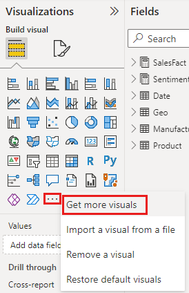
You can personalize the Visualizations pane by adding and removing Power BI visuals. If you remove default visuals from the Visualizations pane, you can restore the pane to default and bring back all the default visuals.
Add a visual to the Visualizations pane
If you find yourself using the same visual across many reports, you can add the visual to your Visualizations pane. Adding visuals applies to AppSource visuals, organizational visuals, and visuals from files. To add a visual, right-click the visual.
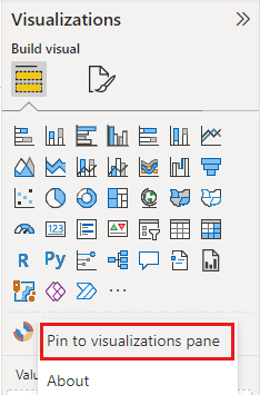
Once a visual is pinned, it moves up to live with the other default visuals. This visual is now tied to your signed in account, so any new reports you build automatically have this visual included as an option, assuming you're signed in. You no longer need to add a specific visual you regularly use to every single report.
Remove a visual from the Visualizations pane
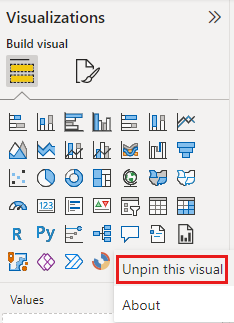
If you stop using a visual regularly, you can right-click it and remove it from the Visualizations pane. You can remove any type of visual from the Visualizations pane, including default, file, organizational, and AppSource visuals.
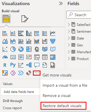
Restore the Visualizations pane
Restoring the Visualizations pane only applies to default visuals. Visuals that you added to the Visualizations pane aren't affected and remain available from the Visualizations pane. If you want to remove AppSource or file visuals from the Visualizations pane, you have to do it manually.
To restore the Visualizations pane to default, select More options (...) and choose Restore default visuals.
Change the visualization type
Try changing the type of visualization to see which works best with your data. Select a visualization to make it active, and from the Visualizations pane, choose the icon for a different visualization type.
If you previously pinned the visualization to a dashboard, changing the type in the report doesn't change the type on the dashboard. For example, you pin a donut chart to a dashboard and then change the donut chart to a bar chart. You now have a bar chart in the report and a donut chart on the dashboard. To update the dashboard, repin the data as the bar chart.
Pin the visualization
In the Power BI service, when you have the visualization the way you want it, you can pin it to a dashboard as a tile. If you change the visualization being used in the report after you pin it, the tile on the dashboard doesn't change. If it was a line chart, it stays a line chart, even if you changed it to a donut chart in the report.
Considerations and limitations
- Depending on the data source and the number of fields (measures or columns), a visual might load slowly. We recommend limiting visuals to 10-20 total fields, both for readability and performance reasons.
- The upper limit for visuals is 100 fields (measures or columns). If your visual fails to load, reduce the number of fields.