Note
Access to this page requires authorization. You can try signing in or changing directories.
Access to this page requires authorization. You can try changing directories.
Note
The Explore feature in the Power BI service is currently in preview.
Explore in the Power BI service is a new experience that you can use to explore your data in a focused way. It's designed to be easy to use, so you can quickly get the answers you need without having to be a Power BI expert. You can use Explore on an existing visual to dig into the underlying data, or you can start with a blank canvas and pull in the data you want to explore.

A few scenarios when you could benefit from Explore include:
- You want to see the underlying data behind a visual in a report or a Copilot-generated visual.
- You want to explore a new semantic model (dataset) to learn about it.
- You want to create a new visual or matrix from scratch, but you don't want to create a report.
- You want to explore a semantic model that you don't have permission to edit, but you want to create a new visual or matrix from it.
Continue reading to learn how to use Explore to build a matrix or visual, customize your Exploration, and then save it to a workspace or as a report to share with others.
Navigate to the Explore experience
Note
You can explore data from any supported Fabric artifact where you have View permission on the data, unless restricted by your tenant admin. If restricted, you can only use artifacts where you have Build permission. Exception: Build permission is always required for Lake Houses.
You can start your experience with Explore from various entry points.
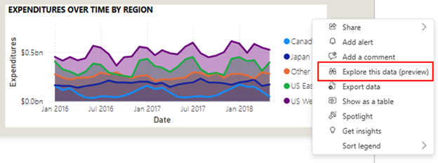
To use Explore in a visual in a report, follow these steps:
Select ... for more options.
Select Explore this data.

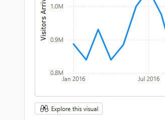
To use Explore in a visual generated by Copilot, follow these steps:
Select the Explore this visual button.

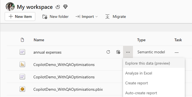
To use Explore in an artifact from a list, follow these steps:
Select ... for more options.
Then select Explore this data.

To use Explore in an artifact from a report, follow these steps:
Select Explore this data.

To use Explore in a workspace, follow these steps:
Select the New button at the top of a workspace.
Then select Exploration.

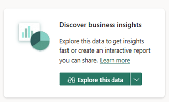
To use Explore in a data hub, follow these steps:
From the Discover business insights action card on the Details page, select the Explore this data button.
Build your matrix or visual with Explore
Regardless of your starting point, when you launch the Explore experience, you land in the new focused view. Your data appears in the data pane, and you can edit, drag and drop, or select fields to start building a matrix or visual.
Matrix and visual fields
If you start from a visual, you see that visual on this page. Get a matrix of the underlying data by expanding the Matrix section.

If you didn't start from a visual, you see a blank canvas with matrix and visual fields. You can drag and drop fields from the data pane to the matrix or visual, or select other fields to add.

The matrix and visual are linked. So as you add fields, sort, and drill into to one, the other one is updated automatically, as long as the visual can accurately reflect the sort or drill state.
For example, you might have a visual with a date hierarchy and you want to drill down to quarters. When you drill down on the visual, the matrix updates accordingly.

Note
- Some interactions between the matrix and visual aren't currently supported. For example, if you drill down on a visual, the matrix might not update to reflect the drill state. The matrix and visual are linked, but if you notice that your visual doesn't reflect the drill state you applied to your matrix, it means that the interaction isn't currently supported.
- In explore, when a user adds or reorders a field in the field well, the matrix automatically adjusts which fields are expanded so the new field is visible. This behavior might be different from what you experience in your reports, depending on the settings the author has chosen.
- When users launch an Exploration from a formatted matrix in a report, the formatting applied to that matrix during authoring is now carried over. Formatting that's part of the theme won't be carried over. If you'd like to clear any of the formatting, navigate to the more menu (...) in the visual toolbar, and select "Clear formatting"
Visual types
You can change the type of visual, like stacked bar chart, pie chart, or funnel, by using the options in the visual type gallery. If you don't choose a visual type, Explore autoselects the type that best suits your selected data. To turn off this autoselection, deselect the lightning bolt icon.

Data pane
Use the Choose data section to add or remove data from your Exploration.
Use the Rearrange data section of the data pane to make adjustments. Drag and drop fields from the Choose data section to the Rows, Columns, and Values wells, or use the + Add data button. You only see the field wells for the outlined selection (that is, the matrix or the visual). Select the other side to see its field wells.

Note
Some users might see the data pane on the left as Microsoft experiments with placement to optimize the experience.
Apply filters to your Exploration
As you build out your Exploration, you can also filter your data. Select the Add filter button on the top left to quickly add filters on the fields already in your visual or pick from any fields in your semantic model in the All data section.

In this Exploration experience, add filters as pills at the top of view, so you can clearly see what the current filter state is and modify it.

Layout options
Switch between a horizontal or vertical orientation by using the Split view horizontally and Split view vertically buttons along the top.

Show or hide totals
You can show or hide totals on matrix and table visuals from the toolbar by toggling the option on or off.

Add calculations to your visual
You can add visual calculations to your visuals. Select the New visual calculation button on any visual to enter visual calculations edit mode.

Enter the calculation or use the provided templates.

For example, to calculate a running sum of visits, use the Running sum template:

Note
In this view, you can also hide fields by using the Rearrange data menu.
After you add your calculations, select Back to return to your Exploration.

Your calculation appears on both visuals, unless it can't be displayed on the other visual.

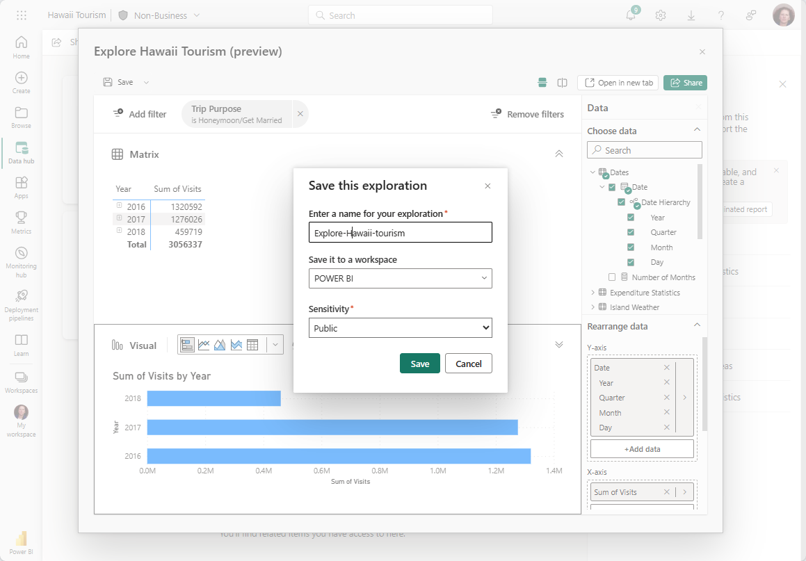
Save your Exploration
Save your Exploration to a workspace or as a report.
To save to a workspace, follow these steps:
Select the Save button in the upper-left corner. A dialog box appears.
Name the Exploration, pick a workspace to save it to, and add a sensitivity label, if applicable. This step also saves your current canvas layout (horizontal or vertical) of the Exploration.

To save as a report, follow these steps:
Select Save.
Select Save as report. This step saves your Exploration as a one-page report matching the layout on the screen.
Note
You need Build permission on the underlying semantic model to save as a report.
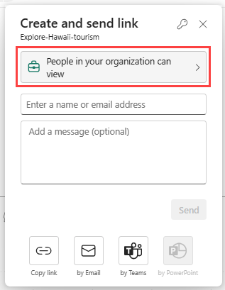
Share your Exploration with others
To share your Exploration with others, follow these steps:
- Select the Share button in the upper-right corner.
- Select the people who can view your Exploration, such as People in your organization can view, People with existing access, or Specific people.
- Choose more permissions such as share or edit.
- Add your recipients' email addresses and an optional message.
- Select Send. You can send via email or Teams, or select Copy link to share it on your own.
Important
You're prompted to share the underlying semantic model so the recipients can view the contents of your Exploration. If you're not prompted, you can manually share the semantic model with read permissions. For reports, sharing the underlying semantic model is done automatically.
Perspectives
For report authors: If your report is built using a large data model, report consumers that decide to use explore might have trouble finding the fields they are interested in in the data pane. To provide them a more focused list of tables and fields, create a perspective (follow these instructions) and then set it as the Exploration perspective for your report.

Set an Explore perspective
To set an Explore perspective in the Power BI service, follow these steps:
- Go to File > Settings > Report settings.
- Set your Explore perspective.
To set an Explore perspective in Power BI Desktop, follow these steps:
- Go to File > Options and settings > Options > Current File > Report settings.
- Set your Explore perspective.
Permissions, requirements, and limitations
To fully benefit from Explore in the Power BI service, be aware of the following permissions, requirements, and limitations.
Permissions and requirements
Explore requires the following permissions and considerations:
Accessing Explore (preview):
By default, people with View permissions on the data can access Explore (preview).
Admins can limit the experience to people with Build permissions if they choose by disabling the Users with view permission can launch Explore setting in the admin portal.
Exception: For Lake Houses, Build permissions are always required.
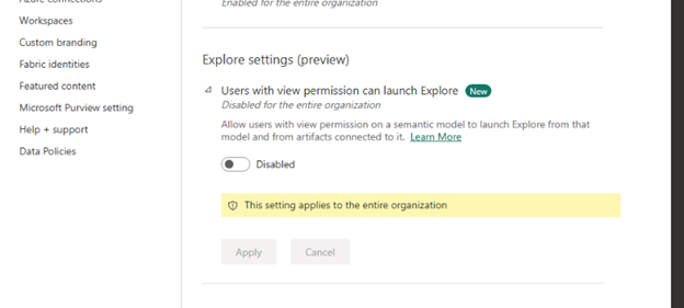
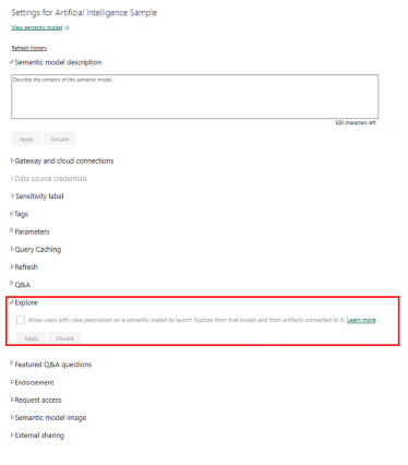
Semantic model owners can also limit Exploration of their models to people with Build permissions on an artifact-by-artifact basis. They can do this by disabling the Allow users with view permissions setting in the Explore section of semantic model settings.
Saving an Exploration to a workspace:
- Changing a sensitivity label on a semantic model doesn't currently propagate down to the Exploration that you create for it.
- If you save to My workspace, you might need to refresh your page to see the newly saved Exploration artifact.
Saving an Exploration as a report:
- You need Build permissions on the underlying semantic model.
Sharing an Exploration:
- You need a Power BI Pro or Premium Per User (PPU) license.
- You need to grant View permissions to the underlying semantic model so your recipients can view the Exploration.
- If you skip this step, your recipients have to request permissions to view the Exploration.
- Explorations aren't currently shown in lineage view as related to the semantic model.


Limitations
Explore has some limitations. Keep these important points in mind:
- The Power BI mobile app doesn't support it.
- The Power BI service Home doesn't provide an entry point from artifacts in the list view of semantic models and reports.
- It doesn't support custom visuals.
- It doesn't support the following native visuals:
- Matrix
- Slicers
- Q&A
- Smart narratives
- Metrics
- Paginated reports
- Power Apps
- Power Automate
- It doesn't currently support streaming datasets.