Visualize your data quickly from Power Apps and Dynamics 365 apps
There's a new way to visualize your model-driven Power Apps and Dynamics 365 data stored within Dataverse. With a single click, Power BI will automatically generate a set of visuals for you to explore and find insights within your data.
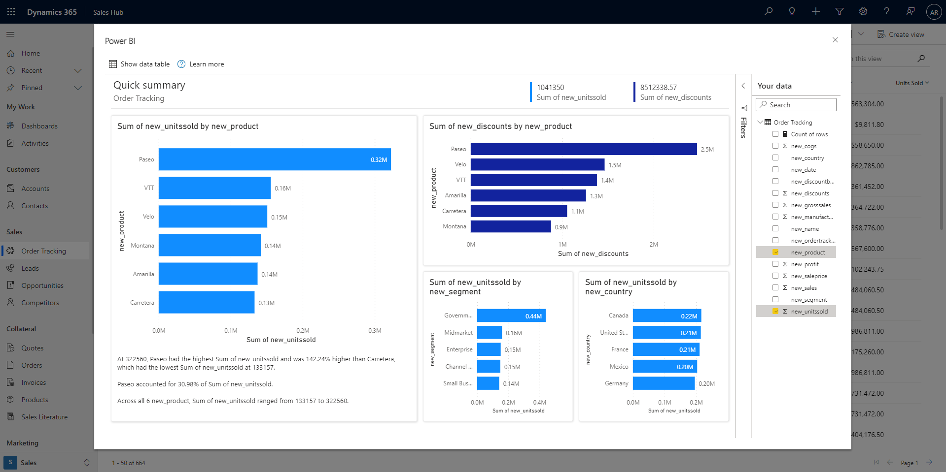
Video
Watch this video showing how to create visuals from data stored within Dataverse, and then try it yourself.
Note
This video might use earlier versions of Power BI Desktop or the Power BI service.
Visualize a view
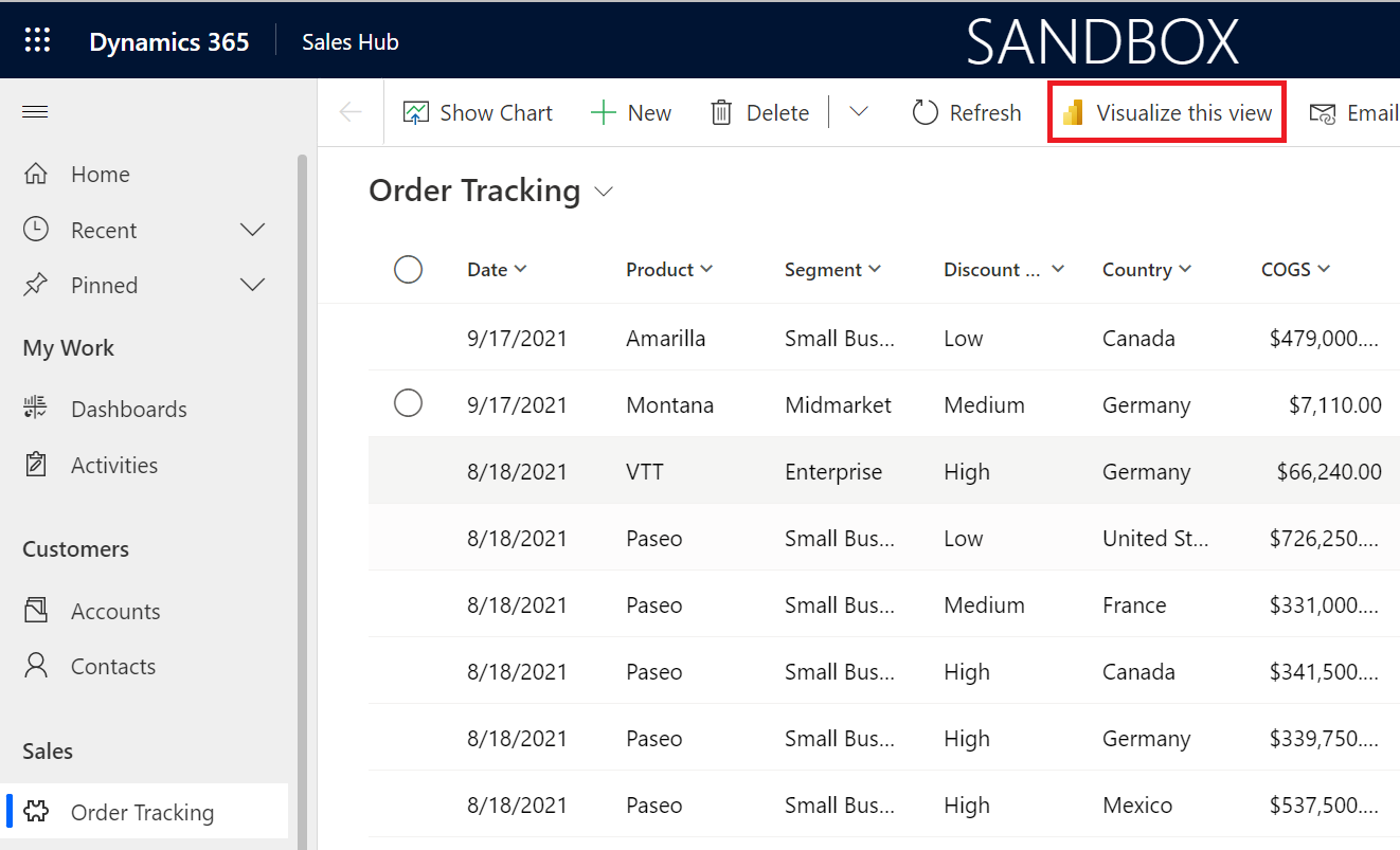
In your model-driven Power App or Dynamics 365 app, select the Visualize this view button in the app bar of any grid view.
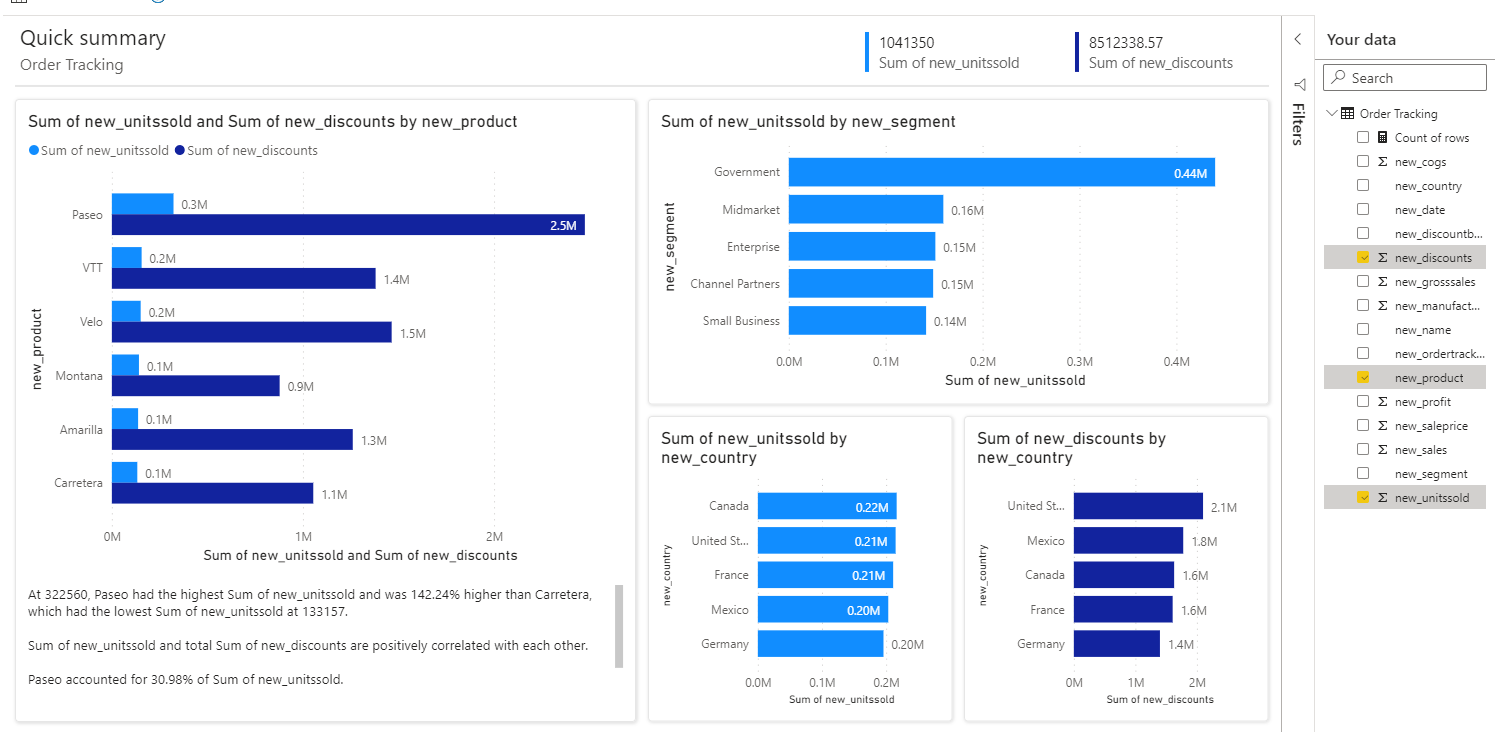
A dialog opens with an automatically generated report with a few fields selected for you in the Your data pane on the right. The visuals within the report will use some or all of your selected fields and potentially other fields from the table that work well with chosen fields.
Note
Power BI is connecting to Dynamics on behalf of the user that clicked the Visualize this view button, so any security rules that have been set up with Dataverse will apply. Users should see the same data they see within the app itself.
Changing the data you see in the report is easy. In the Your data pane, add or remove fields that you’re interested in visualizing. The selected fields are then used as ‘hints’ to the algorithm generating the visuals. Power BI automatically adds or removes charts to show new visuals. Read Interact with autogenerated "quick" reports to learn more about how to interact with and change these reports.
Filter the original view for in-depth exploration
The data being visualized within the report is always based on the data currently in the view’s grid. This means if you've applied any filters to the grid, that filtered data will be used in the Power BI visuals. For example, if the view is filtered down to just 15 rows of data, only 15 rows will be visualized through Power BI.
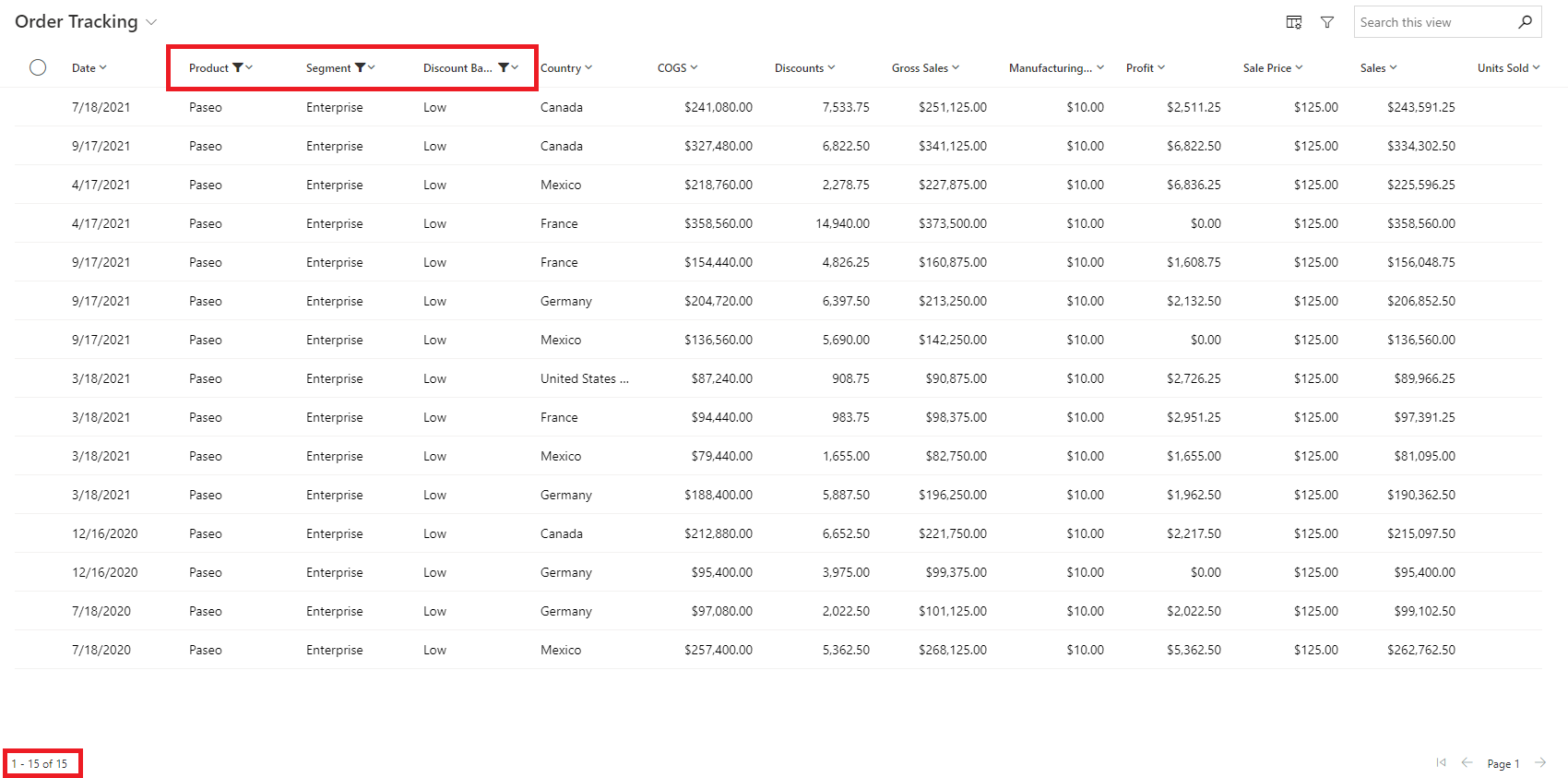
This makes it very easy to iteratively explore your data, jumping back and forth between filtering in the grid and visualizing with Power BI, until you find the insights you’re looking for.
Save the report and semantic model
Once you’ve finished your exploration and are ready to save, just select the Save button in the app bar, give it a name, and pick a workspace. If your organization has enabled sensitivity label, set a label. You can save to any workspace that you have a Contributor, Member, or Admin role assigned. As a free user, you can save to your personal My Workspace.
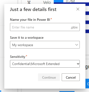
Once you've saved the report, we give you a link to access it in the Power BI service. Selecting the link opens the report in a new tab. Once you save this report, it becomes a normal Power BI report. You can share it, package it in an app, subscribe to email updates, or even download the .pbix to make further modifications.
The semantic model that gets saved through this flow is automatically configured as DirectQuery with single sign-on (SSO) enabled. Thus, it will always be up to date and respect Dataverse security settings. Of course, once you’ve saved the report and semantic model, you can go into the semantic model’s settings and change it later.
If you already have credentials in Power BI configured for the specific Dataverse environment you’re connecting to, and it isn’t set to SSO, we don’t automatically override this. Instead, we ask you to decide how you want to handle your credentials. You can choose to either keep what’s already stored in Power BI or override it to use SSO. If you decide to keep what’s already in Power BI, your report may show different data when you view it in the Power BI service. If you decide to override, this also updates your existing semantic models connected to the same source.
Once the report is in the Power BI service, that is where you’ll access it going forward. However, if you’d like to make it a standardized report included in your app, you can always choose to embed it back into the app.
Considerations and limitations
- You may notice more columns within the report than you see in the original view. These fields could include foreign keys for the columns or hierarchy, or URL fields that are being used within the original view for purposes other than columns.
- The report created through this feature is temporary. Unless you decide to save it, the experience times out after a set amount of time. At that point you need to close and reopen the report to continue exploring your data. For now, the timeout occurs at one hour.
- You can download the data from this report. However, Power BI uses single-sign on and Direct Query for the autogenerated report, so the data you can download is only the data you have permission to see in Dynamics. You can’t access data that you normally wouldn't be able to see. Power BI admins can restrict download to Excel on the Power BI side by managing it in the Power BI admin portal. See the article Export and sharing tenant settings for details.