Note
Access to this page requires authorization. You can try signing in or changing directories.
Access to this page requires authorization. You can try changing directories.
Well-designed, mobile-optimized layouts for your Power BI reports offer the best way for users to consume your data while on the go using their mobile device. This article presents best practices and techniques for getting the most out of the features Power BI offers for creating such attractive, effective, mobile-optimized views of Power BI reports.

Keep mobile devices in mind while designing your desktop report
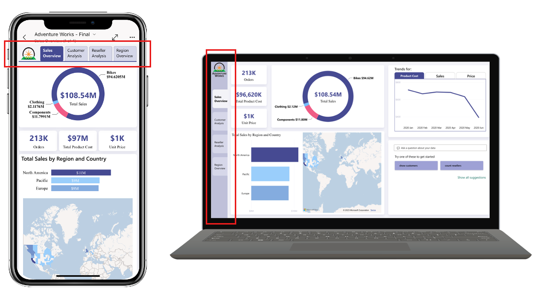
Build the desktop and mobile layouts of each report page together. This facilitates coherence between the two.
When you duplicate a report page that has both desktop and mobile layouts, both layouts are duplicated. This makes page formatting easier if you have visual layout elements, such as a report header or page navigator, that you want to maintain across multiple pages. If you have such elements, create a report page that has both desktop and mobile layouts, and then use that page as a template for building the rest of the report pages.
Focus on the most important content
Add only significant and regularly used visuals to your mobile layout. Simplify headers and designs to better suit the limited screen space on mobile devices as compared to a regular computer screen. Use the mobile visualization pane to optimize the formatting of your visuals specifically for mobile layout (remember - changes made to the mobile layout don't affect the desktop layout).
Consider the following tips:
- Minimize visual titles by using smaller font sizes. Don't use fonts smaller than nine points.
- Remove insignificant details whenever possible, such as axis titles, gridlines, and legends.
- Place objects such as page navigators and slicers horizontally instead of vertically.
- Avoid extra white space in each visual.
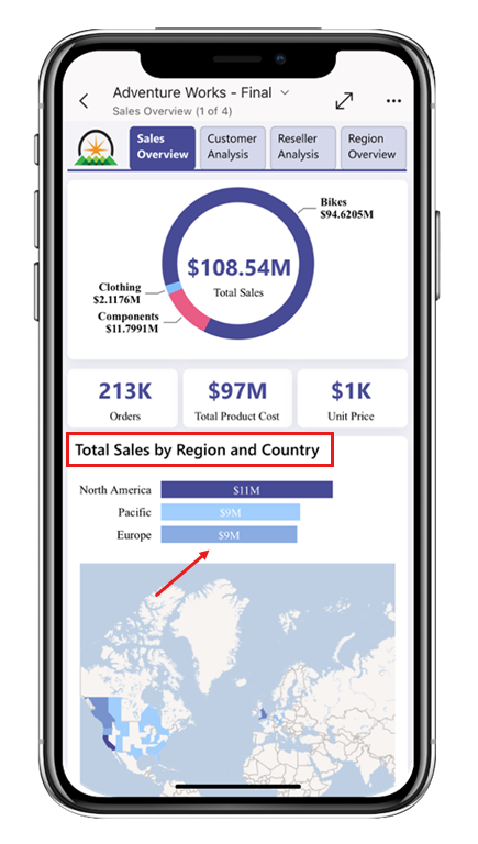
Space your visuals out
Consider expanding your visuals to match the maximum width of your device (323 points is the maximum screen width). A default margin is automatically included, even when visuals are extended to the device's maximum width, so there's no need to reserve extra space.
Don't place visuals side by side (except for single element visuals such as cards or KPI visuals and nondata visuals such as buttons).
Space your visuals out, keeping at least six to eight points (a single arrow press on the keyboard) between elements, both vertically and horizontally. For pixel-perfect design, turn off the Snap to grid option in the view menu.
Arrange your visuals to tell a story
The flow of mobile layout is from top to bottom. Position the most important visuals at the top of the page, whether they're the most significant data-driven visuals or slicers that illustrate a point. Place closely related visuals one after another. Place less significant visuals towards the bottom of the page, where they can be reached via downward scrolling, or just leave them out of the mobile layout all together. Having fewer visuals improves both report loading time and overall performance. Remember, users can always tilt their devices to landscape orientation if they want to view the original report page in its desktop layout.

Avoid causing vertical scroll bars within visuals
Set the height of each visual such that all the elements inside the visual are visible and not truncated. This prevents having a vertical scroll bar appear inside the visual, in addition to the vertical scroll bar of the report page itself. Keep in mind that mobile devices vary in height.
Use the auto-create mobile layout option to get started
Try using the auto-create layout option in the mobile layout view to get started. The auto-create mobile layout option generates a mobile-optimized view of your report on the mobile layout canvas. It places the report visuals on the canvas and tries its best to preserve the desktop report's functionality. Once you have the initial, auto-created layout on the canvas, you can further optimize it for mobile viewing using mobile layout view's formatting options. For more information about the auto-create mobile layout option, see Automatic mobile layout creation.
Stick to standard sizes
The following table lists the standard visuals, classified by their minimum recommended mobile size. Try not to go below these minimum standard sizes when designing your mobile layout.
- XL – minimum width: 323 pt, minimum height: 270 pt
- L – minimum width: 323 pt, minimum height: 180 pt
- M – minimum width: 323 pt, minimum height: 100 pt
- S – minimum width: 158 pt, minimum height: 100 pt
Note
323 pt is the maximum screen width on the mobile layout canvas.
| Name | Visual size |
|---|---|
| ArcGIS Maps for Power BI | XL |
| Azure map | XL |
| Decomposition tree | XL |
| Filled map | XL |
| Key influencers | XL |
| Map | XL |
| Matrix | XL |
| Multi-row card | XL |
| Paginated report | XL |
| Shape map | XL |
| Table | XL |
| table | XL |
| 100% Stacked bar chart | L |
| 100% Stacked column chart | L |
| Area Chart | L |
| Card (New) | L |
| Clustered bar chart | L |
| Clustered column chart | L |
| Custom Visual | L |
| Donut chart | L |
| Funnel | L |
| Line and clustered column chart | L |
| Line and stacked column chart | L |
| Line chart | L |
| Metrics | L |
| Pie chart | L |
| Python visual | L |
| Q&A | L |
| R script visual | L |
| Ribbon chart | L |
| Scatter chart | L |
| Stacked area chart | L |
| Stacked bar chart | L |
| Stacked column chart | L |
| Tree map | L |
| Waterfall chart | L |
| List Slicer | L |
| Continuous Slicer (Before/between/after) | M |
| Continuous Slicer (Single value/Greater than/Less than) | M |
| Tile slicer | M |
| Relative Date/time Slicer | M |
| Bookmark navigator button | M |
| Page navigator button | M |
| Drop down list slicer | M |
| Text Box | M |
| Button | S |
| Card | S |
| Gauge | S |
| KPI | S |
| Shape | S |
| Shape | S |