Events
Take the Microsoft Learn AI Skills Challenge
Sep 24, 11 PM - Nov 1, 11 PM
Elevate your skills in Microsoft Fabric and earn a digital badge by November 1.
Register nowThis browser is no longer supported.
Upgrade to Microsoft Edge to take advantage of the latest features, security updates, and technical support.
The Competitive Marketing Analysis sample contains a report and semantic model for a fictitious manufacturing company named VanArsdel Ltd. The VanArsdel Chief Marketing Officer (CMO) created this report to keep an eye on the industry and the company's market share, product volume, sales, and sentiment.

VanArsdel has many competitors but is the market leader in its industry. The CMO wants to increase market share and discover growth opportunities. However, for unknown reasons, VanArsdel's market share has started to decline, with significant dips in June.
This sample is part of a series that shows how you can use Power BI with business-oriented data, reports, and dashboards. The company obviEnce created samples using real, anonymized data. The data is available in the following formats: built-in sample in the Power BI service and .pbix Power BI Desktop file. See Get the sample in this article.
This tour explores the Competitive Marketing Analysis sample in the Power BI service. Because the report experience is similar in Power BI Desktop and in the service, you can also follow along by using the sample .pbix file in Power BI Desktop.
You don't need a Power BI license to explore the samples in Power BI Desktop. You just need a Fabric free license to explore the sample in the Power BI service, and save it to your My workspace.
Before you can use the sample, get the sample in one of the following ways:
Open the Power BI service (app.powerbi.com), and select Learn in the left navigation.
On the Learning center page, under Sample reports, scroll until you see Competitive Marketing Analysis.
Select the sample. It opens the report in Reading mode.
Power BI imports the built-in sample, adding a report and a semantic model to your My workspace.
Alternatively, you can download the Competitive Marketing Analysis sample as a .pbix file, which is designed for use with Power BI Desktop.
Open the GitHub Samples repository to the Competitive Marketing Analysis sample .pbix file.
Select Download in the upper-right corner. It downloads automatically to your Downloads folder.
If you'd like to view it in the Power BI service, you can publish it there.
Open the file in Power BI Desktop and select File > Publish > Publish to Power BI or choose Publish in the Home ribbon.
In the Publish to Power BI dialog box, choose a workspace, and then Select.
Power BI imports the sample, adding the report and semantic model to your selected workspace.
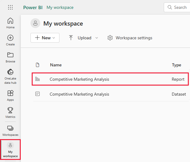
To open the Competitive Marketing Analysis report, go to your workspace and select that report:
If you're following along in Power BI Desktop, open the .pbix file to see the report.
You can edit current visualizations and create your own visualizations that use the semantic model for this sample. This environment is a safe one to play in, because you can choose not to save your changes. But if you do save them, you can always return to the Learning center for a new copy of this sample.
Select Edit in the Power BI header bar to explore in the editing view:
Save or discard your changes.
The visualizations in a Power BI report aren't just pictures. The tiles allow you to interact with data in order to better understand and analyze that data. There are several ways to interact with the data.
Under Pages, select Executive Overview. The overview shows high-level results for different sales channels and products over time.
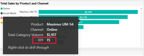
In the Total Sales by Product and Channel tile, right-click a bar. From the context menu, select Drill through > Detailed Info.
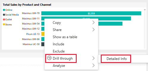
The report opens a report page with data for the bar that you selected. This page is only visible by using the drill through feature. If you select Edit from the report header to enter Edit mode, the page is visible and editable there.
If you entered Edit mode, select Reading view. Then select Executive Overview to return to that page of the report.
You can also learn about the data by using tooltips. To see a tooltip, hover over one of the elements of a tile.
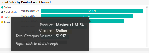
Power BI automatically generates some tooltips, but you can add values to any visualization.
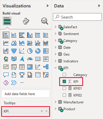
Select Edit and then select the Total Sales by Product and Channel tile.
Under Visualizations, scroll down to Tooltips.
Expand KPI, then drag KPI to the box under Tooltips.
Select Reading view. Be sure to save your changes.
Hover over the visual to see your revised tooltip.
Under Pages, select Top 10 Regions to view that report page. In the Total Sales by Channel and State, hover over a value.
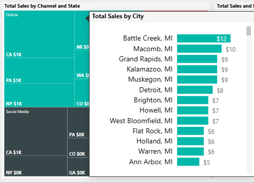
This tooltip is an entire report page. Such a page can contain as many visualizations as needed. Keep in mind that a large tooltip obscures a large part of your report.
You can add a report page tooltip to any visual.
Select Edit to enter Edit mode.
In the tabs at the bottom, select Top 10 Regions, then select the Total Sales and ROI by State and Channel visualization.
Select Format visual > General, and then expand Tooltips. For Type, select Report page. For Page, select Tooltip.
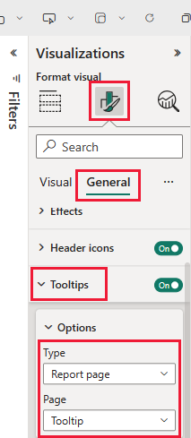
Select Reading view to leave Edit mode. Be sure to save your changes.
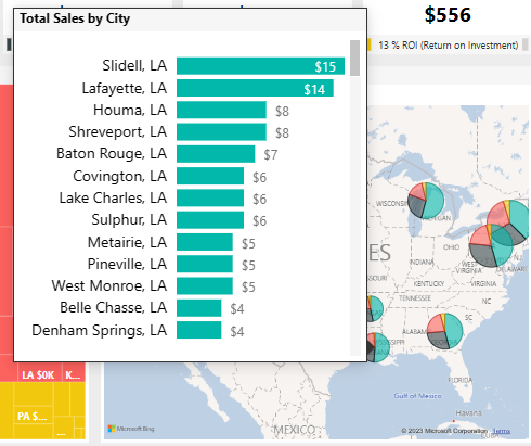
Hover over Total Sales and ROI by State and Channel to see the tooltip there.
You can always look at the raw numbers that underlie the visualizations. Power BI also provides tools for analyzing the data.
Under Pages, select Return on Investment. Right-click the ROI by Product visualization. From the context menu, select Show as a table.
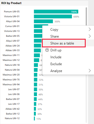
The dashboard shows you the data a table.

Power BI can also help you understand the causes of your data. Right-click on ROI by Product. From the context menu, select Analyze > Find where this distribution is different. The report provides this analysis.

A Power BI dashboard is a single page that contains visualizations that can come from one or more reports, and each report is based on one semantic model. You can also generate visualizations on the dashboard by using the Ask a question about your data feature to explore the data associated with a report. Think of a dashboard as an entryway into the underlying reports and semantic models. Select a visualization to take you to the report that was used to create it.
To create a dashboard in the Power BI service:
Open a report by selecting it in a workspace.
To add all of the visualizations in a page to a dashboard, from the report menu, select ... (More options) > Pin to a dashboard.
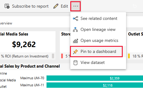
Or, to add a single visualization to a dashboard, hover over it and then select Pin visual.
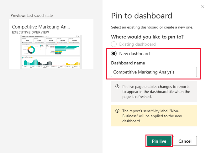
In Pin to dashboard, select New dashboard and enter a name for your dashboard.
You can add visuals to an existing dashboard to show visualizations from different reports.
Then select Pin live.
Your new dashboard now appears in My workspace.
For more information, see Introduction to dashboards for Power BI designers.
A dashboard offers the ability to ask questions about data in natural language to create visuals. It doesn't matter how you create your dashboard or which tiles it has. You can ask questions about any semantic model attached to your dashboard.
In this section, use the dashboard to find out, which segments drive sales? Do they match the industry trend?
In the dashboard, select Ask a question about your data.
Even before you start typing, the dashboard displays suggestions to help you form your question.
In Ask a question about your data, enter total units by segment. The dashboard displays the data as a visualization.

At the end of the query, add: for VanArsdel. Q&A interprets the question and displays an updated chart with the answer.

The product volume is mostly from the Convenience and Moderation segments. Your share in the Moderation and Convenience categories is high. VanArsdel competes in these segments.
Add by region to the query. The dashboard breaks down the results by region.

Tip
Are any of these visualizations useful for future reference? Select Pin visual to add a visual to a new or existing dashboard.
Select Exit Q&A to return to the dashboard.
After experimenting with this report, you can choose not to save your changes. But if you do save them, you can always return to the Learning center for a new copy of this sample.
Now that you've seen how Power BI dashboards, Q&A, and reports can provide insights into data, try connecting to your own data. With Power BI, you can connect to a wide variety of data sources. To learn more, see Get started with the Power BI service.
Events
Take the Microsoft Learn AI Skills Challenge
Sep 24, 11 PM - Nov 1, 11 PM
Elevate your skills in Microsoft Fabric and earn a digital badge by November 1.
Register nowTraining
Learning path
Embed Power BI analytics - Training
This learning path teaches you how to embed Power BI content in apps, develop programmatic solutions using the Power BI REST API and the Power BI Client APIs, enforce row-level security (RLS) for embedded content, automate common Power BI setup tasks, configure a development environment, and determine appropriate licensing.
Certification
Microsoft Certified: Power BI Data Analyst Associate - Certifications
Demonstrate methods and best practices that align with business and technical requirements for modeling, visualizing, and analyzing data with Microsoft Power BI.