Note
Access to this page requires authorization. You can try signing in or changing directories.
Access to this page requires authorization. You can try changing directories.
APPLIES TO: ![]() Power BI Desktop
Power BI Desktop ![]() Power BI service
Power BI service
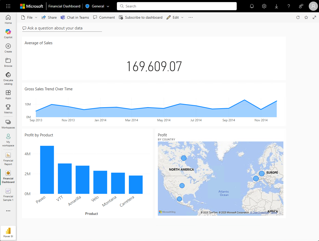
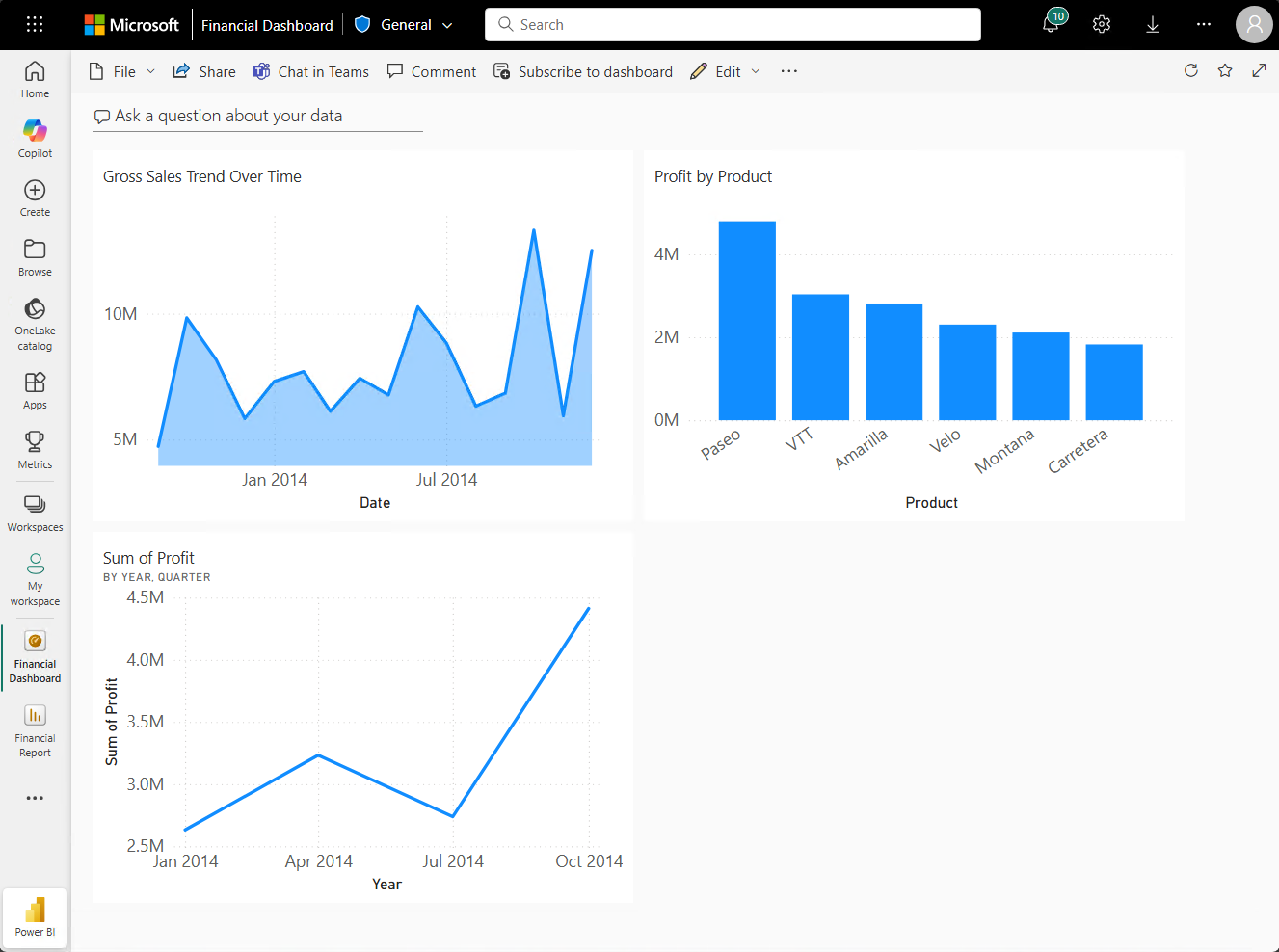
This tutorial is an introduction to some of the features of the Power BI service. In this tutorial, you connect to data, create a report and a dashboard, and ask questions about your data. The exercises show you how to work with data on a dashboard and design semantic model visualizations. Here's an example dashboard:
In the Power BI service, you can accomplish many different tasks, and this tutorial can help you get started. For an understanding of how the Power BI service fits in with the other Power BI offerings, we recommend reading What is Power BI?
If you're a report reader or viewer rather than a creator, check out the Getting around in the Power BI service tutorial.
In this tutorial, you complete the following tasks:
- Sign in to your Power BI online account, or sign up, if you don't have an account yet.
- Open the Power BI service.
- Add and view data in reading or editing mode.
- Use data to create visualizations and save designs as a report.
- Create a dashboard by pinning tiles from the report.
- Add visualizations to a report and dashboard using Copilot.
- Add other visualizations to a dashboard with the Q&A natural-language tool.
- Resize, rearrange, and edit details for the tiles on the dashboard.
- Clean up resources by deleting the semantic model, report, and dashboard.
Sign up for the Power BI service
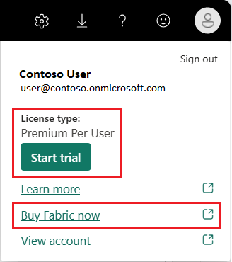
You need a Power BI Pro or Premium Per User (PPU) license to create content in Power BI. If you don't have a Power BI account and plan on creating content, sign up for a free trial before you begin. Complete the wizard to get a license. Open the Power BI service (app.powerbi.com), and select the Account manager icon. Choose Free trial.
Although a paid or trial license is recommended, it isn't required for this tutorial. Even if you can't try the steps yourself, the description and screenshots still provide you with an introduction to working with data in the Power BI service.
Add data to create a report
Often, when you want to create a Power BI report, you start in Power BI Desktop. Power BI Desktop offers more power. You can transform, shape, and model data, before you start designing reports.
For this tutorial, we start from scratch by creating a report in the Power BI service rather than through the Desktop. We create a semantic model from a simple Microsoft Excel file that contains sample financial data.
Open the Power BI service (app.powerbi.com) in your browser.
Don't have an account? Sign up for a free trial.
Download the Excel file that has the Financial Sample data.
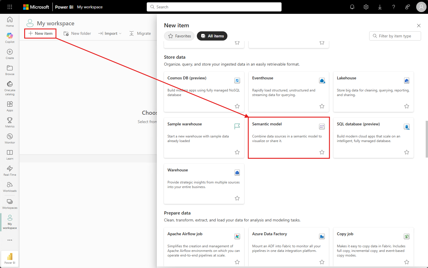
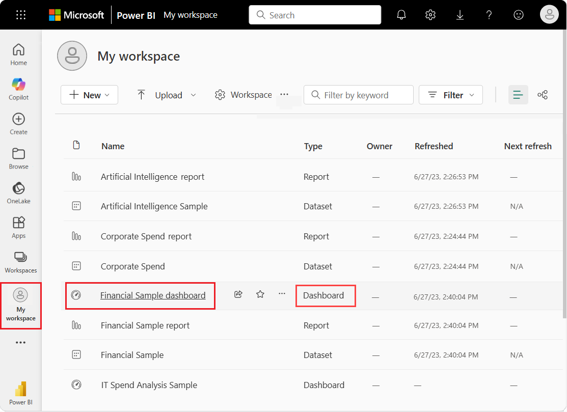
Select My workspace in the navigation pane.
Select New item > Semantic model to initiate the import process. The Add data to start building a report page opens.
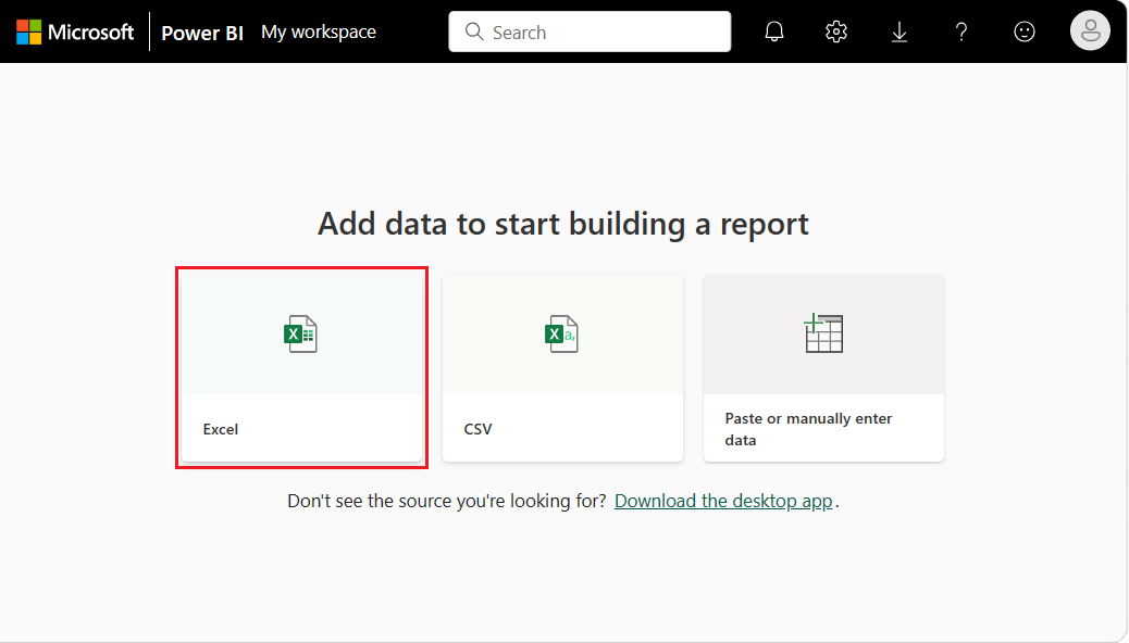
On the Add data to start building a report page, select Excel.
Note
If you select Upload instead of Link to file, the Power BI service uploads the entire Excel workbook. You can then open and edit the workbook in Excel Online.
In the Select a file dialog, browse to the location where you saved the Excel file on your computer.
Select the file and choose Select > Link to file > Next.
Note
If the file doesn't open, try changing the Sensitivity label to Public.
Select the data to use by placing a checkmark next to financials and choosing Create.
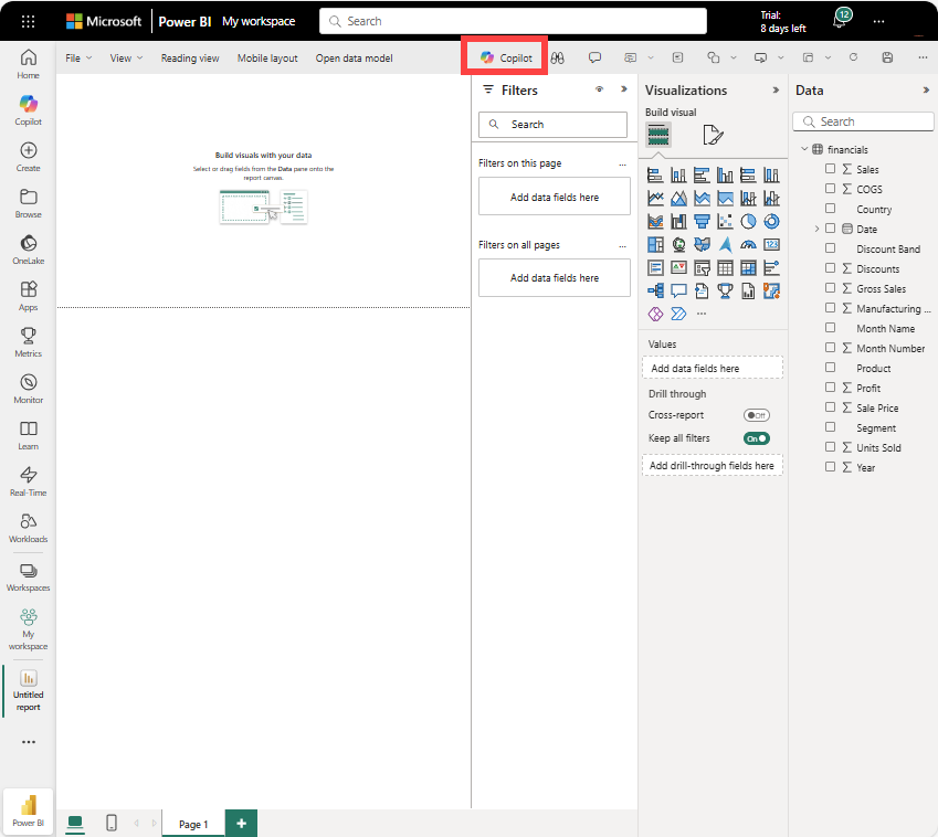
The Power BI service imports the sample data from the Excel file as a semantic model and opens a report canvas. We can now use the sample semantic model to create reports and dashboards. We're going to create a report partly from scratch and partly using Copilot. Let's start with Copilot.
After you connect data to build a report, you're ready to start exploring. When you find an interesting item, you can save it on the report canvas. From the report canvas, you can pin the item to a dashboard to monitor the data for changes over time.
We can start by asking Copilot to review our data and suggest some visuals.
Switch between report views
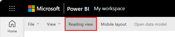
Reports have two modes: Editing and Reading. To create a report, add visuals, and edit your report, use Editing mode. To view your report in progress, switch to the Reading view at the top of the page:
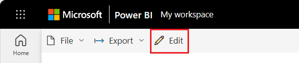
In the Editing view, you can modify reports because you're an owner or creator of the report. When you share your report with colleagues, they often can interact with the report in Reading view only.
When you're ready to continue working on your report, select Edit:
Build a report
There are many ways to build a report. In this article, we start by using Microsoft Copilot to create some report pages. Next, we add more visuals to a report page from scratch.
Use Copilot to create a report in Power BI
You can get AI assistance from Copilot. Generate a Power BI report based on gross sales in Power BI.
Create a Gross Sales report.
Copilot creates a report page and names it Gross Sales Report. Copilot is powered by AI, so it's important to verify the accuracy of results. For more information, see Copilot for Microsoft Fabric and Power BI: FAQ.
Pin a report visual to a dashboard
Create a new dashboard using one of the visuals from the report. Select the Gross Sales Trend Over Time visual. Hover over the visual and select Pin visual > New dashboard > Keep current theme. Give the new dashboard a name and select Pin. You can pin the whole report by selecting Pin to a dashboard in the top menu bar.
After you pin a visualization, it appears on the dashboard as a tile. The data in the visualization stays up-to-date so you can track the latest value at a glance.

Note
When the report is new, you're prompted to save the report before you can pin the visualization to a dashboard. Power BI saves the report to the selected location. The default is My workspace. Power BI shows the report in Reading view.
To continue editing the report, select Edit from the top menu bar.
Use Copilot to suggest insights
Add a new report page by selecting the plus icon (+) at the bottom of the report.
Ask Copilot to suggest content.
Suggest content for a new report page.
Select Profit Analysis by Product > Create. Copilot creates a new report page for you and names it Profit Analysis by Product.
- Select another visual to pin to your dashboard. Select Profit by Product and pin it to the same dashboard.
Create report visuals from scratch
Add a new page to your report. The new report page canvas is blank and shows the Filters, Visualizations, and Data panes.
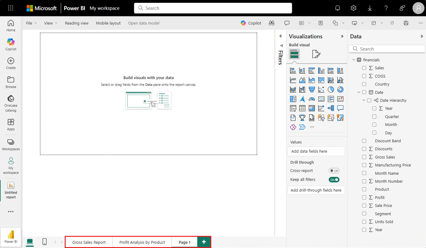
In the Data pane, select the arrow next to the financials heading to show the data items.
Some data items have a sigma symbol (Σ) next to the name. Power BI displays the sigma next to data that has numeric values.
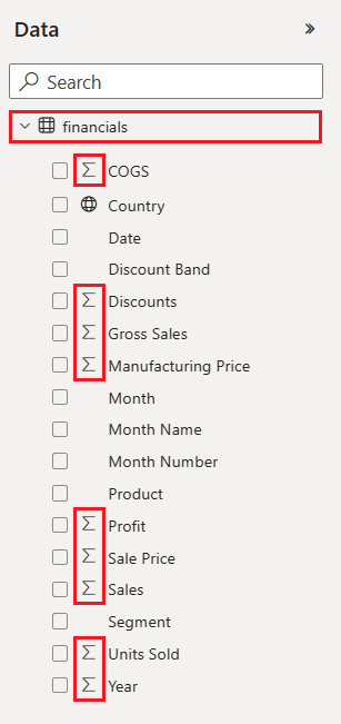
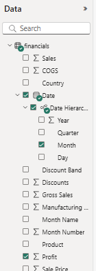
Under financials, select the Profit data item, and then select the Date item. Date has a hierarchy, so expand Date and select Quarter and Year.
Note
If you select the Date items before you select the Profit item, Power BI creates a table rather than a column chart. If you selected the items in this order, it's not a problem. We're going to change the visualization of the data in step 4.
Expand the Filters pane and change Date - Year to 2014.
Power BI analyzes the selected data and creates a column chart visualization.

Let's try a different display of the selected data. Line charts are good visuals for showing changes in values over time. With the visual active, in the Visualizations pane, select Line chart.
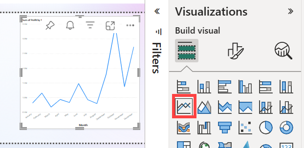
The line chart looks interesting, so let's pin the visualization to our dashboard.
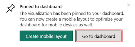
In the message dialog, select Go to dashboard.
Power BI displays a success message after the service adds the visualization to the dashboard. The success dialog includes an option to create an optimized layout of the dashboard for mobile devices.
Your dashboard shows the tiles you pinned earlier when you were using Copilot plus the line chart that you created.
Note
After you pin a visualization, if you change the visualization type in the report, the pinned visualization on the dashboard doesn't change. To see the new visualization, pin it to the dashboard to create another tile. The use of multiple tiles lets you have more than one visualization of the same data on your dashboard.
Now select the line chart tile on the dashboard. The Power BI service returns you to the report editor where you can refine the visualization:
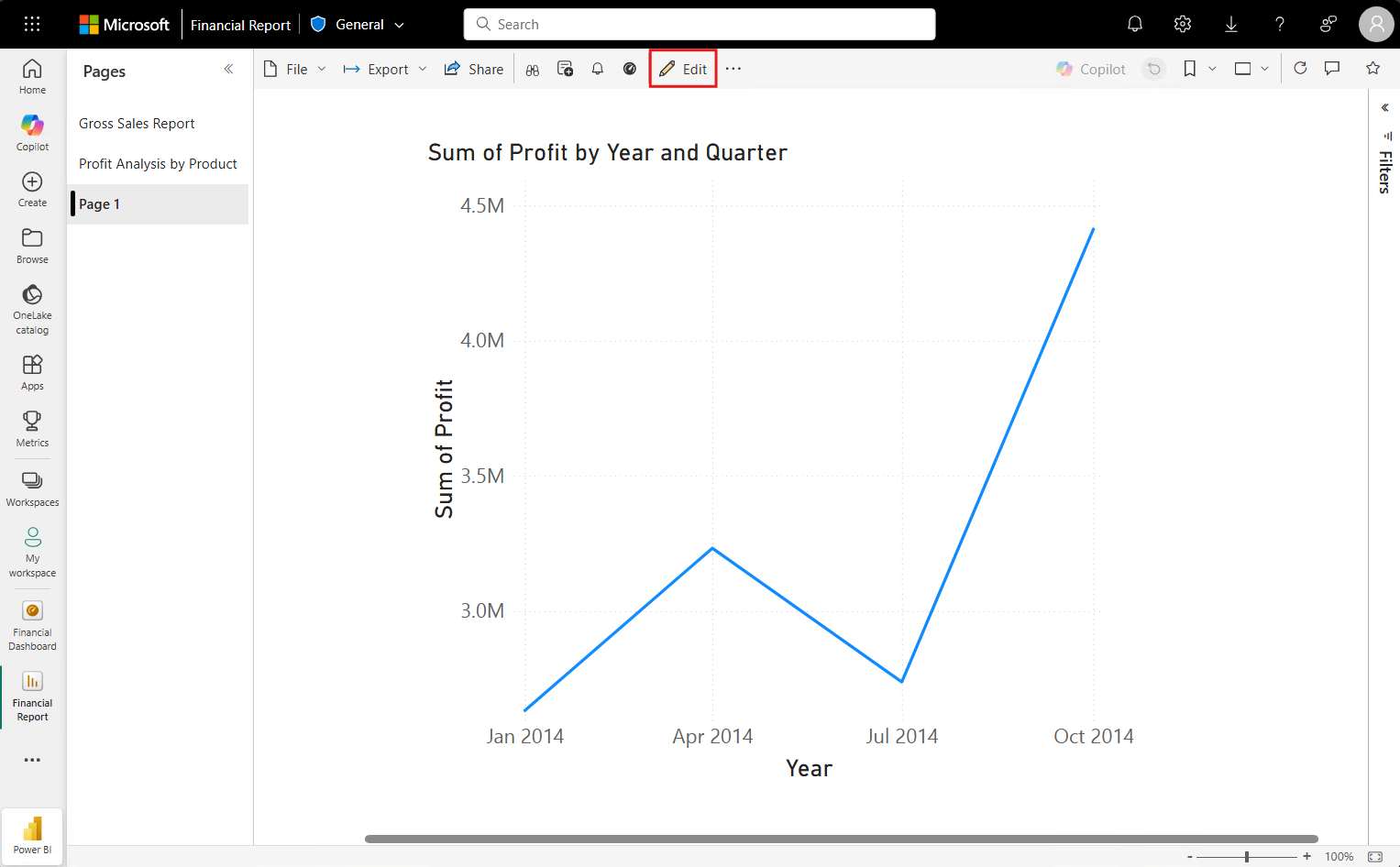
Select Edit to return to Editing view and continue to explore and pin tiles.
Create report visuals with Q&A
For a quick exploration of your data, try asking a question in the Q&A question box. Q&A lets you ask natural-language queries about your data.
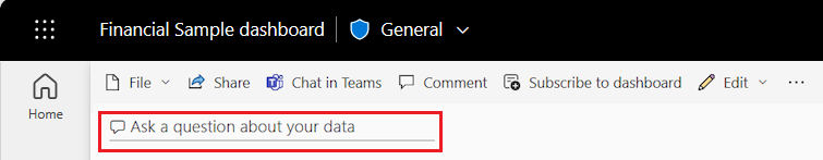
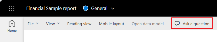
In the Power BI service, you can find the Q&A question box in two places.
On a dashboard, the Ask a question about your data Q&A box is at the top of the tile view:
In the report editor, the Ask a question Q&A box is in the top menu bar:
When you select the Q&A box, Power BI opens an extended view to help you ask questions and find answers.
Let's try out the Q&A experience for a dashboard.
In the Power BI service, select My workspace, and then select your dashboard for the Financial Sample.
At the top of the tile view, select Ask a question about your data. The view expands and Q&A offers several suggestions.
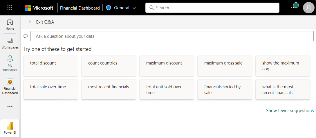
Select a suggestion and see the results, or enter your own question in the Q&A box.
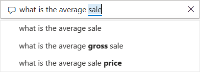
In the Q&A box, enter the question what is the average sales. As you type, Q&A tries to pattern match your text entry for recognized questions.
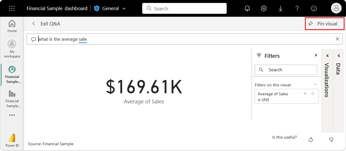
Q&A searches for an answer and displays the answer as a card visualization.
At the top right, select Pin visual and pin the visualization to your financial sample dashboard.
Try another question in the Q&A box. Enter total profit by country as a map.
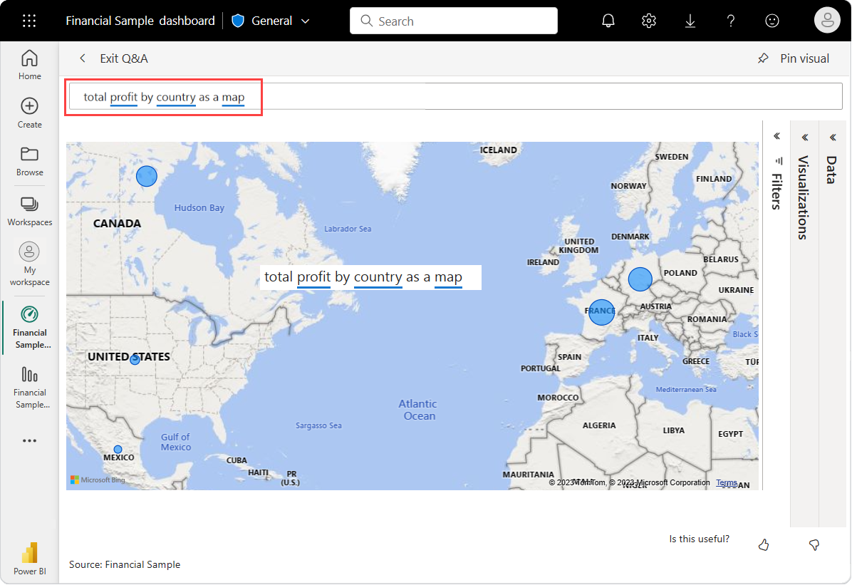
Pin the country/region map visualization to your financial sample dashboard.
In the success dialog, select Go to dashboard to view the newly pinned tiles on your dashboard.
On the dashboard, select the pinned country/region map. Notice how the visualization opens in Q&A.
Place the cursor in the Q&A box at the end of your current query, and enter as bar. Power BI creates a bar chart with the results.
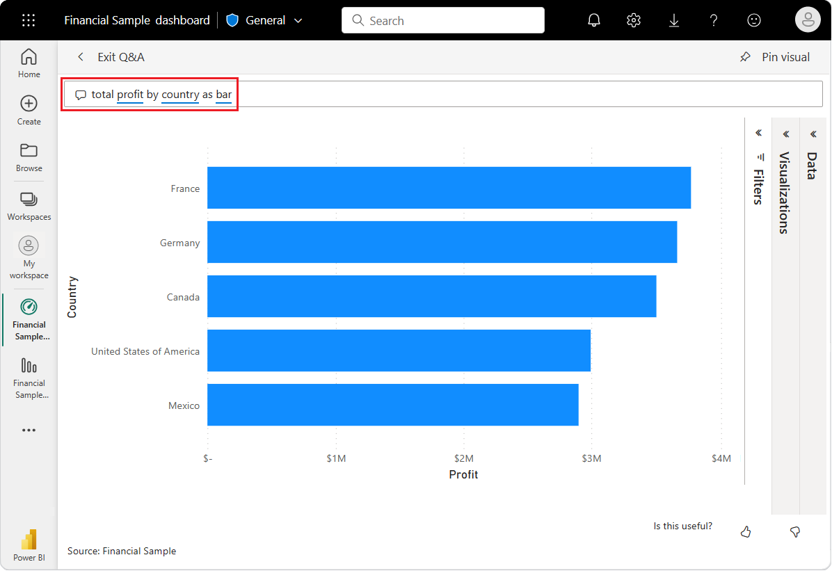
The data looks more interesting as a map, so we don't fin this bar chart.
At the top, select Exit Q&A to return to your dashboard.
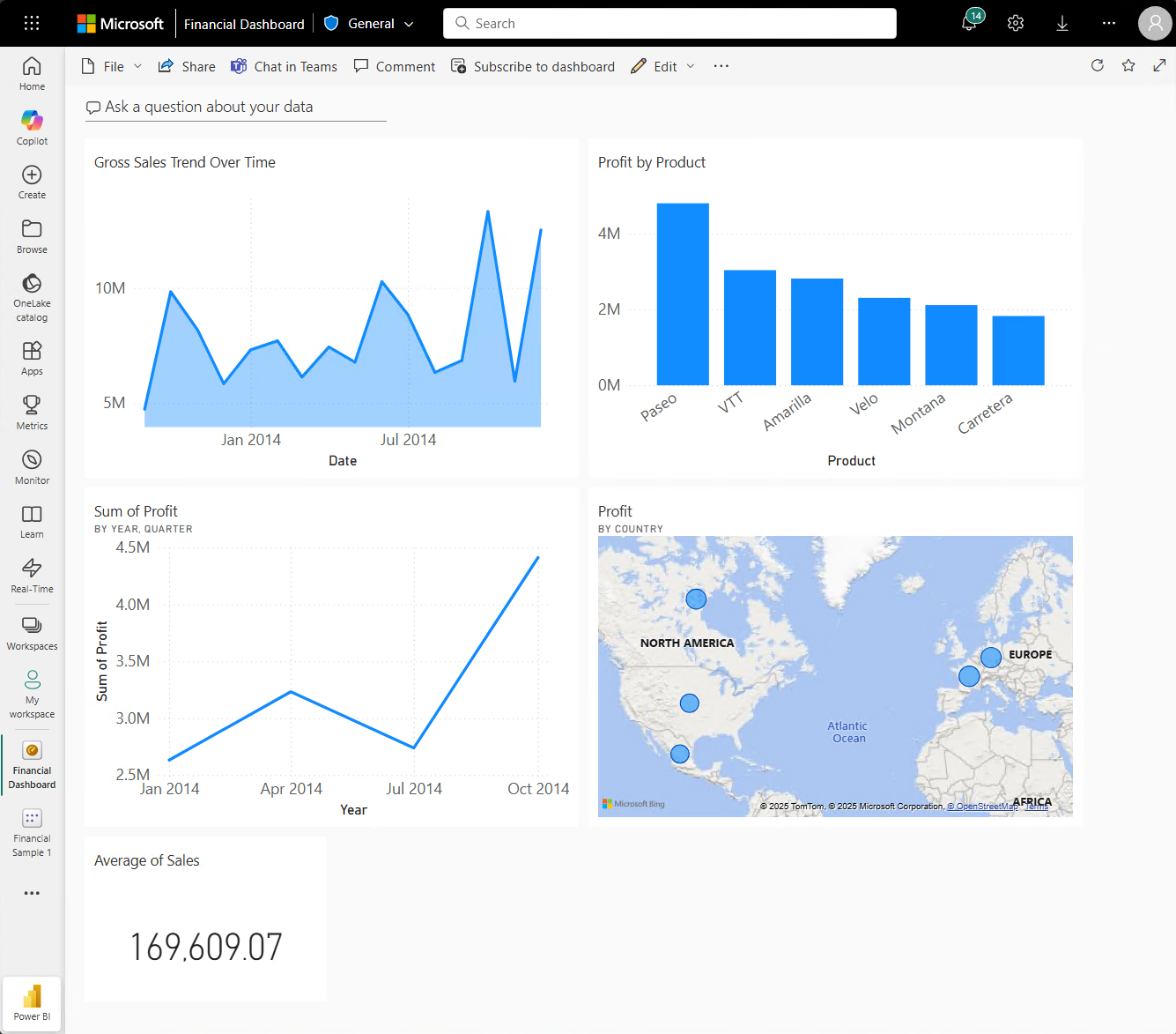
You now have five pinned tiles on your dashboard: line chart, card, country/region map, and bar chart.
Pin different views of data with multiple tiles
Notice that although you changed the map visualization to a bar chart in Q&A, the corresponding tile on the dashboard still shows a map.
When you pin a tile to a dashboard, the tile always displays the data by using the original visualization type. If you change the visualization type for an existing tile, and pin the tile, Power BI creates a new tile with the new visualization type. The original tile remains unchanged. The use of multiple tiles enables you to have more than one visualization of the same data on your dashboard.
Adjust tile layout on the dashboard
Tiles on the dashboard can be rearranged and adjusted to make better use of the space. You can change tile sizes, reposition tiles, and work with tile details to improve the layout.
Adjust tile size
In the previous image, the Sum of Profit line chart was shortened and the Average of sales card was moved and lengthened. Here's how that was done.
Select the lower-right corner of the Sum of Profit line chart tile and drag the tile outline upward to reduce the overall tile height.
Select and hold the Average of sales card as you drag it to a new location. Release and then drag the bottom right corner until it matches the length of the tiles above it.
The two tiles are now the same height.
Modify tile details
Sometimes changing Tile details can improve the dashboard presentation.
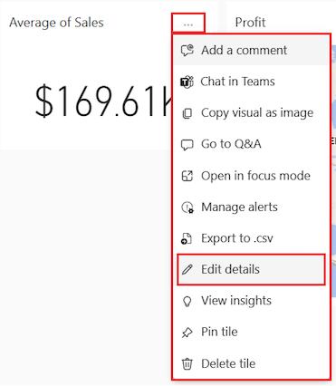
On the Average of Sales tile, select More options (...) > Edit details.
In the Tile details dialog, in the Title box, enter Sales Average.
Select Apply.
Clean up resources
After you finish the tutorial, it's a good practice to delete the semantic model, report, and dashboard.
When you delete a semantic model, the Power BI service also deletes all reports and dashboard tiles that use data from the semantic model.
In the Power BI service, select My workspace.
Locate the Financial Sample semantic model.
Select More options (...) > Delete. Power BI displays a warning message: All reports and dashboard tiles containing data from this semantic model are also deleted.
Select Delete.
Related content
- Create quick reports in the Power BI service.
- Learn all about Microsoft Power BI.
- Become a Microsoft Certified: Power BI Data Analyst Associate.