Note
Access to this page requires authorization. You can try signing in or changing directories.
Access to this page requires authorization. You can try changing directories.
The Regional Sales Sample contains a report for a fictitious company named Contoso. The Contoso sales manager created this report to understand their products and regions' key contributors for revenue wins or losses. This sample is part of a series that shows how you can use Power BI with business-oriented data, reports, and dashboards. See Get the sample in this article.
This tour explores the Regional Sales sample in the Power BI service. Because the report experience is similar in Power BI Desktop and in the service, you can also follow along by downloading the sample .pbix file in Power BI Desktop.
Prerequisites
You don't need a Power BI license to explore the samples in Power BI Desktop. You just need a Fabric free license to explore the sample in the Power BI service, and save it to your My workspace.
Get the sample
Before you can use the sample, get the sample in one of the following ways:
- Get the built-in sample in the service.
- Download the .pbix file.
Get the built-in sample
Open the Power BI service (
app.powerbi.com), and select Learn in the left navigation.On the Learning center page, under Sample reports, scroll until you see Regional Sales Sample.
Select the sample. It opens the report in Reading mode.
Power BI imports the built-in sample, adding a report and a semantic model to your My workspace.
Get the .pbix file for this sample
Alternatively, you can download the Regional Sales Sample as a .pbix file, which is designed for use with Power BI Desktop.
Open the GitHub Samples repository to the Regional Sales Sample .pbix file.
Select Download in the upper-right corner. It downloads automatically to your Downloads folder.
If you'd like to view it in the Power BI service, you can publish it there.
Open the file in Power BI Desktop and select File > Publish > Publish to Power BI or choose Publish in the Home ribbon.
In the Publish to Power BI dialog box, choose a workspace, and then Select.
Power BI imports the sample, adding the report and semantic model to your selected workspace.
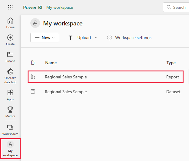
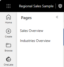
Open the Regional Sales Sample report
To open the Regional Sales report, go to your workspace and select that report:
If you're following along in Power BI Desktop, open the .pbix file to see the report.
You can edit current visualizations and create your own visualizations that use the semantic model for this sample. This environment is a safe one to play in, because you can choose not to save your changes. But if you do save them, you can always return to the Learning center for a new copy of this sample.
Select Edit in the Power BI header bar to explore in the editing view:
- See how the pages are made, the fields in each chart, and the filters on the pages.
- Add pages and charts, based on the same data.
- Change the visualization type for each chart.
- Pin charts of interest to your dashboard.
Select Reading view to leave Edit mode. Save or discard your changes.
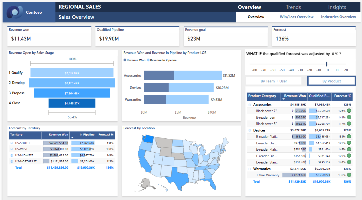
Explore the Sales Overview report page
A report can have several pages that work with the same semantic model. The visuals display different data from the semantic model.

On the Sales Overview page, in the Revenue Won tile, select Accessories. The other visualizations now reflect your selection.

Use this feature to explore your data. Select the Accessories field again to restore all data to the visualizations.
Investigate the report navigation
This report uses several buttons to navigate among the report pages.

The Overview button has three report page links: Overview, Win/Loss Overview, and Industries Overview.
Next to Overview, select Trends, which takes you to a different top level page.

To see how this navigation works, select Edit. In Edit mode, select one of the buttons. Under Format, you can see the action for the button.
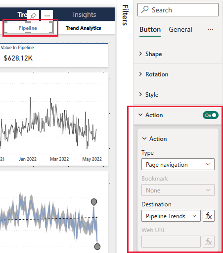
For more information, see Create buttons in Power BI reports.
Look at the tabs along the bottom. Each tab opens a report page for editing. The icons indicate that these pages are hidden.
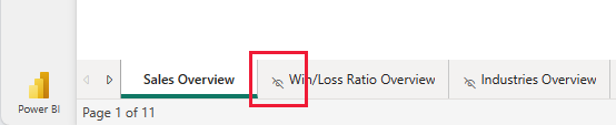
Hiding all report pages except for the Overview page provides a clear entry point for your users. To see the alternative, unhide one of the report pages and then select Reading view to leave Edit mode.
For more information, see Create page and bookmark navigators.
Review the Key Influencers page
The Key Influencers page shows the contribution of different factors to successes for your company. This page isn't a passive display of data. Stakeholders can use these visualizations to interact and learn.
Select Insights > Key Influencers.
In the Close % by Product Category, select Devices.
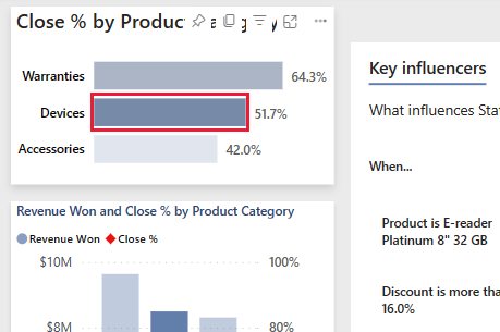
The other visualizations on the page now reflect that choice. Look at the Key influencers visual in the middle of the page. The influence of various factors appears there. For instance, when the product is E-reader Platinum 8" 32 GB, the likelihood of a Won status increases by 2.10 times.
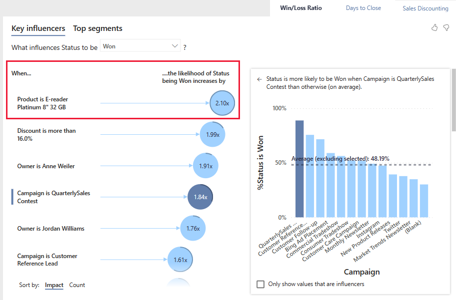
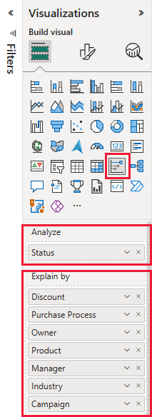
This tile is called a key influencer visualization. To see more, select Edit and then select the diagram. Under Visualizations, you can see the specifics for this visualization.
Select Reading view to leave Edit mode. Back in the report, you can select different categories, different influencers, or select Lost instead of Won.

Drill into data in the decomposition tree
Use the decomposition tree visualization, or decomp tree, to visualize data across multiple dimensions. You can aggregate the data and drill down into your dimensions in any order. This tool is valuable for improvised exploration and conducting root cause analysis.
Select Insights > Decomposition.
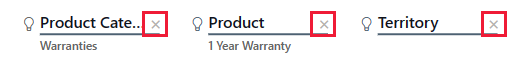
In the decomp tree, select the x next to Territory, Product, and Product Category to clear those values.
Select the plus sign next to a value. From the context menu, select a field, such as Campaign.
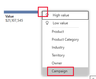
The visual expands the values for campaign, from highest to lowest.
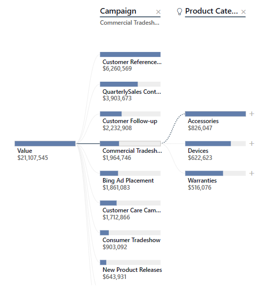
You can select another field to add a level to the diagram, teasing out the effects of different fields. Instead of selecting a field, select the plus sign again and select High value.
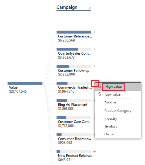
The visual determines which of the possible fields shows the largest effect and expands along that field.
Perhaps the easiest way to interact with a decomp tree is to select High value or Low value repeatedly to see which fields have the greatest effect.
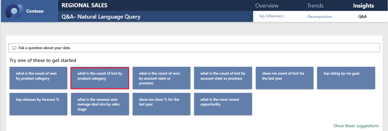
Ask questions about your data
A natural language query, or Q&A visualization, offers the ability to ask questions about data in natural language to explore your data. The report can respond to your queries and make suggestions for useful queries.
Select Insights > Q&A. The report page offers several suggested prompts.
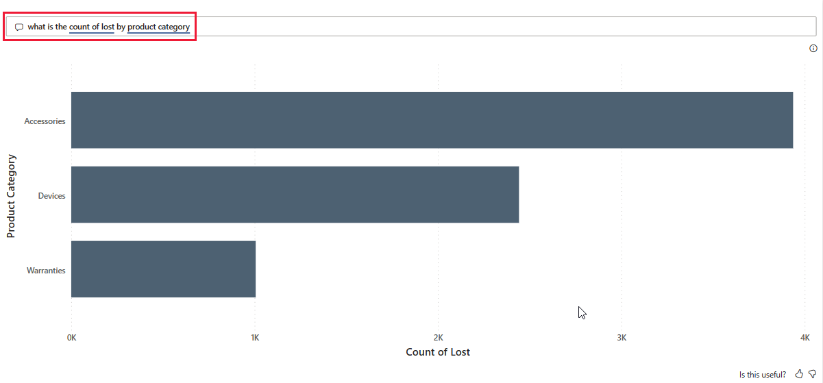
Select a question, for instance, what is the count of lost by product category.
The report displays the fields as a stacked bar chart.
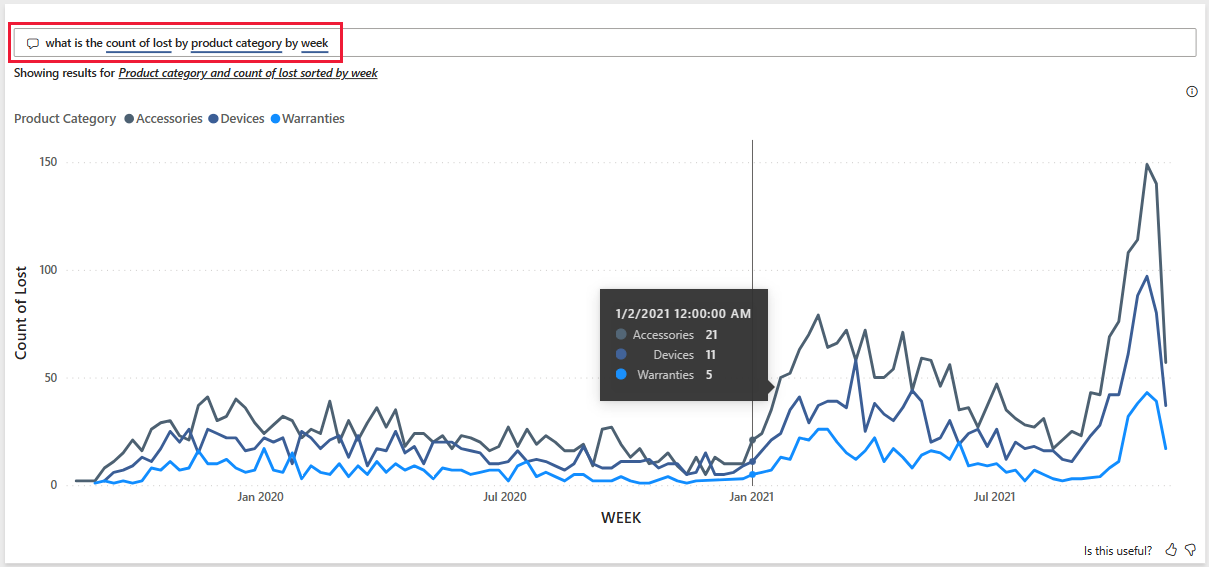
Add by week to the question. The report provides a line chart with the count, categories, and week. Hover over a point for values.


Related content
This environment is a safe one to play in, because you can choose not to save your changes. But if you do save them, you can always return to the Learning center for a new copy of this sample.
We hope this tour has shown how the artificial intelligence capabilities in Power BI can provide insights into data. Now it's your turn. Connect to your own data. With Power BI, you can connect to a wide variety of data sources. To learn more, see Get started with the Power BI service.