Note
Access to this page requires authorization. You can try signing in or changing directories.
Access to this page requires authorization. You can try changing directories.
The Store Sales built-in sample contains a report and semantic model that analyzes retail sales data of items sold across multiple stores and districts. The metrics compare this year's performance to last year's for sales, units, gross margin, variance, and new-store analysis.

This sample is part of a series that shows how you can use Power BI with business-oriented data, reports, and dashboards. The company obviEnce created samples using real, anonymized data. The data is available in several formats: built-in sample in the Power BI service and .pbix Power BI Desktop file. See Samples for Power BI.
Prerequisites
You don't need a Power BI license to explore the samples in Power BI Desktop. You just need a Fabric free license to explore the sample in the Power BI service, and save it to your My workspace.
Get the sample
This tour explores the Store Sales sample in the Power BI service. Because the report experience is similar in Power BI Desktop and in the service, you can also follow along by using the sample .pbix file in Power BI Desktop. Get the sample in one of the following ways:
- Get the built-in sample in the service.
- Download the .pbix file.
Get the built-in sample in the Power BI service
Open the Power BI service (
app.powerbi.com), and select Learn in the left navigation.On the Learning center page, under Sample reports, scroll until you see Store Sales.
Select the sample. It opens the report in Reading mode.
Power BI imports the built-in sample, adding a report and a semantic model to your My workspace.
Get the .pbix file for this sample
Alternatively, you can download the Store Sales sample as a .pbix file, which is designed for use with Power BI Desktop.
Open the GitHub Samples repository to the Store Sales sample .pbix file.
Select Download in the upper-right corner. It downloads automatically to your Downloads folder.
If you'd like to view it in the Power BI service, you can publish it there.
Open the file in Power BI Desktop and select File > Publish > Publish to Power BI or choose Publish in the Home ribbon.
In the Publish to Power BI dialog box, choose a workspace, and then Select.
Power BI imports the sample, adding the report and semantic model to your selected workspace.
Explore the report
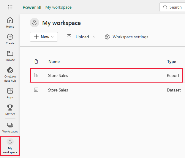
To open the Store Sales report, go to your workspace and select that report:
If you're following along in Power BI Desktop, open the .pbix file to see the report.
You can edit current visualizations and create your own visualizations that use the semantic model for this sample. This environment is a safe one to play in, because you can choose not to save your changes. But if you do save them, you can always return to the Learning center for a new copy of this sample.
Select Edit in the Power BI header bar to explore in the editing view:
- See how the pages are made, the fields in each chart, and the filters on the pages.
- Add pages and charts, based on the same data.
- Change the visualization type for each chart.
- Pin charts of interest to your dashboard.
Save or discard your changes.
Explore Store Sales Overview page
Under Pages, select Store Sales Overview.
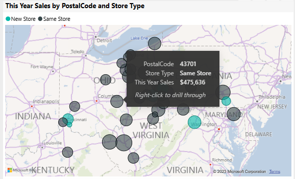
This report includes several visualizations, such as the cards under This Year Sales which each display a single value. This Year Sales by Chain displays the two chains as a pie chart. A bar graph shows sales variance.

In the pie chart, select Fashions Direct.

Both the cards and the bar chart now show data for Fashions Direct. All of the reports on the page also show the Fashions Direct data. In the map below the pie chart, you can see new store and same store figures for different postal codes for just Fashions Direct.
In the map, hover over a bubble to see the values for that area.
Right-click a bubble. From the context menu, select Drill through > New Stores.
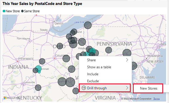
This action takes you to a different page in the report to see more data.
Select Store Sales Overview to return to that page.


Explore the District Monthly Sales page
Under Pages, select District Monthly Sales. This page includes the following visualizations:
- Last Year Sales, This Year Sales, and Total Sales Variance % by Fiscal Month (line and clustered column chart).
- Total Sales Variance %, Avg $/Unit TY, and This Year Sales by Category (scatter chart).
- Total Sales by Chain and Name (stacked bar chart).
Interact with the page
Select 040 - Juniors in the scatter chart.
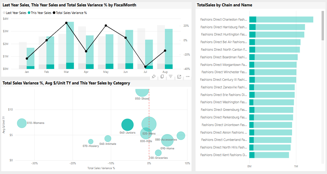
The other charts show the contribution of that category by store and by month. Select different categories to see the results of those categories.
Select 040 - Juniors again to reset the charts.
In Last Year Sales, there's a big decrease between March and April. Right-click the sales variance point. From the context menu, select Analyze > Explain the decrease.

Power BI provides an analysis of the change.


Create a Store Sales dashboard
A Power BI dashboard is a single page that contains visualizations that can come from one or more reports, and each report is based on one semantic model. You can also generate visualizations on the dashboard by using the Q&A Ask a question about your data feature to explore the data associated with a report. Think of a dashboard as an entryway into the underlying reports and semantic models. Select a visualization to take you to the report that was used to create it.
To create a dashboard in the Power BI service:
Open a report by selecting it in a workspace.
To add all of the visualizations in a page to a dashboard, from the report menu, select ... (More options) > Pin to a dashboard.
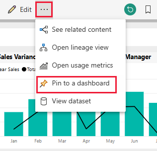
Or, to add a single visualization to a dashboard, hover over it and then select Pin visual.
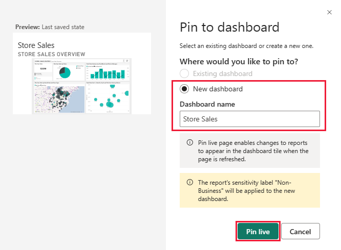
In Pin to dashboard, select New Dashboard and enter a name for your dashboard.
You can add visuals to an existing dashboard to show visualizations from different reports.
Then select Pin live.

Your new dashboard now appears in My workspace.
For more information, see Introduction to dashboards for Power BI designers.
Ask questions of the data
A dashboard offers the ability to ask questions about data in natural language to create visuals. It doesn't matter how you create your dashboard or which tiles it has. You can ask questions about any semantic model attached to your dashboard.
In the dashboard, select Ask a question about your data.
In the question box, enter this year sales. The dashboard creates a card visualization for that data.

Change the question to this year's sales by district. The dashboard updates the visual, now using a bar chart to show both sales and district.

Now change the question to this year's sales by postal code and chain. The dashboard creates a map visual to display this data.

Suppose that you want to see the individual postal codes instead of sales on a map. You can select any visualization. This example uses a stacked bar chart.

Experiment with more questions, try out different visualizations, and see what kind of results you get.
Select Exit Q&A to return to the dashboard.


Note
If you create a useful visual, you can add it to this dashboard or a new dashboard. Select Pin visual and follow the procedure from the previous section.
Related content
This environment is a safe one to play in, because you can choose not to save your changes. But if you do save them, you can always return to the Learning center for a new copy of this sample.
We hope this tour has shown how Power BI dashboards, Q&A, and reports can provide insights into sample data. Now it's your turn. Connect to your own data. With Power BI, you can connect to a wide variety of data sources. To learn more, see Get started with the Power BI service.