Note
Access to this page requires authorization. You can try signing in or changing directories.
Access to this page requires authorization. You can try changing directories.
APPLIES TO: ![]() Power BI Desktop
Power BI Desktop ![]() Power BI service
Power BI service
When you create a dashboard and add some tiles, think about how to make your dashboard both visually interesting and functional. In general, you want the most important information to stand out and be clean and uncluttered.

Tip
Like this dashboard? You can download the related sample and reports from AppSource. In the Power BI service, select Learn in the left navigation. On the Learning center page, under Sample reports, locate the Sales & Marketing Sample. Select the sample to download.
Dashboard design best practices video
Watch Dashboard design best practices in Power BI for design tips from Marco Russo of SQLBI.com.
Consider your audience
When you optimize the dashboard layout for your audience, consider the following scenarios:
- How does your audience use the dashboard?
- What key metrics help your audience make decisions?
- What learned or cultural assumptions might affect design choices?
- What information does your audience need to be successful?
Keep in mind that the dashboard is an overview, a single place to monitor the current state of the data. The dashboard is based on underlying reports and semantic models, and those items often contain many details. Your readers can drill into the reports from your dashboard, so don't put a detail on the dashboard unless that's what your readers need to monitor.
Where is the dashboard going to be displayed? If the dashboard is viewed on a large monitor, you can include more content. But if readers view your dashboard on their tablets or phones, a dashboard with fewer tiles is more readable.
Tell a story on one screen
Because dashboards are meant to show important information at a glance, having all the tiles on one screen is best.
- Can you avoid scroll bars on your dashboard?
- Is the dashboard too cluttered? Remove all but essential information.
Make use of full-screen mode
When presenting a dashboard, display it in full-screen mode and without distractions.
Accent the most important information
If text and visualizations on a dashboard are the same size, readers might have difficulty focusing on what's most important. To highlight information, card visualizations are a good way to display an important number prominently:
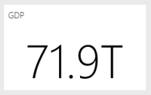
Be sure to provide context for your visualization.
Read about how to create a tile with just a number.
Place the most important information
Most people read from top to bottom. Put the highest level of data at the top left corner and show more detail as you move in the direction the audience uses for reading (left-to-right, top-to-bottom).
Use the right visualization for the data
Avoid variety for the sake of variety. Visualizations should paint a picture and be easy to read and interpret. For some data and visualizations, a simple graphic visualization is enough. Other data might need a more complex visualization. Use titles, labels, and other customization to help the reader.
Here are some helpful tips:
Avoid visuals that are hard to read, such as 3D charts.
Pie charts, donut charts, gauges, and other circular chart types aren't ideal data visualizations.
- Bar and column charts are better for comparing values because humans can compare values side by side.
- Pie charts are best when there are fewer than eight categories. Pie charts can be good for viewing part-to-whole relationships rather than for comparing the parts.
- Gauge charts are great for displaying the current status in the context of a goal.
Be consistent with chart scales on axes and chart dimension ordering. Be consistent with the colors you use for dimension values within charts as well.
Be careful encoding quantitative data. Don't exceed three or four numerals when displaying numbers. Display measures to one or two numerals left of the decimal point and scale for thousands or millions. It's easier for humans to read the value "3.4 million" than "3,400,000."
Don't mix levels of precision and time. Make sure time frames are distinct and consistent. Don't have one chart that has last month next to filtered charts from a specific month of the year.
Avoid mixing large and small measures on the same scale, such as on a line or bar chart; for example, one measure that's in the millions and another measure that's in the thousands. With such a large scale, it's difficult to see the differences of the measure that's in the thousands. If you need to mix measurement scales, choose a visualization that allows the use of a second axis.
Remove unnecessary data labels from your charts. Users can usually understand values in bar charts without displaying the actual number.
Pay attention to how charts are sorted. If you want to draw attention to the highest or lowest number, sort by the measure. If you want people to quickly find a particular category within many other categories, sort by the axis.
For more visualization-specific guidance, see Visualization types in Power BI.
Learn more about dashboard design
To become an expert in the art of excellent dashboard design, consider learning basic Gestalt Principles of visual perception. The principles help you learn how to clearly communicate actionable information in context. Luckily, there are many resources already available within our blogs and docs, such as Basic concepts for designers in the Power BI service.
Here are a few book recommendations:
- Information Dashboard Design by Stephen Few
- Show Me the Numbers: Designing Tables and Graphs to Enlighten by Stephen Few
- Now You See It by Stephen Few
- Envisioning Information by Edward Tufte
- Advanced Presentations by Design: Creating Communication that Drives Action by Andrew Abela