Note
Access to this page requires authorization. You can try signing in or changing directories.
Access to this page requires authorization. You can try changing directories.
Power BI Desktop helps you create insights into your data in just a few steps. But sometimes that data doesn't include everything you need to answer some of your most important questions. Measures can help you get there.
Measures are used in some of the most common data analyses. You can set basic summarizations such as sums, averages, minimums, maximums, and counts through the Data pane. The calculated results of measures change as you interact with your reports, making it possible to do fast and dynamic data exploration.
This article introduces you to measures and shows you how to use and organize them.
Understand measures
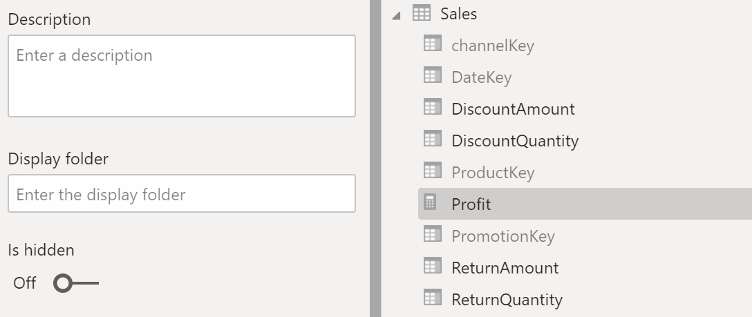
In Power BI Desktop, you create and display measures in the Report, Table, or Model view. Measures you create yourself appear in the Data list with a calculator icon. You can name measures whatever you want, and add them to a new or existing visualization just like any other field.

To find out how to create a measure and use it in a report, see Create and use your own measures.
Report-level measures
Besides model measures that you create in your data model, you can also create report-level measures in Power BI. Report-level measures, or report measures, are custom calculations or metrics that you create directly within a report, based on an existing dataset or a live connection. These measures provide a way for users to add specific business logic, create visual calculations, or perform calculations that are relevant to the report's context without altering the original dataset.
You use Data Analysis Expressions (DAX) to write report-level measures. You can use these measures in visualizations within a report to provide extra insights and tailor the data presentation to meet specific analytical needs. These measures enhance flexibility, helping users to derive new insights from existing data models dynamically.
Note
You might also be interested in quick measures, which are ready-made measures you can select from dialogs. They're a good way to quickly create measures, and also a good way to learn DAX syntax, because their automatically created DAX formulas are available to review. For more information, see Use quick measures for common calculations.
DAX
Measures calculate a result from an expression formula. When you create your own measures, you use the DAX formula language. DAX includes a library of over 200 functions, operators, and constructs. Its library provides immense flexibility in creating measures to calculate results for just about any data analysis need.
DAX formulas are a lot like Excel formulas. DAX even has many of the same functions as Excel, such as DATE, SUM, and LEFT. But the DAX functions are meant to work with relational data like you find in Power BI Desktop.
Sales projection example
Janice is a sales manager at Contoso. Janice needs to provide reseller sales projections over the next fiscal year. Janice decides to base the estimates on last year's sales amounts, with a 6 percent annual increase resulting from various promotions that are scheduled over the next six months.
To report the estimates, Janice imports last year's sales data into Power BI Desktop. Janice finds the SalesAmount field in the Reseller Sales table. Because the imported data contains sales amounts only for last year, Janice renames the SalesAmount field Last Years Sales. Janice then drags Last Years Sales onto the report canvas. It appears in a chart visualization as a single value that's the sum of all reseller sales from last year.
Janice notices that even without specifying a calculation, one is provided automatically. Power BI Desktop creates its own measure by summing up all the values in Last Years Sales.
But Janice needs a measure to calculate sales projections for the coming year. The measure should be last year's sales multiplied by 1.06 to account for the expected 6 percent increase in business. For this calculation, Janice creates a measure by selecting Modeling > New measure and then entering the following DAX formula:
Projected Sales = SUM('Reseller Sales'[Last Years Sales])*1.06
Janice then drags the new Projected Sales measure into the chart.

Quickly and with minimal effort, Janice now has a measure to calculate projected sales. Janice can further analyze the projections by filtering on specific resellers or by adding other fields to the report.
Data categories for measures
You can set the data category of a measure.
Among other things, data categories make it possible to use measures to dynamically create URLs. Specifically, you can create a measure to generate a URL string. Then you can set the data category of the measure to Web URL. When you add the measure to a report, Power BI displays it as a link that users can select to access content. Because the target URL is created from a measure, it adapts based on the data context or user selections.
This approach is especially useful when you want to use URL filter parameters to link to other Power BI reports.
Organize your measures
Measures have a home table that defines where they're found in the data list. You can change their location by choosing a location from the tables in your model.

You can also organize fields in a table into display folders:
- On the left edge of Power BI Desktop, select Model view.
- On the Data pane, go to the list of available fields, and then select the field you want to move.
- On the Properties pane, under Display folder, enter a name for a new folder.
The new folder is created, and the selected field is moved into that folder.
You can create subfolders by using a backslash character. For example, if you enter Finance\Currencies, Power BI creates a Finance folder and within it, a Currencies folder.
You can make a field appear in multiple folders by using a semicolon to separate the folder names. For example, if you enter Products\Names;Departments, the field appears in a Departments folder and in a Names folder inside a Products folder.
You can create a special table that contains only measures. That table always appears at the top of the Data pane. To do so, take the following steps:
- Use Enter data to create a table with just one column.
- Move your measures to that table.
- Hide the column of that table, but not the table itself.
- Select the arrow at the top of the Data pane to close and reopen the field list and make your changes visible.

Tip
Hidden measures are displayed and accessible in Power BI Desktop. However, you don't find hidden measures in Excel or the Power BI service, because Excel and the Power BI service are considered client tools.
Dynamic format strings
When you use dynamic format strings, you can customize how measures appear in visuals by conditionally applying a format string with a separate DAX expression. For more information, see Create dynamic format strings for measures.
Related content
This article provides you with a quick introduction to measures. Many other resources are available to show you how to create your own measures. For more information, see Tutorial: Create your own measures in Power BI Desktop. When you follow that tutorial, you can download a sample file and get step-by-step instructions on how to create more measures.
DAX is an established language that's used in Power Pivot in Excel and SQL Server Analysis Services, besides Power BI. For more information about DAX, see the following resources:
- To see how to use DAX for basic calculations and data analysis problems, see Learn DAX basics in Power BI Desktop.
- For detailed articles on DAX functions, syntax, operators, and naming conventions, see Data Analysis Expressions (DAX) Reference.
- For discussions about DAX among influential members of the business intelligence (BI) community, see DAX Resource Center.