Note
Access to this page requires authorization. You can try signing in or changing directories.
Access to this page requires authorization. You can try changing directories.
APPLIES TO:
Power BI Desktop
Power BI service
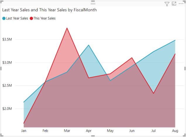
Basic area charts in Power BI help you visualize data trends and emphasize volume changes over time. The basic area chart (also known as layered area chart) is based on the line chart, with the area between axis and line filled with colors to indicate volume.
Area charts emphasize the magnitude of change over time and draw attention to the total value across a trend. For example, data that represents profit over time can be plotted in an area chart to emphasize the total profit.
Note
Sharing your report with a Power BI colleague requires that you both have individual Power BI Pro licenses or that the report is saved in Premium capacity.
When to use a basic area chart
Basic area charts are a great choice:
- To see and compare the volume trend across a time series
- For an individual series representing a physically countable set
Prerequisites
To follow this tutorial in Power BI Desktop, download the Retail Analysis Sample PBIX file. If you'd like to use the Power BI service, download the Retail Analysis PBIX file, and then upload it to a workspace in the Power BI service.
Create a basic area chart
These steps will help you create an area chart that displays this year's sales and last year's sales by month.
In Power BI Desktop, open the Retail Analysis Sample PBIX file in report view
 . In the Power BI service, open the Retail Analysis Sample PBIX file and select Edit.
Select
 to add a new page.
From the Fields pane, select Sales > Last Year Sales, and This Year Sales > Value.
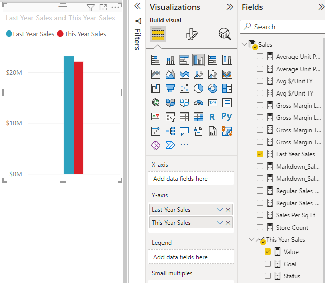
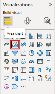
Convert the chart to a basic area chart by selecting the Area chart icon from the Visualizations pane.
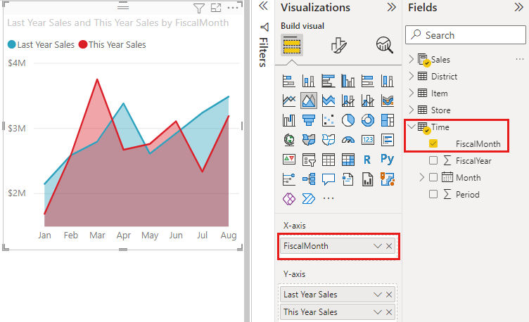
Select Time > FiscalMonth to add it to the Axis well.
To display the chart by month, select the ellipses (top right corner of the visual) and choose Sort by > FiscalMonth. To change the sort order, select the ellipses again and select either Sort ascending or Sort descending.
Highlight and cross-filter
For information about using the Filters pane, see Add a filter to a report.
To highlight one particular area in your chart, select that area or its top border. Unlike other visualization types, if there are other visualizations on the same page, highlighting a basic area chart doesn't cross-filter the other visualizations on the report page. However, area charts are a target for cross-filtering triggered by other visualizations on the report page.
Try it out by selecting your area chart and copying it to the New Stores Analysis report page (CTRL-C and CTRL-V).
Select one of the shaded areas of the area chart and then select the other shaded area. You'll notice no effect on the other visualizations on the page.
Now select an element. Notice the effect on the area chart—it gets cross-filtered.
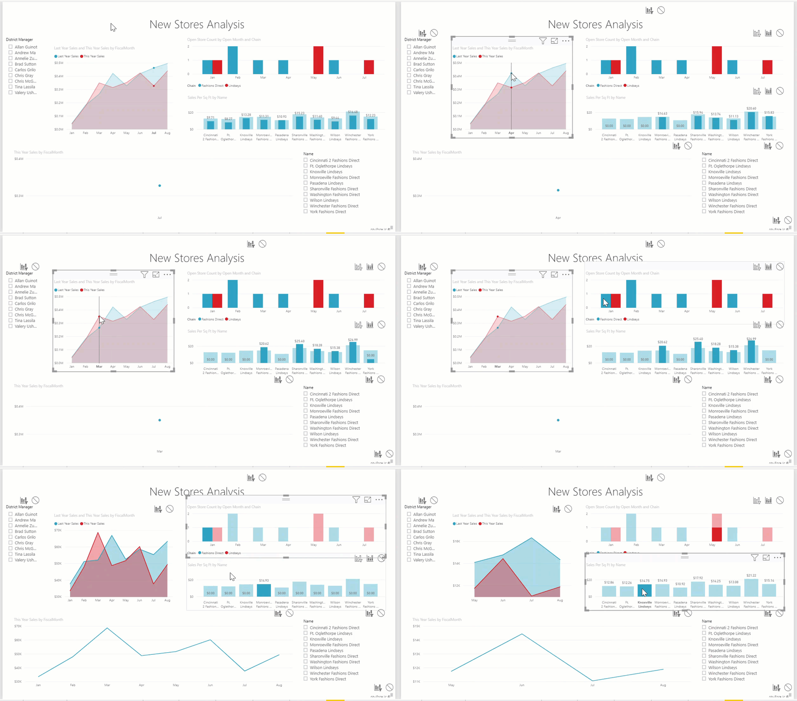
To learn more, see Visual interactions in reports
Considerations and troubleshooting
- Make the report more accessible for people with disabilities.
- Basic area charts aren't effective for comparing the values due to the occlusion on the layered areas. Power BI uses transparency to indicate the overlap of areas. However, it only works well with two or three different areas. When you need to compare trend to more than three measures, try using line charts. When you need to compare volume to more than three measures, try using treemap.