Note
Access to this page requires authorization. You can try signing in or changing directories.
Access to this page requires authorization. You can try changing directories.
APPLIES TO:  Power BI Desktop
Power BI service
Power BI Desktop
Power BI service
This detailed guide provides a comprehensive and detailed exposition of the various format settings available for column charts in both Power BI Desktop and Power BI Service.
Serving as a reference guide, we've listed the multitude of customization options at your disposal, enabling you to tailor your data visualization to your specific needs. From layout enhancements to advanced ribbon settings, this document covers every setting for column chart formatting, ensuring that you can present your data in the most effective and visually appealing way possible.
Whether you're a seasoned Power BI user or new to data visualization, this document is an invaluable resource for understanding column chart formatting in Power BI Desktop and Power BI Service, providing you with a detailed explanation for each setting and control.
Prerequisites
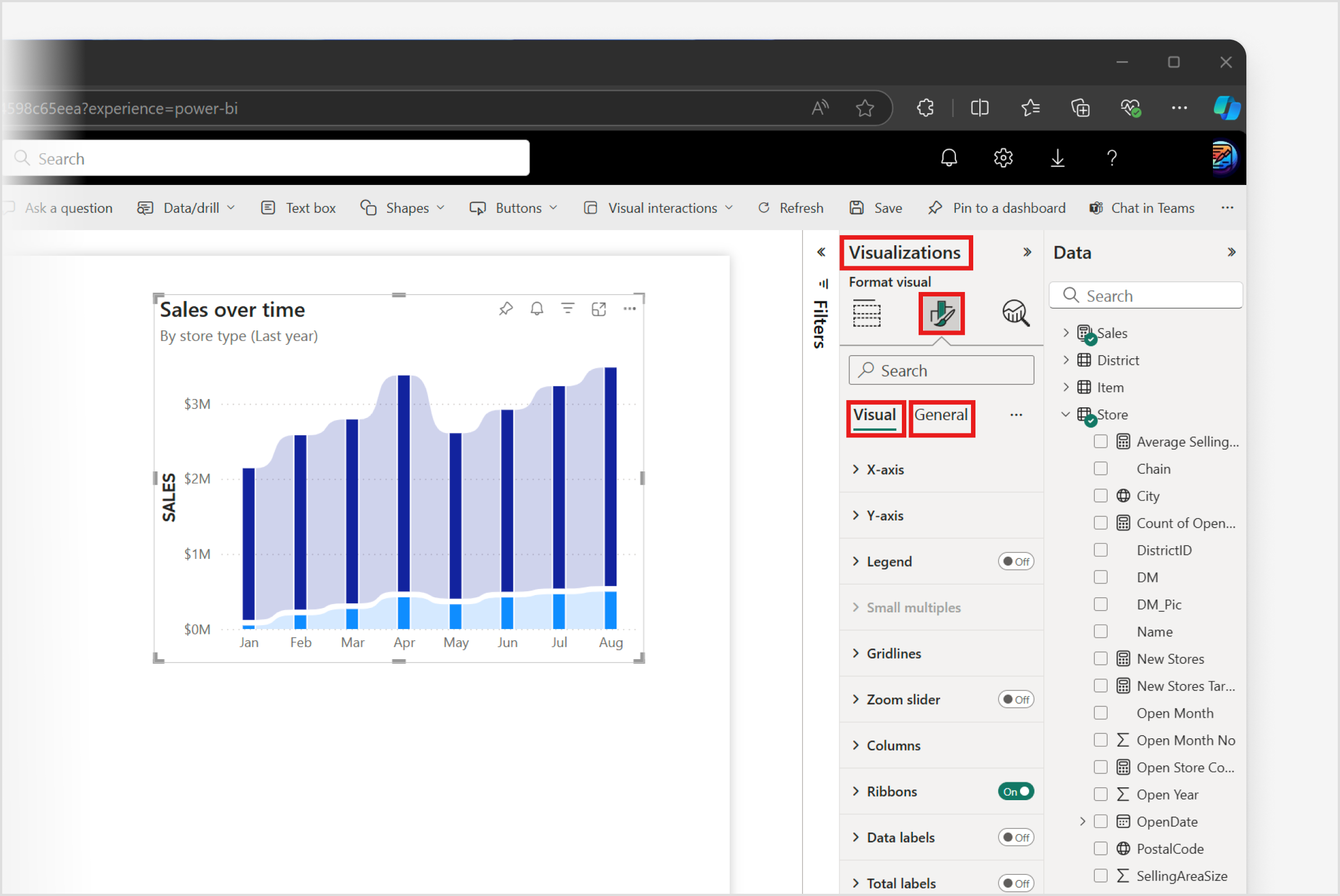
To format and customize your column chart in Power BI Desktop, simply select the Format visual icon in the Visualizations Pane Clicking this option grants access to the vast array of formatting options under the Visual and General tabs, enabling you to refine both appearance and functionality of your column charts to meet your specific needs.

Note
Sharing your report with a Power BI colleague requires that you both have an individual Power BI Pro license or that you have saved the report in Premium capacity.
Format settings
X-axis
Type
The Type setting within x-axis options is only available when you choose a single data field that is either numerical or date/time.
Type
This menu presents two distinct options for setting the axis type:
- Continuous: This option arranges data values along the axis as evenly spaced discrete entries, without considering the actual distance between individual data points.
- Categorical: Opting for this setting ensures that all data values are represented. The axis is automatically labeled with suitable time increments to reflect the data distribution accurately.
Range
The availability of Range settings depends on configuring the x-axis Type as Continuous. Once the X-axis Type is specified as Continuous, you can access and adjust all the Range settings shown here.
Maximum
This setting defines the final axis value. If no user-defined value is provided, the system automatically assigns a maximum value based on the data. Additionally, this value can be determined through conditional formatting.
Minimum
This setting establishes the initial axis value. If no user-defined value is provided, the system automatically assigns a minimum value based on the data. Additionally, this value can be determined through conditional formatting.
Logarithmic scale
This toggle enables a logarithmic scale for values along the axis, effectively organizing data points based on exponential growth by orders of magnitude. Enabling this toggle can be useful when dealing with data that spans a wide range of values, allowing you to visualize and compare data points more effectively.
Invert range
This toggle modifies the axis orientation. When toggled off (default), values ascend from right to left. When toggled on, values ascend from left to right.
Values
The visibility of x-axis Values can be toggled on or off to make them apparent or to hide them. When toggled on, you can access and adjust all the Values settings shown here.
Font
The font’s appearance is determined by three distinct controls:
- Font family: Select from preset font families.
- Font size: Font size can be adjusted within a range of 8 to 60 points.
- Font style: With normal being the default, you can also choose bold, italic, or underlined.
Color
This setting allows you to customize the color by either selecting from the color palette or applying conditional formatting.
Display units
This setting offers several options for defining the Display units but only when the axis is configured as Continuous:
- Auto: The unit adjusts dynamically based on the data value's magnitude.
- None: Displays the value as is, without any unit.
- Thousands: Divides the value by 1,000 and appends a "K" suffix.
- Millions: Divides the value by 1,000,000 and appends an "M" suffix.
- Billions: Divides the value by 1,000,000,000 and appends a "B" suffix.
- Trillions: Divides the value by 1,000,000,000,000 and appends a "T" suffix.`
Value decimal places
Allows you to specify the number of decimal places for values, only when the axis is configured as Continuous, with a selectable range from 0 to 15.
Maximum height
This setting determines the proportion of the chart area allocated to the axis but only when the axis is configured as Categorical. The axis can occupy a range from 15% to 50% of the total chart area, which includes both the columns and the axis itself.
Concatenate labels
This toggle enables the combination of hierarchical levels into a single row, rather than displaying the hierarchy across multiple tiers. To observe this feature in operation, ensure that more than one data field is applied to the axis.
Title
The visibility of x-axis Title can be toggled on or off to make it apparent or to hide it. When toggled on, you can access and adjust all the Title settings shown below.
Title text
The default text for the axis title is automatically derived from the name of the data field used, or the last data field's name in cases involving multiple fields. However, you can customize this title to a different text.
Style
The menu provides options for configuring the axis title, but only when the axis value's Display units is set to display Thousands, Millions, Billions, or Trillions:
- Shows title only: This default option displays only the title. If the Display units are set to None, displaying the title remains the only available option.
- Show unit only: This exhibits solely the unit as determined in the display units control.
- Show both:: Show both presents both the title and the unit as selected in the Display units control.
Font
The font’s appearance is determined by three distinct controls:
- Font family: Select from preset font families.
- Font size: Font size can be adjusted within a range of 8 to 60 points.
- Font style: With normal being the default, you can also choose bold, italic, or underlined.
Color
This setting allows you to customize the color by either selecting from the color palette or applying conditional formatting.
Layout
The Layout setting within x-axis options is only available when you’re working with certain types of data which allow for a categorical axis.
Minimum category width
This setting can be specified within a range of 20px to 180px
Y-axis
Range
Maximum
This setting defines the final axis value. If no user-defined value is provided, the system automatically assigns a maximum value based on the data. Additionally, this value can be determined through conditional formatting.
Minimum
This setting establishes the initial axis value. If no user-defined value is provided, the system automatically assigns a minimum value based on the data. Additionally, this value can be determined through conditional formatting.
Logarithmic scale
This toggle enables a logarithmic scale for values along the axis, effectively organizing data points based on exponential growth by orders of magnitude. Enabling this toggle can be useful when dealing with data that spans a wide range of values, allowing you to visualize and compare data points more effectively.
Invert range
This toggle modifies the axis orientation. When toggled off (default), values ascend from right to left. When toggled on, values ascend from left to right.
Values
The visibility of y-axis Values can be toggled on or off to make them visible or to hide them. When toggled on, you can access and adjust all the Values settings shown here.
Font
The font’s appearance is determined by three distinct controls:
- Font family: Select from preset font families.
- Font size: Font size can be adjusted within a range of 8 to 60 points.
- Font style: With normal being the default, you can also choose bold, italic, or underlined.
Color
This setting allows you to customize the color by either selecting from the color palette or applying conditional formatting.
Display units
Display units
The menu offers several options for defining the Display units:
- None: Displays the value as is, without any unit.
- Thousands: Divides the value by 1,000 and appends a "K" suffix.
- Millions: Divides the value by 1,000,000 and appends an "M" suffix.
- Billions: Divides the value by 1,000,000,000 and appends a "B" suffix.
- Trillions: Divides the value by 1,000,000,000,000 and appends a "T" suffix.
Value decimal places
Allows you to specify the number of decimal places for values, with a selectable range from 0 to 15.
Switch axis position
This toggle alters the axis position. When turned off, the axis remains on the left side. When turned on, the axis shifts to the right side.
Title
The visibility of y-axis Title can be toggled on or off to make it visible or to hide it. When toggled on, you can access and adjust all the Title settings shown here.
Title text
The default text for the axis title is automatically derived from the name of the data field used, or the last data field's name in cases involving multiple fields. However, you can customize this title to a different text.
Style
The menu provides options for configuring the axis title, but only when the axis value's Display units is set to display Thousands, Millions, Billions, or Trillions:
- Shows title only: This default option displays only the title. If the Display units are set to None, displaying the title remains the only available option.
- Show unit only: This exhibits solely the unit as determined in the display units control.
- Show both:: Show both presents both the title and the unit as selected in the Display units control.
Font
The font’s appearance is determined by three distinct controls:
- Font family: Select from preset font families.
- Font size: Font size can be adjusted within a range of 8 to 60 points.
- Font style: With normal being the default, you can also choose bold, italic, or underlined.
Color
This setting allows you to customize the color by either selecting from the color palette or applying conditional formatting.
Legend
This setting is accessible when a data field is active in the Legend field well within the Build pane. The legend's visibility can be toggled on or off to make it visible or to hide it. When toggled on, you can access and adjust all the Legend settings shown here.
Options
Position
With this dropdown menu, users have several options to define the position of the legend:
- Top left
- Top center
- Top right
- Top left stacked
- Top right stacked
- Center left
- Center right
- Bottom left
- Bottom center
- Bottom right
Text
Font
The font’s appearance is determined by three distinct controls:
- Font family: Select from preset font families.
- Font size: Font size can be adjusted within a range of 8 to 60 points.
- Font style: With normal being the default, you can also choose bold, italic, or underlined.
Color
This setting allows you to customize the color by either selecting from the color palette or applying conditional formatting.
Title
Title text
The default Title text for the legend is automatically derived from the name of the data field used. However, this title can be manually altered to a different text.
Notice that Title text doesn't have font or color settings, those settings are pre-defined by the Legend's text settings.
Small multiples
The settings for Small multiples become accessible when a data field is active in the small multiples field well within the Build pane. However, it’s important to note that small multiples don't function properly when the x-axis and legend share the same data field.
Layout
Rows
This setting establishes the vertical grid for small multiples, allowing users to specify and number of rows between 1 and 19. When specifying the number of rows and columns, the maximum number of small multiple charts permitted within a single visual is 36.
Columns
This setting establishes the vertical grid for small multiples, allowing users to specify and number of columns between 1 and 19. When specifying the number of rows and columns, the maximum number of small multiple charts permitted within a single visual is 36.
All padding
This setting simultaneously adjusts the padding within columns and rows.
Customize padding
Activating this toggle unveils a suite of controls for granular padding adjustments: - Inner column padding: Modifies vertical padding within each grid. - Outer column padding: Alters vertical padding surrounding the grid's perimeter. - Inner row padding: Adjusts horizontal padding within each grid. - Outer row padding: Modifies horizontal padding around the grid's outer edge.
Border
Gridlines
The menu offers several options to delineate gridlines to the small multiples grid:
- All
- Horizontal and vertical
- Horizontal only
- Vertical only
Color
This setting allows you to customize the color by selecting colors from the color palette.
Transparency
The Transparency setting allows you to adjust the transparency level, ranging from 0% for full opacity to 100% for complete transparency, enabling you to achieve either a subtle or a more pronounced effect.
Line style
The menu provides three selections to customize the line style pattern:
- Solid: A continuous line without breaks.
- Dashed: A line consisting of a series of short segments.
- Dotted: A line made up of a sequence of dots.
Width
The Width setting allows you to define the thickness in pixels, offering a range from 0 (none) to 12 (widest).
Background
Color
This setting allows you to customize the color by either selecting from the color palette or applying conditional formatting. No filled color is applied by default.
Transparency
The Transparency setting allows you to adjust the transparency level, ranging from 0% for full opacity to 100% for complete transparency, enabling you to achieve either a subtle or a more pronounced effect.
Gridlines
Horizontal
The visibility of Horizontal gridlines can be toggled on or off to make it visible or to hide it. When toggled on, you can access and adjust the setting as shown here.
Color
This setting allows you to customize the color by either selecting from the color palette or applying conditional formatting.
Transparency
The Transparency setting allows you to adjust the transparency level, ranging from 0% for full opacity to 100% for complete transparency, enabling you to achieve either a subtle or a more pronounced effect.
Line style
The menu provides four selections to customize the line style pattern:
- Solid: A continuous line without breaks.
- Dashed: A line consisting of a series of short segments. The dashed pattern can scale with the line width.
- Dotted: A line made up of a sequence of dots. The dotted pattern can scale with the line width.
- Custom: This option introduces a dash array control, allowing for a user-defined pattern syntax (dash, gap, etc.). The custom pattern can scale with the line width, and you can select a dash cap style from flat, round, or square options. Keep in mind, the dash cap feature can greatly change the appearance of the line style specified in the dash array.
Dash array
The Dash array text input field enables the creation of custom line patterns. Enter a sequence of numbers to define the dash and gap lengths in pixels, using the syntax: dash length, gap length.
Example: '2 5 2 5' represents a pattern with a 2-pixel dash, a 5-pixel gap, followed by another 2-pixel dash and a 5-pixel gap.
Dash cap
This dropdown menu determines the line's end style, offering options such as:
- Flat: This cap style creates a flat end to each dash, making the ends of the dashed line look squared off and abrupt.
- Round: This cap style adds a semi-circular, rounded end to each dash, giving the dashed line a softer and more continuous appearance.
- Square: Similar to the flat cap, but with a more pronounced square shape that extends beyond the width of the line, making the dashes look like they have small squares at the ends.
Scale by width
The toggle, when activated, automatically adjusts the line pattern to match the line width. When deactivated, the line pattern remains unchanged (default). This feature is accessible only for dashed, dotted, or custom Scale by widths.
Width
The Width setting allows you to define the thickness in pixels, offering a range from 0 (none) to 4 (widest).
Vertical
The Vertical gridlines are only available when the axis has been set to Continuous. This feature gives you the flexibility to show or hide the gridlines as needed. When toggled on, you can access and adjust the setting as shown here.
Color
This setting allows you to customize the color by either selecting from the color palette or applying conditional formatting.
Transparency
The Transparency setting allows you to adjust the transparency level, ranging from 0% for full opacity to 100% for complete transparency, enabling you to achieve either a subtle or a more pronounced effect.
Line style
The menu provides four selections to customize the line style pattern:
- Solid: A continuous line without breaks.
- Dashed: A line consisting of a series of short segments. The dashed pattern can scale with the line width.
- Dotted: A line made up of a sequence of dots. The dotted pattern can scale with the line width.
- Custom: This option introduces a dash array control, allowing for a user-defined pattern syntax (dash, gap, etc.). The custom pattern can scale with the line width, and you can select a dash cap style from flat, round, or square options. Keep in mind, the dash cap feature can greatly change the appearance of the line style specified in the dash array.
Dash array
The Dash array text input field enables the creation of custom line patterns. Enter a sequence of numbers to define the dash and gap lengths in pixels, using the syntax: dash length, gap length.
Example: '2 5 2 5' represents a pattern with a 2-pixel dash, a 5-pixel gap, followed by another 2-pixel dash and a 5-pixel gap.
Dash cap
This dropdown menu determines the line's end style, offering options such as:
- Flat: This cap style creates a flat end to each dash, making the ends of the dashed line look squared off and abrupt.
- Round: This cap style adds a semi-circular, rounded end to each dash, giving the dashed line a softer and more continuous appearance.
- Square: Similar to the flat cap, but with a more pronounced square shape that extends beyond the width of the line, making the dashes look like they have small squares at the ends.
Scale by width
The toggle, when activated, automatically adjusts the line pattern to match the line width. When deactivated, the line pattern remains unchanged (default). This feature is accessible only for dashed, dotted, or custom Scale by widths.
Width
The Width setting allows you to define the thickness in pixels, offering a range from 0 (none) to 4 (widest).
Columns
Apply settings to
The Apply settings to feature enables you to configure formatting globally options across all series or categories, or target them specifically. Certain formatting options are exclusive to All series or All categories.
Categories
The dropdown menu becomes active when no data field is specified in the legend, and there is only a single field on the y-axis. This allows users to apply the necessary settings to either all categories or individual ones.
Series
The dropdown menu becomes available when a data field is specified in the legend or when multiple fields are present on the y-axis. This feature ensures that users can apply the necessary settings to either all series or individual ones.
Color
The Color setting feature enables you to select a hue from the color palette aligned with the current theme, or define custom colors for a unique aesthetic.
Color
This color setting varies depending on the Apply settings to configuration: - When set globally to all series, the color setting is disabled. - When applied to an individual series, the color setting is enabled, but conditional formatting is not available. - When set globally to all categories, both color and conditional formatting are accessible. - When applied to an individual category, the color setting is enabled, but conditional formatting is not available.
Transparency
The Transparency setting allows you to adjust the transparency level, ranging from 0% for full opacity to 100% for complete transparency, enabling you to achieve either a subtle or a more pronounced effect.
Border
The Border controls allow you to customize the appearance of the borders around each column in a column chart.
Match column color
The toggle, when activated, aligns the column color and conceals the color setting; when deactivated, it reveals the color setting.
Color
This setting allows you to customize the color by selecting colors from the color palette.
Transparency
The Transparency setting allows you to adjust the transparency level, ranging from 0% for full opacity to 100% for complete transparency, enabling you to achieve either a subtle or a more pronounced effect.
Width
The Width setting allows you to define the thickness in pixels, offering a range from 1 to 10 (widest).
Hide inner borders
This toggle conceals the inner borders between the stacked elements (series) of a column, and is only available when using the Stacked column chart, the 100% Stacked column chart, or the Line and stacked column chart. However, the toggle remains hidden when using other column charts.
Layout
The layout settings are available only when Apply settings to is set to either all series or categories.
Reverse order
This toggle, when switched on, reverses the series order; when off, it maintains the legend's order.
Sort by value
This toggle, when enabled, sorts series in each category based on their data values; when disabled, the series order follows the legend's order.
Space between categories
This setting adjusts the inner padding of the category plot area from 0% (no padding) to 75%, affecting its total area, creating a visual separation between categories.
Space between series
This setting increases the upper inner padding for positive series and the lower inner padding for negative series from 0 pixels (no space) to 5 pixels. This adjustment preserves the secondary axis and creates a visual separation between series.
Series explosion
This toggle is only visible when using stacked bar or column charts. Enabling this toggle adjusts the Space between series setting to increase series separation from 0% (no space) to 10%, calculated from the tallest column plotted. This feature is exclusive to stacked column or bars, and it removes the secondary axis.
Overlap
This toggle is only visible when using clustered bar or column charts. Enabling this toggle adjusts the Space between series setting, increasing the series overlap from 0% to 100%, based on the category plot area. This functionality is exclusive to clustered columns or bars.
Flip overlap
This toggle is only visible when using clustered bar or column charts and is only available if the Overlap toggle is active. When the Flip overlap toggle is switched on, it reverses the overlap order. When off, it maintains the legend's order.
Ribbons
The visibility of Ribbons can be toggled on or off to make them visible or to hide them. When toggled on, you can access and adjust all the ribbon settings shown here.
Apply settings to
The Apply settings to feature enables you to configure formatting options globally across all series, or target them specifically. Certain formatting options are exclusive to the all series.
Series
The dropdown menu becomes available when a data field is specified in the legend or when multiple fields are present on the y-axis. This feature ensures that users can apply the necessary settings to either all series or individual ones.
Color
The Color setting feature enables you to select a hue from the color palette aligned with the current theme, or define custom colors for a unique aesthetic.
Match column color
The toggle, when activated, aligns the series color and conceals the color setting; when deactivated, it reveals the color setting.
Color
This setting allows you to customize the color by selecting colors from the color palette.
Transparency
The Transparency setting allows you to adjust the transparency level, ranging from 0% for full opacity to 100% for complete transparency, enabling you to achieve either a subtle or a more pronounced effect.
Border
When toggled on, inner borders become apparent, allowing you to adjust the border settings shown here.
Match ribbon color
The toggle, when activated, aligns the ribbon color and conceals the color setting; when deactivated, it reveals the color setting.
Color
This setting allows you to customize the color by selecting colors from the color palette.
Transparency
The Transparency setting allows you to adjust the transparency level, ranging from 0% for full opacity to 100% for complete transparency, enabling you to achieve either a subtle or a more pronounced effect.
Width
The Width setting allows you to define the thickness in pixels, offering a range from 1 to 10 (widest).
Layout
The Layout settings are available only when Apply settings to is set to either all series.
Space between ribbons and columns
This setting adjusts the inner padding of the ribbon area from 0% (no padding) to 25%, affecting its total area, creating a visual separation between ribbons and columns.
Data labels
The visibility of Data labels can be toggled on or off to make them visible or to hide them. When toggled on, you can access and adjust all the data labels settings shown here.
Apply settings to
The Apply settings to feature enables you to configure formatting options globally across all series, or target them specifically. Certain formatting options are exclusive to the all series.
Series
The dropdown menu becomes available when a data field is specified in the legend or when multiple fields are present on the y-axis. This feature ensures that users can apply the necessary settings to either all series or individual ones.
Options
The Options dropdown provides a collection of settings that modify the appearance of the data labels.
Orientation
With this dropdown menu, users can select either Vertical or Horizontal orientation of the data label.
Position
With this dropdown menu, users have four options to specify the position of the data label:
- Auto
- Inside end (top)
- Inside center (middle)
- Inside base (bottom)
Overflow text
This toggle allows the labels to extend beyond the boundaries of the shape they’re in, keeping in mind that these only appear if there’s enough space in the visual.
Optimize label display
This toggle enables truncation and width control to enhance visibility.
Title
The Title toggle controls the visibility of the Series title. When enabled, an array of settings becomes available allowing users to fully adjust the appearance of the Series title.
Content
With this dropdown menu, users can choose the Series name as the displayed title, or specify a Custom title and include an additional data field, as shown below.
Data
This option only becomes available when the Custom title option has been selected in the Content dropdown as indicated above. When activated, users can add an additional data field that will be displayed as the custom Title.
Font
The font’s appearance is determined by three distinct controls:
- Font family: Select from preset font families.
- Font size: Font size can be adjusted within a range of 8 to 60 points.
- Font style: With normal being the default, you can also choose bold, italic, or underlined.
Color
This setting allows you to customize the color by either selecting from the color palette or applying conditional formatting.
Transparency
The Transparency setting allows you to adjust the transparency level, ranging from 0% for full opacity to 100% for complete transparency, enabling you to achieve either a subtle or a more pronounced effect.
Display units
The menu offers several options for defining the Display units:
- Auto: The unit adjusts dynamically based on the data value's magnitude.
- None: Displays the value as is, without any unit.
- Thousands: Divides the value by 1,000 and appends a "K" suffix.
- Millions: Divides the value by 1,000,000 and appends an "M" suffix.
- Billions: Divides the value by 1,000,000,000 and appends a "B" suffix.
- Trillions: Divides the value by 1,000,000,000,000 and appends a "T" suffix.
- Custom: Allows user to customize how data values are displayed in the visual. When the Custom option is selected, a Format code input field becomes as shown below.
Value decimal places
Allows you to specify the number of decimal places for values, with a selectable range from 0 to 15.
Format code
The Format code setting, available only when selecting custom display units, allows you to customize the display format of values using custom format codes (based on Excel format codes) or apply conditional formatting. Format codes change how numbers, dates, and other data types are presented, such as formatting numbers as currency with $#,###M or dates as yyyy-MM-dd, ensuring your data is presented in a manner tailored to the specific needs of your visual.
Show blank as
This setting allows users to customize how blank or missing values are displayed in visualizations. When left blank, nothing is displayed however, users can specify custom text to represent blank values.
Value
The Value toggle enables users to display the data value for each data point in the visualization. When enabled, the settings become available allowing users to fully adjust the appearance of the data values.
Field
This setting allows you to select which particular field from your data model you want to display as a data label on your visualization.
Font
The font’s appearance is determined by three distinct controls:
- Font family: Select from preset font families.
- Font size: Font size can be adjusted within a range of 8 to 60 points.
- Font style: With normal being the default, you can also choose bold, italic, or underlined.
Color
This setting allows you to customize the color by either selecting from the color palette or applying conditional formatting.
Transparency
The Transparency setting allows you to adjust the transparency level, ranging from 0% for full opacity to 100% for complete transparency, enabling you to achieve either a subtle or a more pronounced effect.
Display units
The menu offers several options for defining the Display units:
- Auto: The unit adjusts dynamically based on the data value's magnitude.
- None: Displays the value as is, without any unit.
- Thousands: Divides the value by 1,000 and appends a "K" suffix.
- Millions: Divides the value by 1,000,000 and appends an "M" suffix.
- Billions: Divides the value by 1,000,000,000 and appends a "B" suffix.
- Trillions: Divides the value by 1,000,000,000,000 and appends a "T" suffix.
- Custom: Allows user to customize how data values are displayed in the visual. When the Custom option is selected, a Format code input field becomes as shown below.
Value decimal places
Allows you to specify the number of decimal places for values, with a selectable range from 0 to 15.
Format code
The Format code setting, available only when selecting custom display units, allows you to customize the display format of values using custom format codes (based on Excel format codes) or apply conditional formatting. Format codes change how numbers, dates, and other data types are presented, such as formatting numbers as currency with $#,###M or dates as yyyy-MM-dd, ensuring your data is presented in a manner tailored to the specific needs of your visual.
Show blank as
This setting allows users to customize how blank or missing values are displayed in visualizations. When left blank, nothing is displayed however, users can specify custom text to represent blank values.
Detail
The Detail toggle enables users to display the detail for each data point in the visualization. When enabled, the settings become available allowing users to fully adjust the appearance of the data values.
Field
Provides users the option to add an additional data field that will be displayed as detailed information.
Font
The font’s appearance is determined by three distinct controls:
- Font family: Select from preset font families.
- Font size: Font size can be adjusted within a range of 8 to 60 points.
- Font style: With normal being the default, you can also choose bold, italic, or underlined.
Color
This setting allows you to customize the color by either selecting from the color palette or applying conditional formatting.
Transparency
The Transparency setting allows you to adjust the transparency level, ranging from 0% for full opacity to 100% for complete transparency, enabling you to achieve either a subtle or a more pronounced effect.
Display units
The menu offers several options for defining the Display units:
- Auto: The unit adjusts dynamically based on the data value's magnitude.
- None: Displays the value as is, without any unit.
- Thousands: Divides the value by 1,000 and appends a "K" suffix.
- Millions: Divides the value by 1,000,000 and appends an "M" suffix.
- Billions: Divides the value by 1,000,000,000 and appends a "B" suffix.
- Trillions: Divides the value by 1,000,000,000,000 and appends a "T" suffix.
- Custom: Allows user to customize how data values are displayed in the visual. When the Custom option is selected, a Format code input field becomes as shown below.
Value decimal places
Allows you to specify the number of decimal places for values, with a selectable range from 0 to 15.
Format code
The Format code setting, available only when selecting custom display units, allows you to customize the display format of values using custom format codes (based on Excel format codes) or apply conditional formatting. Format codes change how numbers, dates, and other data types are presented, such as formatting numbers as currency with $#,###M or dates as yyyy-MM-dd, ensuring your data is presented in a manner tailored to the specific needs of your visual.
Show blank as
This setting allows users to customize how blank or missing values are displayed in visualizations. When left blank, nothing is displayed however, users can specify custom text to represent blank values.
Background
The Background toggle allows users to display a background color behind the data label in visualizations. When disabled, data labels appear directly overlaid on the chart without the addition of a background color. Enabling the Background toggle adds a colored background behind each data label, allowing users to adjust all the background settings shown here.
Color
This setting allows you to customize the color by either selecting from the color palette or applying conditional formatting.
Transparency
The Transparency setting allows you to adjust the transparency level, ranging from 0% for full opacity to 100% for complete transparency, enabling you to achieve either a subtle or a more pronounced effect.
Total labels
The Total labels toggle enables users to display the total values for a set of data points in the visualization. When enabled, the settings shown here become available allowing users to fully adjust the appearance of the data values.
Values
The Values settings enable users to configure formatting options for font, color, display units, and more, as shown here.
Font
The font’s appearance is determined by three distinct controls:
- Font family: Select from preset font families.
- Font size: Font size can be adjusted within a range of 8 to 60 points.
- Font style: With normal being the default, you can also choose bold, italic, or underlined.
Color
This setting allows you to customize the color by either selecting from the color palette or applying conditional formatting.
Display units
The menu offers several options for defining the Display units:
- Auto: The unit adjusts dynamically based on the data value's magnitude.
- None: Displays the value as is, without any unit.
- Thousands: Divides the value by 1,000 and appends a "K" suffix.
- Millions: Divides the value by 1,000,000 and appends an "M" suffix.
- Billions: Divides the value by 1,000,000,000 and appends a "B" suffix.
- Trillions: Divides the value by 1,000,000,000,000 and appends a "T" suffix.
Value decimal places
Allows you to specify the number of decimal places for values, with a selectable range from 0 to 15.
Split positive and negative
This toggle allows enables positive and negative values to be displayed separately, presenting one value above the column, and the other value below the column, within the same visualization.
Background
The Background toggle allows users to display a background color behind the total label in visualizations. When disabled, data labels appear directly overlaid on the chart without the addition of a background color.
Color
This setting allows you to customize the color by either selecting from the color palette or applying conditional formatting.
Transparency
The Transparency setting allows you to adjust the transparency level, ranging from 0% for full opacity to 100% for complete transparency, enabling you to achieve either a subtle or a more pronounced effect.
Plot area background
The Plot are background enables users to display a background image behind the columns in visualizations. When an image is added, more settings become available allowing users to format the image.
Browse…
When selected, users can browse their device to add an image file that will be displayed in the background.
Image fit
The Image fit setting offers three options as shown in the dropdown menu:
- Normal: This option maintains the original size of the image. If the image is larger than the available area, it will be cropped accordingly to fit the area.
- Fit: This option scales down the image to fit within the available area while maintaining the original aspect ratio. While no part of the image is cropped, empty space may appear around the image if its aspect ratio differs from the area you’re fitting the image into.
- Fill: This option stretches or compresses the image to completely fill the available area. The image’s aspect ratio might not be preserved, which can lead to distortion if the aspect ratio of the image is different from the area being filled.
Transparency
The Transparency setting allows you to adjust the transparency level, ranging from 0% for full opacity to 100% for complete transparency, enabling you to achieve either a subtle or a more pronounced effect.
Reference line
A Reference line allows you to add context and benchmarks in your visual, displaying key values such as averages, medians, or specific targets withing your chart. Keep in mind that your data model must have the necessary fields or measures to work, and must be a single value, not a range. Reference lines are available with Column charts that are Clustered, Stacked, or 100% Stacked.
Apply settings to
The Apply settings to feature enables you to configure formatting options for each reference line that is added to the visual. When there is more than one line, select the line that you would like to apply formatting options.
+ Add line
When selected, users can add reference lines to the visual and then select a line Type as shown below, which can be customized in terms of color, line style, and whether or not they include labels.
Type
There are several types of reference lines that can be added to column charts to provide including:
- Constant line: A line that remains constant across the chart, which can be useful for marking a specific value such as a sales target or a historical benchmark.
- X-Axis constant line: A vertical line at a constant value along the primary axis, useful for marking a specific point in time or category.
- Min line: A line that represents the minimum value in your data set.
- Max line: A line that represents the maximum value in your data set.
- Average line: A line that represents the average value of the data points in your visual.
- Median Line: A line that represents the median value of the data points in your visual, providing a sense of the distribution’s center.
- Percentile Line: A line that represents a specific percentile in your data set, allowing you to see how a particular value compares to the rest of the distribution.
The Constant line is available for all Column charts. The X-Axis constant line is also available for all Column charts, but only when the X-Axis is set to Continuous. The Min, Max, Average, Median, and Percentile lines are only available for Clustered column charts.
Series
This Series setting only appears and is available when you select any line type other than Constant.
Series
In instances where you have more than one data field specified, this allows you to select which Series the Reference line refers to.
Line
The Line toggle feature is activated by default when a Reference line is added to a visual. The Line toggle allows you to access and modify the line format settings to adjust the appearance of the Reference line as shown here.
Value
This option allows users to specify a fixed value, a date, or use conditional formatting, depending on the line type.
Percentile
This option configures the percentile from 0% to 100% whenever a Percentile line has been included in the visual.
Color
This setting allows you to customize the color by either selecting from the color palette or applying conditional formatting.
Transparency
The Transparency setting allows you to adjust the transparency level, ranging from 0% for full opacity to 100% for complete transparency, enabling you to achieve either a subtle or a more pronounced effect.
Line style
The menu provides four selections to customize the line style pattern:
- Solid: A continuous line without breaks.
- Dashed: A line consisting of a series of short segments. The dashed pattern can scale with the line width.
- Dotted: A line made up of a sequence of dots. The dotted pattern can scale with the line width.
- Custom: This option introduces a dash array control, allowing for a user-defined pattern syntax (dash, gap, etc.). The custom pattern can scale with the line width, and you can select a dash cap style from flat, round, or square options. Keep in mind, the dash cap feature can greatly change the appearance of the line style specified in the dash array.
Dash array
The Dash array text input field enables the creation of custom line patterns. Enter a sequence of numbers to define the dash and gap lengths in pixels, using the syntax: dash length, gap length.
Example: '2 5 2 5' represents a pattern with a 2-pixel dash, a 5-pixel gap, followed by another 2-pixel dash and a 5-pixel gap.
Dash cap
This dropdown menu determines the line's end style, offering options such as:
- Flat: This cap style creates a flat end to each dash, making the ends of the dashed line look squared off and abrupt.
- Round: This cap style adds a semi-circular, rounded end to each dash, giving the dashed line a softer and more continuous appearance.
- Square: Similar to the flat cap, but with a more pronounced square shape that extends beyond the width of the line, making the dashes look like they have small squares at the ends.
Scale by width
The toggle, when activated, automatically adjusts the line pattern to match the line width. When deactivated, the line pattern remains unchanged (default). This feature is accessible only for dashed, dotted, or custom Scale by widths.
Width
The Width setting allows you to define the thickness in pixels, offering a range from 0 (none) to 4 (widest).
Position
With this dropdown menu, users have several options to define the position of the reference line:
- Behind: Positions the reference line behind the data bars to maintain focus on the data itself, while still providing a point of reference. This prevents the reference line from overpowering the visualization when dealing with complex charts where too many foreground elements can make the chart difficult to read.
- In front: Positions the reference line in front of the data bars to make it more visible and prominent, which can be beneficial to highlight specific thresholds or targets critical to analysis. This setting can helps to see how the data compares to the reference line without any visual obstruction.
Shade area
When working with column charts, the Shade area is a feature that allows you to add a shaded area to your chart to highlight a specific range of data. After adding a reference line, you can specify the range and the formatting of the shade area, including its color and transparency.
Position
With this dropdown menu, users have two options to specify the position of the shade area in relation to the reference line:
- Before: Refers to shading the area left of the reference line.
- After: Refers to shading the area right of the reference line.
Color
This setting allows you to customize the color by either selecting from the color palette or applying conditional formatting.
Transparency
The Transparency setting allows you to adjust the transparency level, ranging from 0% for full opacity to 100% for complete transparency, enabling you to achieve either a subtle or a more pronounced effect.
Background
The Background toggle allows users to display a background color behind the total label in visualizations. When disabled, data labels appear directly overlaid on the chart without the addition of a background color.
Color
This setting allows you to customize the color by either selecting from the color palette or applying conditional formatting.
Transparency
The Transparency setting allows you to adjust the transparency level, ranging from 0% for full opacity to 100% for complete transparency, enabling you to achieve either a subtle or a more pronounced effect.
Data label
The Data Label for the reference line provides information about the value or category of the reference line at a glance. When the toggle is activated, the label can be formatted and positioned to best fit the chart visual using the settings as shown here.
Horizontal position
With this dropdown menu, users have two options to specify the horizontal position of the reference line data label:
- Left: Aligns the label to the left of the reference line, beneficial when dealing with left-to-right reading patterns.
- Right: Aligns the label to the right of the reference line, which is useful when the chart is dense with information on the left side.
Vertical position
With this dropdown menu, users have two options to specify the vertical position of the reference line data label:
- Above: Positions the label above the reference line, which can be useful when you want to avoid overlapping with the data points.
- Under: Positions the label below the reference line, which can help in distinguishing it from other chart elements.
Style
The menu provides options for configuring what is displayed on the data label, with three options to choose from:
- Data value: Displays the value of the data represented by the reference line.
- Name: Displays the name of the reference line.
- Both: Displays both the data value and the name of the reference line.
Color
This setting allows you to customize the color by either selecting from the color palette or applying conditional formatting.
Transparency
The Transparency setting allows you to adjust the transparency level, ranging from 0% for full opacity to 100% for complete transparency, enabling you to achieve either a subtle or a more pronounced effect.
Display units
This setting offers several options for defining the Display units but only when the axis is configured as Continuous:
- Auto: The unit adjusts dynamically based on the data value's magnitude.
- None: Displays the value as is, without any unit.
- Thousands: Divides the value by 1,000 and appends a "K" suffix.
- Millions: Divides the value by 1,000,000 and appends an "M" suffix.
- Billions: Divides the value by 1,000,000,000 and appends a "B" suffix.
- Trillions: Divides the value by 1,000,000,000,000 and appends a "T" suffix.`
Format code
The Format code setting, available only when selecting custom display units, allows you to customize the display format of values using custom format codes (based on Excel format codes) or apply conditional formatting. Format codes change how numbers, dates, and other data types are presented, such as formatting numbers as currency with $#,###M or dates as yyyy-MM-dd, ensuring your data is presented in a manner tailored to the specific needs of your visual.
Value decimal places
Allows you to specify the number of decimal places for values, with a selectable range from 0 to 15.
Error bars
Error bars in column charts are graphical representations that visually express the degree of uncertainty in the data points. Error bars are crucial when the exact value isn’t as important as the trend or pattern. Smaller error bars suggest more precise measurements, while larger ones suggest higher variability and less reliability. They're a best practice in data visualization and they add a level of professionalism to reports, showing that you’ve considered and are presenting the variability in your data.
Apply settings to
The Apply settings to feature enables you to configure formatting options individually for each series, choosing which Series you want to enable Error bars for, and then format each series individually.
Options
The Options settings help tailor the Error bars to fit the context of your data and the message you want to convey with your visualization.
Enabled
When activated, the Options toggle enables the following settings.
Type
Select from the following:
- By field: Specify the value of another field to determine the upper and lower bounds for each error bar, allowing you to customize error bars based on specific criteria.
- By percentage: Extend above and below the column or shape they pertain to by a specified percentage of the value represented by the column or shape.
- By percentile: Calculate bounds based on aggregated data points at each X-axis value on your chart. Results can be unexpected, so it’s essential to understand the statistical implications.
- By standard deviation: Most common statistical treatment for error bars, representing the variability around each data point based on the standard deviation of the underlying data.
Upper bound
Represents the maximum value or limit for a data point, defining the upper range within which the actual value is expected to fall.
Lower bound
Represents the minimum value or limit for a data point, defining the lower range within which the actual value is expected to fall.
Relationship to measure
This refers to how the error bars are calculated relative to the primary measure. Here, there are two ways to define error bars:
- Absolute: Represents the exact value of the upper or lower bound, to emphasize precise ranges of uncertainty around data points..
- Relative: Represents the difference between the upper or lower bound and the measure itself, to focus on deviations from the measure, regardless of specific values.
Make symmetrical
When enabled, the error bars extend equally above and below the data point, emphasizing the overall variability without distinguishing between positive and negative deviations.
Bar
The Bar toggle enables Error bars in your visual after configuring the options as outlined earlier in this article. When enabled, error bars can be formatted according to your needs, to best fit the visual using the settings as shown here.
Match column color
The toggle, when activated, aligns the series color and conceals the color setting; when deactivated, it reveals the color setting.
Bar color
This setting allows you to customize the color by selecting colors from the color palette.
Width
The Width setting allows you to define the thickness in pixels, offering a range from 1 to 10 (widest).
Marker shape
The Marker Shape setting offers eight different shapes as the bar marker or, if you prefer no marker, you can select None.
Marker size
This setting allows you to define the size of the marker in pixels, offering a range from 1 to 10.
Border color
This setting allows you to customize the color by selecting colors from the color palette.
Border size
This setting allows you to define the border size in pixels, offering a range from 0 to 2 (widest).
Error labels
Error labels enhance the understanding of your data by providing more context and insights into the precision and variability of measurements.
Font
The font’s appearance is determined by three distinct controls:
- Font family: Select from preset font families.
- Font size: Font size can be adjusted within a range of 8 to 60 points.
- Font style: With normal being the default, you can also choose bold, italic, or underlined.
Match column color
The toggle, when activated, aligns the series color and conceals the color setting; when deactivated, it reveals the color setting.
Color
This setting allows you to customize the color by selecting colors from the color palette.
Label format
The format setting provides four options:
- Absolute: This displays the actual numeric deviation from the reported value, providing insight into how much each data point might differ from its true value.
- Relative (numeric): This displays a numeric deviation as a proportion or ratio relative to a reference point, helping to understand the significance of variations.
- Relative (percentage): This displays a percentage relative error that focuses on the percentage deviation from a reference point.
- Range: This indicates the span between the upper and lower bounds of a data point, representing the potential variability.
Show background
This toggle, when enabled, allow displays a background color behind the label. When disabled, labels will appear directly overlaid on the chart without the addition of a background color.
Background color
This setting allows you to customize the color by selecting colors from the color palette.
Transparency
The Transparency setting allows you to adjust the transparency level, ranging from 0% for full opacity to 100% for complete transparency, enabling you to achieve either a subtle or a more pronounced effect.
Tooltip
The Tooltip toggle only appears when the Options toggle, as outline earlier in this article, has been activated. Then, you can enable the Tooltip toggle, and you’re granted access to the settings shown here. This sequential toggle design ensures that you can customize your visual elements in a structured and organized manner.
Label format
The format setting provides four options:
- Absolute: This displays the actual numeric deviation from the reported value, providing insight into how much each data point might differ from its true value.
- Relative (numeric): This displays a numeric deviation as a proportion or ratio relative to a reference point, helping to understand the significance of variations.
- Relative (percentage): This displays a percentage relative error that focuses on the percentage deviation from a reference point.
- Range: This indicates the span between the upper and lower bounds of a data point, representing the potential variability.