Note
Access to this page requires authorization. You can try signing in or changing directories.
Access to this page requires authorization. You can try changing directories.
APPLIES TO: ![]() Power BI Desktop
Power BI Desktop ![]() Power BI service
Power BI service
Overview
A column chart, commonly referred to as a vertical bar graph, is a visual tool utilized to display and compare numerical data across different categories. Each column within the chart corresponds to a specific category, with the height of the column proportionally representing the associated value. This design facilitates an intuitive comparison of values across various categories or over distinct time periods. Column charts are frequently employed in the realms of business and finance to illustrate key financial metrics, including revenue, expenses, and profits. Additionally, they serve as a valuable asset in marketing for the depiction of data points such as sales figures, market share, and customer demographics.
The guide illustrated in this article provides a step-by-step walkthrough for constructing a column chart visual, encompassing both the Power BI Desktop and Power BI Service platforms.
Depending on the unique needs of your analysis, you can choose from three distinct types of column charts:
- Stacked column chart

- Clustered column chart

- 100% Stacked column chart

Prerequisites
- Always make sure you have the latest version of Power BI Desktop installed before proceeding.
- For the purposes of this guide, in Power BI Desktop's Global options, under the Preview features section, the On-object interaction feature is not enabled.
In the following guide, we're using the Retail Analysis Sample PBIX file. After downloading the file, let's get started:
Launch Power BI Desktop.
On the left-side navigation pane, select Open, otherwise on the top-left of the window, select File > Open.
Locate and select your copy of the Retail Analysis Sample PBIX file. The file will open in report view, ready for you to begin.
Select the + icon at the bottom of the window to add a new page to the report.


Note
Sharing your report with a Power BI colleague requires that you both have an individual Power BI Pro license or that you have saved the report in Premium capacity.
Create a column chart
Before we begin, if you haven't already done so, refer to the Prerequisites section above, and follow the steps under the tab for Power BI Desktop.
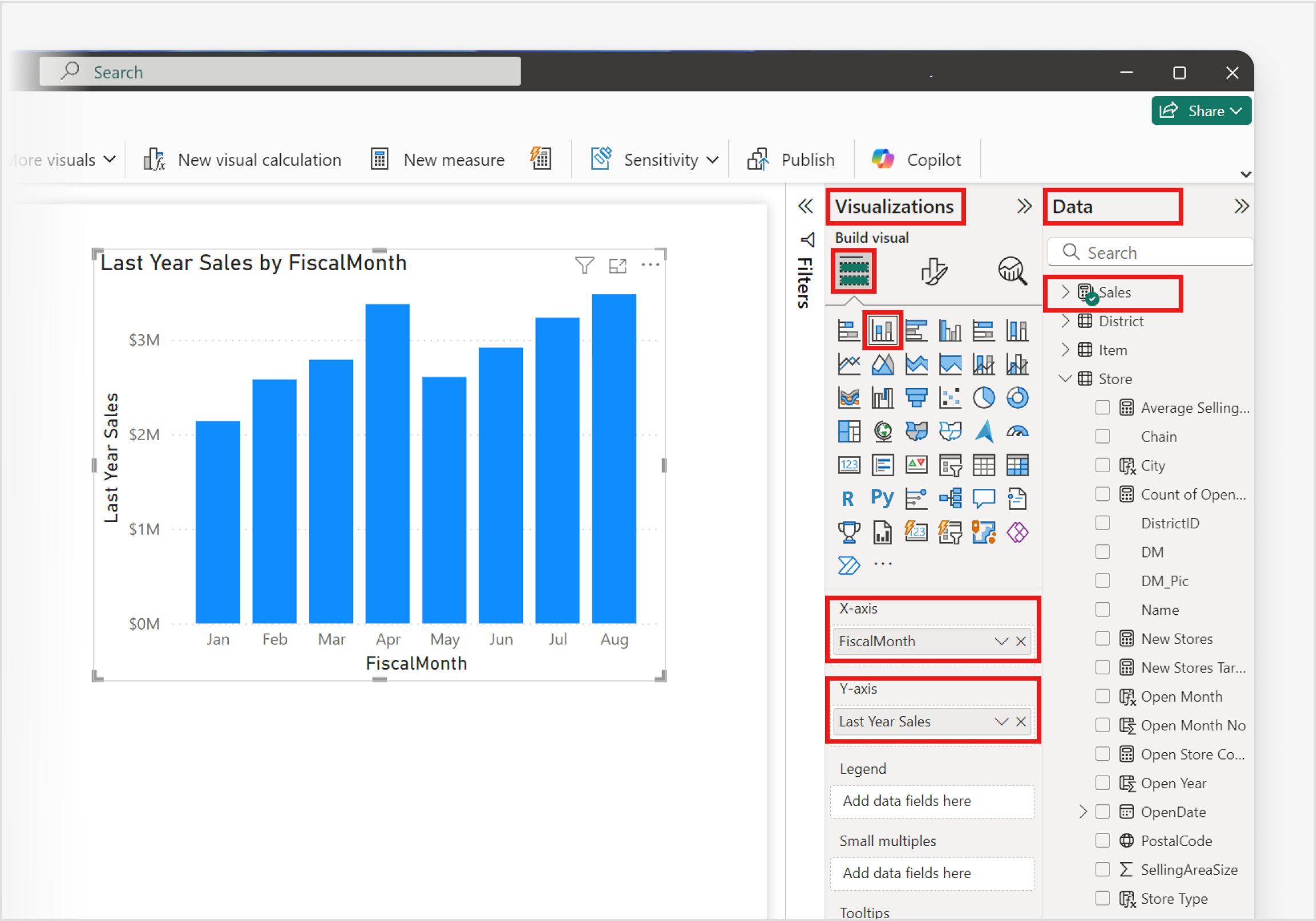
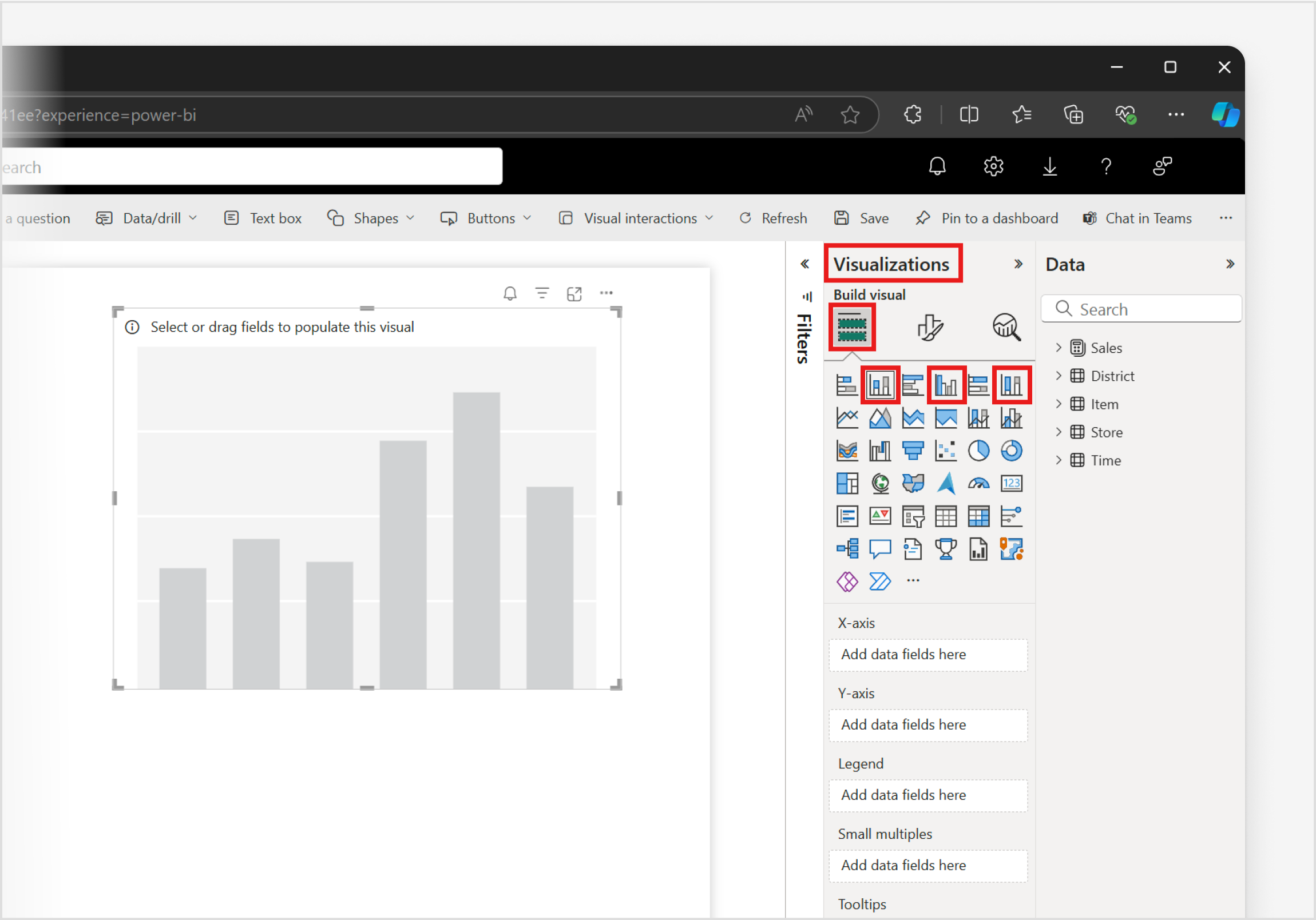
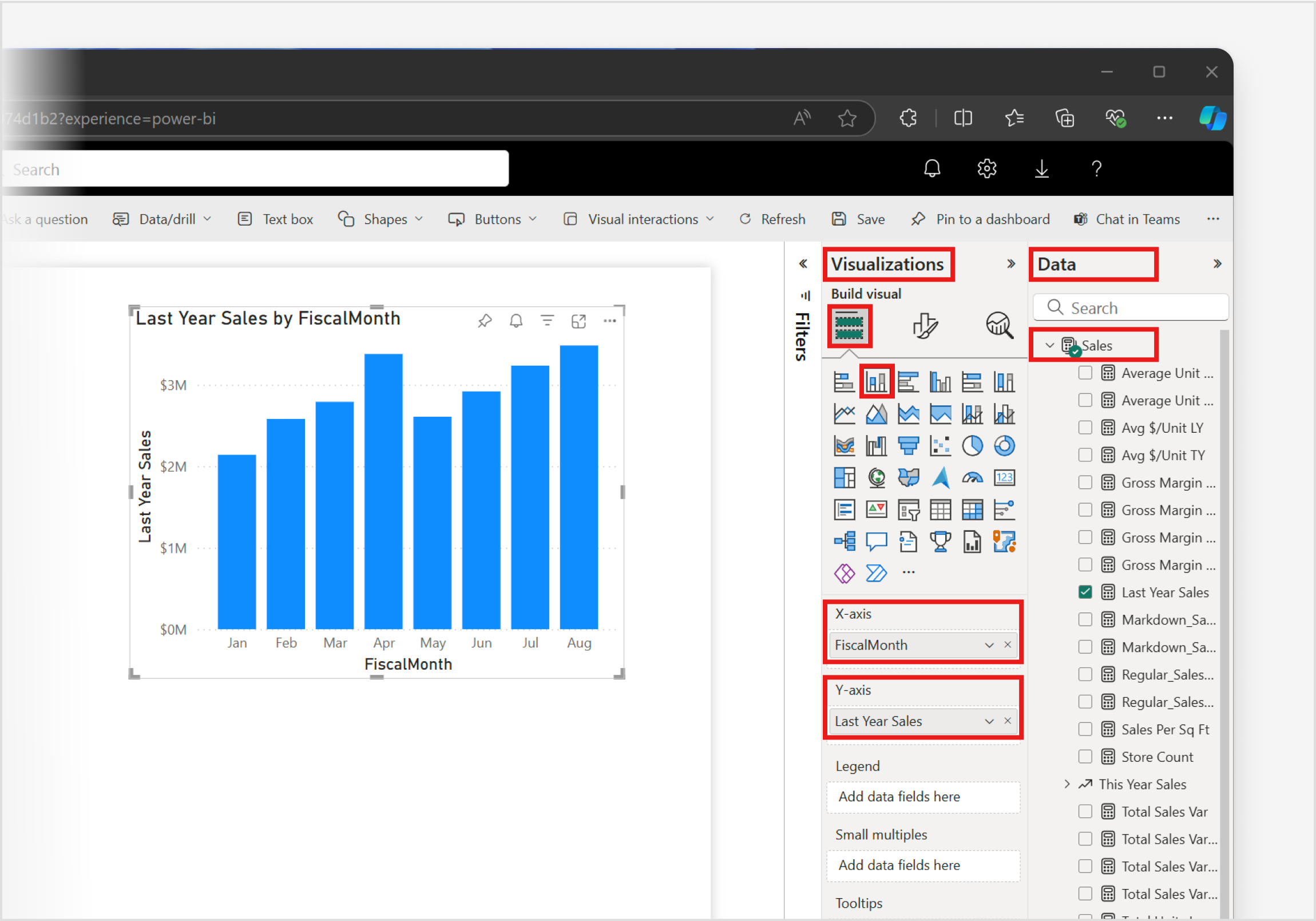
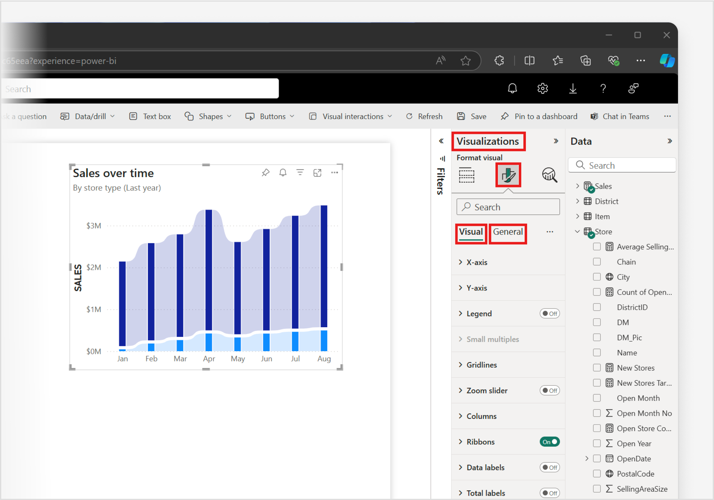
For this example, let’s create a column chart starting from the Visualizations pane in Power BI Desktop.
From the Visualizations pane, select any Column chart icon, and a visual placeholder is immediately added to the canvas.

To add data to your column chart, open the Data pane and expand the Sales dropdown to select the desired fields or measures.
Any one of the following combinations are required to create column charts:
- A minimum of one data field on the X-axis and one measure on the Y-axis, or
- At least one data field on the X-axis, one measure on the Y-axis, and precisely one data field in the Legend, or
- One or more data fields on the X-axis and multiple measures on the Y-axis, keeping in mind that column charts with multiple measures don’t support a Legend.
The specific combination you choose depends on the data you’re working with, and the insights you want to glean from your chart. As a visual guide, in the example below, we’ve selected one data field on the X-axis and one measure on the Y-axis.
To customize your column chart, select the Format icon in the Visualizations Pane, to reveal the Format pane, granting you access to all available formatting options under the Visual tab and the General tab. This allows you to tailor the chart's appearance and functionality to your specific requirements.

Congratulations! You've successfully created a column chart with Power BI. Next, take time to familiarize yourself with the comprehensive list Column chart format settings and other related articles in the Related content section.