Note
Access to this page requires authorization. You can try signing in or changing directories.
Access to this page requires authorization. You can try changing directories.
APPLIES TO: ![]() Power BI Desktop
Power BI Desktop ![]() Power BI service
Power BI service
A doughnut chart is similar to a pie chart in that it shows the relationship of parts to a whole. The only difference is that the center is blank and allows space for a label or icon.
Doughnut charts work best when you use them to compare a particular section to the whole, rather than comparing individual sections with each other.
Prerequisites
Sharing your report with a Power BI colleague requires that you both have licenses for the paid version of Power BI or that the report is saved in Premium capacity.
Get the sample
To follow along, download the Retail Analysis sample .pbix file in Power BI Desktop or the Power BI service.
This tutorial uses the Retail Analysis Sample PBIX file.
At the top left, select File > Open report.
Find your copy of the Retail Analysis Sample PBIX file, and select Open.
The Retail Analysis Sample PBIX file opens in report view.

At the bottom, select the green plus symbol
 to add a new page to the report.


Create a doughnut chart
Follow these steps to create a doughnut chart.
Start on a blank report page and from the Data pane, select Sales, then select the Last Year Sales checkbox.
On the Visualizations pane, select the icon for doughnut chart
 to convert your bar chart to a doughnut chart. If Last Year Sales isn't in the Values section of the Visualizations pane, drag it there.
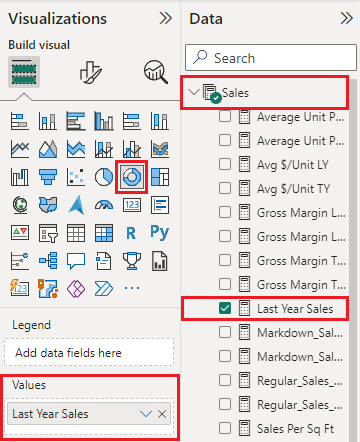
Select Item > Category to add it to the Legend area of the Visualizations pane.
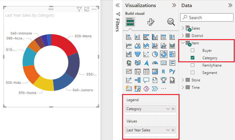
To see details within each section of a doughnut chart, add a category to the Details field.
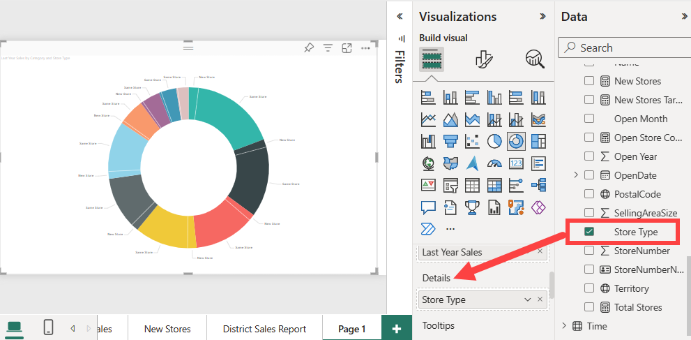
Optionally, adjust the size and color of the chart's text.
Considerations and troubleshooting
Here are a few things to consider as you work with doughnut charts.
- The sum of the doughnut chart values must add up to 100%.
- Too many categories create small slices in the chart. Small slices can be difficult to read and interpret.