Note
Access to this page requires authorization. You can try signing in or changing directories.
Access to this page requires authorization. You can try changing directories.
APPLIES TO: ![]() Power BI Desktop
Power BI Desktop ![]() Power BI service
Power BI service
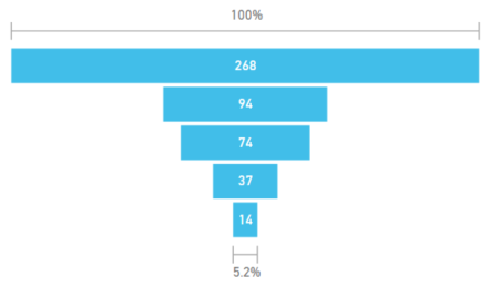
A funnel chart helps you visualize a linear process that has sequential, connected stages. A common use for a funnel chart is to track sales customers through stages, such as Lead > Qualified Lead > Prospect > Contract > Close. At a glance, the shape of the funnel conveys the health of the process you're tracking.
Each funnel stage represents a percentage of the total. In most cases, a funnel chart is shaped like a funnel where the first stage is the largest and each subsequent stage is smaller than its predecessor. A pear-shaped funnel is also useful and can help identify a problem in the process. Typically, the first stage (called the intake stage) is the largest.
Funnel charts support many capabilities, such as sorting and displaying multiples. You can highlight and cross-filter data in a funnel chart by selecting data on other visualizations on the same report page and vice versa.
When to use a funnel chart
Funnel charts are a great choice for many scenarios:
- Chart the progress of sequential data through at least four stages.
- Chart items where the amount in the first stage is expected to be greater than the amount in the final stage.
- Calculate potential, such as for revenue, sales, deals, and so on, by stages.
- Calculate and track conversion and retention rates.
- Reveal bottlenecks in a linear process.
- Track the workflow for a shopping cart.
- Track the progress and success of click-through advertising and marketing campaigns.
Watch the following video to see how to create a funnel chart by using data from the Sales and Marketing sample.
Note
The video might use earlier versions of Power BI Desktop or the Power BI service.
Prerequisites
Review the following prerequisites for using funnel charts in Power BI Desktop or the Power BI service.
This tutorial uses the Opportunity Analysis Sample .pbix file.
Download the Opportunity Analysis Sample .pbix file to your desktop.
In Power BI Desktop, select File > Open report.
Browse to and select the Opportunity Analysis Sample .pbix file, and then select Open.
The Opportunity Analysis Sample .pbix file opens in report view.

At the bottom, select the green plus symbol
 to add a new page to the report.


Note
To share content (or for a colleague without edit rights to view content outside your personal My workspace) both users need either a Power BI Pro or Premium Per User (PPU) license, OR the content must reside in a workspace on a capacity (Fabric F64+ or Power BI Premium (P)). PPU workspaces behave like capacity for feature availability. Free users can only consume content that lives on a capacity.
Create a basic funnel chart
Let's create a funnel chart to show the number of opportunities in each sales stage in the Opportunity Analysis Sample data.
On the Data pane, expand SalesStage and select the Sales Stage checkbox. By default, Power BI creates a table visual to display the data.
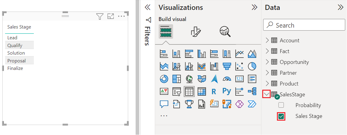
You can now convert the table visual into a funnel chart.
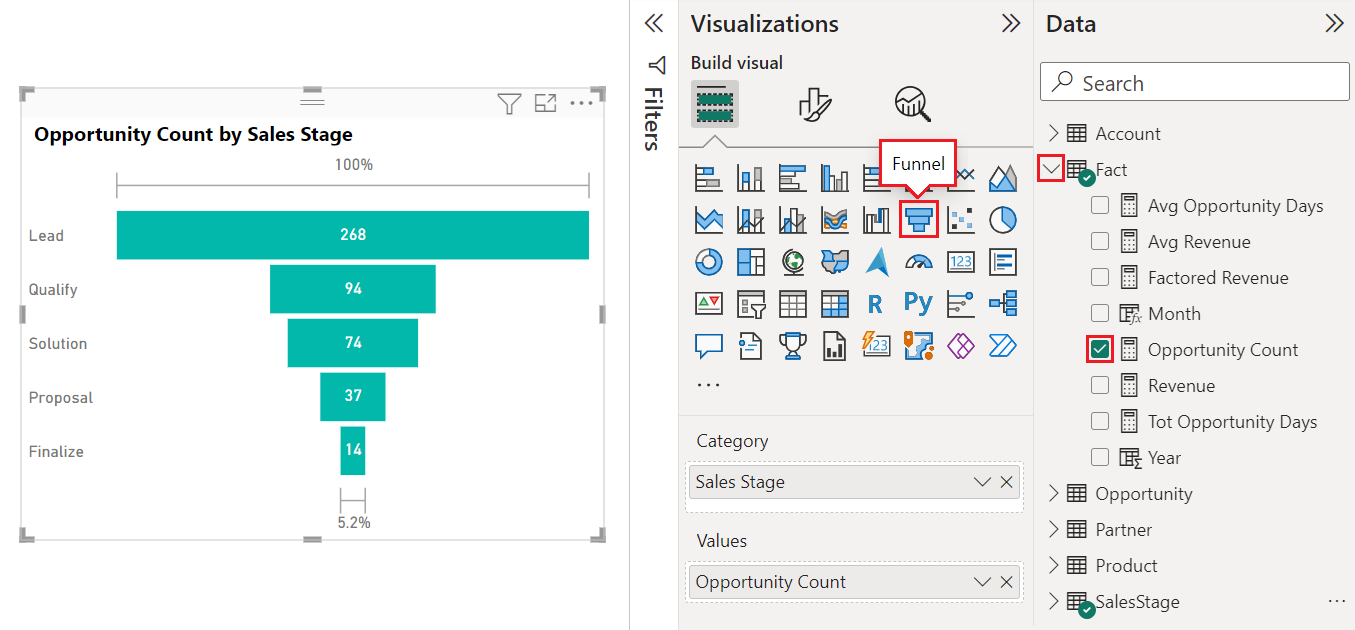
Select the table visual, and then select Funnel on the Visualizations pane. Power BI converts the visual type to a funnel chart.
On the Fields pane, expand Fact and select the Opportunity Count checkbox.
Power BI updates the funnel chart and the Visualizations pane. The Opportunity Count field is added to the Values option and the Sales Stage field is added to the Category option.
When you hover over a bar in the chart, Power BI displays the details for that data. Hover over the Proposal bar.
Some of the details include:
- The name of the stage.
- The number of opportunities currently in this stage.
- The overall conversion rate (% of Lead).
- The stage-to-stage value (also known as the Drop Rate), which is the percentage of the previous stage. In our example, the stage-to-stage value equals Proposal Stage/Solution Stage.

Save the report.
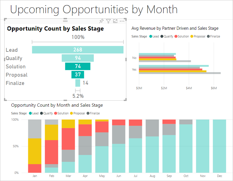
Use highlighting and cross-filtering
Highlighting a bar in a funnel chart cross-filters the other visualizations on the same report page and vice versa. To follow along, add a few more visuals to the report page that contains the funnel chart.
On the funnel chart visual, select the Proposal bar. This action cross-highlights the related data in the other visualizations on the report page. You can use CTRL (+ select) to select multiple bars in the chart.
For information about setting preferences to cross-highlight and cross-filter multiple visuals, see Change how visuals interact in a Power BI report.
For information about working with the Filters pane in Power BI, see Add a filter to a report in Power BI.
Related content
- Create radial gauge charts in Power BI.
- Review visualization types in Power BI.