Note
Access to this page requires authorization. You can try signing in or changing directories.
Access to this page requires authorization. You can try changing directories.
APPLIES TO: ![]() Power BI Desktop
Power BI Desktop ![]() Power BI service
Power BI service
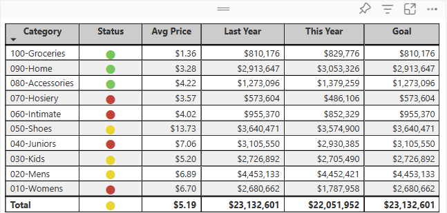
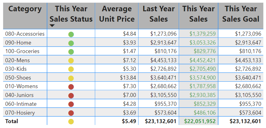
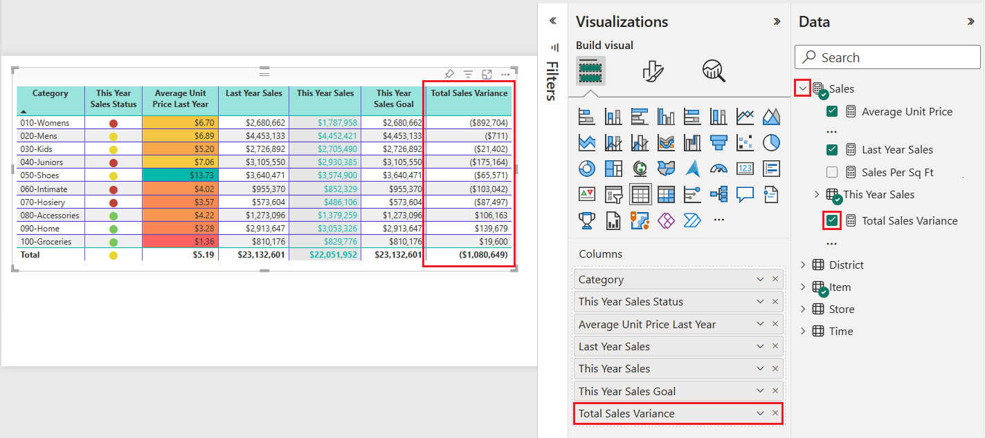
A table is a grid that contains related data in a logical series of rows and columns. A table can also contain headers and a row for totals. Tables work well with quantitative comparisons where you're looking at many values for a single category. In the following example, the table displays five different measures for the Category items, including average prices, year over year sales, and sales goals.
Power BI helps you create tables in reports and cross-highlight elements within the table with other visuals on the same report page. You can select rows, columns, and even individual cells, then cross-highlight the values. You can also copy and paste individual cells and multiple cell selections into other applications.
When to use a table
Tables are a great choice for several scenarios:
- Representing numerical data by category with multiple measures.
- Displaying data as a matrix or in a tabular format with rows and columns.
- Reviewing and comparing detailed data and exact values rather than visual representations.
Note
To share content (or for a colleague without edit rights to view content outside your personal My workspace) both users need either a Power BI Pro or Premium Per User (PPU) license, OR the content must reside in a workspace on a capacity (Fabric F64+ or Power BI Premium (P)). PPU workspaces behave like capacity for feature availability. Free users can only consume content that lives on a capacity.
Get the sample
To follow along, download the Retail Analysis sample .pbix file in Power BI Desktop or the Power BI service.
This tutorial uses the Retail Analysis Sample PBIX file.
Download the Retail Analysis Sample PBIX file to your desktop.
In Power BI Desktop, select File > Open report.
Browse to and select the Retail Analysis Sample PBIX file, then select Open.
The Retail Analysis Sample PBIX file opens in report view.
At the bottom, select + to add a new page to the report.
Create a table
You can create a table like the one shown at the beginning of this article and display sales values by item category.
On the Data pane, expand Item and select the Category checkbox. Power BI automatically creates a table that lists all the categories in the Retail Analysis Sample semantic model. If you don't see a table visual, use the Visualizations pane to select the table icon.

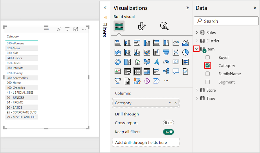
This action configures the Category data as a field in the Columns section on the Visualizations pane.
Let's add more categories to the table.
Expand Sales and select the Average Unit Price and Last Year Sales checkboxes. Under Sales, expand This Year Sales and select the checkboxes for all three options: Value, Goal, and Status.
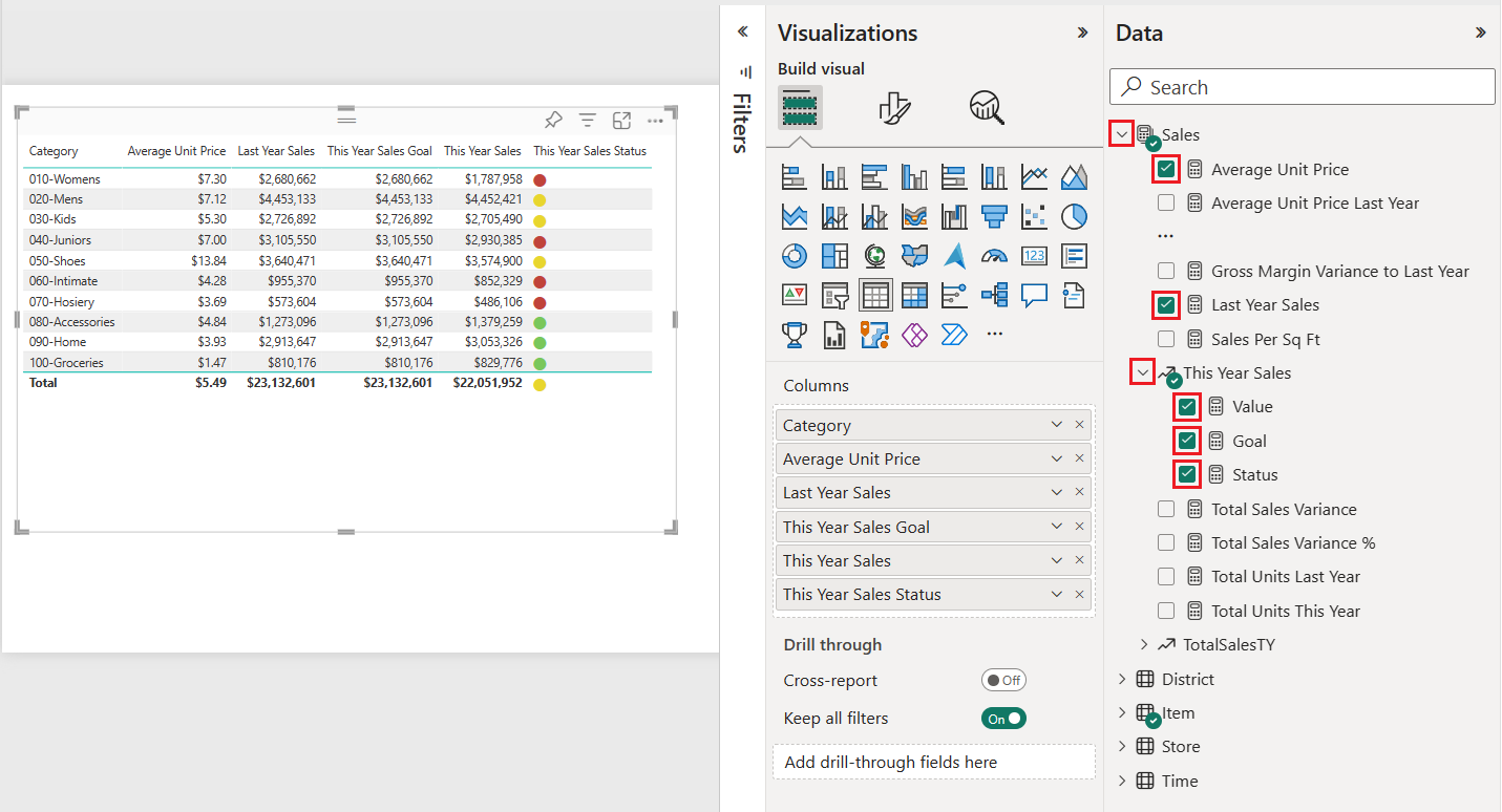
Power BI adds the selected data as fields to the Columns section on the Visualizations pane.
On the Visualizations pane, rearrange the data fields in the Columns section to match the order shown in the following image:
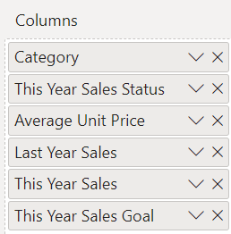
To move a column on the Visualizations pane, select and hold the field in the Columns section. Drag the field to the new location within the order of columns and release the field. The column order in the table updates to match the new order of the fields in the Columns section.
Format the table
There are many ways to format a table. We cover only a few scenarios in this article.
The following steps show how to configure settings and options to adjust the presentation of the table data.
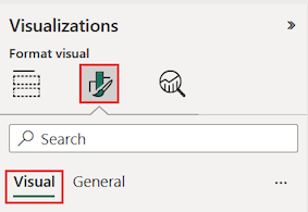
On the Visualizations pane, select the Format your visual (paintbrush) icon to open the Format section. Make sure the Visual tab is selected.
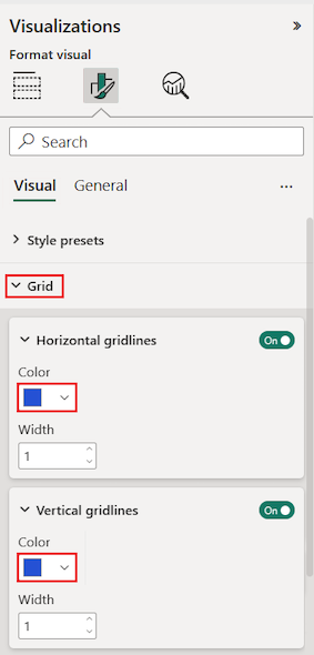
Try formatting the table grid options.
- Expand the Grid > Horizontal gridlines and Vertical gridlines options.
- Change the horizontal and vertical gridlines to use a blue Color.
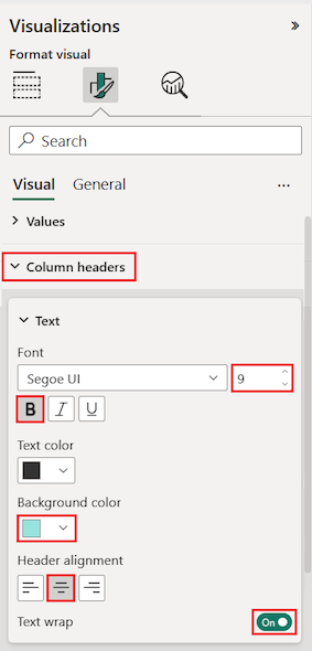
Next, try adjusting the column header text.
Expand the Column headers > Text options.
Set the following options:
- Increase the Font size and apply bold (B).
- Change the Background color.
- Adjust the Header alignment to center the header text.
- Turn on Text wrap to allow long column headings to display across multiple lines.
You can also format individual columns and headers.
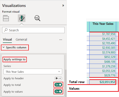
Expand the Specific column section.
For the Apply settings to options, select the specific column to format by using the Series drop-down list.
Let's begin by selecting the column This Year Sales.
The data values in the selected column determine the available formatting options.
Expand the Values options and update some settings, such as Text color and Background color.
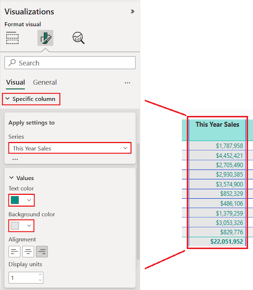
Finally, configure the other Apply settings to options to specify how to use the updated settings for the column data.
Let's apply the changes to all values in the column and to the row that shows the total of value.
Practice what you learned by updating another specific column field.
- Update the This Year Sales Status column.
- For the Values options, specify center Alignment.
- Configure the Apply settings to options to use the updated settings for the cell values only.
Select File > Save to save your changes for the table report page.
Here's an example of an updated table:
Format tables in other ways to complement your configuration options and settings. In the next section, we explore how to apply conditional formatting.
Use conditional formatting
You can add conditional formatting for subtotals and totals in tables. Power BI can apply conditional formatting for total values to any field in the Columns section of the Visualizations pane. Use the Apply settings to options to specify which table values should use the conditional formatting.
You specify the thresholds or ranges for the conditional formatting rules. For matrices, any Values options refer to the lowest visible level of the matrix hierarchy.
With conditional formatting for tables, you can specify icons, URLs, cell background colors, and font colors based on cell values. You can also apply gradient coloring to show value distribution across a numerical range.
Set background color shading
A common use for conditional table formatting is to change the cell background color based on the corresponding numerical data value. You can set static colors for specific custom values, or instruct Power BI to determine the cell color based on the data value.
The Background color option offers a gradient that can range in color from the lowest to highest value for the category. You can configure the color gradient and specify how to choose the cell background color based on the gradient.
By default, Power BI uses a gradient that spans across two primary colors from red to green. The Minimum value color applies to the lowest value in the range. This value is the darkest shade of red. The Maximum value color applies to the highest value in the range. This value is the darkest shade of green. Midrange values for the category are colored with shades of red or green depending on the specific data value.
Let's modify the background color for a column that has numerical data values.
Select the table visual.
On the Visualizations pane, expand the drop-down menu for a field under Columns. Choose the Average Unit Price column.
On the menu, select Conditional formatting > Background color.
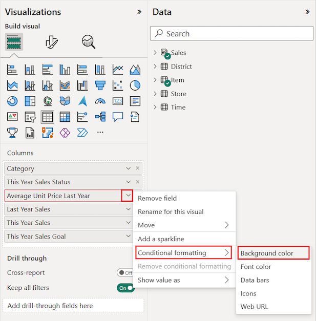
The Background color dialog opens.
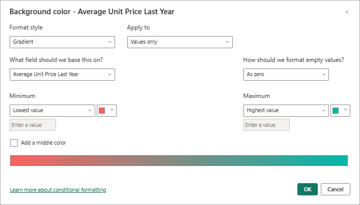
On the dialog, select the Add a middle color option to expose the optional Center color value.
The gradient updates to include the default Center color value (yellow). The category values for the column can now be represented with a gradient that spans three primary colors.
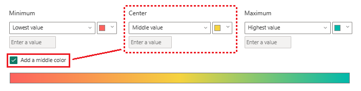
Choose colors for the Minimum (lowest) and Maximum (highest) values.
Choose a color for the Center (middle) option for values within the range.
Select OK to apply your changes to the specified column.
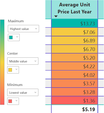
The following illustration shows how Power BI applies a color gradient to the cells in the Average Unit Price Last Year column. In this example, the column data is sorted in descending order, from highest to lowest value.
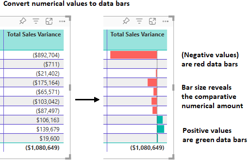
Replace numbers with data bars
You can replace numerical values in the table presentation with Data bars. Bars of color that represent data can be easier to scan and analyze than many numerical values.
Power BI shows negative and positive data values in the table by using different bar colors. By default, Negative values are shaded red and Positive values are shaded green. This approach is similar to the default settings for the Minimum and Maximum values in the background color gradient.
Each bar is the same height, which is based on the table row cell height. The length of each bar represents the numerical amount of the data. A higher number value is shown with a longer bar compared to other bars in the same column.
Let's add another column to the table with a field that has both positive and negative data values. We can configure the column data to display as color bars rather than numbers.
On the Data pane, expand Sales and select the Total Sales Variance checkbox.
Power BI adds the new field to the Columns section of the Visualizations pane.
On the Visualizations pane, expand the drop-down menu for the Total Sales Variance field under Columns, and select Conditional formatting > Data bars.
On the Data bars dialog, configure how to apply conditional formatting for the data in the selected column.
- Choose colors for the Positive bar and Negative bar options.
- Select the Show bar only option.
- Make any other changes you'd like.
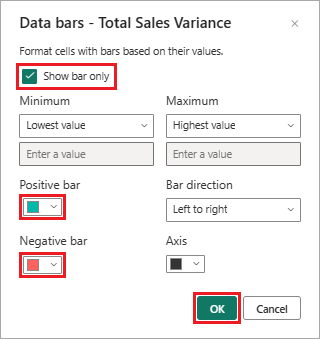
Select OK.
Power BI updates the table data presentation style. Data bars replace the numerical values for the selected column.
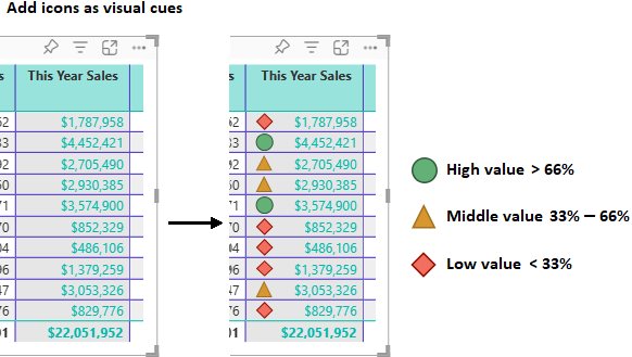
Use visual cues
Another formatting option is to add visual cues to the table with conditional Icons. Icons are like data bars. They present information about the data in a more visual manner that's easier to scan and analyze than numbers.
On the Visualizations pane, expand the drop-down menu for the This Year Sales field under Columns, and select Conditional formatting > Icons.
On the Icons dialog, configure how to use conditional icons to represent the data in the selected column.
The default presentation uses three different icons based on the numerical value. Each icon represents values for one third of all the values (lowest, middle, and highest) for a range of 33 percentage points. The default position for an icon is to the left of the number within the column.
- Choose your preferences for Icon layout, Icon alignment, and Style.
- Configure your desired presentation settings according to the numerical values for the column data.
- Make any other changes you'd like.
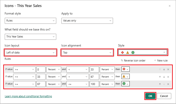
Select OK.
Power BI updates the table data presentation style. Icons are added to the left of the numerical values for the selected column.
For more information about conditional formatting, see Apply conditional formatting in tables and matrices.
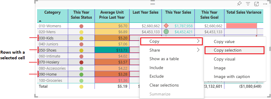
Copy table values into other applications
Your table or matrix might include content that you'd like to use in other applications, such as Dynamics CRM, Excel, and even other Power BI reports. When you right-click inside a cell in Power BI, you can copy the data in a single cell or a selection of cells onto your clipboard. You can then paste the clipboard contents into other applications.
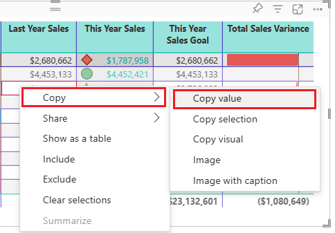
Copy single cell
To copy the value of a single cell:
Select the cell to copy.
Right-click inside the cell.
Select Copy > Copy value to copy the cell value to your clipboard.
Note
Power BI copies only the data value in the cell. Any formatting applied to the cell value isn't copied.
Copy multiple cells
To copy the values for more than one cell:
Select a contiguous range of cells or use CTRL (+ select) to choose multiple cells that aren't contiguous.
Right-click inside a selected cell.
Select Copy > Copy selection to copy the cell values to your clipboard.
Note
Power BI copies the data values in the cells along with any applied formatting.
Adjust column width
Column width in Power BI tables and matrices can be adjusted to improve readability and presentation. You can manually resize columns or use automatic options to optimize how your data appears in the report.
Manual adjustment
Sometimes Power BI shortens a column heading in a report or dashboard. To display the full column name, you can resize the column in two ways:
Resize by dragging
Move to the space just to the right of the column heading until the resize arrows appear. Once the arrows are visible, adjust the column width by moving the resize handle left or right.
Resize using menu options
Select the column you want to adjust. From the available options, choose Widen column or Narrow column to change its width by 10px.
Automatic adjustment
Power BI can also automatically adjust column sizes for you.
Two options are available:
- Fit to content: Makes the columns as wide as they need to be to show the data, assuming there's room in the visual container.
- Grow to fit: Automatically expands your columns to fill the visual container for a more balanced layout. When Grow to fit is enabled, any leftover horizontal space is distributed evenly to each column.
Note
Columns that were manually resized aren't changed by the Autosize width option.
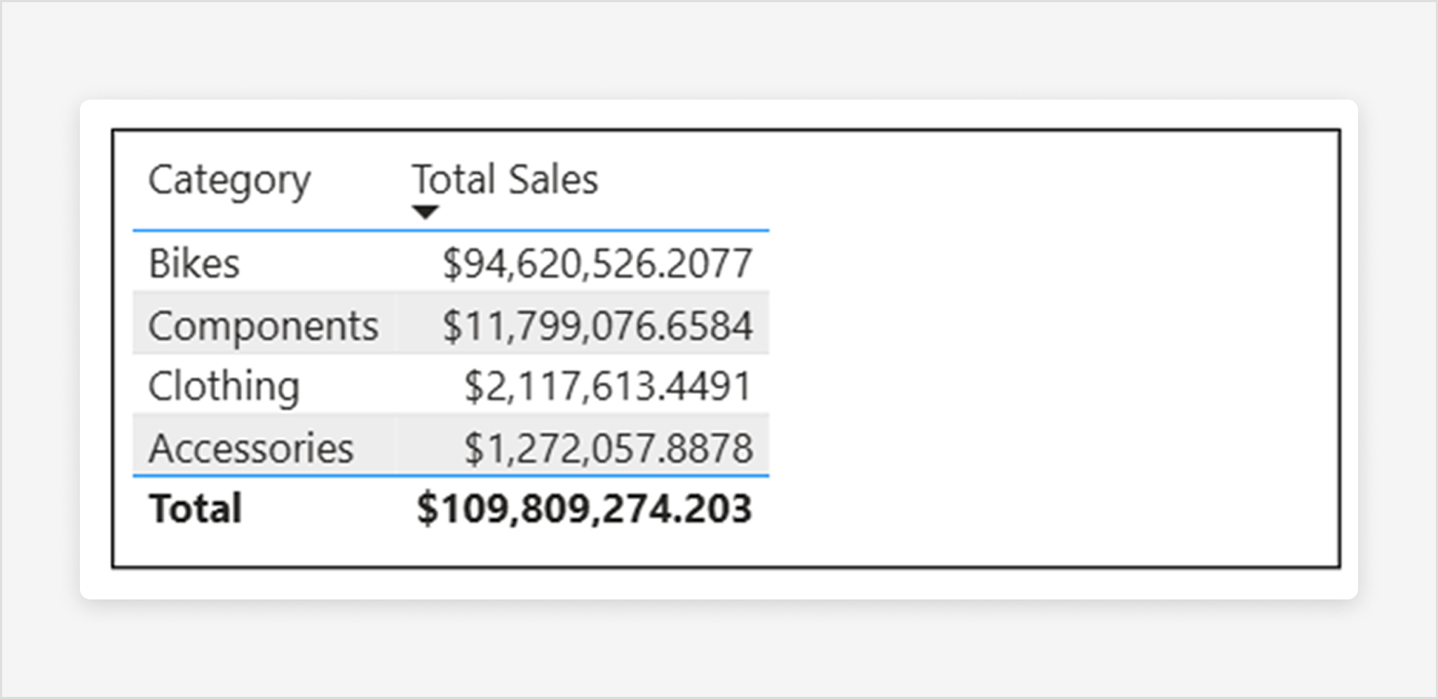
The manual resize and Autosize width (fitting to content) options size each column to its contents, but you might still have some unused space in the visual container:
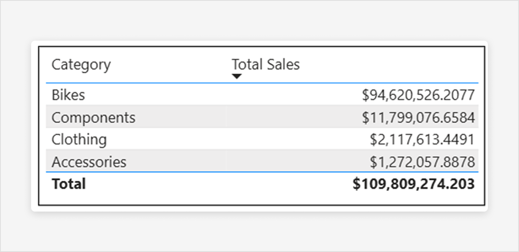
The Grow to fit feature automatically expands your columns to fill the visual container for a more balanced layout. When Grow to fit is enabled, any leftover horizontal space is distributed evenly to each column:
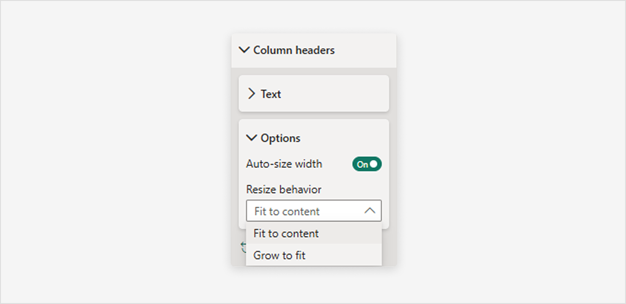
To enable Grow to fit:
- Select the table visual.
- Open the Format pane.
- Expand Column headers, then expand Options.
- Toggle Autosize width to On.
- From the Resize behavior dropdown, select Grow to fit.
Note
Columns that were manually resized don't change.
Considerations and troubleshooting
Review the following considerations for working with tables in Power BI.
- When you apply column formatting, you can choose only one alignment method per column: Auto, Left, Center, or Right. Usually, a column contains all text or all numbers, and not a mix of values. In cases where a column contains both numbers and text, the Auto option aligns left for text and right for numbers. This behavior supports languages where you read left-to-right.
- If text data in table cells or headers contain new line characters, the characters are ignored by default. If you want Power BI to recognize these formatting characters, enable the Values > Values > Text wrap option for the specific element on the Format section of the Visualizations pane.
- Power BI calculates the maximum cell size for a table based on the contents of the first 20 columns and the first 50 rows. Content in cells beyond those table dimensions might not be appropriately sized.