Note
Access to this page requires authorization. You can try signing in or changing directories.
Access to this page requires authorization. You can try changing directories.
APPLIES TO: ![]() Power BI Desktop
Power BI Desktop ![]() Power BI service
Power BI service
If you have edit permissions for a report, there are numerous formatting options available. In Power BI reports, you can change the color of data series, data points, and even the background of visualizations. You can change how the x-axis and y-axis are presented. You can customize the data labels. You can even format the font properties of visualizations, shapes, and titles. Power BI provides you with full control over how your reports appear.
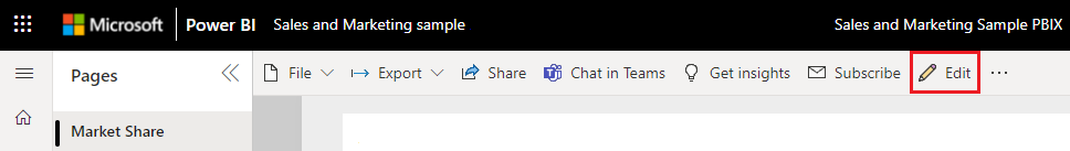
To get started, open a report in Power BI Desktop or the Power BI service. Both provide almost identical formatting options. In the Power BI service, you need to select Edit from the menu bar.
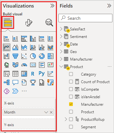
When you’re editing a report and you select a visualization, the Visualizations pane appears. Use this pane to change visualizations. Directly below the Visualizations pane, there are three icons: the Fields icon (a stack of bars), the Format icon (a paint brush), and the Analytics icon (a magnifying glass). In the image below, the Fields icon is selected, indicated by a yellow bar below the icon.
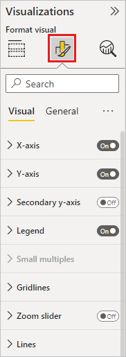
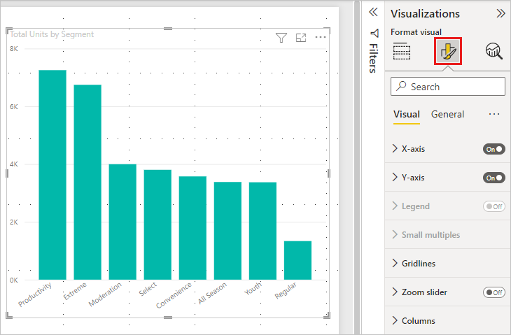
When you select Format, the area below the icon displays the customizations available for the currently selected visualization.
You can customize many elements of each visualization. The options available depend on the visual selected. Some of those options are:
- Legend
- X-axis
- Y-axis
- Data colors
- Data labels
- Total labels
- Shapes
- Plot area
- Title
- Background
- Lock aspect
- Border
- Shadow
- Tooltip
- Visual header
- Shapes
- Position
- Zoom
Note
You don’t see all these elements with each visualization type. The visualization you select affects which customizations are available. For example, you don’t see an X-axis if you have a pie chart selected because pie charts don’t have an X-axis.
Also note that if you don’t have any visualization selected, Filters appears in place of the icons, which lets you apply filters to all visualizations on the page.
The best way to learn how to use the Formatting options is to try them out. You can always undo your changes or revert to default. There are an incredible number of options available, and new ones being added all the time. It's just not possible to describe all formatting options in one article. But to get you started, let's review a few together.
- Change colors used in the visual
- Apply a style
- Change axis properties
- Add data labels
- Customize data labels
- Add total labels
Change colors in a visual
Let’s walk through the steps necessary to customize colors on a visualization.
Select a visualization to make it active.
Select the paint brush icon to open the Formatting tab. The Formatting tab displays all the formatting elements available for the selected visual.
Select Colors to expand its available customizations.
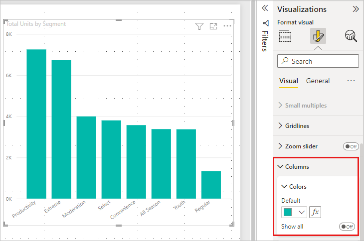
Change Show all to On, and select different colors for columns, rows, and lines, depending on the visual type.
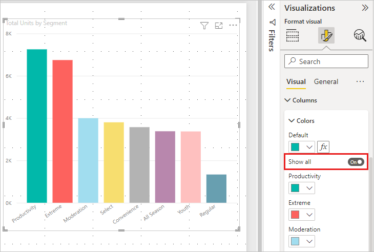
Here are a few tips for working with colors. The numbers in the following list are also shown on the following image, indicating where you can access and change these useful elements.
Don’t like the color? No problem, just select the down-arrow to open the color palette and select a new one.
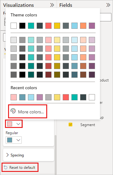
Don't like any of the color changes? Select Reset to default from the bottom of the Data color section, and your colors revert to the default settings.
Want a color you don’t see in the palette? Just select More colors..., and choose from the spectrum.
Don't like the change you just made? Use CTRL+Z to undo, as you’re used to doing.
Apply a style to a table
Some Power BI visualizations have a Style option. One click applies a full set of formatting options to your visualization, all at once.
Select a table or matrix to make it active.
Open the Formatting tab and select Style presets.
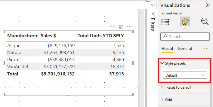
Select a style from the dropdown.
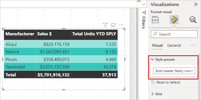
Even after you apply a Style, you can continue formatting properties, including color, for that visualization.
Change axis properties
It’s often useful to modify the X-axis or the Y-axis. Similar to working with colors, you can modify an axis by selecting the down-arrow icon to the left of the axis you want to change, as shown in the following image.
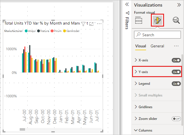
The following example illustrates making the following formatting changes to the Y axis:
- Move the labels to the right side of the visualization.
- Change the starting value to zero.
- Change the label font color to black.
- Increase the label font size to 12.
- Add a Y-axis title.
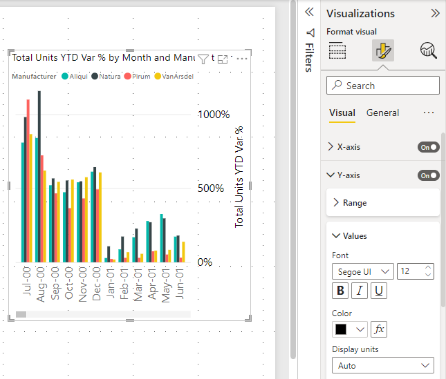
You can remove the axis labels entirely, by toggling the radio button beside X-Axis or Y-Axis. You can also choose whether to turn axis titles on or off by selecting the radio button next to Title.
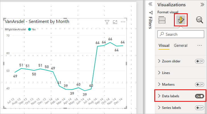
Add data labels
You can also add data labels to a line chart.
Here is the before picture.
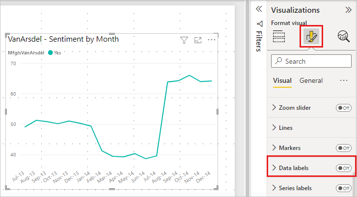
Here is the after picture.
Add and format data labels
Select the visualization to make it active, and open the Formatting tab.
Select Data labels and turn them On.
Make these formatting changes:
- Increase the font size to 12.
- Change the font family to Arial Black.
- Turn Show background to On and Background color to white with a Transparency of 5%.
Depending on the visual and its size, data labels might not display. If your data labels don't display, try making the visual larger or viewing it in full screen mode.
These are just a few of the formatting tasks that are possible. Open a report in Editing mode and explore the Formatting pane to create beautiful and informative visualizations.
Customize data labels
Data labels have some enhanced formatting capabilities, giving you extended customization choices. For example, you can integrate additional metrics on your charts to improve your data analysis experience. These options are available for columns, bars, lines, and ribbon charts.

- Title: The new Title card feature enables you to display legend fields on your data labels, so you can omit the legend for a cleaner look. You can also customize data label titles using different data fields, adjustable font style, color, and transparency.
- Value: Spot the active field for your data label in the field well. Modifying it to another field is easy, with customization options like font, color, transparency, and more, plus a new feature for blank value display.
- Detail: The new detail card feature lets you add a secondary metric to your data labels. Choose any field to add an extra value, with the full range of formatting options.
- Visual label layout: Choose between a sleek single-line data label or a multi-line data label, as needed.
Add total labels
One last formatting example before you start exploring on your own. Let's add total labels to a stacked column chart. Total labels are available for stacked charts, combo charts, and area charts.
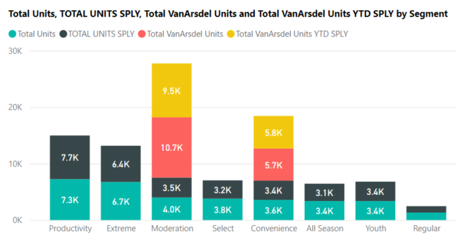
When you turn on total labels, Power BI displays the aggregate, or total, of the data. Let's look at an example.
Here, this stacked column chart has data labels showing the value of each portion of each full stack. This view is the default.
By opening the visual in Editing view, you can change the display for data labels and total labels. Select the visual to make it active and open the Formatting pane. Scroll down to Data labels and Total labels. Data labels is On and Total labels is Off.
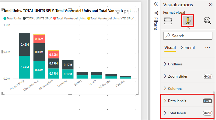
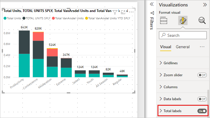
Turn Data labels Off, and turn Total labels On. Power BI now displays the aggregate for each column.
These are just a few of the formatting tasks that are possible. Open a report in Editing mode and have fun exploring the Formatting pane to create beautiful and informative visualizations.
Related content
For more information, see the following articles: