Note
Access to this page requires authorization. You can try signing in or changing directories.
Access to this page requires authorization. You can try changing directories.
APPLIES TO: ![]() Power BI Desktop
Power BI Desktop ![]() Power BI service
Power BI service
Power BI provides many different ways to customize your reports. This article details a collection of tips that can make your Power BI visualizations more compelling, interesting, and customized to your needs.
The following tips are provided. Have another great tip? Great. Send it our way.
- Apply a theme to the entire report
- Change the color of a single data point
- Conditional formatting
- Base the colors of a chart on a numeric value
- Base the color of data points on a field value
- Customize colors used in the color scale
- Use diverging color scales
- Add color to table rows
- How to undo in Power BI
To make any changes, you must have edit permissions for the report.
Open a report in Report view.
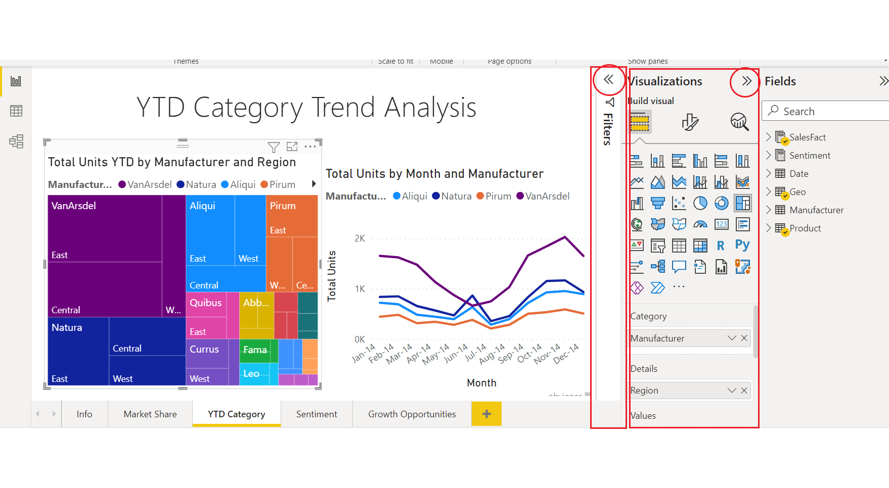
When the Filters and Visualizations panes appear along the right side of the report canvas, you’re ready to start customizing. If the panes don't appear, select the top-right arrows to open them.
Apply a theme
In Power BI Desktop, you can apply design changes to your entire report. With themes you can use corporate colors, change icon sets, or apply new default visual formatting. When you apply a report theme, all visuals in your report use the colors and formatting from your selected theme. To learn more, see Use report themes.
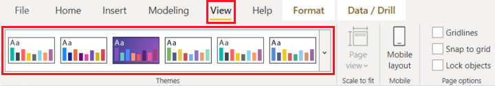
Here, the Innovate theme is applied to the report.
Report themes aren't available in the Power BI service.
Change the color of a single data point
Sometimes you want to highlight one particular data point. Perhaps it’s a sales figure for the launch of a new product, or improvements in quality scores after launching a new program. With Power BI, you can highlight a particular data point by changing its color.
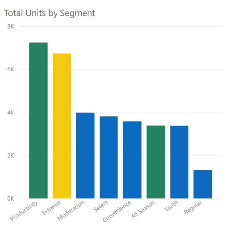
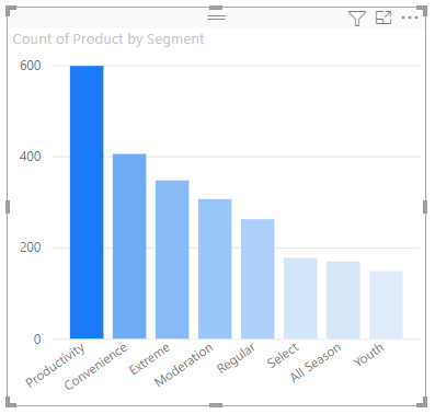
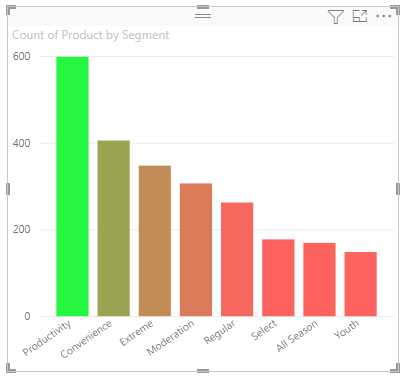
The following visualization ranks units sold by product segment.
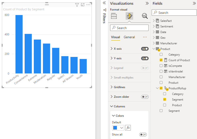
Imagine you want to call out the Extreme segment to show how well this brand new segment is performing, by using color. Here are the steps:
For each visual type, there are many color options. You can color text, gridlines, backgrounds, and more. And the path to the Color option that you want may not be the same across visuals. For that reason, select the visual and then use the Search bar to find the chart feature that you want to color. For a column chart, search for Column. The color option we want is on the Columns card.
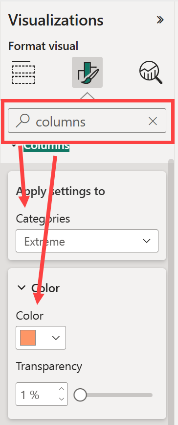
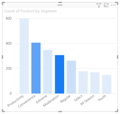
From the Categories dropdown, select All to set the same color for all columns. To change the color of the Extreme column, select Extreme from the Categories dropdown and the new color from the Color card.
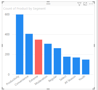
Once selected, the Extreme data point is a nice shade of orange, and certainly stands out.
If you expect to add new columns to the chart, and want to maintain the same color scheme, be sure to set the Default color to blue.
Even if you change visualization types, then return, Power BI remembers your selection and keeps Extreme orange.
Change the color of all data points
You can change the color of a data point for one, several, or all data elements in the visualization. Perhaps you want your visual to mimic your corporate colors of yellow, green, and blue.
Or, perhaps you want a different color for each category.
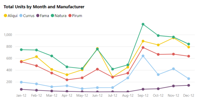
Notice that the legend colors match the data colors. Legend colors aren't set separately, but inherit the colors set for the Data colors.
Note
There are certain circumstances where Power BI will change the legend (and data) colors. One example is when your visual is created using streaming data, a new month begins, and a new category is introduced into your visual. Let's say that you've set the data colors for all five categories in the line chart. And now it's Jan-13 and another manufacturer has entered the market. Because you did not set a data color for that new manufacturer, you may find that Power BI has changed the data colors for the original five manufacturers. When a new category is introduced, you may have to reassign data colors to the new and existing categories using the Formatting > Data colors pane.
There are all sorts of things you can do with colors. In the next section, we take a look at conditional formatting.
Add conditional formatting for visuals
Visualizations often benefit from dynamically setting color based on the numeric value of a field. You can show a different value for the size of a bar, and show two values on a single graph. Or you can highlight data points over (or under) a certain value—perhaps highlighting areas of low profitability.
The following sections demonstrate different ways to base color on a numeric value.
Base the color of data points on a value
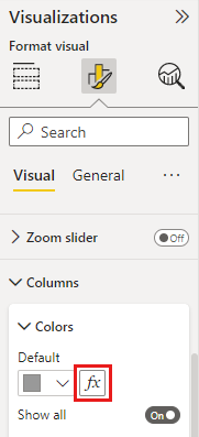
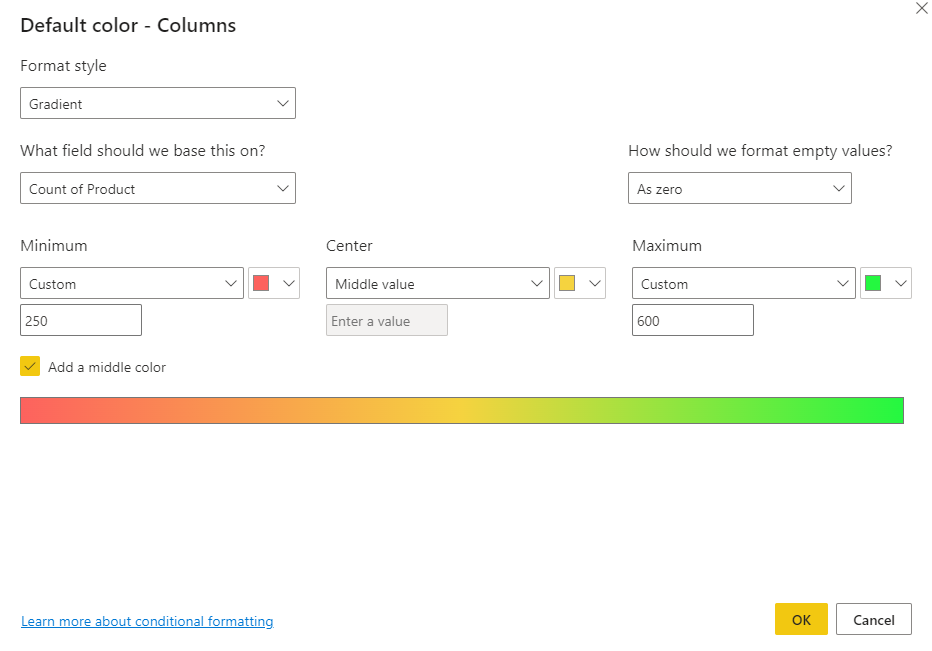
To change color based on a value, select a visualization to make it active. Open the Format pane by selecting the paint brush icon and then search for the Colors card. Since our example uses a column chart, scroll down to Columns. Next to Default, select the fx icon.
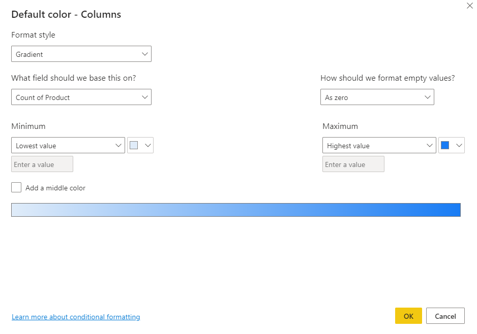
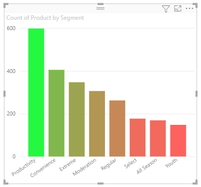
In the Default color dialog box, use the dropdowns to identify the fields to use for conditional formatting. In this example, we apply a gradient and select the Count of Product field. Then we select light blue for the Lowest value and dark blue for Highest value.
You can also format the color of the visual using a field that isn't part of the visual. In the following image, % Units Market Share SPLY is being used.
As you can see, we sold more units of Productivity, Convenience, and Extreme (their columns are higher). However, Moderation has a larger % Units Market Share SPLY (its column has more color saturation).
Customize the colors used in the color scale
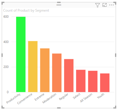
You can also change the way the values map to these colors. In the following image, the colors for Minimum and Maximum are set to red and green, respectively.
In this first image, notice how the bars in the chart reflect the gradient shown in the bar. The highest value is green, the lowest is red, and each bar in between is colored with a shade of the spectrum between green and red.
Now, let’s see what happens if we provide numeric values in the Minimum and Maximum value boxes. Select Custom from the drop-down boxes for both Minimum and Maximum, and set Minimum to 250, and set Maximum to 600.
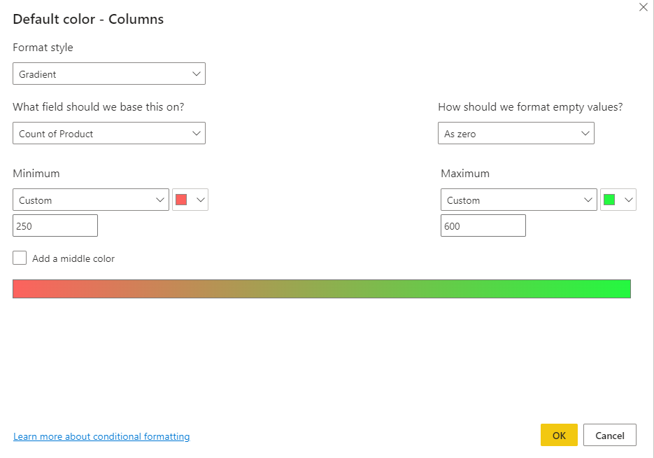
By setting those values, gradient is no longer applied to values on the chart that are below Minimum or above Maximum; any bar with a value over Maximum value is colored green, and any bar with a value under Minimum value is colored red.
Use diverging color scales
Sometimes your data may have a naturally diverging scale. For example, a temperate range has a natural center at freezing point, and a profitability score has a natural mid-point (zero).
To use diverging color scales, select the checkbox for Add a middle color. Another color selector called Center appears.
When Add a middle color is selected, you can set the colors for Minimum, Maximum, and Center separately. In the following image, bars with values near the center of the range are now colored yellow.
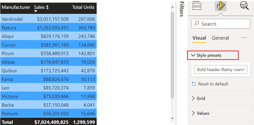
Add color to table rows
Tables and matrixes offer many options for color formatting.
One of the quickest ways to apply color to a table or matrix is to open the Format pane and select Style presets. Here we select Bold header flashy rows.
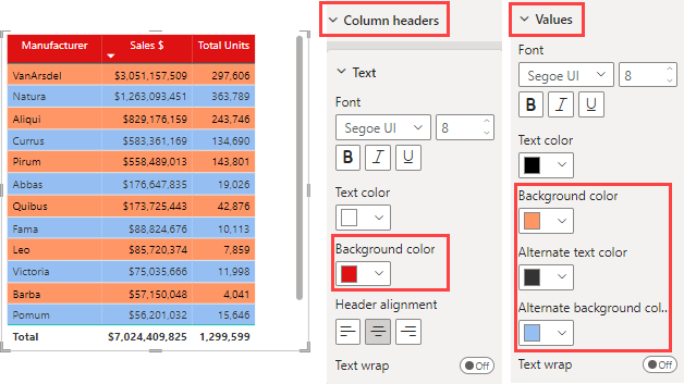
Experiment with other color formatting options. In this image, we change the background color under Column headers and change both the Background color and Alternate background color for the Values (rows).
Undo in Power BI
Like many other Microsoft services and software, Power BI provides an easy way to undo your last command. For example, let’s say you change the color of a data point, or a series of data points, and you don’t like the color when it appears in the visualization. You don’t recall exactly which color it was before, but you know you want that color back.
To undo your last action, or the last few actions, all you have to do is type CTRL+Z.
To discard all the changes you make on a Formatting card, select Reset to default.
Give us your feedback
Do you have a tip you’d like to share? Send it our way.