Note
Access to this page requires authorization. You can try signing in or changing directories.
Access to this page requires authorization. You can try changing directories.
This post was written by Jeff Sandquist, General Manager in the Cloud + Enterprise Division.
Today we're announcing the preview release of our new documentation service /, showcasing content supporting our Enterprise Mobility products.
Why docs.microsoft.com?
In short, content matters. We interviewed and surveyed hundreds of developers and IT Pros and sifted through your website feedback over the years on UserVoice. It was clear we needed to make a change and create a modern web experience for content. The first thing we did was evaluate our existing content infrastructure TechNet and MSDN. Both sites are built on a 10-15 year-old brittle codebase with an archaic publishing and deployment system that was never designed to run on the cloud.
Our focus was not only on the experience, but also on the content we create and how each of you consume it. For years customers have told us to go beyond walls of text with feature-level content and help them implement solutions to their business problems. We knew that the content we delivered and the platform we built must make it easy for customers to learn and deploy solutions.
We realized that to get the overall experience right we needed to start from scratch; from this effort comes https://docs.microsoft.com – a new hope for documentation at Microsoft.
Note: This preview release of the website includes content *only* for Enterprise Mobility Documentation (which consists of Advanced Threat Analytics, Azure Active Directory, Azure Remote App, Multi-factor Authentication, Azure Rights Management, Intune, and Microsoft Identity Manager). In the future, as our platform matures with the help of your feedback, we will migrate more of our documentation onto this experience.
Key Features
Let's start with an example documentation page shown below and we'll showcase some of the new features on the site.
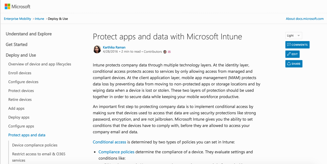
Readability
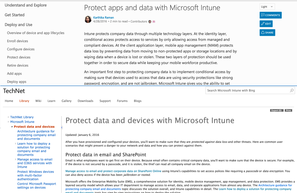
To improve content readability, we changed the site to have a set content width. Eye tracking studies have shown that you can improve comprehension and reading speed with a set content width as it's difficult for the eye to follow long passages left-to-right. To show this in action, below is an example of an Intune article running on docs.microsoft.com followed by the same article on TechNet. We've also increased the font size for the left navigation and the text itself, something customers have been asking for (UserVoice - Increase Font size).
Estimated Reading Time
Another simple enhancement we've made based on your input is to provide an estimated reading time for an article. We know many of you are learning/evaluating technology a few minutes between meetings and you're more likely to read articles if you knew how much of a time commitment is required. We also added date stamps to content to help customers understand how fresh the information is based on UserVoice feedback.

Content and Site Navigation
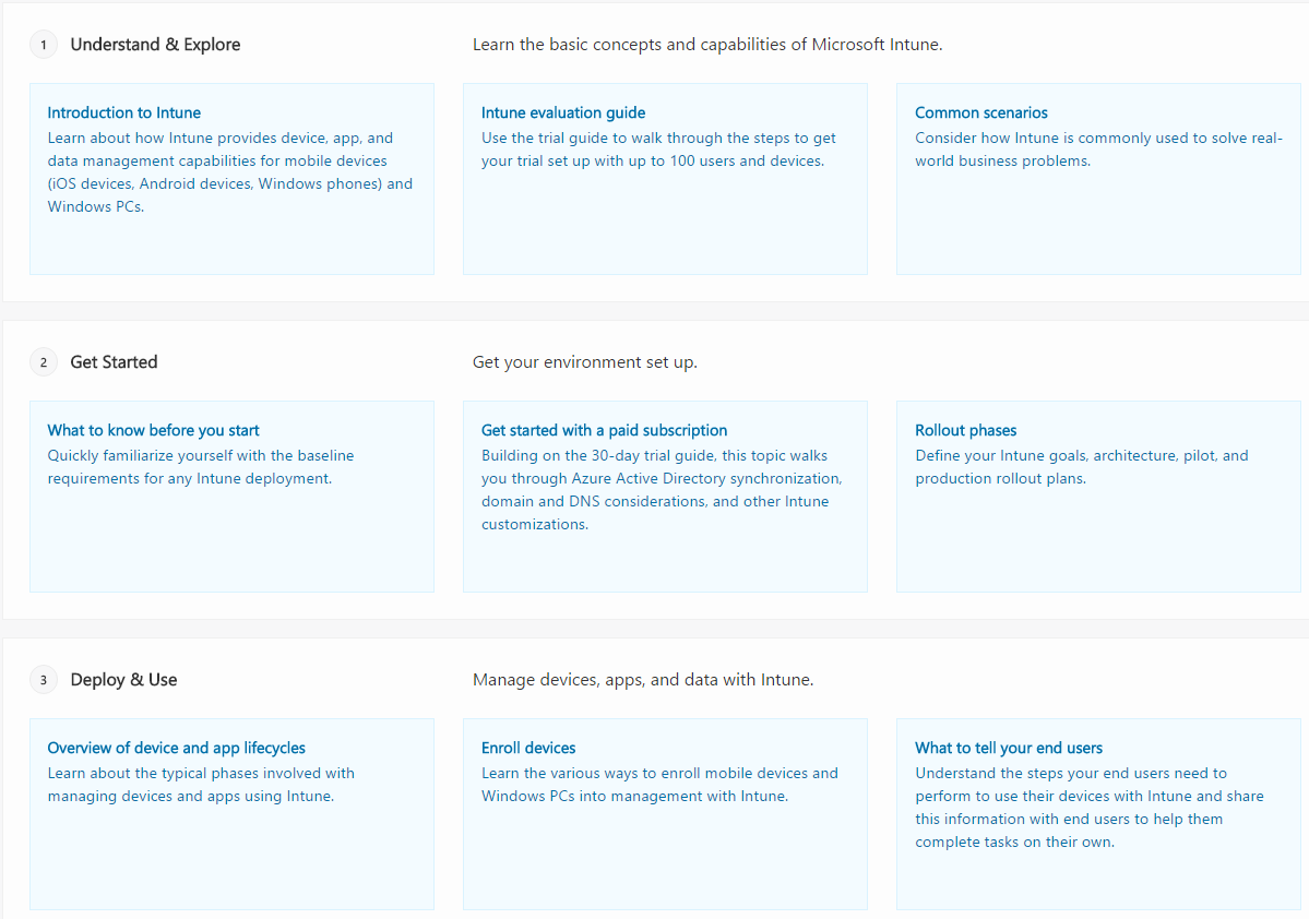
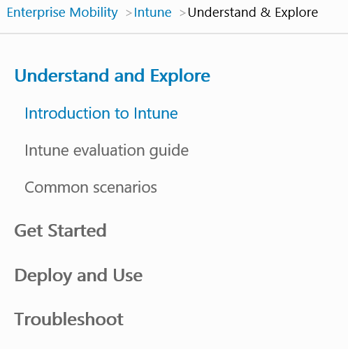
One key area of investment based on customer interviews and UserVoice feedback was improvements in site navigation, information architecture and content organization based on the customer's intent. We refactored our content into logical groupings around evaluating, getting started, planning, deploying, managing, or troubleshooting products or services. You can see this content broken down in both the left navigation and our product/service pages.
Below is a screenshot of the Intune documentation home page:
This same categorization is on the left navigation of articles as well:
Shortened Article Length
Another common piece of feedback was that our content at times can be overwhelming because of its length and that long articles are more difficult to navigate and find what you're looking for. To address this, we've broken down many longer articles into smaller logical steps and provided Previous and Next buttons at the bottom of articles to navigate between steps in a multi-part tutorial as shown below.

While many customers like the ability to have multi-part tutorials, we also heard from customers who want the ability to combine multi-step tutorials into a single, offline printer-friendly PDF. We don't have this yet, but it will be coming soon to the preview.
Responsive Design
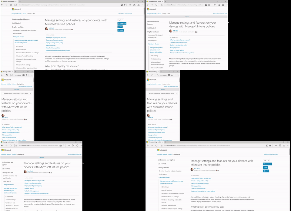
To build a great experience on mobile devices, tablets, and PCs like you asked for on UserVoice, we switched to a responsive layout. Clicking the Options button will expand/collapse to show the same options on a desktop view.
Community Contributions
All documentation on docs.microsoft.com is open sourced and designed to allow community contributions. This follows in the footsteps of other teams at Microsoft that have already open sourced all or parts of their documentation including ASP.NET, Azure, .NET Core, and Microsoft Graph.
Every article has an Edit button (shown below) that takes you to the source Markdown file in GitHub where you can easily submit a pull request to fix or improve content.
Feedback Mechanisms
Your questions, comments, and feedback are important to us. We've partnered with [Livefyre](https://web.livefyre.com/) to provide comments and Sidenotes on all of our articles. At the top of every article you'll see a link for comments as shown below.
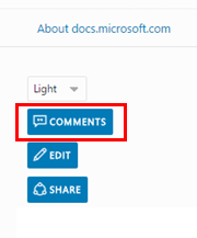
Clicking comments will take you to the bottom of the page where you can login (using Twitter, Facebook, Google, Yahoo, or Microsoft credentials) to add, follow, or like comments.
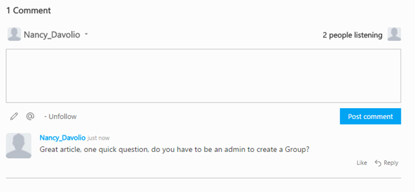
You can also add Sidenotes or notes on each paragraph of content or specifically highlighted text. To do that, with the mouse cursor on the comment symbol on the right, click it to add an inline comment.


Social Sharing
The sharing button at the top of the page lets you easily share with Twitter and Facebook.
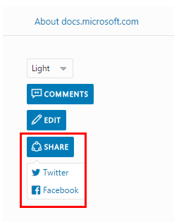
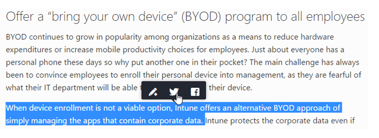
You can also use your mouse cursor to select content on an article to add a comment or share on Twitter or Facebook directly from the context menu as shown below.
Friendly URLs
We care about our web experience and one thing that regularly bugged us as users of TechNet and MSDN is that articles didn't have friendly, readable URLs. Here's an example of the same article with our new URLs.
Before:
<https://technet.microsoft.com/library/dn646983.aspx>After:
<https://learn.microsoft.com/intune/get-started/start-with-a-paid-subscription-to-microsoft-intune>
Website theming
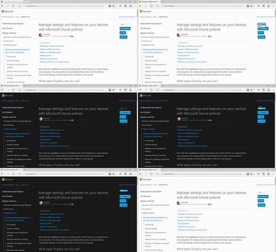
We also added a theme picker to articles so that you can change between a light and dark theme, something that some of you have asked for on UserVoice.
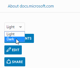
The image below shows the difference between the light and the dark theme.
Fundamentals
Fundamentals like site performance are a key feature and something many customers have asked us to improve on UserVoice. Page load time on docs.microsoft.com are between 50-300% faster in terms of load time and we are better geo-distributed than ever before. We've also built on an architecture that is running 100% on Azure.
We want your feedback!
We hope you enjoy the preview version of docs.microsoft.com and please send us your feedback to https://aka.ms/sitefeedback. In future posts we'll discuss our plans to dramatically improve the experience for reference content and our plans for content localization.