Exercise - Perform Linear Regression with Numpy
Scatter plots offer a handy means for visualizing data, but suppose you wanted to overlay the scatter plot with a trend line showing how the data is trending over time. One way to compute such trend lines is linear regression. In this exercise, you will use NumPy to perform a linear regression and Matplotlib to draw a trend line from the data.
Place the cursor in the empty cell at the bottom of the notebook. Change the cell type to Markdown and enter "Perform linear regression" as the text.
Add a Code cell and paste in the following code. Take a moment to read the comments (the lines that begin with # signs) to understand what the code is doing.
# Creates a linear regression from the data points
m,b = np.polyfit(yearsBase, meanBase, 1)

# This is a simple y = mx + b line function
def f(x):
    return m*x + b

# This generates the same scatter plot as before, but adds a line plot using the function above
plt.scatter(yearsBase, meanBase)
plt.plot(yearsBase, f(yearsBase))
plt.title('scatter plot of mean temp difference vs year')
plt.xlabel('years', fontsize=12)
plt.ylabel('mean temp difference', fontsize=12)
plt.show()

# Prints text to the screen showing the computed values of m and b
print(' y = {0} * x + {1}'.format(m, b))
plt.show()
Now run the cell to display a scatter plot with a regression line.
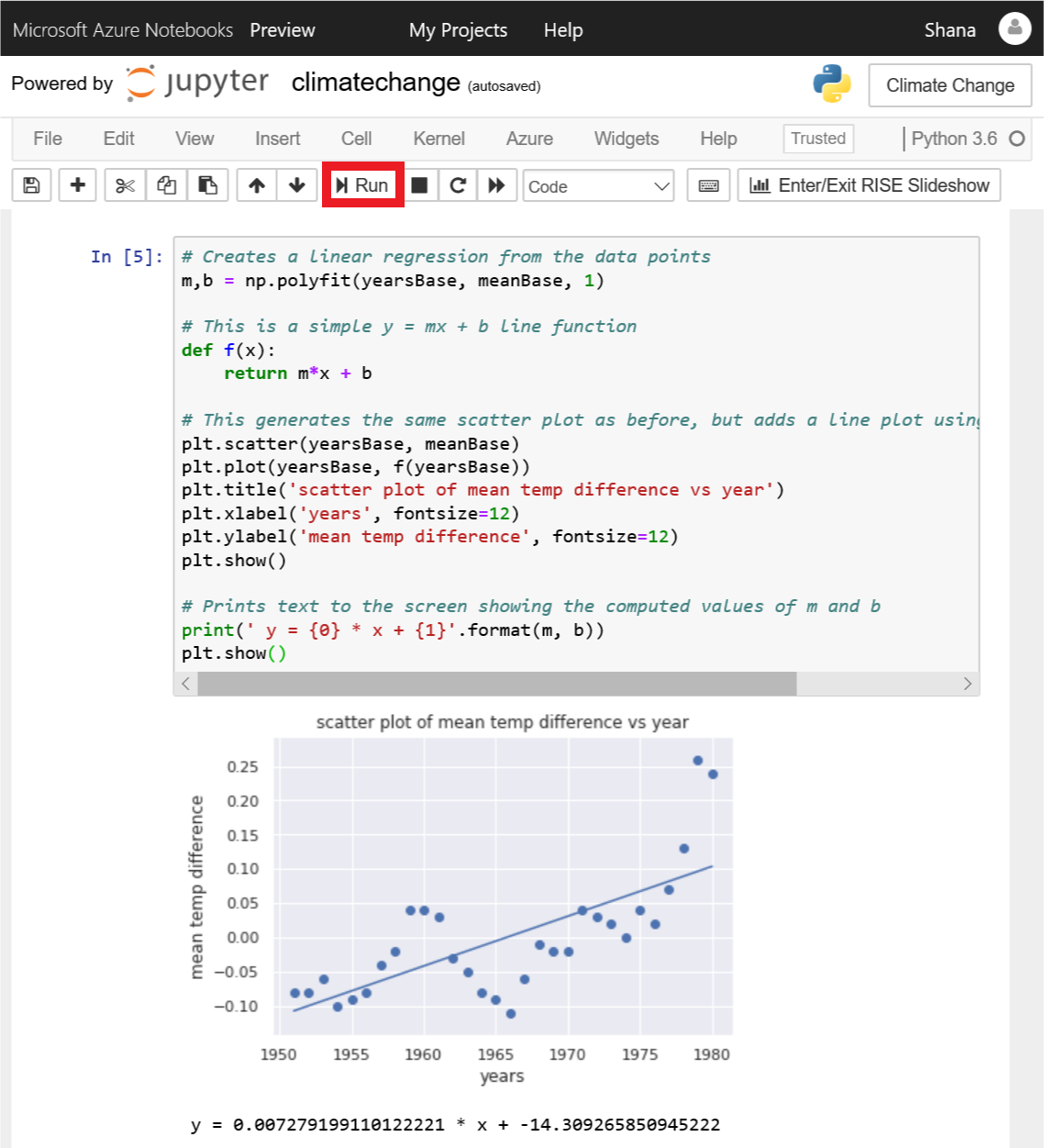
Scatter plot with regression line
From the regression line, you can see that the difference between 30-year mean temperatures and 5-year mean temperatures is increasing over time. Most of the computational work required to generate the regression line was done by NumPy's polyfit function, which computed the values of m and b in the equation y = mx + b.