Out-of-box tools
Tools like the out-of-box reports, Microsoft Excel PivotTables, and workbooks do a great job of aggregating and providing a perspective on data. But most users don't need that level of data analysis. They're just looking for a way to quickly navigate and see the high-level data that's important to them. For example, they might want to see their top open opportunities, the current day's activities, or their sales pipeline. Microsoft Dynamics 365 has two commonly used features that meet the needs of these users:
- Charts: Charts provide visual insights into an organization's or user's most important data and information. Each table has several predefined charts that can be used to quickly consume big picture data.
- Dashboards: Dashboards let users see, at a glance, the most important information that they need to make business decisions. Dashboards can consist of charts, lists, and other resources, like external webpages. Dynamics 365 includes several preconfigured dashboards that help shed light on the most important information. These preconfigured dashboards can be changed, and custom dashboards can be created.
Besides being easy to use, charts and dashboards show data in real time. As leads are created, opportunities are opened and closed, orders are updated, and so on, the charts and dashboards immediately reflect the changes. Additionally, users see only the records that they have permission to view in the context of the user who is accessing them.
Work with charts
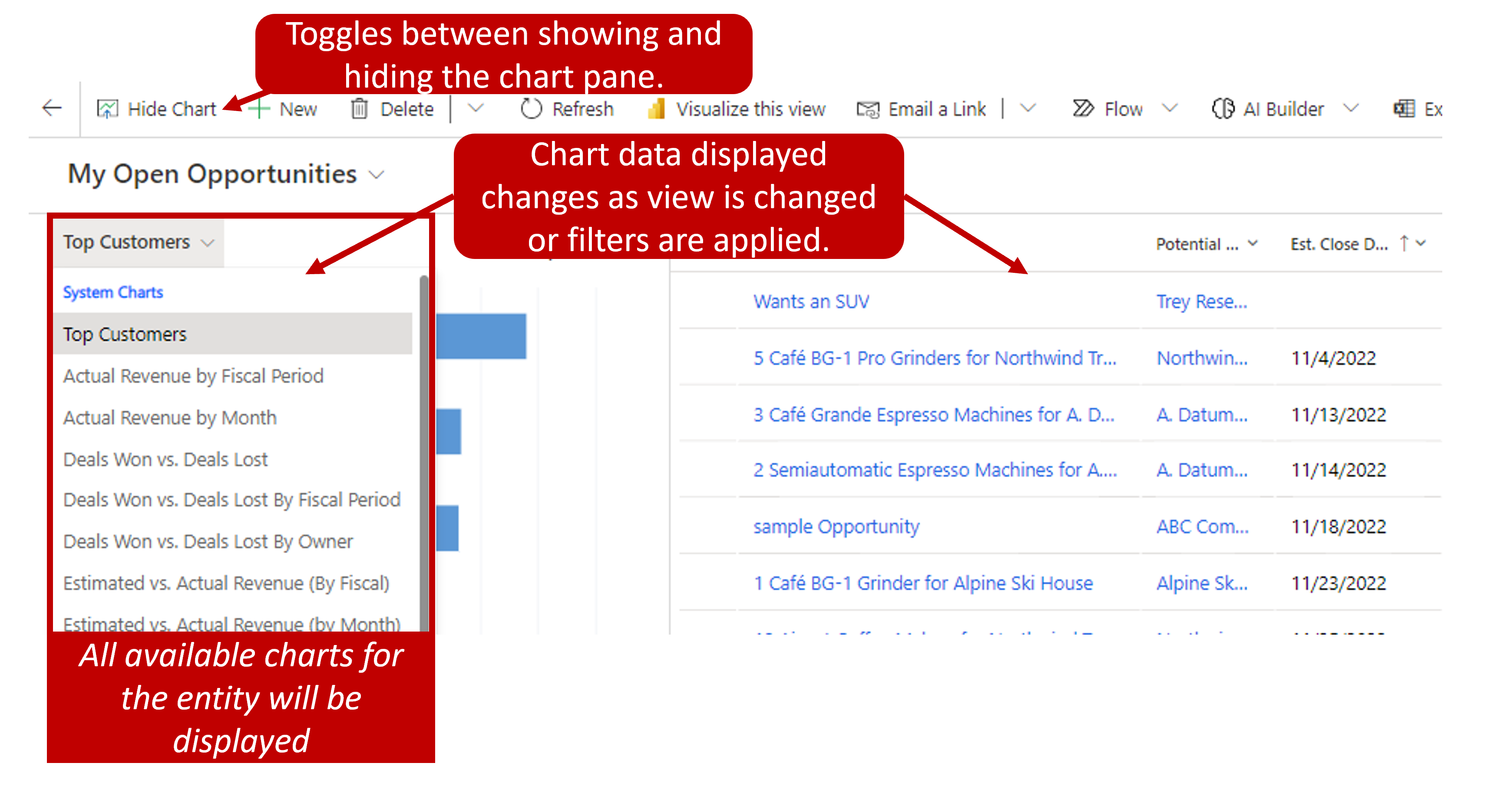
Most out-of-box tables, like accounts, leads, and opportunities, have multiple charts predefined for them. You can open those charts from any view that's associated with the tables. Just select the Show Chart button on the command bar. After the chart pane appears, you can switch to any chart that's defined for the table by selecting the down arrow next to the chart name.
As you filter the data in the view or change the view that you're using, the chart in the chart pane is updated so that it reflects only the data that's currently shown. For example, if you filter a view so that it shows only hot opportunities, only hot opportunities are included in the chart that's shown.
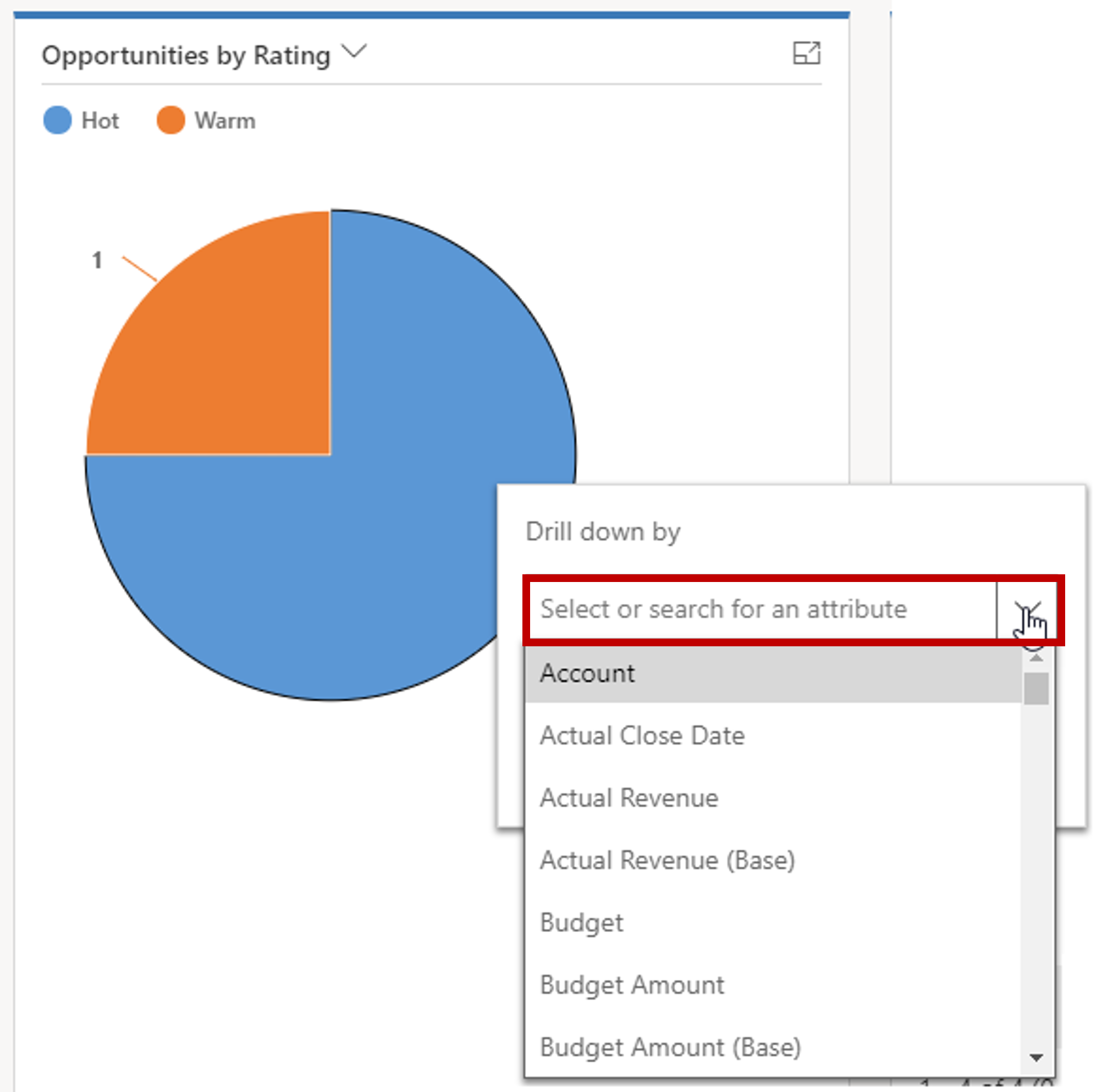
If you want to look at only a specific set of data, like the data that's presented in a bar chart, you can drill down to view more detail. To drill down into the data, select a chart element. You can then make data selections. As you drill down through the chart, you're asked specific questions about the data that you're drilling into.
After you've finished working with charts, you can close the chart pane by selecting the Hide Chart button on the command bar.
Work with dashboards
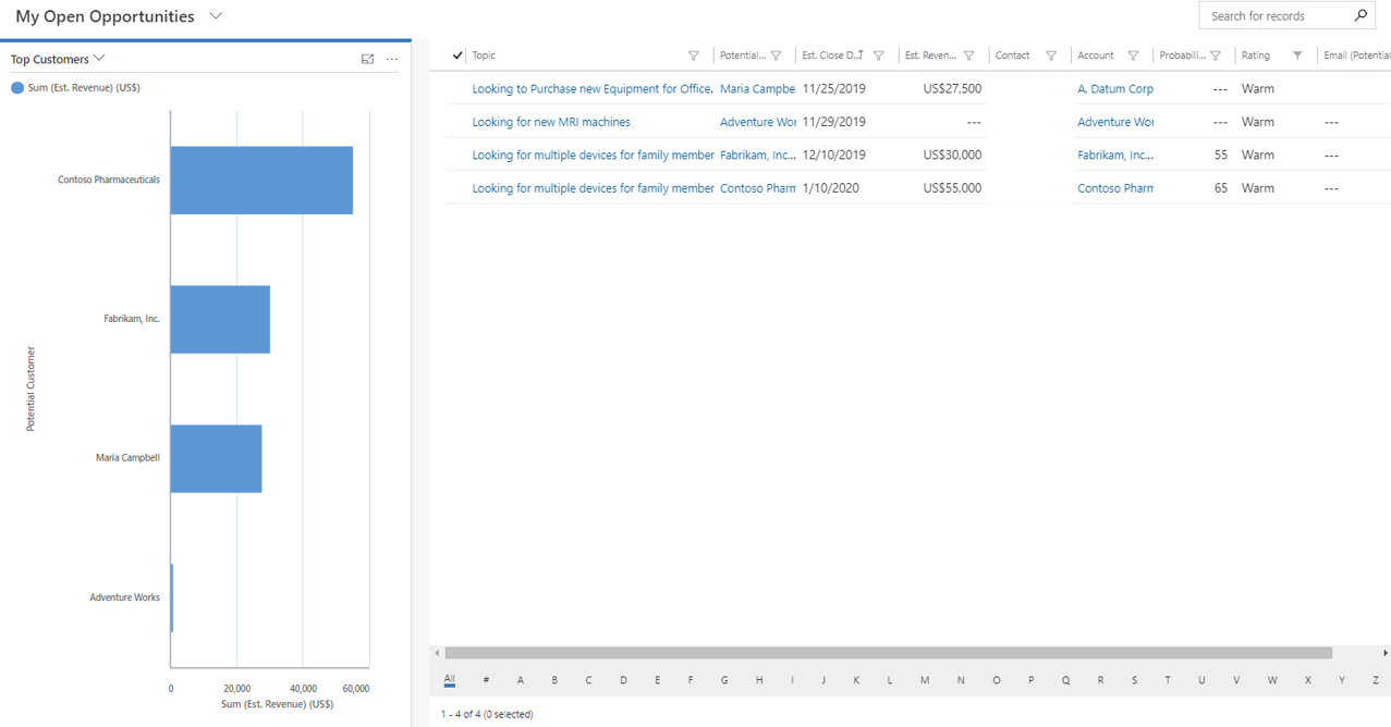
Dashboards are a collection of views, charts, IFrames, web resources, and other graphical reports that provide a high-level overview of data from one location. Therefore, you can analyze different sales data at the same time. Essentially, a dashboard is a snapshot of the data in different formats on one page. Not only is the data shown in a central location, but it can be interacted with directly from the dashboard itself. For example, sales staff can view their sales pipeline chart and see how many opportunities have been closed. At the same time, the Relationship Assistant can prompt them to take action on opportunities, appointments, and tasks that are related to their customers.
The following image shows an example of a dashboard.
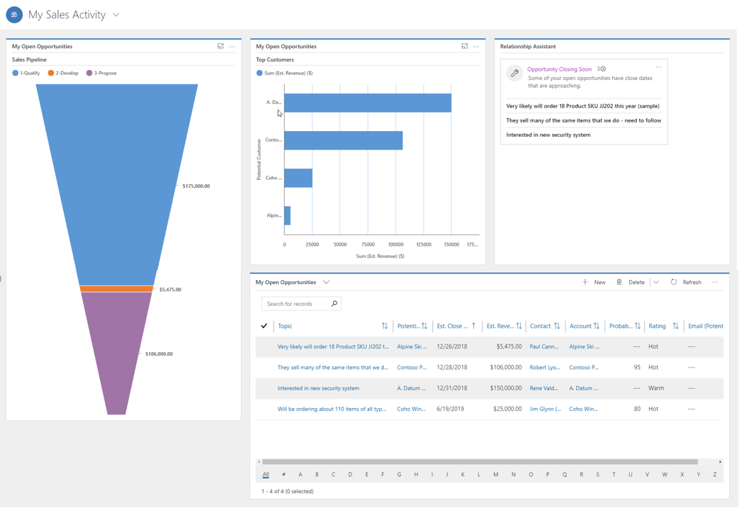
Each item that's presented on a dashboard is called a component. Each dashboard can include a maximum of six components, unless you're using interactive dashboards, or unless you've increased the default limit through advanced customizations by using Microsoft Windows PowerShell.
Dashboards aren't automatically refreshed, but they show the most current data every time you load the page. If you leave a dashboard to make changes to a record, the dashboard will reflect those changes the next time it's loaded.
Microsoft Dynamics 365 Sales includes several out-of-box dashboards that let users measure their productivity and see how they compare to the other users in their organization. These out-of-box dashboards are called system dashboards, and they all users of an organization can view them. Here's a list of the system dashboards:
- Sales Dashboard
- Sales Activity Dashboard
- Sales Activity Social Dashboard
You can expand components or drill down into the records that are used to generate the charts by selecting the appropriate button.
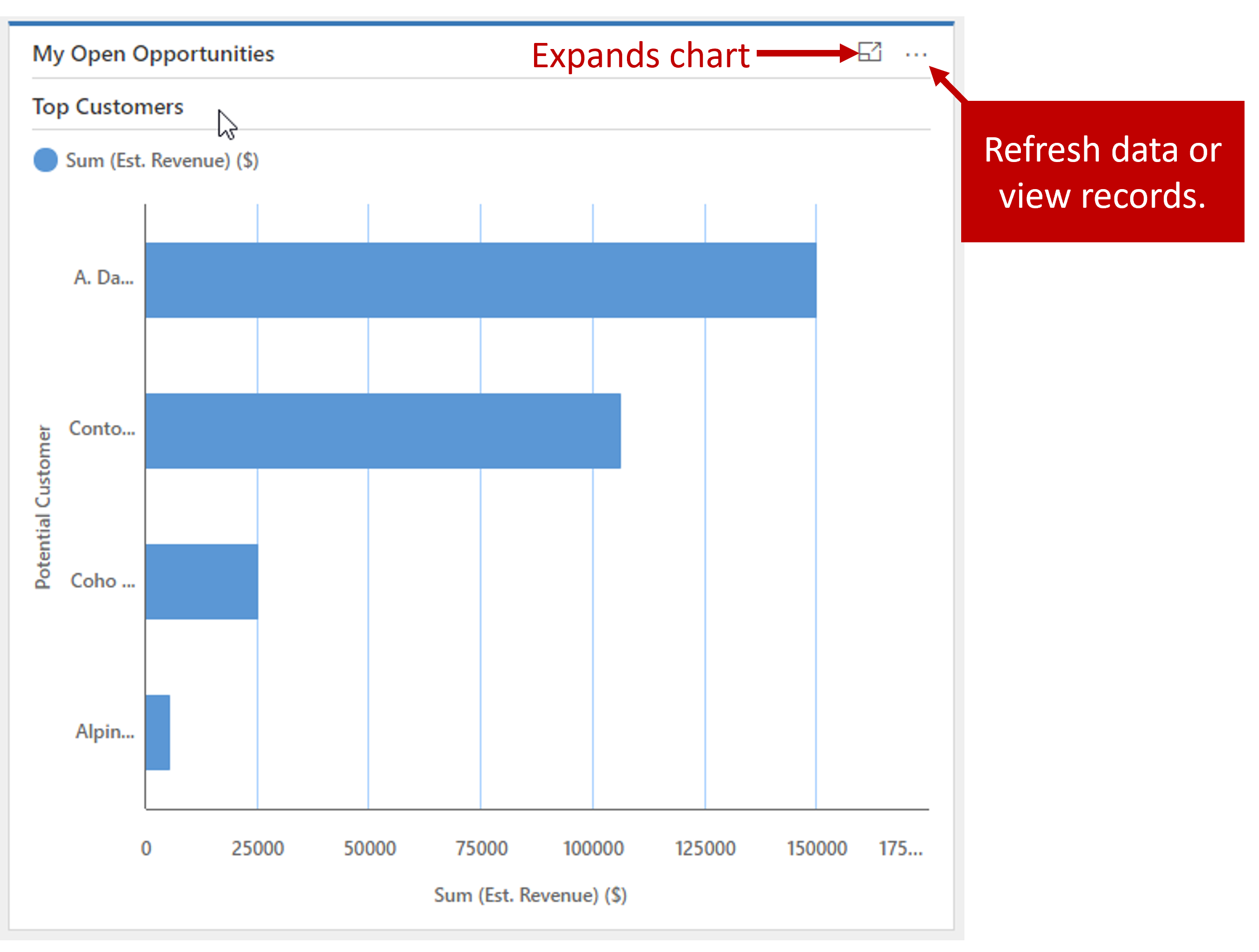
If you select the View the records that are used to generate the chart button, a window is opened that shows the chart and a list of the records that it's associated with. You can select one of the chart elements to view just the records that are associated with that area. After you've finished reviewing the data, you can close the window to return to the original dashboard.
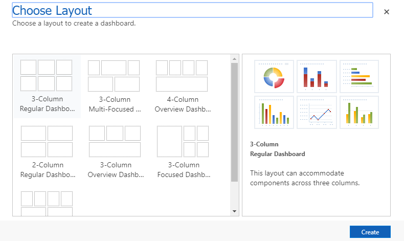
If you want dashboards that have specific items that are relevant to you, you can create more dashboards. Dashboards that are created by individual users are referred to as personal dashboards. By default, personal dashboards are visible only to the users who created them, but they can be shared with other users as needed. To create a personal dashboard, select the Dynamics 365 Dashboard button on the command bar. The first step is to select a layout for the dashboard.
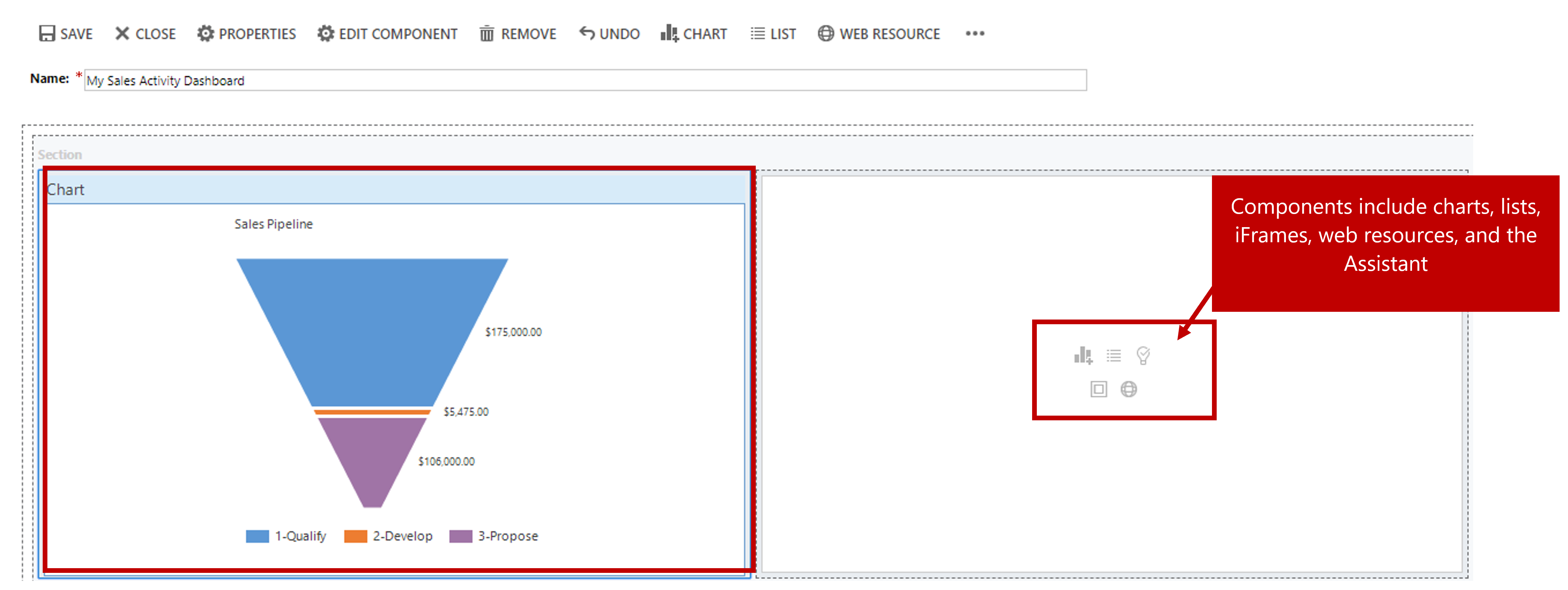
In the dashboard designer, you can add components based on your specific needs. Each component placeholder includes a set of buttons that correspond to the different types of components that can be set up. As you add components to the dashboard, you can size, move, or delete them as needed.
Here are some of the types of components that can be added to a dashboard:
Chart: This component shows a Dynamics 365 chart. If you add a chart to a dashboard, you must define the following properties:
- The table to use
- The view that defines the data that's shown in the chart
- The specific chart to show
List: This component shows a specific Dynamics 365 view. If you add a list to a dashboard, you must define the following properties:
- The table to use
- The specific view to show
IFrame: This component shows information for a webpage.
Web resource: This component shows information for a web resource that has been added.
Assistant: This component shows the Assistant.
After the dashboard looks the way you want, you can save and close it. The next time you select the Dashboards option in the site map, the dashboard that you created will be available in the list of dashboards. Personal dashboards always appear at the bottom of the list, under My dashboards.
Creating personal charts and dashboards
Watch the video to see how to create personal charts and dashboards.