Create a Razor class library
In this exercise, you create a modal dialog in a Razor class library that you can reuse in the default Blazor template application.
Create the Razor class library project
This module uses the .NET 8.0 SDK. Ensure that you have .NET 8.0 installed by running the following command in your preferred command terminal:
dotnet --list-sdks
Output similar to the following example appears:
6.0.317 [C:\Program Files\dotnet\sdk]
7.0.401 [C:\Program Files\dotnet\sdk]
8.0.100 [C:\Program Files\dotnet\sdk]
Ensure that a version that starts with 8 is listed. If none is listed or the command isn't found, install the most recent .NET 8.0 SDK.
To begin, create the Razor class library project for a modal dialog component. You can use Visual Studio to create a new project, or you can create the project in a new folder with the .NET command-line tool, as shown here:
dotnet new razorclasslib -o FirstClassLibrary -f net8.0
Build the modal dialog component
Next, build the modal component in your project with an appropriate CSS file to go with it, and provide an initial format.
Rename the Component1.razor file to Modal.razor and the
Component1.razor.cssfile to Modal.razor.css. The Modal.razor file contains the component you'll create, and in the future you can add blank text files to your project and format them with content for Razor or CSS appropriately.Add the following Razor content to the Modal.razor file:
@if (Show) {

 <div class="dialog-container">
  <div class="dialog">
   <div class="dialog-title">
    <h2>@Title</h2>
   </div>

   <div class="dialog-body">
    @ChildContent
   </div>

   <div class="dialog-buttons">
    <button class="btn btn-secondary mr-auto" @onclick="OnCancel">@CancelText</button>
    <button class="btn btn-success ml-auto" @onclick="OnConfirm">@ConfirmText</button>
   </div>

  </div>
 </div>

}

@code {

 [Parameter]
 public string Title { get; set; }

 [Parameter]
 public string CancelText { get; set; } = "Cancel";

 [Parameter]
 public string ConfirmText { get; set; } = "Ok";

 [Parameter]
 public RenderFragment ChildContent { get; set; }

 [Parameter]
 public bool Show { get; set; }


 [Parameter] public EventCallback OnCancel { get; set; }
 [Parameter] public EventCallback OnConfirm { get; set; }

}
This component has several nice features that you can share between your projects:
- A title.
- Cancel and Confirm buttons, with labels you can configure and click events you can manage.
- You can set the inner content of the component through the
ChildContentparameter. - You can control the display state of the dialog with the
Showparameter.
To provide default formatting for the component, add the following CSS to the Modal.razor.css file:
.dialog-container {
 position: absolute;
 top: 0;
 bottom: 0;
 left: 0;
 right: 0;
 background-color: rgba(0,0,0,0.5);
 z-index: 2000;
 display: flex;
 animation: dialog-container-entry 0.2s;
}

@keyframes dialog-container-entry {
 0% {
   opacity: 0;
 }

 100% {
   opacity: 1;
 }
}

.dialog {
 background-color: white;
 box-shadow: 0 0 12px rgba(0,0,0,0.6);
 display: flex;
 flex-direction: column;
 z-index: 2000;
 align-self: center;
 margin: auto;
 width: 700px;
 max-height: calc(100% - 3rem);
 animation: dialog-entry 0.4s;
 animation-timing-function: cubic-bezier(0.075, 0.820, 0.165, 1.000);
}

@keyframes dialog-entry {
 0% {
   transform: translateY(30px) scale(0.95);
 }

 100% {
   transform: translateX(0px) scale(1.0);
 }
}

.dialog-title {
 background-color: #444;
 color: #fff2cc;
 padding: 1.3rem 0.5rem;
}

 .dialog-title h2 {
   color: white;
   font-size: 1.4rem;
   margin: 0;
   font-family: Arial, Helvetica, sans-serif;
   line-height: 1.3rem;
 }

.dialog-body {
 flex-grow: 1;
 padding: 0.5rem 3rem 1rem 0.5rem;
}

.dialog-buttons {
 height: 4rem;
 flex-shrink: 0;
 display: flex;
 align-items: center;
 background-color: #eee;
 padding: 0 1rem;
}
This Markup gives some default coloring to a title bar and button bar at the bottom, making it more interesting than a simple set of gray-colored HTML elements.
Reference and use the modal component
With the modal component now residing in the FirstClassLibrary project, add a new Blazor server application and start using the modal component.
Create a new Blazor server project called MyBlazorApp in a folder next to the FirstClassLibrary project either by using the Visual Studio Add New Project feature or by running the following command:
dotnet new blazor -o MyBlazorApp -f net8.0Add a reference to the FirstClassLibrary project in the MyBlazorApp project, either by using the Visual Studio Add Reference feature or by running the following command from the MyBlazorApp folder:
dotnet add reference ../FirstClassLibrary
With this project reference in place, the MyBlazorApp application can interact with the components in the FirstClassLibrary project.
Make it easier to reference the modal component by adding an entry to the end of the _Imports.razor file in the Components folder of the MyBlazorApp application. By doing so, you can reference the modal component without having to specify the entire namespace for the component.
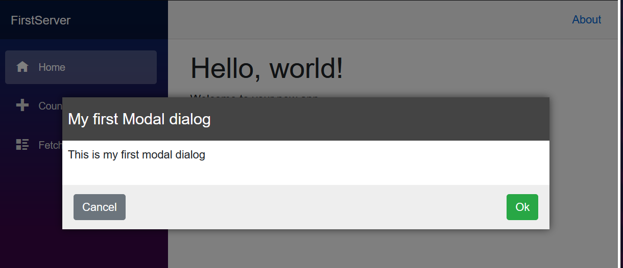
@using FirstClassLibraryAdd a modal component to the opening page of this application, the Components/Pages/Home.razor file
<Modal Title="My first Modal dialog" Show="true">
 <p>
   This is my first modal dialog
 </p>
</Modal>
a. Give the component a title, "My first Modal dialog."
b. Add a short paragraph to be displayed inside the dialog. This content describes the purpose of the dialog.
c. Set the dialog to be visible by using theShowparameter.
Check your work
Start the MyBlazorApp application with dotnet run and navigate to it in your browser. The My first Modal dialog dialog should be displayed in front of the rest of the content on the screen.