Exercise - Create a Power BI report
To complete the end-to-end solution for spotting polar bears in the wild, first, you'll connect Power BI to the SQL Database you created in the last unit. Then, you'll build a report that shows in near real time where your cameras are spotting polar bears. You'll use Power BI Desktop to create a customizable report.
Power BI Desktop runs only on Windows. If you aren't running Windows, an alternative is to create a Windows virtual machine in Azure and run Power BI Desktop in the virtual machine.
Connect Power BI to the SQL Database
You used Azure AI Custom Vision to train an image classification model to differentiate between various types of Arctic wildlife. You modified the function app you wrote to write the results to a SQL database. The first step in using Power BI to explore and visualize this data is to connect Power BI to the SQL Database.
In this exercise, you connect Power BI Desktop to the SQL Database.
If Power BI Desktop isn't already installed on your computer, install it.
Open Power BI Desktop. If you're asked to sign in, sign in with your work or school account.
Note
There are two types of Microsoft accounts: personal Microsoft accounts and work or school accounts. You can sign in to Power BI with a work or school account, but not with a personal account. A Microsoft 365 subscription uses your work or school account. But, you can have a work or school account without having a Microsoft 365 subscription. Learn about the differences between Microsoft work and personal accounts.
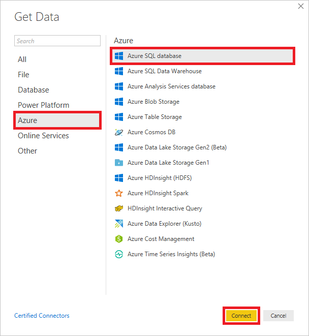
On the ribbon, select Get Data. In the left menu, select Azure, and then select Azure SQL database. Select Connect.
Add a data source
Enter the server's host name (the server name you specified in the preceding unit, with .database.windows.net added to the end of the server name) and the database name. Select DirectQuery, and then select Advanced options.
In SQL Server database, copy and then paste in the following code to select the 20 most recently added rows in the
dbo.PolarBearstable. Power BI uses this query to pull information from the database. Select OK.SELECT TOP 20 Id, CameraId, Latitude, Longitude, Url, Timestamp, FORMAT(Timestamp,'MM/dd/yyyy h:mm:ss tt') AS TimestampLabel, IsPolarBear FROM dbo.PolarBears ORDER BY Timestamp DESC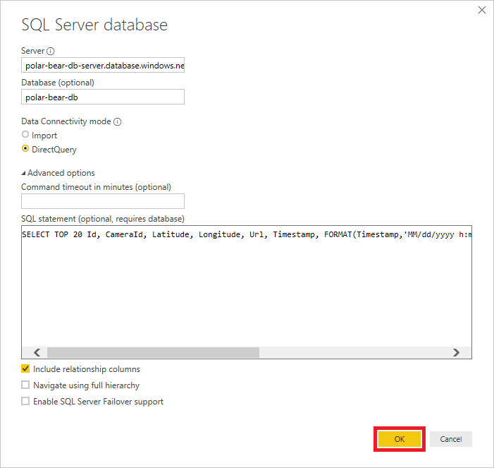
Connect to the database
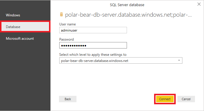
Select the Database tab. In SQL Server database:
- Enter the user name and password you specified when you created the database server.
- Select the database server from the dropdown list.
- Select Connect, and then select Load.
Enter the admin credentials
After a short delay, Power BI connects to the database and retrieves a dataset by using the query you provided. The next step is to add visuals to bring that dataset to life.
Build a report in Power BI Desktop
Visualizations (visuals) are the primary element in a Power BI report. In this exercise, you'll use the Power BI report designer to create visuals from the database you connected to, adjust filters and aggregates to refine the way the data is reported, and then format the visuals to produce compelling output.
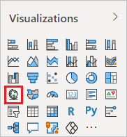
In Visualizations, select Map to add a map visual to the report.
Add a map visual
In Fields, select IsPolarBear, Latitude, and Longitude to include these fields in the map visual.
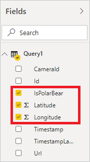
Add fields to the map visual
In Visualizations, next to Average of Latitude, select the down arrow, and then select Don't summarize. Do the same for Average of Longitude.
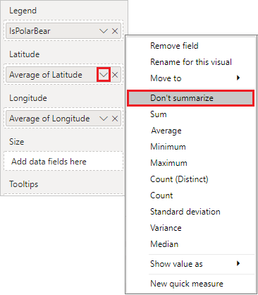
Remove summary calculations
Select the empty area outside the map to deselect the map.
In Fields, select CameraId, IsPolarBear, and TimestampLabel to add a table visual that contains those columns to the report.
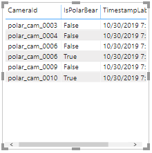
Add a table visual
Select an empty area to deselect the table visual.
In Visualizations, select Pie Chart to convert the table into a pie chart. Then, in Fields, select IsPolarBear and Latitude to add another table visual.
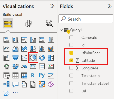
Add a pie chart visual
In Visualizations, under Values, next to Average of Latitude, select the down arrow, and select Count. This setting configures the pie chart to show a count of sightings and the proportion of sightings in which polar bears were detected.
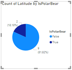
Refine the pie chart visual
Clear the pie chart visual and select Slicer to add a slicer to the report. Slicers are a convenient way to filter information in a Power BI report by narrowing the data that's shown in other visuals.
Add a slicer
In Fields, select IsPolarBear so that the slicer shows checkboxes labeled True and False.
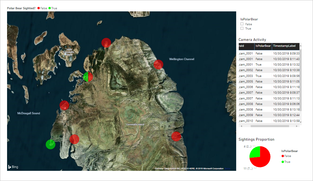
Resize and reposition the visuals to achieve a layout similar to this example:
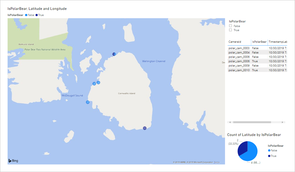
Adjust the layout
With the report structure in place, the next task is to use some of the rich formatting options in Power BI to enhance the visuals. Start by selecting the map visual in the report designer. Then, in Visualizations, select Format Visual.
Format the map visual
In Visualizations, use the formatting controls to make the following changes to the map visual:
- Legend: Set Legend Title to Polar Bear Sighted?
- Data colors: Set the color for True to 00FF00 (pure green) and set the color for False to FF0000 (pure red).
- Bubbles: Set the bubble size to 30%.
- Map styles: Set the theme to Aerial.
- Title: Select Off.
Confirm that the resulting map looks something like this example:
Formatted map visual
Select the pie chart visual and use the formatting controls in Visualizations to make the following changes:
- Slices: Set True to 00FF00, and set False to FF0000.
- Detail labels: Set the label style to Data value, percent of total.
- Title: Change the title text to Sightings Proportion.
Select the table visual and use the formatting controls in Visualizations to make the following changes:
- Style: Change the table style to Alternating rows.
- Title: Select On. Change the title text to Camera Activity.
Select the slicer visual and use the formatting controls in Visualizations to make the following changes.
- Under Selection controls, select Off. With this setting, you don't have to use the Ctrl key to select more than one checkbox.
In the bottom-left corner of the designer, double-click Page 1, and change the report title to Polar Bear Activity.
Select File > Save to save the report.
Change and enhance the report as you like. When you're satisfied with the report layout and content, it's time to put it to work using a live data source.
Run the end-to-end solution
Now that the report is prepared in Power BI, your final task is to run the end-to-end solution and check for polar bears!
In the Azure portal, open your SQL Database. Use the query editor to run the following query and delete all rows from the
dbo.PolarBearstable:DELETE FROM dbo.PolarBearsIn a Command Prompt or terminal window, return to the project directory, and run run.js:
node run.jsReturn to Power BI Desktop. In the ribbon, select Refresh. Select it again every 15 seconds or so. The report refreshes automatically every few minutes, but you can refresh it manually as often as you like to update the visuals.
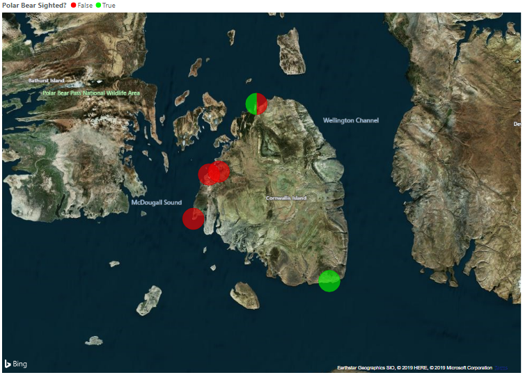
Confirm that red and green bubbles appear at various locations around the island. Green bubbles indicate the presence of polar bears. Red bubbles represent locations where photos were taken but no polar bears were detected. Locations that have a mixture of sightings show red and green, as shown in the following screenshot:
There be polar bears!
If you want to show only locations where polar bears were detected, in the slicer visual, select True. What happens in the map?
Continue running the report for a few minutes. Refresh the report once or twice a minute. Confirm that there are polar bears active on the island!
When you're satisfied that the solution is working as intended, return to the Command Prompt or terminal window, and select Ctrl+C to stop the cameras.
You now have a report that shows, in near real time, polar bear activity on the island. If you have a Power BI Pro or Power BI Premium account, you can share the report with other Power BI users so that they, too, can monitor polar bear activity. For more information about sharing your work, see Share Power BI dashboards and reports. You also can view reports in the Power BI Mobile apps, so you can keep track of polar bears on your Windows, Android, or iOS device—even on an Apple watch!