Design the user interface (UI)
The functionality of the front-end app is complete but it isn't engaging visually. Let's fix that.
Design systems for front-end apps
A design system is a collection of reusable components, guided by clear standards that can be assembled together to build any number of applications. Design systems are used to create consistent, high-quality user experiences.
A design system specifies the look and feel of an application, and the way that users interact with it. They also provide a common language for designers and developers to communicate with each other.
Design systems are made up of many parts, some of which are:
- Design Principles: Ideas that guide the design of the site.
- Brand Values: Ideas that guide the overall design to create specific emotions for users.
- Brand Style Guide: Rules and guidelines for using the brand's visual identity.
- Content Guidelines: Rules and guidelines for writing content for the site.
- Accessibility Guidelines: Rules and guidelines for making the site accessible to all users.
- Component Library: A collection of reusable components for building applications.
- Pattern Library: A collection of components organized in specific ways such as the navigation bars, footer, and forms.
- Icon Library: A collection of icons for use in the site.
- Design Tokens: Names that represent hard-coded values for visual elements like spacing, color, and typography.
Common front-end design systems
There are many front-end design systems available. Here are some of the most popular:
Select a design system
When selecting a design system, consider the following:
- Features: What features does the design system provide? Does it provide the features you need?
- Customization: How customizable is the design system? Can you change the look and feel of the site?
- Accessibility: How accessible is the design system? Does it provide accessibility features?
- Community: How large is the community around the design system? How active is the community?
- Support: How much support is available for the design system? Is there a support team? Is there a paid support option?
- Cost: How much does the design system cost? Is it free? Is it a one-time cost? Is it a subscription?
Technical considerations include:
- Framework: What framework does the design system support? Does it support the framework you're using?
- Modular: How modular is the design system? Can you use only the features you need? Can it be optimized for treeshaking (including only used components in generated artifacts) so you don't import unnecessary code?
- Browser Support: What browsers does the design system support? Does it support the browsers you need to support?
- Performance: How does the design system affect the performance of the site?
- Size: Does the system add a lot of size to the downloads required for the site?
- Dependencies: What dependencies does the design system have? Does it have dependencies that you don't want to use?
Using a design system
A design system is specified in the application as a combination of features, which interact together to create the look and feel of the site. Once you select your design system, add the required npm packages. Many design systems have a default style, so you can add the packages and see the changes immediately. You can change the style by selecting different preconfigured styles or providing your own.
Common features includes:
- Default or Theme styles including color maps, font selections with color, weight, and spacing.
- Prebuilt and composable components.
CSS Styles
Design systems rely on styling to control the look and feel of the site. Cascading Style Sheet (CSS) is the most common styling syntax language to describe the style of an HTML document and how the document's elements should be displayed.
A style is defined with CSS syntax. It can appear in a *.css file, be transpiled into a *.css file (such as with SASS), or be defined in a JavaScript file *.jsx.
| CSS style syntax | Location |
|---|---|
max-height: 100px; |
CSS file |
max-height: 100px; |
JavaScript file inline |
maxHeight: '100px' |
JavaScript file styled-components |
| JSX style syntax | Origin |
|---|---|
<button class='primary'> |
Design system as style |
<Button> or <Button primary> or <PrimaryButton> |
Design system as component |
Modern CSS includes preprocessors and postprocessors to make CSS easier to write and maintain.
- Preprocessors add syntax and tools to make CSS more efficient and concise, powerful, and dynamic. They include SASS, LESS, and Stylus.
- Postprocessors apply automation and repetition to optimize the final css output. They include Autoprefixer, PostCSS, and CSSNano.
Using CSS in JavaScript
Historically CSS (.css) and JavaScript (.js) were separated. CSS was applied to HTML and JavaScript operated on the HTML using a name or ID or other query selector. Modern changes to front-end development moved CSS closer with new front-end frameworks, or even into the same file (.jsx). This change comes with pros and cons to consider for your own team and projects.
Pros of CSS in JavaScript:
- Management and maintainability: When the visual elements and code are in the same place, it's great for teams that collaborate closely on design and development. It keeps things organized.
- Theme and Style consistency: Storing design elements within the source code and framework helps maintain a consistent look and feel throughout the project.
- Dynamic styling: Putting design aspects in the code means that the design can adapt based on the code's output. While this leads to more concise code, it might be a bit challenging for junior developers joining the team.
Cons of CSS in JavaScript:
- Onboarding and migration: It takes time to learn how to use CSS in JavaScript properly, not just for development but also for building the project. Sometimes, you might need additional tools that the design system doesn't provide yet.
- Delivery: When using CSS in JavaScript, the final compiled project is larger compared to serving CSS and JavaScript separately. To manage this, you need to understand how to optimize for tree-shaking during both the CSS-in-JavaScript process and website generation.
- Performance: Frameworks that enable CSS in JavaScript have to handle the Document Object Model (DOM) to apply, update, or remove styles. This can impact the speed at which the client's browser renders the content.
Component composability
A component is a reusable piece of code (HTML, JavaScript, and CSS) used to build elements sharing functionality and styling. Components can be used to build other components, and they can be used to build entire applications.
Design system components usually include the following categories, which allow you to compose your own reusable components or component families:
- Organization components used to layout components such as container, box, grid.
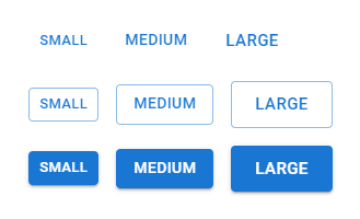
- Presentation components cover a wide range of elements, including buttons, text boxes, sliders, tables, alerts, cards, and more. They're crucial for creating a polished user interface.
Typography
Typography is all about the style and look of text. It includes things like font size, font weight, font color, and font family. There are three common types:
- Serif Fonts: These fonts have little lines or decorations at the ends of letters, like Times New Roman or Georgia.
- Sans-serif Fonts: These fonts are plain without those decorative lines, like Arial or Helvetica.
- Display Fonts: These fonts are fancier and are usually used for titles or headings, like Brush Script or Lobster.

Optimizing typography is important because it affects the size of downloads and the speed of your application. Two things to consider are:
- Flash of Invisible Text (FOIT): This is when text is hidden until the font is fully loaded, potentially delaying text display.
- Flash of Unstyled Text (FOUT): In this case, the browser initially shows text in a basic system font and then switches to the web font once it's ready.
Icons
Icons are small images used to convey information fast and clearly, often in navigation bars and buttons. Design system icons let you pick from a set of consistent icons that match the design style.
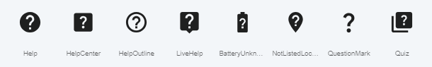
Apply a design system theme to your React app
Design systems provide either default themes meant to apply to the entire site. In React, this is typically in main.jsx or index.jsx. The following example uses Material UI to add a default theme to the app.
import React from 'react'
import ReactDOM from 'react-dom/client'

import { ThemeProvider, createTheme } from '@mui/material/styles';
import CssBaseline from '@mui/material/CssBaseline';
const theme = createTheme();

import Pizza from './Pizza'

ReactDOM.createRoot(document.getElementById('root')).render(
  <React.StrictMode>
    <ThemeProvider theme={theme}>
      <CssBaseline />
      <Pizza className="Pizza"/>
    </ThemeProvider>
  </React.StrictMode>,
)
Apply a design system component to your React app
Let's apply a design system component to an HTML button. Replace the button element with the design system Button.
Include the component in your component's page:
import Button from '@mui/material/Button';Replace HTML with the design system component:
/* remove this HTML element */
<button onClick={incrementCounter}>Increment</button>

/* replace with this Design System component */
<Button onClick={incrementCounter}>Increment</Button>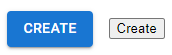
The Button, with default styling, is on the left and the button is on the right: