Exercise - Use a design system in your app
Use a design system to improve the appearance of your app.
Install Material UI
Right-click the PizzaClient subfolder and select Open in integrated terminal.
Run the following command to install the Material UI components:
npm install @mui/material @emotion/react @emotion/styled @mui/icons-material
Import Material UI
To import Material UI to your React app, replace the code in main.jsx with the following code:
import React from 'react'
import ReactDOM from 'react-dom/client'

import { ThemeProvider, createTheme } from '@mui/material/styles';
import CssBaseline from '@mui/material/CssBaseline';
const theme = createTheme();

import Pizza from './Pizza'

ReactDOM.createRoot(document.getElementById('root')).render(
  <React.StrictMode>
    <ThemeProvider theme={theme}>
      <CssBaseline />
      <Pizza className="Pizza"/>
    </ThemeProvider>
  </React.StrictMode>,
)
The code imports the ThemeProvider and createTheme components from Material UI and creates a default theme using the createTheme function. The ThemeProvider component is then used to wrap the Pizza component and apply the default theme to the app. Additionally, the CssBaseline component is imported and used to apply a baseline CSS to the app.
Pizza component
Because the pizza.jsx file controls state but doesn't apply styles or components to rendering the pizza list, you don't need to add anything to this page.
PizzaList component
Material UI provides a lot of functionality. For this unit, change the Pizza List to be more engaging with styles and icons. Open PizzaList.jsx and replace the code with the following code. Notice that only the return () section is changed.
import { useState, useEffect } from 'react';
import { TextField, Button, Box, List, ListItem, ListItemText, ListItemSecondaryAction, IconButton } from '@mui/material';
import { Delete, Edit } from '@mui/icons-material';

function PizzaList({ name, data, onCreate, onUpdate, onDelete, error }) {

  console.log(`PizzaList: ${JSON.stringify(data)}`);

  const [formData, setFormData] = useState({ id: '', name: '', description: '' });
  const [editingId, setEditingId] = useState(null);

  useEffect(() => {
    if (editingId === null) {
      setFormData({ id: '', name: '', description: '' });
    } else {
      const currentItem = data.find(item => item.id === editingId);
      setFormData(currentItem);
    }
  }, [editingId, data]);

  const handleFormChange = (event) => {

    console.log(`handleFormChange: ${event.target.name} ${event.target.value}`)

    const { name, value } = event.target;
    setFormData(prevData => ({
      ...prevData,
      [name]: value,
    }));
  };

  const handleSubmit = (event) => {
    event.preventDefault();

    console.log(`formData: ${JSON.stringify(formData)}`)

    if (editingId !== null) {
      console.log(`update item: ${JSON.stringify(formData)}`)
      onUpdate(formData);
    } else {
      onCreate(formData);
    }

    setFormData({ id: '', name: '', description: '' });
    setEditingId(null);
  };

  const handleEdit = (id) => {
    setEditingId(id);
  };

  const handleCancel = () => {
    setFormData({ id: '', name: '', description: '' });
    setEditingId(null);
  };

  const handleDelete = (id) => {
    onDelete(id);
  };

  return (
    <Box className="Box" sx={{ display: 'flex', flexDirection: 'column', alignItems: 'center' }}>
      <h2>{name}</h2>
      <form onSubmit={handleSubmit} style={{ display: 'flex', flexDirection: 'row', alignItems: 'center', gap: 8}}>
        <TextField label="Name" name="name" value={formData.name} onChange={handleFormChange} />
        <TextField label="Description" name="description" value={formData.description} onChange={handleFormChange} />
        <Button sx={{ mr: 1 }} variant="contained" type="submit">{editingId === null ? 'Create' : 'Update'}</Button>
        {editingId !== null && <Button variant="contained" color="secondary" onClick={handleCancel}>Cancel</Button>}
      </form>
      <List sx={{ width: '100%', maxWidth: 360 }}>
        {data.map(item => (
          <ListItem key={item.id} secondaryAction={
            <>
              <IconButton edge="end" aria-label="edit" onClick={() => handleEdit(item.id)}>
                <Edit />
              </IconButton>
              <IconButton edge="end" aria-label="delete" onClick={() => onDelete(item.id)}>
                <Delete />
              </IconButton>
            </>
          }>
            <ListItemText primary={item.name} secondary={item.description} />
          </ListItem>
        ))}
      </List>
      {error && <p>{error}</p>}
    </Box>
  );
}

export default PizzaList;
In the PizzaList component, the Material UI components TextField, Button, Box, List, ListItem, ListItemText, ListItemSecondaryAction, and IconButton are imported and used to create a list of pizza items.
Organization components:
The Box component is used to wrap the form elements and add spacing between them.
Presentation components:
- The List component is used to display the list of pizza items.
- The ListItem component is used to display each pizza item in the list.
- The ListItemText component is used to display the name and description of each pizza item.
- The ListItemSecondaryAction component is used to display the edit and delete buttons for each pizza item.
- The IconButton component is used to create the edit and delete buttons.
- The TextField component is used to create the input fields for the name and description of each pizza item.
- The Button component is used to create the create, update, and cancel buttons.
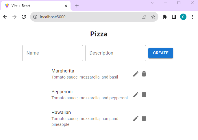
Test the new design
Wait for Vite to reload the front-end React app.
Return to the browser and test the app.