Entering and displaying data with text controls
In Power Apps, text controls are used for all kinds of purposes, like displaying text, numbers, dates, and calculating currency. For example, you could calculate the value of two Text input controls and display the results in a Text label control.
There are several text controls that you could incorporate into your app. Each of these controls has a slightly different purpose and use case. For example, maybe you're creating an employee survey app, and you want to get employee feedback. In this scenario, you would use the Text input control and modify the Mode property to be Multiline instead of single line. Most likely, every app that you work with has text controls, so familiarizing yourself with these controls is helpful as you develop your app. The following list details the different text controls that are available.

Text label - Shows data that you specify as a literal string of text or a number value, which appears exactly the way you type it, or as a formula that evaluates to a string of text or number. Text labels often appear outside of any other control (such as a banner that identifies a screen), as a label that identifies another control (such as a rating or audio control), or in a gallery to show a specific type of information about an item.
Text input - A box in which the user can type text, numbers, and other data. For example, a user can specify data by typing in a text input control. Depending on how you configure the app, that data might be added to a data source, used to calculate a temporary value, or incorporated in some other way.
HTML text - An HTML text control not only shows plain text and numbers but also converts HTML tags, such as non-breaking spaces.
Rich text editor - The rich text editor control provides the app user a WYSIWYG editing area for formatting text. This control should be used if you want to allow the user to provide numbered lists or bullet lists. A good example is an app used to collect content for an article or newsletter, where you allow the user to add formatted text that would be helpful for the person compiling the article.
Pen input - A control in which the user can draw, erase, and highlight areas of an image. The user can use this control like a whiteboard, drawing diagrams and writing words that can be converted to typed text.
Text label exercise
Here's a closer look at the Text label control so you can get a better idea as to how it works.
Open an app or create a new app in Power Apps studio.
Add a Text label control to a screen.
Set the Text property to "Hello, world" (including the double quotation marks). This is the basic function of a Text label, displaying text to a user.
Next, let's create a more dynamic solution by combining a button, gallery, and multiple label controls. In this scenario, you create a collection called CityPopulations that contains data about the population of various cities in Europe. Then, you show that data in a gallery that contains three labels, and you specify the type of data that each label shows.
Add a Button control, and set its OnSelect property to this formula:
ClearCollect(CityPopulations, {City:"London", Country:"United Kingdom", Population:8615000}, {City:"Berlin", Country:"Germany", Population:3562000}, {City:"Madrid", Country:"Spain", Population:3165000}, {City:"Rome", Country:"Italy", Population:2874000}, {City:"Paris", Country:"France", Population:2273000}, {City:"Hamburg", Country:"Germany", Population:1760000}, {City:"Barcelona", Country:"Spain", Population:1602000}, {City:"Munich", Country:"Germany", Population:1494000}, {City:"Milan", Country:"Italy", Population:1344000})Before we proceed, let's get an idea of what this formula is doing by using the Copilot button in the formula input field. Select the button and then select Explain this formula. Copilot analyzes the formula and attempt to provide you with an explanation in natural language. It looks something like this image.
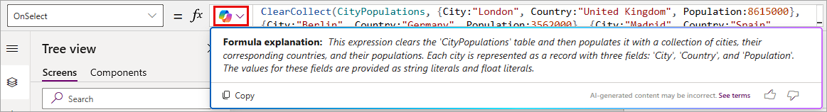
Keep in mind that copilot might offer a slightly different explanation, but the point is that it can help you understand what's going on in a formula in your app. You can also use the Copy button to use the Formula explanation in the remarks of your formula simply by pasting it in a separate line of code preceded by two forward slashes (//). The forward slashes tell Power Apps not to consider the code behind them for any calculations. Go ahead and practice adding the explanation that Copilot provides by going to a new line in your formula, adding two forward slashes, and then pasting the explanation.
Press and hold Alt Key, and select the Button control. This creates your collection and store all the information.
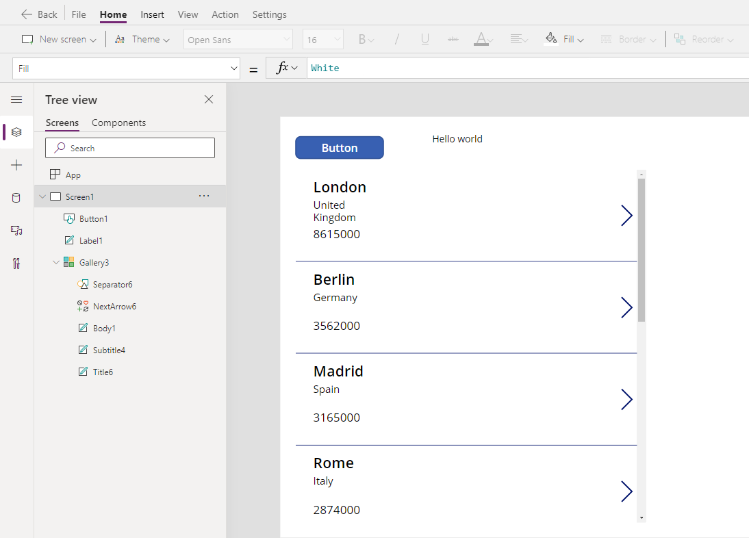
Add a Vertical gallery and set its Items property to CityPopulations.
With the gallery selected, look at the properties panel on the right side of your screen, change the layout from blank to Title, subtitle, and body.
Select the top (or title) Text label control. The Text property shows ThisItem.City. A Text label in a gallery can display any available text or numeric field (or field property displayable as text or number) in the record. In our collection, each record includes the text values for City, Country, and a number value for Population; you could display any of these in a label in this gallery.
Select the middle (or subtitle) Text label, which shows as ThisItem.Country.
Select the last (or body) Text label, ensure that it shows a Text property of ThisItem.Population. Change it if needed. Notice if you select the formula bar, Power Apps lets you know the Data type is Number.
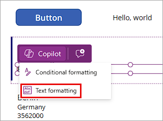
Copilot has another useful function that we can cover now. Make sure you select the body (or Population) Text label. Notice how that when you select the label, it has a purple box hovering over it with a Copilot option. Go ahead and select Copilot.
In this case Copilot gives you two options: Conditional formatting or Text Formatting. Select Text formatting.
A panel to Format text using examples slides over the right portion of your screen. You can either type in a format for your number or select the input field and see what Copilot suggests. Notice that Copilot provides some examples of how we can portray this value. Let's add the thousands and millions separators to our number by selecting
8,615,000from the values in the Desired format dropdown.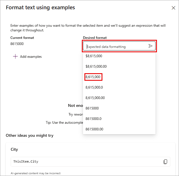
At this point, you should see a formula under Suggestions showing:
Text(ThisItem.Population, "#,##0", "en-US")To use this formula, select it.
Finally select the Apply button. The Apply button isn't selectable until you select the formula.
Your population value should now display showing comma separators under thousands and millions.
We learned the basic functionality of a Text label control, how you can use it to display different information, and how you can use Copilot to help you understand formulas and format output. There are many ways to use Text label controls in your app.