Modern controls
Microsoft is always working on new ways to not only make the application design experience easier, but also to improve the look and feel of the applications to users. One way that this is being done in Power Apps, is through Modern controls and themes.
The advantages of modern controls and themes are that they're quicker and simpler for makers to configure. Additionally, they also provide a more cohesive experience for end-users. Modern controls focus on accessibility, usability, and better performance, which makes them more visually appealing, highly functional, and intuitive to use.
Currently the following modern controls are available:
Button - A control for interacting with an app by clicking or tapping.
Combobox - A control that allows users to make selections from provided choices and supports search and multiple selections.
Link - Used to open hyperlinks in new tab.
Number input - A number input control the user can modify.
Progress bar - Displays the user's progress. It can be configured to show an exact progress or indeterminate for ongoing progress.
Radio group - An input control that shows multiple options, of which users can select only one at a time.
Slider - A control where a user can specify a value by dragging a handle.
Spinner - Displays state in motion. These are often used when loading a page or table.
Table - A control that shows a set of data in a tabular or list format.
Tabs or tab list - Used to select a tab to move screens or act on app.
Text - Display text on the app, can also be used as label for fields.
Text input - A box in which the user can type text, numbers, and other data.
The following modern controls are in preview: (Preview features are available for testing but shouldn't be used in production scenarios as the feature is subject to change.)
Badge - A badge is a visual decoration that can be used to display content in a visually better way.
Checkbox - Used to select or clear an option to specify true or false.
Copilot answer - A control that makers can use to add predefined questions that end users can use to get generated answers.
Date picker - A control where a user can select to specify a date.
Dropdown - Allows a user to select a value from the list of items.
Form - Use this control to view/update records from your data source.
Header - A control that creates a modern app header.
Info button - This control can be used to provide additional information to users.
Stream - A control that lets you add Steam videos in your app.
Toggle - A control that the user can turn on or off by moving the handle.
Once a modern control is added to your app, they have properties that can be configured like the classic controls. The properties that are available vary from component to component. You can learn more about the different modern controls that are available here: Modern controls and properties in canvas apps.
Enable modern controls and themes
Currently modern controls and themes need to be enabled on an app-by-app basis. Once they're turned on for your application, you can add both classic and modern controls to it.
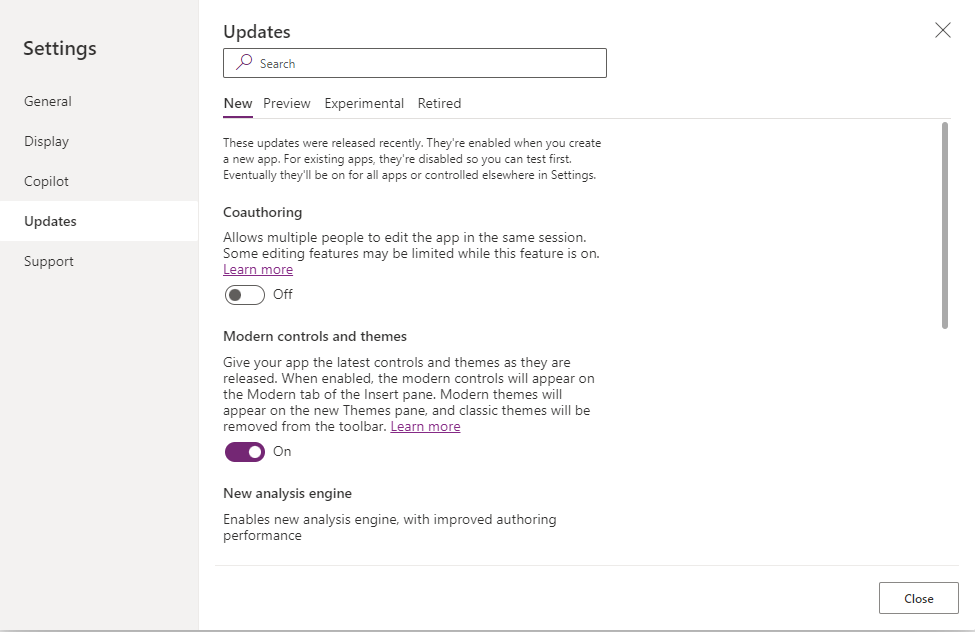
To enable modern controls, on the command bar, select Settings > Updates. Then set the toggle for Modern controls and themes to On. Then you can close your Settings.
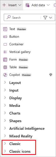
Once they're enabled, modern controls are available by selecting the Insert button from the command bar or the icon on the side of the app designer. You still have access to the Classic controls, but you either have to search for them, or scroll to the bottom of the insert list to find them.
Use modern themes
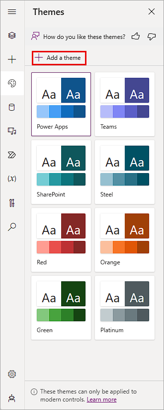
Like modern controls, users can use modern themes. These themes only apply to inserted Modern controls, and they vary from control to control. Modern themes are available by selecting Themes on the app authoring menu. With a theme selected, any control you insert colors according to the selected theme. An advantage of this is that you can change the theme of all of the modern controls at once, including controls already part of the app, simply by selecting a theme.
Add a custom theme
You can add a custom theme to your app from the Themes menu, simply by selecting the Add a theme button from the menu.
In the Create a theme pop up, you can add a Theme name, select a Font for your theme, and add a color by moving the sliders on the color controls or by inputting Hex or R,G,B values for your primary color.
Once you do that, Power Apps creates a Generated palette showing a color scheme based on your primary color selections.
To create your scheme, select Create and your new theme appears in your Themes tab.
To edit or delete a custom theme, there's an options ellipsis in the lower right corner of your custom theme. You can select the ellipsis and choose the options Edit or Delete.


