Implement flyout navigation
Flyout navigation is a type of navigation where a window of menu items slides (or flies out) from the side of the device's screen. It's invoked by tapping on what's called a "hamburger" menu, or an icon with three horizontal lines stacked on top of each other.
In this unit, you learn how to build an app that implements flyout navigation.
What is flyout navigation?
Flyout navigation displays a menu that provides a quick means to switch context within your application.
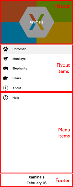
The flyout menu is composed of several parts, the Header, FlyoutItems, MenuItems, and Footer.
The following image shows a visual example of the flyout parts.
Because the flyout menu isn't always visible, it can be used to switch context between conceptually different parts of your application. For example, one flyout item can lead to a data entry page (or pages), and another to an about page.
Flyout navigation in a .NET MAUI app
You use the FlyoutItem class to implement flyout navigation in .NET MAUI. FlyoutItem is part of the Shell app development paradigm provided by .NET MAUI.
Navigation with a flyout in .NET MAUI occurs when a FlyoutItem item is tapped. The FlyoutItem automatically switches what's displayed in your app. You specify what gets displayed when a FlyoutItem is tapped by setting its ShellContent property. That property points to a page in your application.
The FlyoutItem needs to be hosted in a Shell page, which serves as your application's main page. And you can have as many FlyoutItems as you'd like.
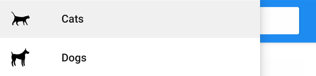
The following example creates a flyout containing two flyout items:
<Shell xmlns="http://schemas.microsoft.com/dotnet/2021/maui"
       xmlns:x="http://schemas.microsoft.com/winfx/2009/xaml"
       xmlns:controls="clr-namespace:Xaminals.Controls"
       xmlns:views="clr-namespace:Xaminals.Views"
       x:Class="Xaminals.AppShell">
    <FlyoutItem Title="Cats"
                Icon="cat.png">
       <Tab>
           <ShellContent ContentTemplate="{DataTemplate views:CatsPage}" />
       </Tab>
    </FlyoutItem>
    <FlyoutItem Title="Dogs"
                Icon="dog.png">
       <Tab>
           <ShellContent ContentTemplate="{DataTemplate views:DogsPage}" />
       </Tab>
    </FlyoutItem>
</Shell>
Create a flyout
One or more flyout items can be added to the flyout. A FlyoutItem object represents each flyout item. Each FlyoutItem object should be a child of the subclassed Shell object that serves as your app's MainPage.
The Shell object has implicit conversion operators that enable the Shell visual hierarchy to be simplified. This simplification is possible because a subclassed Shell object can only ever contain FlyoutItem objects or a TabBar object, which can only ever contain Tab objects, which can only ever contain ShellContent objects.
These implicit conversion operators can be used to remove the FlyoutItem and Tab objects from the previous example:
<Shell xmlns="http://schemas.microsoft.com/dotnet/2021/maui"
       xmlns:x="http://schemas.microsoft.com/winfx/2009/xaml"
       xmlns:controls="clr-namespace:Xaminals.Controls"
       xmlns:views="clr-namespace:Xaminals.Views"
       x:Class="Xaminals.AppShell">
   <ShellContent Title="Cats"
                 Icon="cat.png"
                 ContentTemplate="{DataTemplate views:CatsPage}" />
   <ShellContent Title="Dogs"
                 Icon="dog.png"
                 ContentTemplate="{DataTemplate views:DogsPage}" />
</Shell>
This code results in a flyout with two items. The CatsPage is displayed by default when the app opens. Tapping on the second displays the DogsPage.
Flyout menu items
Menu items can be optionally added to the flyout. A MenuItem object represents each menu item. Menu items are similar to buttons in that tapping one leads to an action to occur rather than a page to display.
The position of MenuItem objects on the flyout is dependent upon their declaration order in the Shell visual hierarchy. Therefore, any MenuItem objects declared before FlyoutItem objects will appear before the FlyoutItem objects in the flyout, and any MenuItem objects declared after FlyoutItem objects will appear after the FlyoutItem objects in the flyout.
<Shell ...>
    ...
    <MenuItem Text="Help"
              IconImageSource="help.png"
              Command="{Binding HelpCommand}"
              CommandParameter="https://learn.microsoft.com/dotnet/maui/fundamentals/shell" />
</Shell>
Flyout header and footer
The flyout header is the content that optionally appears at the top of the flyout. You define the appearance of the header by setting an object with the Shell.FlyoutHeader bindable property:
<Shell ...>
    <Shell.FlyoutHeader>
        <Grid>
            <Image Source="header-image.png" />
        </Grid>
    </Shell.FlyoutHeader>
</Shell>
The flyout footer is the content that optionally appears at the bottom of the flyout. You define the appearance of the footer by setting an object with the Shell.FlyoutFooter bindable property:
<Shell ...>
    <Shell.FlyoutFooter>
        <Grid>
            <Image Source="footer-image.png" />
        </Grid>
    </Shell.FlyoutFooter>
</Shell>