Arrange views with Grid
Suppose you're building a page that displays images in a 7x5 grid. It's possible to create this page with multiple horizontal and vertical StackLayout containers. But it would be tedious to code and could cause performance problems because of the memory and processing requirements of multiple layout panels. The Grid layout panel is a better choice for UIs that need both rows and columns. In this unit, you learn how to define a Grid and position views inside its cells.
What is a Grid?
A Grid is a layout panel that consists of rows and columns. The following illustration shows a conceptual view of a grid.
You place views in the cells that are created from the intersection of the rows and columns. For example, if you create a Grid that has three columns and two rows, there are six cells available for views. The rows and columns can be different sizes, or they can be set to automatically adapt to the size of the children placed inside them. Child views can occupy a single cell or span across many cells. This flexibility makes Grid a good choice for the root layout panel for many apps.
How to specify the rows and columns of a Grid
When you create a Grid, you can define each row and column individually. This system gives you full control over the height of each row and the width of each column. Every Grid has a collection of RowDefinition and ColumnDefinition objects that define the shape of the grid. You populate these collections with instances of RowDefinition and ColumnDefinition, each representing a row or column in your UI.
Here are two snippets of code that show the class definitions for RowDefinition and ColumnDefinition:
public sealed class RowDefinition : ...
{
    ...
    public GridLength Height { get; set; }
}
public sealed class ColumnDefinition : ...
{
    ...
    public GridLength Width { get; set; }
}
Notice that RowDefinition has a property called Height and ColumnDefinition has a property called Width. You use these properties to set the height of a row and the width of a column, as described in the following sections.
What is GridLength?
The data type for the Width and Height properties is GridLength. This type contains two properties: GridUnitType and Value. Here's a snippet of code that shows a portion of the type definition.
public struct GridLength
{
    ...
    public GridUnitType GridUnitType { get; }
    public double Value { get; }
}
You can set the property GridUnitType to one of these values:
AbsoluteAutoStar
Let's take a closer look at each of these values.
Absolute GridUnitType
Absolute specifies that the row or column should be fixed in size. You use the Value property to indicate the size. Here's an example that shows how you would set the height of a row to be a fixed size of 100 device units in C#. Notice how you use the GridLength constructor, which takes a numeric value. This constructor sets GridUnitType to Absolute for you automatically.
var row = new RowDefinition() { Height = new GridLength(100) };
In XAML, you just provide a numeric value. The XAML parser invokes a type converter to create the GridLength instance. Here's an example that shows the same thing in XAML:
<RowDefinition Height="100" />
Auto GridUnitType
Auto automatically sizes the row or column to fit your child views. The Grid scans all child views in that row or column, selects the largest view, and then makes the row or column large enough to fit that child. When you create a row definition in code, the numeric value is ignored. You can use any value. Here's an example that shows how you would set the height of a row to be automatically sized in C#. Notice that we arbitrarily chose 1 for the value.
var row = new RowDefinition() { Height = new GridLength(1, GridUnitType.Auto) };
In XAML, you use the value Auto. Here's an example showing the same thing in XAML.
<RowDefinition Height="Auto" />
Star GridUnitType
Star gives you proportional sizing. In proportional sizing, the total available space and the ratio that each row or column asks for determines the size. In conversation, people often call this star sizing instead of proportional sizing.
Let's walk through the process of using proportional sizing for the rows in a grid.
Determine the available space: The
Gridscans all the rows that don't use star sizing. It adds up the height of all those rows and subtracts that total from the height of theGriditself. This calculation provides the amount of space that's available for all the star-sized rows.Divide the available space: The
Gridthen divides up the available space among all the star-sized rows based on theValuesetting for each row. Think of theValueproperty as a multiplier that determines the ratio among all the rows defined as star sized. For example, if we had two star-sized rows, both with1as the multiplier, the available space would be divided equally between them. But if one of them had2as the Value, it would get twice as much space as the other.
Here's an example showing how you would set the height of a row to be 2 Star in C#:
var row = new RowDefinition() { Height = new GridLength(2, GridUnitType.Star) };
In XAML, you use the * symbol to represent star sizing. You combine the value and the * in a single string and a type converter creates the GridLength for you. Here's the same example in XAML.
<RowDefinition Height="2*" />
Grid collections
After you define the rows and columns by using RowDefinition and ColumnDefinition, you can add them to a Grid. You use the RowDefinitions and ColumnDefinitions collection properties of the Grid. Populating these collections is most commonly done in XAML.
This example shows how to define four rows and add them to a Grid by using the RowDefinitions property:
<Grid>
    <Grid.RowDefinitions>
        <RowDefinition Height="100" />
        <RowDefinition Height="Auto" />
        <RowDefinition Height="1*" />
        <RowDefinition Height="2*" />
    </Grid.RowDefinitions>
    ...
</Grid>
This definition can be shortened to:
<Grid RowDefinitions="100, Auto, 1*, 2*">
    ...
</Grid>
The XAML for defining columns is analogous to this XAML, except you would use ColumnDefinitions and you would set the width.
At runtime, this XAML produces a Grid with four rows. The first row has a fixed height of 100 device units. The second row has the height of the tallest view in the row. The third and fourth rows use star sizing, which means they take the remaining available space and divide it proportionally based on their Value multiplier. Because the third row is 1* and the fourth row is 2*, the fourth row is twice the height of the third row.
Row and column default size
The default for rows and columns is 1* size. For example, look at the following XAML.
<Grid>
    <Grid.RowDefinitions>
        <RowDefinition />
        <RowDefinition />
        <RowDefinition />
    </Grid.RowDefinitions>
    <Grid.ColumnDefinitions>
        <ColumnDefinition />
        <ColumnDefinition />
    </Grid.ColumnDefinitions>
    ...
</Grid>
This definition can be shortened to:
<Grid RowDefinitions="*, *, *" ColumnDefinitions="*, *">
    ...
</Grid>
Because none of the rows or columns have sizes specified, 1* is applied to all of them. At runtime, this configuration creates a Grid that's uniform, meaning all rows are the same height and all columns are the same width.
How to add views to a Grid
When you add a view to a Grid, you add it to a specific cell. Cells are created at positions where rows and columns intersect. To position a view in a cell, you need to know the location of the cell. You use a combination of a row number and a column number to identify a cell.
Row and column numbering
The numbering of rows and columns starts at zero. The origin is the upper-left corner. Here's an illustration showing the numbering for a Grid with four rows and two columns.
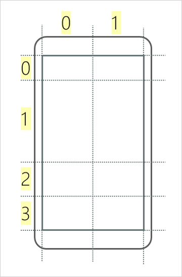
For example, if we wanted to add a view to the bottom-right cell, we'd say the view's position was row 3 column 1.
Add a view to a Grid by using attached properties
You need a way to specify a view's row and column number when we add it to a grid. One solution would be to define Row and Column properties on the View base class so that you could specify the position on the view directly. This technique would work, but it's not the most efficient approach. Views aren't always going to be in a Grid, so sometimes those properties wouldn't be needed. A better approach is to use attached properties.
An attached property is a property defined in one class but set on objects of other types.
Think of attached properties as a collection of key-value pairs that is part of a view. When you add a view to a Grid, you specify the row and column. By using attached properties, you can add a key-value pair with the key Grid.Row and a value that specifies the row number. When the Grid is ready to position the view, it checks the collection to see if there's a key called Grid.Row. If there is, the Grid uses the value to position the view.
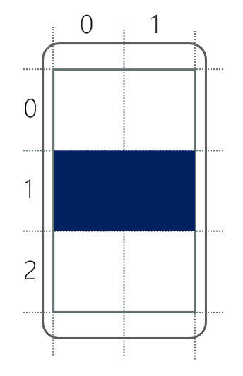
This example shows how to create a Grid and add a view by using attached properties:
<Grid RowDefinitions="*, *, *" ColumnDefinitions="*, *">

    <BoxView Grid.Row="1" Grid.Column="0" Color="Navy" />

</Grid>
In this example, Grid.Row=1 and Grid.Column=0 are key-value pairs that get added to an internal collection of the BoxView. The Grid uses those values to determine where the view should be positioned. Here's what this Grid would look like if you ran the application on a device.
How to make a view span multiple rows or columns
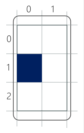
There are two more attached properties you should be aware of: Grid.RowSpan and Grid.ColumnSpan. These properties specify how many rows or columns the view should occupy. For example, look at the following XAML.
<Grid RowDefinitions="*, *, *" ColumnDefinitions="*, *">

    <BoxView Grid.Row="1" Grid.Column="0" Grid.ColumnSpan="2" Color="Navy" />

</Grid>
Notice that this example sets the ColumnSpan to 2. This view occupies two columns starting at Column 0. Here's what this Grid would look like if you ran the application on a device.