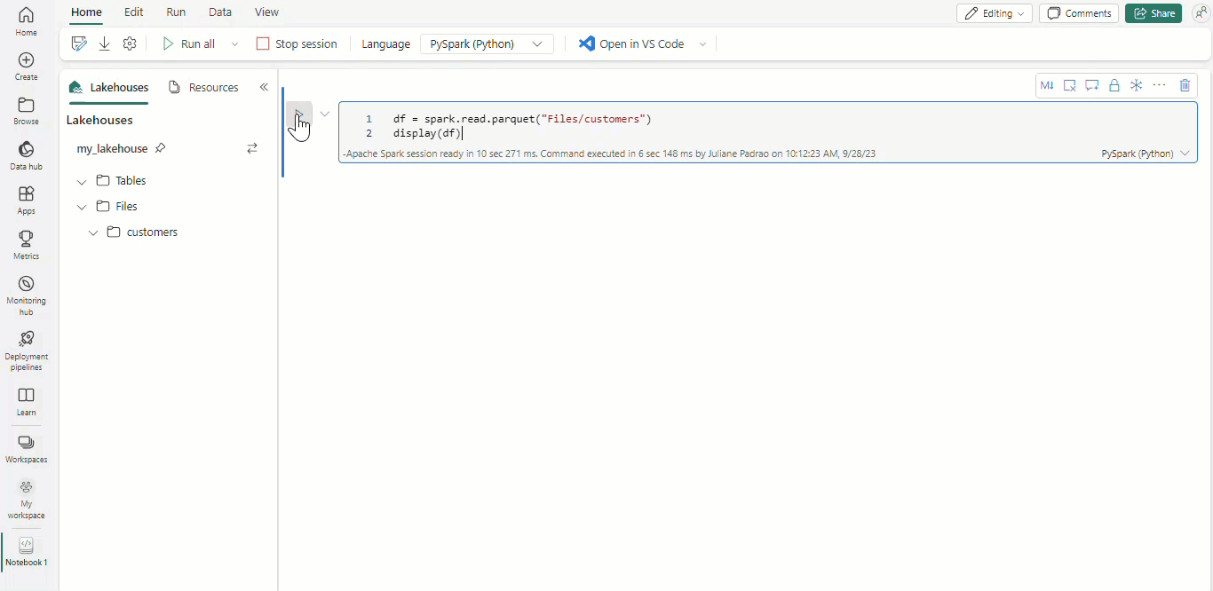
Visualize charts in notebooks
Data visualization is a key aspect of data exploration. It involves presenting data in a graphical format, making complex data more understandable and usable.
With Microsoft Fabric notebooks and Apache Spark dataframes, your tabular results are automatically presented as charts without the need of any extra coding.
Tip
Open-source libraries such as matplotlib and plotly among others can also be used to enhance the data exploration experience.
Understand categorical and numerical variables
For categorical variables, it's important to understand the different categories or levels in the variable. This involves identifying how many observations there are in each category, which is referred to as counts or frequencies. Additionally, understanding what proportion or percentage of the observations each category represents is crucial.
When it comes to numerical variables, several aspects need to be considered. The central tendency of the variable, which can be the mean, median, or mode, provides a summary of the variable.
Dispersion measures such as the range, interquartile range (IQR), standard deviation, or variance give insights into the spread of the variable. Lastly, understanding the distribution of the variable is key. This involves determining whether the variable is normally distributed or follows some other distribution and identifying any outliers.
These are often referred to as summary statistics of numerical and categorical variables.
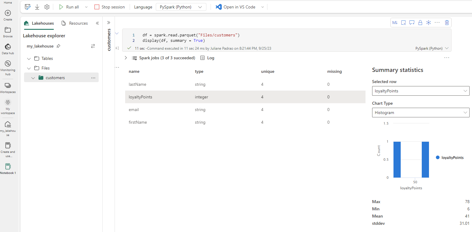
Summary statistics
Summary statistics are available for Apache Spark dataframes when you use the parameter summary=True.
Alternatively, you can generate the summary statistics using Python.
import pandas as pd

df = pd.DataFrame({
    'Height_in_cm': [170, 180, 175, 185, 178],
    'Weight_in_kg': [65, 75, 70, 80, 72],
    'Age_in_years': [25, 30, 28, 35, 32]
})

desc_stats = df.describe()
print(desc_stats)
Univariate analysis
Univariate analysis is the simplest form of data analysis where the data being analyzed contains only one variable. The main purpose of univariate analysis is to describe the data and find patterns that exist within it.
These are common plots used to perform univariate analysis.
Histograms: Used to show the frequency of each category of a continuous variable. They can help identify the central tendency, shape, and spread of the data.
Box plots: Used to show the range, interquartile range (IQR), median, and potential outliers of a numerical variable.
Bar charts: These are similar to histograms but are typically used for categorical variables. Each bar represents a category, and the height or length of the bar corresponds to its frequency or proportion.
The following code creates a box plot and histogram using Python.
import numpy as np
import matplotlib.pyplot as plt

# Let's assume these are the heights of a group in inches
heights_in_inches = [63, 64, 66, 67, 68, 69, 71, 72, 73, 55, 75]

fig, axs = plt.subplots(1, 2, figsize=(10, 5))

# Boxplot
axs[0].boxplot(heights_in_inches, whis=0.5)
axs[0].set_title('Box plot of heights')

# Histogram
bins = range(min(heights_in_inches), max(heights_in_inches) + 5, 5)
axs[1].hist(heights_in_inches, bins=bins, alpha=0.5)
axs[1].set_title('Frequency distribution of heights')
axs[1].set_xlabel('Height (in)')
axs[1].set_ylabel('Frequency')

plt.tight_layout()
plt.show()
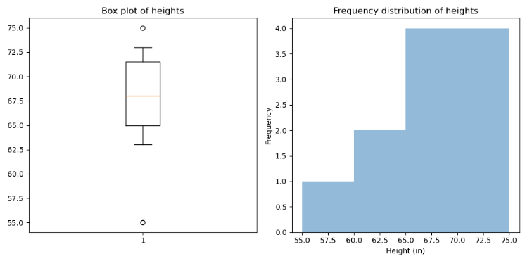
These are a few conclusions we can draw from the results.
- In the box plot, the distribution of heights is skewed to the left, meaning there are many individuals with heights significantly below the mean.
- There are two potential outliers: 55 inches (4’7") and 75 inches (6’3"). These values are lower and higher than the rest of the data points.
- The distribution of heights is roughly symmetrical around the median, assuming that the outliers don't significantly skew the distribution.
Bivariate and multivariate analysis
Bivariate and multivariate analysis helps understand the relationships and interactions between different variables in a dataset, and are often presented using scatter plots, correlation matrices, or cross-tabulations.
Scatter plots
The following code uses the scatter() function from matplotlib to create the scatter plot. We specify house_sizes for the x-axis and house_prices for the y-axis.
import matplotlib.pyplot as plt
import numpy as np

# Sample data
np.random.seed(0)  # for reproducibility
house_sizes = np.random.randint(1000, 3000, size=50)  # Size of houses in square feet
house_prices = house_sizes * 100 + np.random.normal(0, 20000, size=50)  # Price of houses in dollars

# Create scatter plot
plt.scatter(house_sizes, house_prices)

# Set plot title and labels
plt.title('House Prices vs Size')
plt.xlabel('Size (sqt)')
plt.ylabel('Price ($)')

# Display the plot
plt.show()
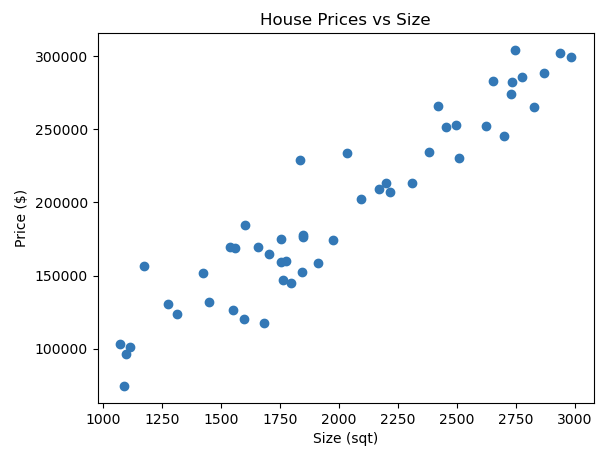
In this scatter plot, each point represents a house. You see that as the size of the house increases (moving right along the x-axis), the price also tends to increase (moving up along the y-axis).
This type of analysis helps us understand how changes in the dependent variables affect the target variable. By analyzing the relationships between these variables, we can make predictions about the target variable based on the values of the dependent variables.
Moreover, this analysis can help identify which dependent variables have a significant impact on the target variable. This is useful for feature selection in machine learning models, where the goal is to use the most relevant features to predict the target.
Line plot
The following Python script uses the matplotlib library to create a line plot of simulated house prices over a period of three years. It generates a list of monthly dates from 2020 to 2022 and a corresponding list of house prices, which start from $200,000 and increase each month with some randomness.
The x-axis of the plot is formatted to display dates in 'Year-Month' format and set the interval of the ticks on the x-axis to every six months.
import matplotlib.pyplot as plt
from datetime import datetime, timedelta
import random
import matplotlib.dates as mdates

# Generate monthly dates from 2020 to 2022
dates = [datetime(2020, 1, 1) + timedelta(days=30*i) for i in range(36)]

# Generate corresponding house prices with some randomness
prices = [200000 + 5000*i + random.randint(-5000, 5000) for i in range(36)]

plt.figure(figsize=(10,5))

# Plot data
plt.plot(dates, prices)

# Format x-axis to display dates
plt.gca().xaxis.set_major_formatter(mdates.DateFormatter('%Y-%m'))
plt.gca().xaxis.set_major_locator(mdates.MonthLocator(interval=6)) # set interval to 6 months
plt.gcf().autofmt_xdate() # Rotation

# Set plot title and labels
plt.title('House Prices Over Years')
plt.xlabel('Year-Month')
plt.ylabel('House Price ($)')

# Show the plot
plt.show()
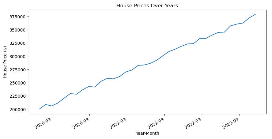
Line plots are simple to understand and read. They provide a clear, high-level overview of the data’s progression over time, making them a popular choice for time series data.
Pair plot
A pair plot can be useful when you want to visualize the relationship between multiple variables at once.
import seaborn as sns
import pandas as pd

# Sample data
data = {
    'Size': [1000, 2000, 3000, 1500, 1200],
    'Bedrooms': [2, 4, 3, 2, 1],
    'Age': [5, 10, 2, 6, 4],
    'Price': [200000, 400000, 350000, 220000, 150000]
}

df = pd.DataFrame(data)

# Create a pair plot
sns.pairplot(df)
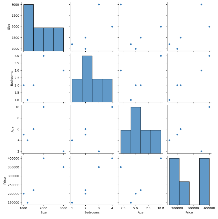
This creates a grid of plots where each feature is plotted against every other feature. On the diagonal are histograms showing the distribution of each feature. The off-diagonal plots are scatter plots showing the relationship between two features.
This kind of visualization can help us understand how different features are related to each other and could potentially be used to inform decisions about buying or selling houses.