Exercise - Visualize data with the render operator
We've used a meteorological dataset to aggregate and compare the number of certain kinds of storm events in different US states for the year 2007. Here, you'll visualize these results with the aid of time-binned graphs.
Use the render operator
Recall that you've used the summarize operator to group events by a common field such as State. In the previous unit, you used different versions of the count operator to compare the number and types of events by state. Visualizing these results can be a helpful aid in comparing activity across states.
To visualize results, you'll use the render operator. This operator comes at the end of a query. Within the render operator, you'll specify which type of visualization to use, such as columnchart, barchart, piechart, scatterchart, pivotchart, and others. You can also optionally define different properties of the visualization, such as the x-axis or y-axis.
In this example, you'll visualize the previous query using a bar chart.
Run the following query.
StormEvents
| summarize count(),
    EventsWithDamageToCrops = countif(DamageCrops > 0),
    dcount(EventType) by State
| sort by count_
| render barchart
You should get results that look like the following image:

Notice the legend to the right of the bar chart. Each value in the legend represents a different column of data that's been summarized by State in the query. Try selecting one of the values, such as count_, to toggle the display of this data in the bar chart. By toggling off count_, you remove the total count and are left with count of events that caused damage and distinct number of events. You should get a graph that looks like the following image:
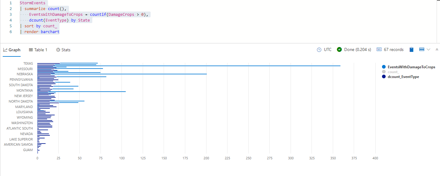
Take a look at the resulting bar chart. What insights can you gain from this? You may notice, for example, that Texas had the most individual storm events, but Iowa had the highest incidence of damaging storm events.


Group values using the bin() function
Until now, you've used aggregation functions to group events by State. Let's now look at the distribution of storms throughout the year, by grouping data by time. The time values we have in every record are the start time and end time. Let's group the event start times by week, so we can see how many storms happened each week during the year 2007.
You'll use the bin() function, which groups values into set intervals. For example, you may have a data from every day of the year and you'd like to group these dates by week. Or, you want to group population data by age bins. The syntax of this operator is:
bin(value,roundTo)
The bin value can be a number, date, or timespan. You'll aggregate the count using the bin() function to give you a count of events per week. The value you want to group is the StartTime of the storm event, with the roundTo bin size of 7days or 7d for short. Finally, render the data as a columnchart to create a histogram.
Run the following query:
StormEvents
| summarize count() by bin(StartTime, 7d)
| render columnchart
You should get results that look like the following image:
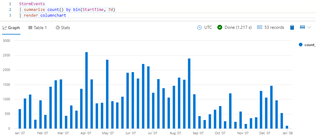
Take a look at the resulting histogram. Hover over one of the bars to see the bin start time (x-value) and event count (y-value).
Use the sum operator
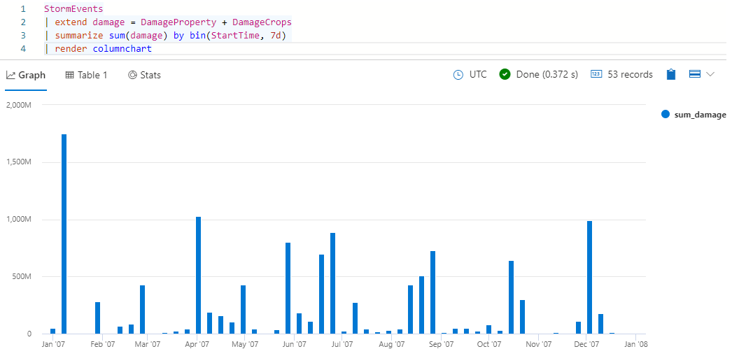
In the previous query, you looked at the number of storm events over time. Now let's take a look at the damage caused by these storms. For this, you'll use the sum aggregation function, because you want to see the total amount of damage caused in each time interval. The dataset you're working with has two columns related to damage: DamageProperty and DamageCrops.
In the following query, you'll first create a calculated column that adds these two damage sources together. Then, you'll create an aggregation of total damage binned by week. Finally, you'll render a column chart representing the weekly damage caused by all storms.
Run the following query:
StormEvents
| extend damage = DamageProperty + DamageCrops
| summarize sum(damage) by bin(StartTime, 7d)
| render columnchart
You should get results that look like the following image:
The previous query shows you damage as a function of time. Another way to compare the damage is by event type. Run the following query to use a pie chart to compare the damages caused by different event types.
StormEvents
| extend damage = DamageProperty + DamageCrops
| summarize sum(damage) by EventType
| render piechart
You should get results that look like the following image:
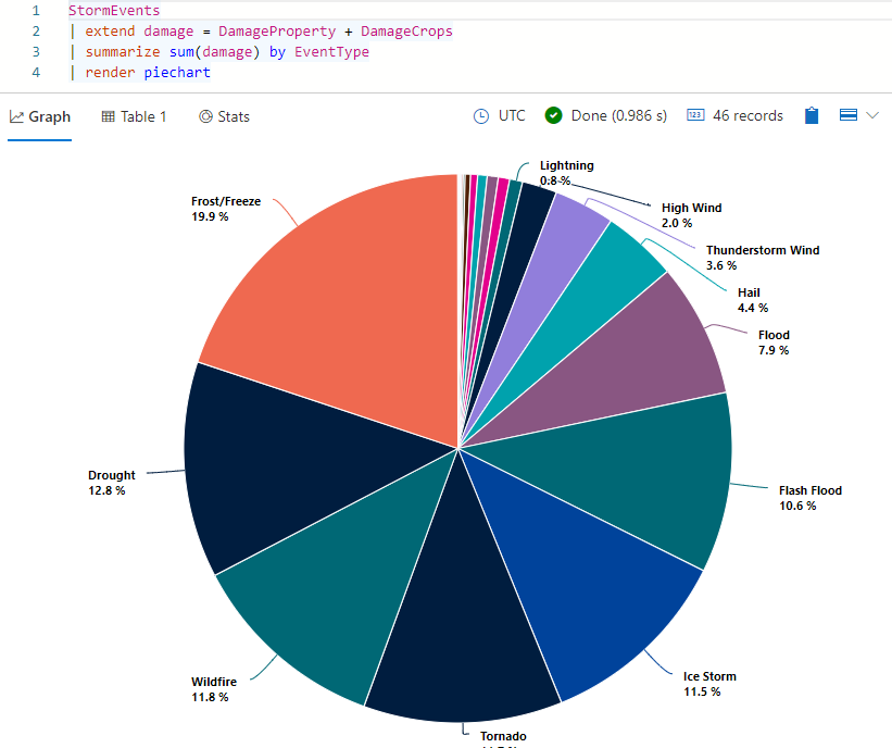
Hover over one of the slices of the pie chart. You should see the absolute value (total damage caused by this event type) and the corresponding percentage of the overall damage.