Exercise - Specify and monitor blob metrics
This module requires a sandbox to complete. A sandbox gives you access to free resources. Your personal subscription will not be charged. The sandbox may only be used to complete training on Microsoft Learn. Use for any other reason is prohibited, and may result in permanent loss of access to the sandbox.
Microsoft provides this lab experience and related content for educational purposes. All presented information is owned by Microsoft and intended solely for learning about the covered products and services in this Microsoft Learn module.
As a proof-of-concept exercise, you want to move some files into Azure Blob Storage to see how the metrics are displayed in the Azure portal. Let's create a storage account and a blob container, and then view the metrics that appear.
Create a storage account in the Azure portal
Sign in to the Azure portal by using the same account with which you activated the sandbox.
In the Azure portal, select Create a resource.
In the Search services and Marketplace box, search for and select Storage account. The Storage account panel appears.
Select Create. The Create a storage account panel appears.
On the Basics tab, fill in the following values for each setting.
Setting Value Project details Subscription Concierge Subscription Resource group [Sandbox resource group] Instance details Storage account name <your-storage-account-name>, which is 3 to 24 characters and consists of only lowercase letters and numbers; for example, monitorstorageaccount Region Use the default region Performance Standard Redundancy Geo-redundant storage (GRS) Select the Advance tab. Scroll down to the Blob storage section and make sure that access tier is set to Hot.
Select Review + create. After validation passes, select Create.
On the Your deployment is complete panel, select Go to resource.
View the properties of the storage account
On the Overview page, you can see the following information about the storage account:
- Resource group name
- Status
- Location
- Subscription
- Performance or access tier
- Replication
- Account kind
You can change the storage account to another resource group.
Add a blob container
Before you can add blobs to a storage account, you need to create a blob container.
Under Data storage, select Containers.
The Containers panel appears.
In the Containers panel, select + Container.
The New container pane appears.
In the Name field, enter monitor-blobs-container, and then select Create.
When you select your new container, notice the No results status message.
You're now ready to upload files to the blob container.
Upload files to the blob container
To upload a single file to the blob container:
Open the monitor-blobs-container container, and then select Upload.
On the Upload blob pane, select Browse for files.
In the Open dialog box, select a small text file from your local file system, and select Open.
On the Upload blob pane, Select Advanced to view the advanced upload options.
Select Blob type. In the drop-down list, the options are Block blob, Page blob, and Append blob. Ensure that Block blob is selected.
Under Block size, select 64 KiB. Select Upload and note when the file upload has finished.
To upload multiple files to the blob container:
Select Upload.
On the Upload blob panel, select Browse for files.
In the Open dialog box, select several graphics files from your local file system, and then select Open. Ensure that you have at least 50 MB of files selected.
Select Advanced to view the advanced upload options.
Ensure that Block blob is selected.
Under Block size, select a file size that's slightly larger than the largest file you're uploading, and then select Upload. Note when the file uploads have finished.
Page blobs are typically for large files, such as virtual machine disk images (VHDs). The only block size available for page blobs is 4 MB. Append blobs are optimized for append operations, such as log file updates.
Check the size of data
You can check the size of the data stored in a container, along with the number and types of blobs, by completing the following steps:
For the monitor-blobs-container container, select Properties.
On the Properties pane, select Calculate size.
The size and number of blobs now appear.
Create a capacity metrics chart
Next, view the metrics that the storage account generates. Complete the following steps:
On the menu pane, select Storage accounts. On the Storage accounts pane, select the name of the storage account that you created.
Scroll down the middle pane to the Monitoring section, and then select Metrics.
Select New Chart.
Next to Chart Title, select the pen icon.
Enter Capacity Chart as the name for your chart.
Add several metrics to your chart:
Select Add metric.
Under Scope, select the name of the storage account that you created.
Under Metric Namespace, select Blob.
Under Metric, select Blob Capacity.
Under Aggregation, select Avg.
Repeat the previous steps to add Blob Container Count and Blob Count to the chart.
At the bottom of the chart, you now have a color bar and a count for the current value of the counter. It's highly likely that the counter is initially at zero for all the capacity metrics, because the values haven't been aggregated.
Create a transaction metrics chart
Transaction metrics are updated hourly, so you should see changes in these values relatively quickly. To create a transaction metrics chart, complete the following steps:
Select + New Chart.
Next to Chart Title, select the pen icon.
Enter Transaction Chart as the name for your chart.
Select Add metric.
Under Scope, select the name of the storage account that you created.
Under Metric Namespace*, select Blob.
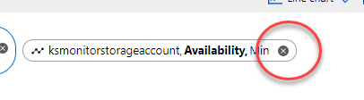
Under Metric, select Availability.
Under Aggregation, select Avg.
View the resulting chart. It should show just one line set at 100%.
Change the Aggregation option to Min. It's unlikely that an Azure outage happened during that time, so the line should stay at 100%. This information generally doesn't change much.
Select the X to the right of the monitor ellipsis to close it.
Select Add metric. Both the Resource and Metric Namespace values should already be selected.
Under Metric, select Egress.
Under Aggregation, select Avg, Max, and Min. Note how the data shapes change with each value. Finally, select Sum. You should have a single spike at the time when you imported the files.
Split a metric
Splitting a chart enables you to view more dimensions in the data, depending on the type of metric that you're viewing. To split a metric, complete the following steps:
Select Apply splitting.
In the Splitting oval, from the Values drop-down list, select API name.
View the output in the chart window. You should now have the following splits of the monitoring data:
- ListBlobs (note this value)
- BlobPreflightRequest
- GetContainerProperties
- GetBlobServiceProperties
- PutBlob
- GetBlobproperties
- PutBlockList
- GetContainerServiceMetadata
- ListContainers
- GetFileServiceProperties
- GetBlobTags
Select the X to the right of the Splitting oval.
Add a filter
Filtering also enables you to look at the metrics with greater granularity. To apply a filter, complete the following steps:
Select Add filter.
Under Property, select API name.
Under Values, select ListBlobs. Note the data values and compare them with the ListBlobs value from the splitting exercise.
Select the X to the right of the filter oval to remove the filter.
Customize charts
You can customize charts in various ways, such as by changing the time range, time granularity, and time zone. To make these changes, use the following steps:
Text at the top of the chart says Last 24 hours (automatic). Select this oval, and a dialog box for time range and time granularity appears.
Under Time range, select Last 4 hours. Note the ability to change from local to UTC/GMT time, as needed.
Under Time granularity, select 1 hour, and then select Apply.
View data in other formats
You can view metric data in other formats, including line charts, bar charts, area charts, and scatter charts. To change the view of the data, complete the following steps:
By using the metrics defined in the previous section, select Line Chart > Area Chart. Note the change in the display of the data.
Select Area Chart > Scatter Chart. With the low levels of storage activity, the scatter chart shows only the peaks of activity.
Select the ellipsis next to Save to dashboard, and then select Chart Settings.
Under Chart Title, select Custom, and enter a more descriptive name for the chart.
For the displayed data, under Min value, enter a value in bytes that's lower than your lowest data point.
Under Max value, enter a value in bytes that's slightly higher than your highest data point. Your data should now fill the entire chart.
Select the different chart types and notice the change in the data display.
Select the X to close the Chart settings pane.
Export a chart to Excel
Exporting a chart to Excel gives you all the data analysis tools of that platform. To export a chart to Excel, complete the following steps:
Select Share, and then select Download to Excel.
Open the Excel spreadsheet that's downloaded.
View the data in the chart.
Next unit: Use dashboards in the Azure portal
Having an issue? We can help!
- For issues related to this module, explore existing questions using the #azure training tag or Ask a question on Microsoft Q&A.
- For issues related to Certifications and Exams, post on Certifications Support Forums or visit our Credentials Help.