What is classification?
In this unit, you'll learn about classification, how to describe it, and how the concept is applied.
Let's begin by looking at binary classification, in which data is separated into either of two distinct categories. For example, we could label patients as non-diabetic or diabetic.
We make a class prediction by determining the probability for each possible class as a value between 0 (impossible) and 1 (certain). The total probability for all classes is 1, because the patient must be either diabetic or non-diabetic. For example, if the predicted probability of a patient being diabetic is 0.3, there's a corresponding probability of 0.7 that the patient is non-diabetic.
We use a threshold value, usually 0.5, to help determine the predicted class. That is, if the positive class (in our example, diabetic) has a predicted probability that's greater than the threshold, a classification of diabetic is predicted.
Train and evaluate a classification model
Classification is an example of a supervised machine learning technique, which means that it relies on data that includes known feature values (for example, diagnostic measurements for patients) as well as known label values (for example, a classification of non-diabetic or diabetic). You use a classification algorithm to fit a subset of the data to a function that can calculate the probability for each class label from the feature values. You use the remaining data to evaluate the model by comparing the predictions that it generates from the features to the known class labels.
A simple example
Let's explore a simple example to help explain the key principles. Suppose you have the following patient data, which consists of a single feature (blood-glucose level) and a class label (0 for non-diabetic, 1 for diabetic).
| Blood-glucose | Diabetic/non-diabetic |
|---|---|
| 82 | 0 |
| 92 | 0 |
| 112 | 1 |
| 102 | 0 |
| 115 | 1 |
| 107 | 1 |
| 87 | 0 |
| 120 | 1 |
| 83 | 0 |
| 119 | 1 |
| 104 | 1 |
| 105 | 0 |
| 86 | 0 |
| 109 | 1 |
Let's use the first eight observations (rows, in the preceding table) to train a classification model. Start by plotting the blood-glucose feature (x-axis) and the predicted diabetic label (y-axis).
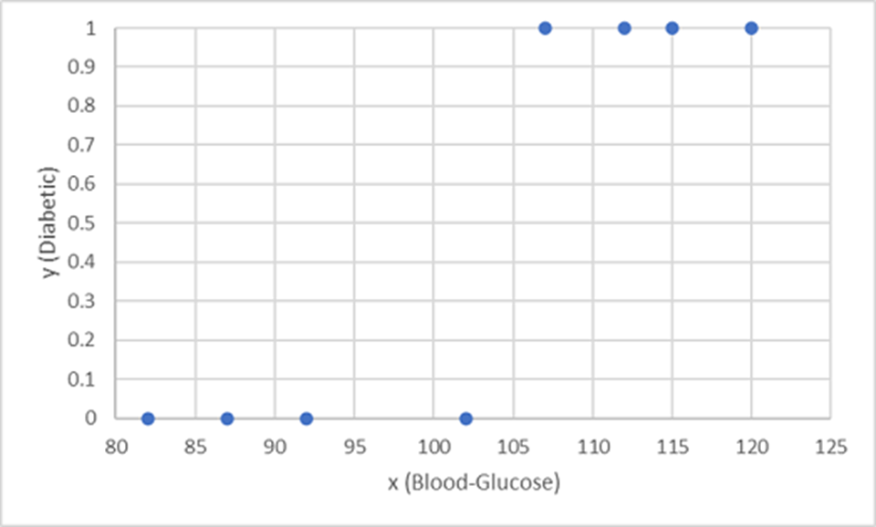
What you need is a function that calculates a probability value for y based on x. That is, you need the function f(x) = y. You can see from the chart that patients with a low blood-glucose level are all non-diabetic, and patients with a higher blood-glucose level are diabetic.
It seems that the higher the blood-glucose level, the more probable it is that a patient is diabetic, with the inflection point being somewhere between 100 and 110. You need to fit a function that calculates a value between 0 and 1 for y to these values.
One such function is a logistic function, which forms a sigmoidal (S-shaped) curve, like this:
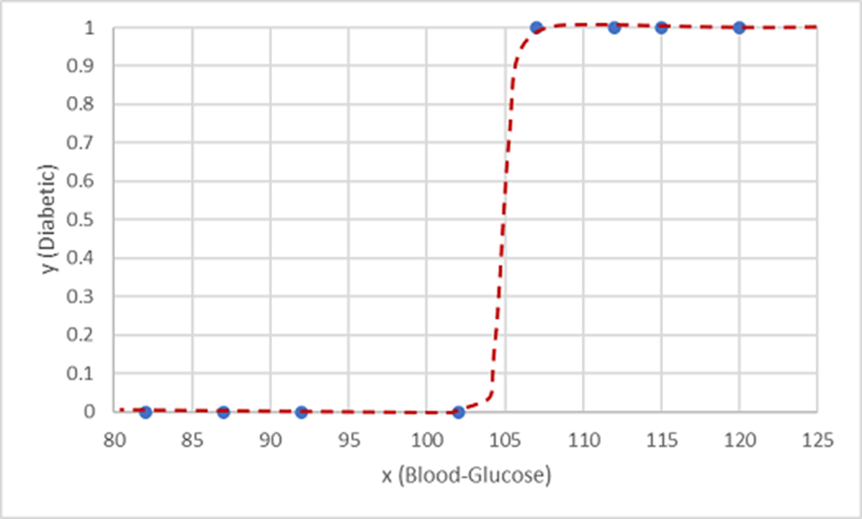
Now you can use the function to calculate a probability value that y is positive, meaning that the patient is diabetic, from any value of x by finding the point on the function line for x. You can set a threshold value of 0.5 as the cutoff point for the class label prediction.
Let's test it with the data values we've held back:
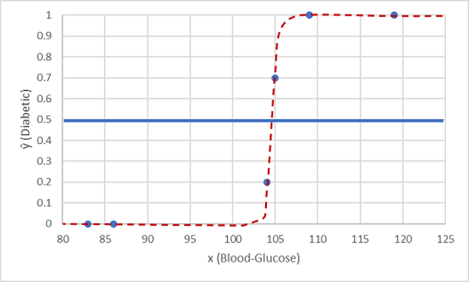
Points plotted below the threshold line yield a predicted class of 0 (non-diabetic), and points above the line are predicted as 1 (diabetic).
Now you can compare the label predictions based on the logistic function encapsulated in the model (which we'll call ŷ, or "y-hat") to the actual class labels (y).
| x | y | ŷ |
|---|---|---|
| 83 | 0 | 0 |
| 119 | 1 | 1 |
| 104 | 1 | 0 |
| 105 | 0 | 1 |
| 86 | 0 | 0 |
| 109 | 1 | 1 |