Design Power Apps cards
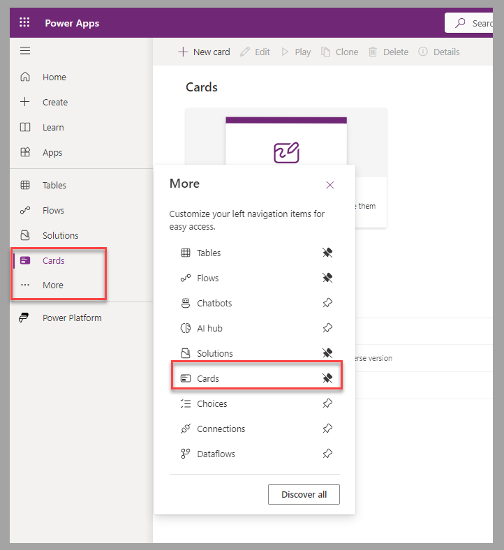
To design cards for Power Apps, you need to access the Cards section in the left navigation pane of Power Apps Studio. If the option is unavailable, you can access and optionally pin it to the main navigation pane from the More menu option. To create cards within a Dataverse solution, select Card from the New menu in Power Apps Studio.
The Power Apps card designer studio contains the following areas (numbers corresponding with the ensuing screenshot):
Power Fx formula bar
Main navigation pane
Tool pane
Card canvas
Properties pane
Save and Play buttons
Card design considerations
If you have experience creating canvas apps, the card designer studio might seem similar to the canvas app studio. Make sure that you understand and consider the following differences, even if it's your first time using Power Apps:
The size of the card is automatically based on the content of the card and location in which it's shared.
Multiple screens can be part of a card. You can manage navigation by using the Navigate and Back functions. Also, you can display a screen below the existing one by adding a Button control with a Type property set to Show Screen.
To list multiple records, the Repeat for every property of a control must be bound to the data value that it references. The records can be from a Dataverse table or a collection variable.
To help group controls together, containers are provided:
Button set for a group of button controls
Column set for a group of column controls
Fact set for a series of name/value pairs
Image set for a group of image controls
Container for a collection of different controls
You can test cards in light or dark display modes.
Variables in cards are always global and offer the following options, which are unavailable in canvas apps:
Persistence - You can set the variable as permanent; whenever the card is opened, the last set value remains.
Customization - You can set the variable as an input variable; the sender can set its value when the card is shared.
For more information, see Controls and properties in cards | Microsoft Learn.
Next steps
Now, you've learned how to design cards for Power Apps. Next, you'll apply those learned concepts and create a card to capture employee suggestions.
