Exercise - Add the compare screen
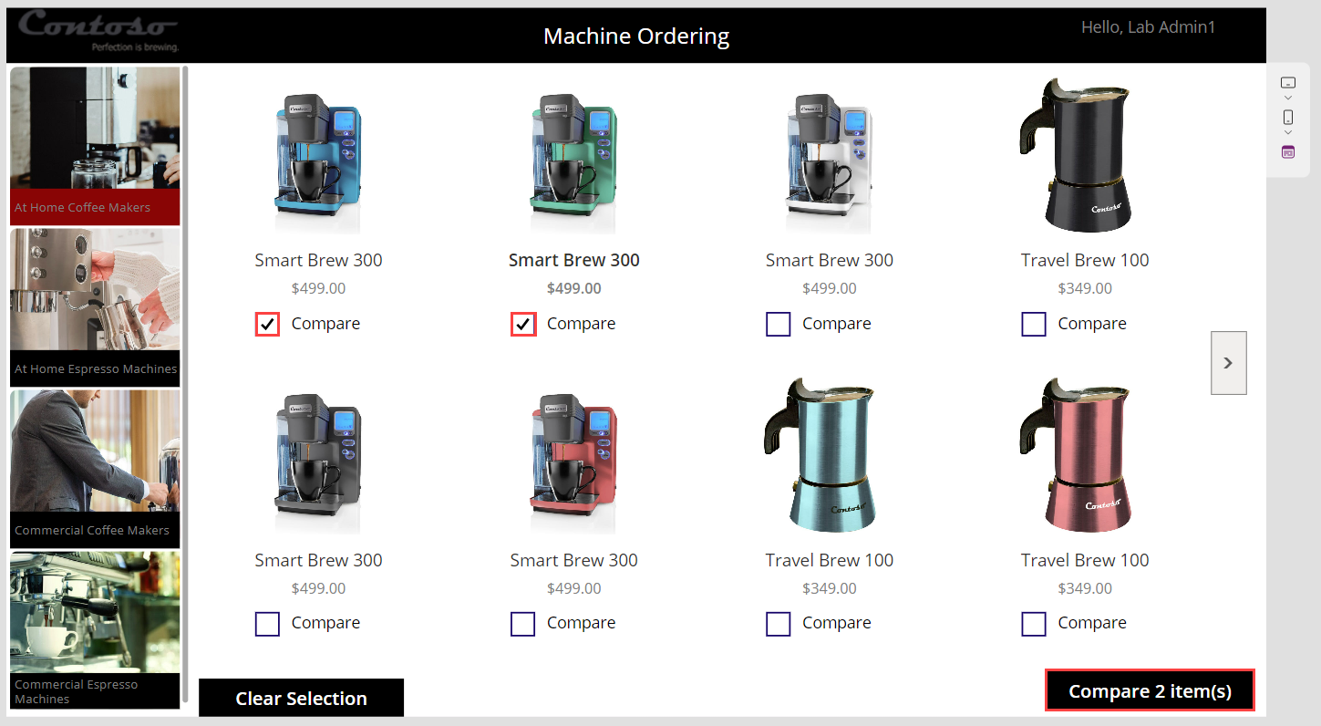
The second screen is where users compare the selected machines and then choose the one that they want to submit for approval. This screen includes:
A back button for navigating back to the main screen.
A list of selected machines for comparison (carried over from the main screen).
Other details for each machine.
Highlighting of the selected machine.
In a subsequent lab, you create the database tables to store the machine orders, add an edit form to this screen to enter extra information, and then submit the request.
Note
To complete the exercises, you'll need to use a few files. Download the App in a Day files for use in this module. The file folders that are in this download include:
- Completed modules with instructions - Package files to import the completed exercise steps.
- Machine-Order-Data.xlsx - File used in the exercises.
Task: Add a screen
Your first task is to add a new screen by following these steps:
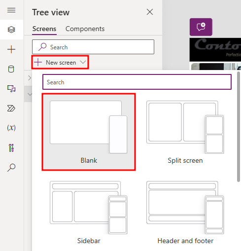
From the Tree View pane, select + New screen and then choose Blank.
Rename the screen to
Compare Screen.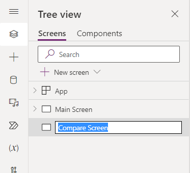
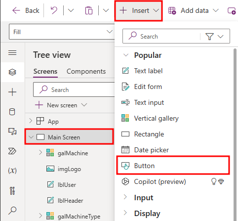
From the Tree view pane, select the Main Screen, then select the + Insert drop-down. Expand the Popular group, and then choose Button.
Rename the button within the Tree view pane to
btnCompare.Select the btnCompare within the Tree view pane.
Set the button's Text property to the following:
"Compare " & CountRows(CompareList) & " item(s)"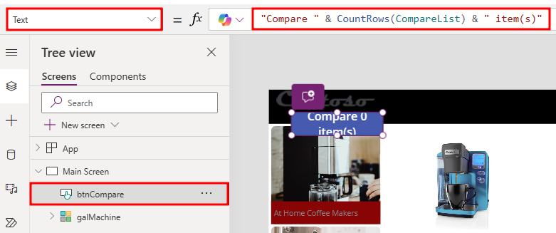
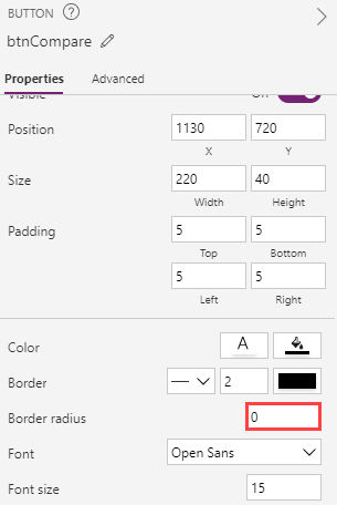
Set the Fill value of the Compare Button to
Color.Black.Set the X value of the Compare Button to
1130.Set the Y value of the Compare Button to
720.Set the Width value of the Compare Button to
220.Set the Height value of the Compare Button to
40.Set the DisplayMode property of the Compare Button to the following formula. This Power Fx formula disables the button if no items are selected and will enable it if at least one item is selected.
If(CountRows(CompareList) > 0, DisplayMode.Edit, DisplayMode.Disabled)Select the btnCompare, and within the Properties pane, set the Border radius to
0.
Select the btnCompare and then copy it by pressing the Ctrl+C keyboard shortcut.
Paste the button on the same screen by using the Ctrl+V keyboard shortcut.
Rename the new button as
btnClear.Set the X value of the new btnClear to
210. Ensure that the Y value of btnClear is set to720.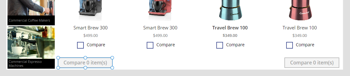
Change the Text value of the btnClear button to
"Clear Selection".Set the OnSelect value of the Clear Button to the following formula. This Power Fx formula removes all items in the CompareList collection.
Clear(CompareList)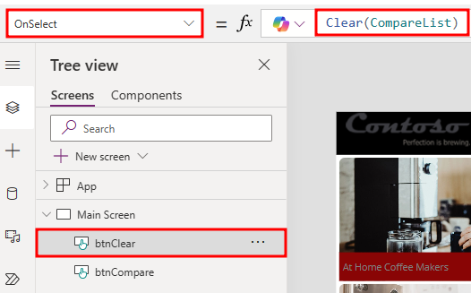
Select the btnCompare and then change the OnSelect value to the following formula:
Navigate('Compare Screen')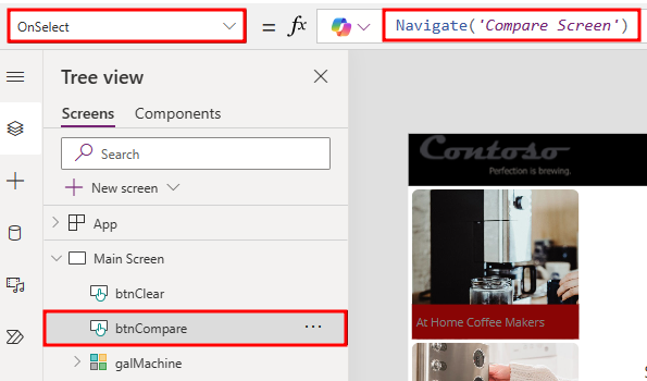
Select Preview the app.
Select a couple of machines, select the Compare button, and then verify that it takes you to the second screen.
You should be directed to the new empty screen. Close the preview.
Select the Main Screen in the tree view.
Muli-select imgLogo, lblUser, and lblHeader from the Tree View pane. Right-click and select Group.
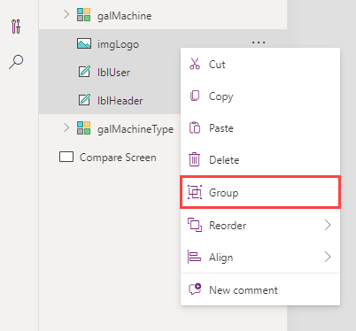
Rename the group as
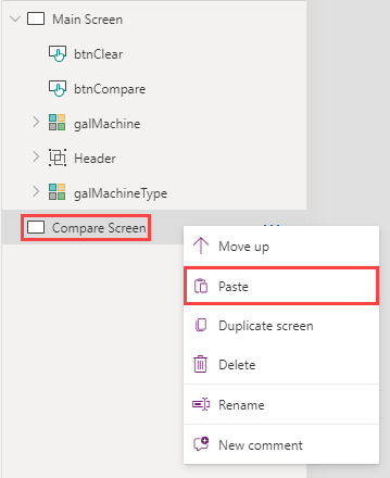
Header.Select the ellipsis (...) button of the Header and then select Copy.
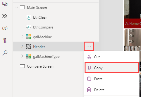
Right-click the Compare Screen option and then select Paste.
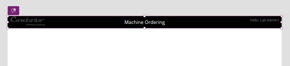
The Header in the Compare Screen should resemble the following image.
Rename the control of the copied
Headerand the child controls of the copiedHeaderto match the screenshot below.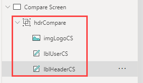
Copy galMachine from the Main Screen and then paste it in the Compare Screen.
Rename the gallery in the Compare Screen as
galCompareList.Set the X value of the Compare List Gallery to
0.Set the Width value of the Compare List Gallery to
840.Set the Height value of the Compare List Gallery to
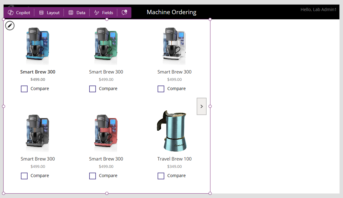
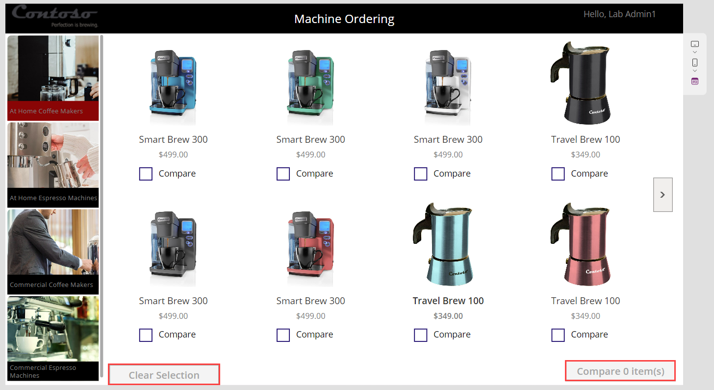
708.The gallery should now resemble the following image.


Task: Set up the gallery
In this task, you set up the gallery to show machines that were selected from the comparison gallery on the Main Screen.
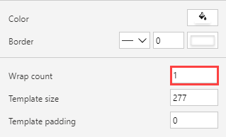
Select the new galCompareList from the Tree view pane.
Within the Properties pane, change the Wrap count to
1.
Select Items from the property value dropdown list, then change the value within the formula bar to
CompareList.

The gallery will now show the selected items from the Main Screen.

Task: Remove and add controls to the gallery
In the Compare Screen, you're selecting a given item to get approved, so you don't need a Compare checkbox.
From within the galCompareList in the Tree view pane, select the Compare checkbox and then press the Delete key to delete the checkbox.
Add a new label to display other attributes about the machine. A method is to copy and paste. Select the first label in the gallery that's displaying the machine name. Copy the label (Ctrl+C) and then paste it (Ctrl+V). Rename this label to lblItemFeature so that you can easily identify it later.
Move the new label so that it's below the price.
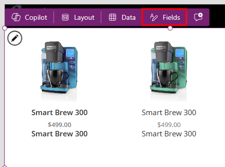
Normally we would edit each individual label's Text value manually in the properties pane, but with the inline actions feature of the galCompareList we can make these changes directly in the canvas.
With the galCompareList selected in the tree view, select the Fields option above the gallery
Select the lblItemFeature drop-down and choose Feature. This changes the text value of lblItemFeature from
ThisItem.'Machine Name'toThisItem.Feature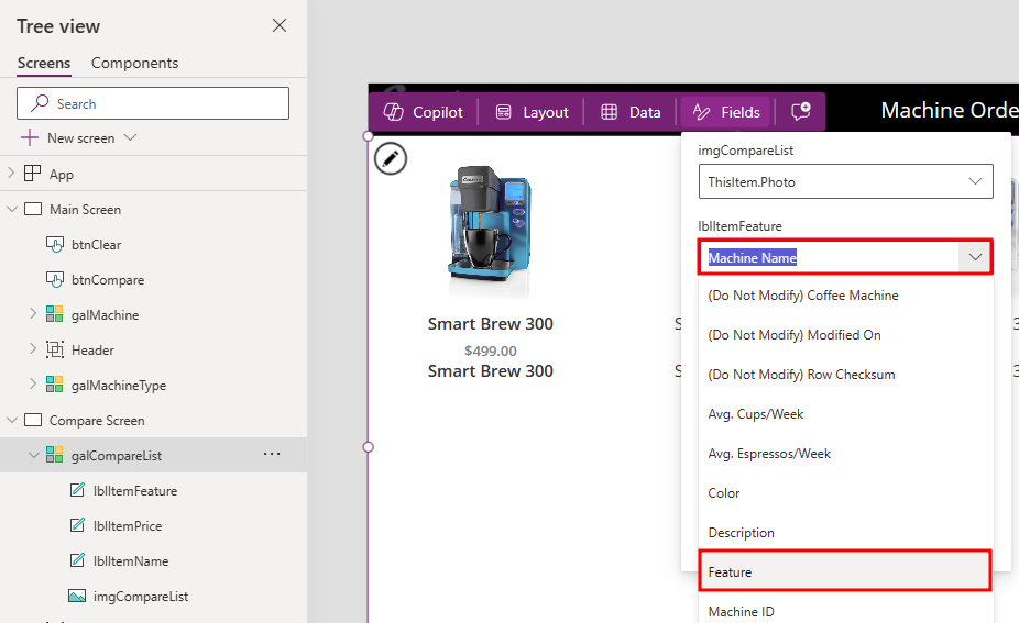
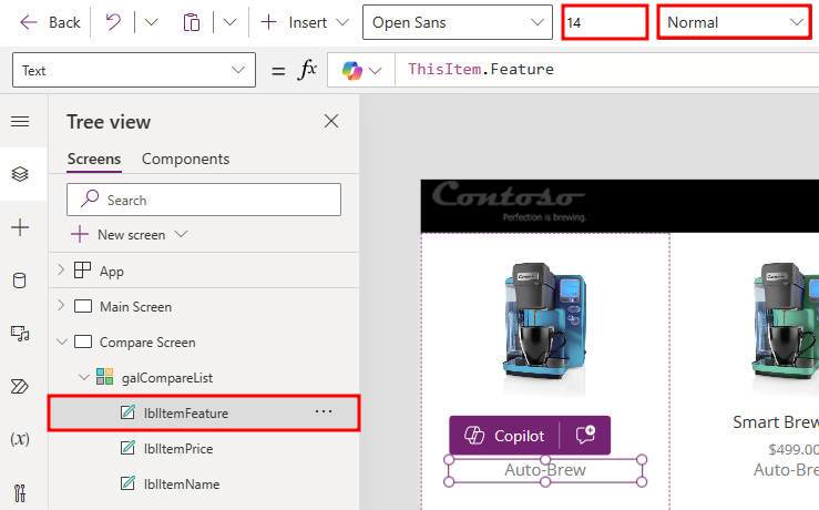
Use the ribbon tool bar at the top of the page to change the font weight from Semibold to Normal. Then change the Size property to
14.
Copy and paste this label and then move the new fourth label below the third label and rename it as lblAvgCups/Week.
Using the inline actions feature, have the galCompareList selected in the tree view, then select the Fields option in the ribbon above the gallery, and change the lblAvgCups/Week text value to
Avg. Cups/Week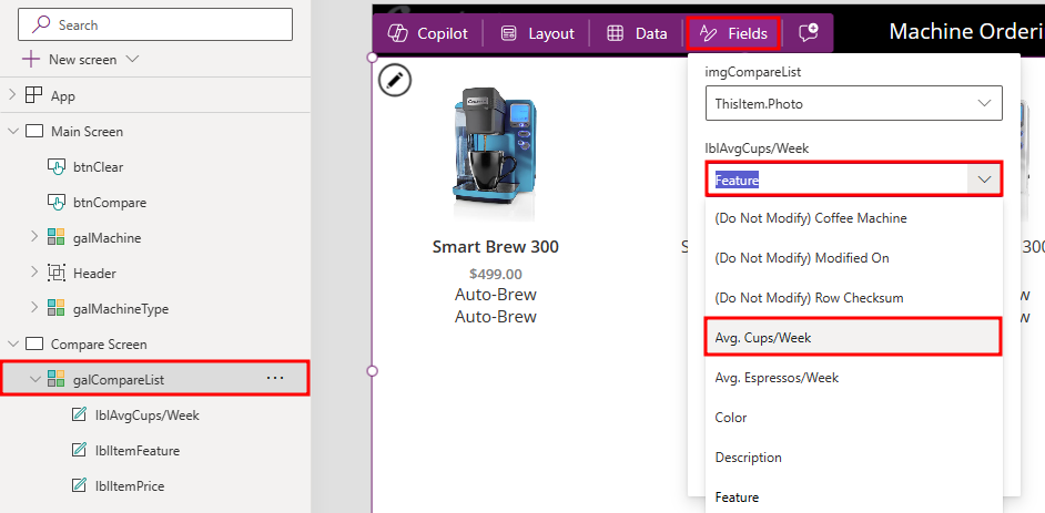
Repeat the previous steps to add text boxes to display the other machine properties, the Avg. Espressos/Week value, and the Description. You can customize the labels by changing their Size, Color, Fill, and Font Weight properties.
Select the Description label inside the gallery.
Change the Size of the Description to
12.Change the AutoHeight value, located within the Properties pane, of the Description to
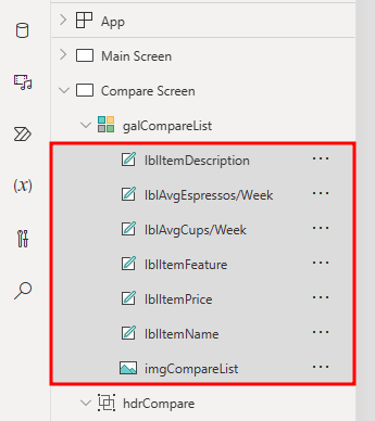
on.Multi-select all of the labels inside the gallery within the Tree view pane.
Note
Within the image above, you will notice that each label has been renamed to correspond with the purpose of the label within the app.
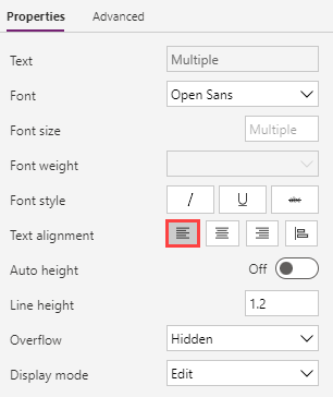
Go to the Properties pane and set the Text alignment to Align left.


The gallery should now resemble the following image.

Note
To save time in this lab, you can add one or two of these extra properties and then skip adding the other machine properties.
Task: Highlight the selected machine
To highlight the selected machine, follow these steps:
Select the galCompareList.
With the gallery selected, set the TemplateFill property to:
If(ThisItem.IsSelected,ColorFade(lblHeaderCS.Fill,75%))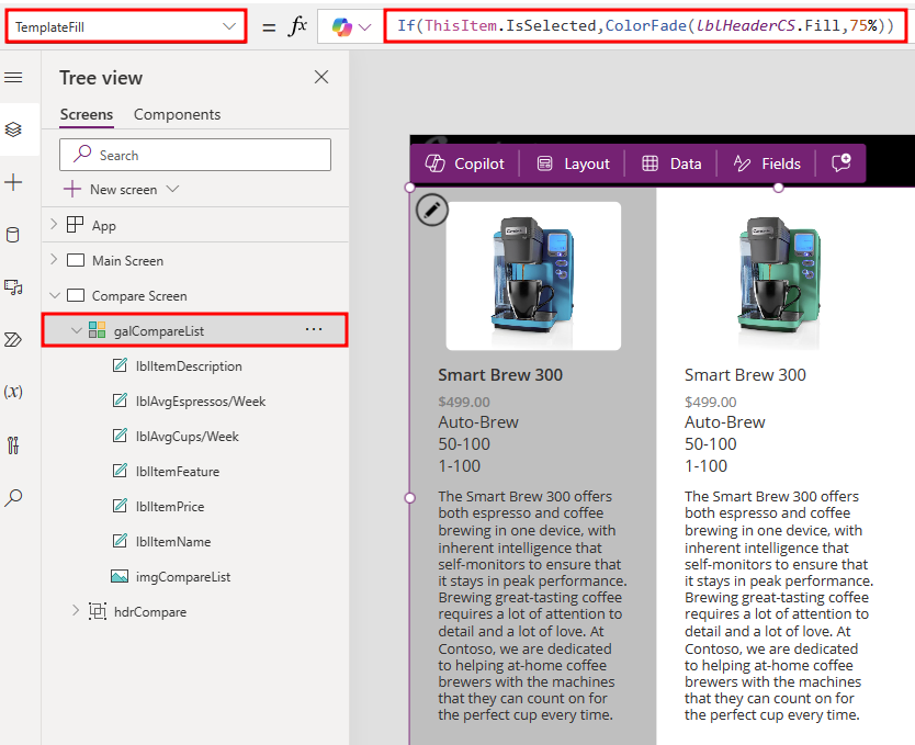
This step will conditionally set a Fill color if the cell is selected.
You could have set a specific color or RGB value, but we recommend that you use the ColorFade function so that it matches the header label with a 75 percent fade. If you change the fill color of header label, this template fill color will automatically change.
While pressing the Alt key, select a different item in the gallery. Notice that the selected item is highlighted in a light gray color.

Task: Add an icon to navigate to the first screen
In this task, you add an icon to navigate to the first screen.
Select the Compare Screen.
Select the + Insert drop down, search for
left, and then choose the Left icon.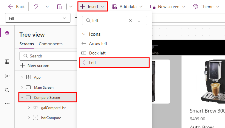
Set the Color of the icon that you added to
Color.Gray.Set the X of the icon to
220.Set the Y of the icon to
5.Set the Height of the icon to
50.Set the Width of the icon to
50.Set the OnSelect action for the icon to
Back(), which will cause navigation back to the previous screen.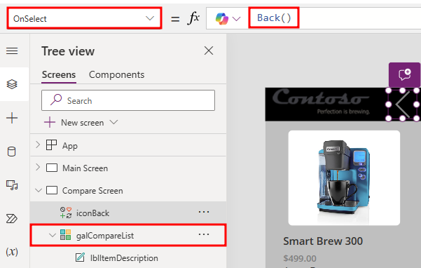

Optional UI enhancement
Add padding around the icon by using the Properties pane. Set the padding values to 10 for the Top, Bottom, Left, and Right settings. As a result, the icon looks smaller but will still have a larger hit target for the select action. This pattern is optimal for most icons.
Task: Test the app
Select Save to save your app. It's a good idea to save your app regularly. You can also test your app directly on the canvas by holding down the Alt key to activate buttons and other controls and then double-clicking to type into controls.
Go to the Main Screen and Preview the app by selecting the Play button in the upper right.
Clear any selected machines, if necessary.
Select one of the machine types.
Select the Compare checkbox on a few machines on the main screen.
Select the Compare button to go to the compare screen.
Tap or select a different machine in the gallery and then verify that the selection highlight works.
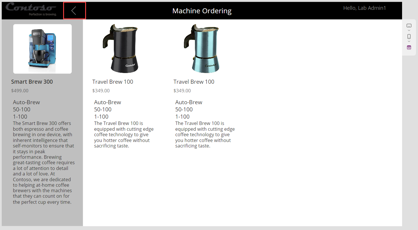
Select the Back button and then confirm that you return to the main screen.
Select Clear Selection.
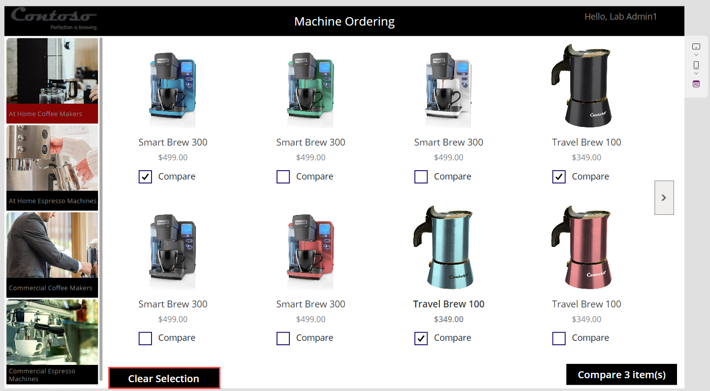
The CompareList should clear, and the Compare button should become disabled.
Close the preview.


Task: Test the app on a mobile device
Congratulations, you've created your Power Apps application. Now, you can publish and test it on a mobile device.
Select the Publish button located in the top right corner of the screen.
Select Publish this version on the confirmation prompt.
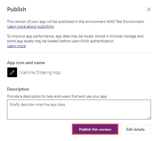
This action publishes the latest saved version of the app.
Go to your device's app store application. Search for Power Apps and install the Power Apps application. Launch the app.
When the app starts, it prompts for your business or school account credentials. Sign in with the same account that you used to create the Power Apps application. The app that you created should appear in the list of apps. Select to Run the app.


New Feature: Copresence within Canvas Studio
Microsoft is thrilled to announce the General Availability launch of Copresence within Power Apps Studio that allows you to collaborate with others in canvas apps. Copresence only supports one editor at a time, but other makers can enter the canvas app as readers in read-only mode. This allows readers to debug codes, review screens, and interact with comments all together in the same session. This feature doesn't have to be turned on as for it's already enabled by default for your ease of use.
The following are the benefits of using Copresence within the Power Apps Canvas Studio:
- Only one editor allowed, but other makers can now access the app within the Power Apps Canvas Studio in read-only mode.
- Icons and names of people who have the app open are displayed with indicators to show who is editing the app and who's viewing it.
- Read-only labels are displayed to indicate to makers that they're in read-only mode.
- While in read-only mode, makers receive notification for saved changes made from the current editor. Then, they'll be prompted to refresh the app to stay up to date on the latest version so they won't lose work or overwrite other's work later.
Note
When you are entering the email of the users in which you wish to share the app, you can choose to make them a User or a Co-owner. Depending on which you choose to enter them as, this will determine what their availibitity is as to what they can do within the app canvas.
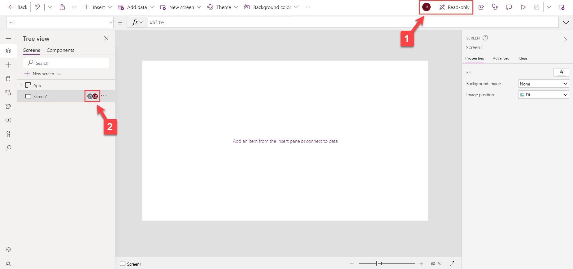
The image below shows what the canvas would look like if you were viewing the app in Read-only mode.
At the top of the screen, you can see whether you are in Edit mode or Read-only mode. Here's also where you can view everyone that is currently viewing the app canvas.
Within the Tree view pane in the canvas, you can see what screen everyone is viewing within the app.

Note
For more information, see Copresence.