Exercise - Add a machine gallery and connect to the data source
In this exercise, you add a gallery of all available machines to help make it easier for users to browse the list and get a quick overview of the available machines.
Note
To complete the exercises, you'll need to use a few files. Download the App in a Day files for use in this module. The file folders that are in this download include:
- Completed modules with instructions - Package files to import the completed exercise steps.
- Machine-Order-Data.xlsx - File used in the exercises.
Task: Add a machine type gallery
In this task, you add a gallery that lists the machine types. This gallery is a single-column, vertical gallery down the left side of the screen, with each cell displaying an image of the machine type. You use this gallery later as a filter for the machine gallery that you create.
Select the Main Screen from the Tree View pane.
Select + Insert, expand the Layout group, and then select Vertical gallery.
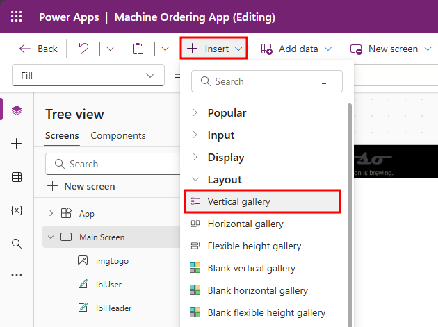
This action adds a gallery called Gallery1 on the screen. The control tree view on the left will display this gallery with a rectangle, separator, next arrow, two labels and an image. The data pane will automatically appear when the gallery is created.
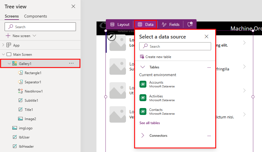
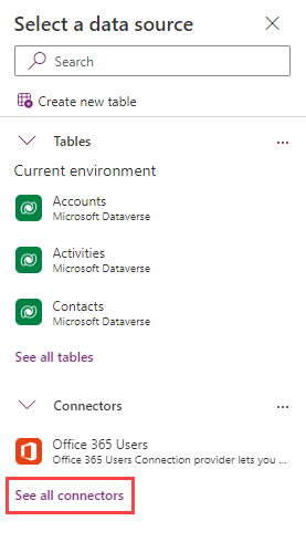
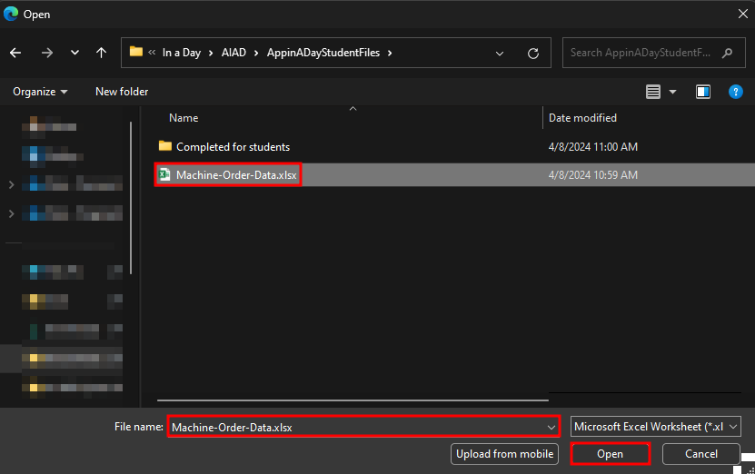
Expand Connectors and then select See all connectors.
Select Import from Excel.
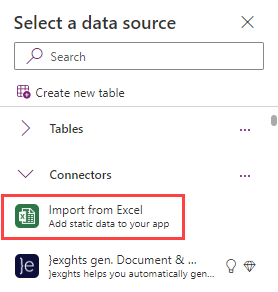
In the File Open dialog, browse to the location where you unzipped the data file (for example C:\AIAD\PAHandsOnLabContent) and then select Machine-Order-Data.xlsx to load it.
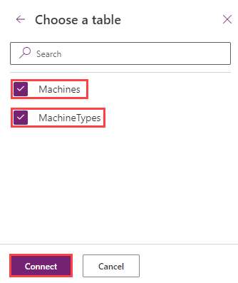
Select the Machines and MachineTypes tables and then select the Connect button. Now, both tables are added as static data into the application.
Note
In this lab, you'll work with tables that are imported from a static data file and embedded as resources in the app. If you were building a real solution, the same tables would likely be stored in the cloud, such as in a SharePoint list, a SQL table, or a Microsoft Dataverse table.
Rename the gallery as
galMachineType.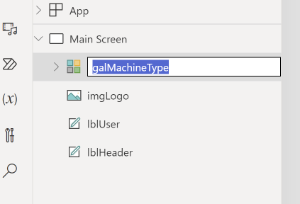


Work with galleries
Galleries provide a powerful way to visualize tabular data in Power Apps. It's important that you become familiar with customizing a gallery. Key components of a gallery are the gallery control, the template cell (first cell), and controls within the template cell.
To select the entire gallery, select the gallery in the tree view on the left or select the second or third cell. Selecting any cell that isn't the first cell of the gallery selects the entire gallery. Now, you can specify properties that apply to the entire gallery, such as the Items property, which is the data source, the gallery fill color, borders, and more.
To customize how each item is displayed in the gallery, you customize the template cell. Select the template by selecting in the first cell of the gallery, or you can select the pencil icon in the upper-left corner when the entire gallery is selected.
Now, you can add, remove, and customize the controls within the template cell. These changes repeat across each item or row in the table.
If you select the machine image in the template cell, you can change its size. Notice how the size of the image changes in all cells.
Additionally, you can test your gallery directly on the canvas by pressing the Alt key on your keyboard to activate.
You customize the machine gallery in subsequent steps.
You don't need to make the gallery pixel perfect; the purpose of this exercise is to get your app working with an acceptable user experience (UX). You can always repeat these labs to practice your pixel-perfect skills.
When you're working with control positioning, X refers to horizontal positioning, and Y refers to vertical positioning.
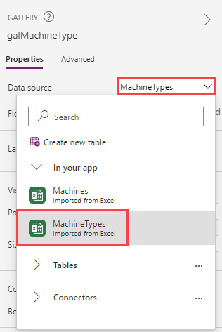
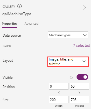
Select the Machine Type Gallery, go to the Properties pane, and select MachineTypes as the Data source.
Set the X value of the Machine Type Gallery to
0.Set the Y value of the Machine Type Gallery to
60.Set the Height value of the Machine Type Gallery to
708.Set the Width value of the Machine Type Gallery to
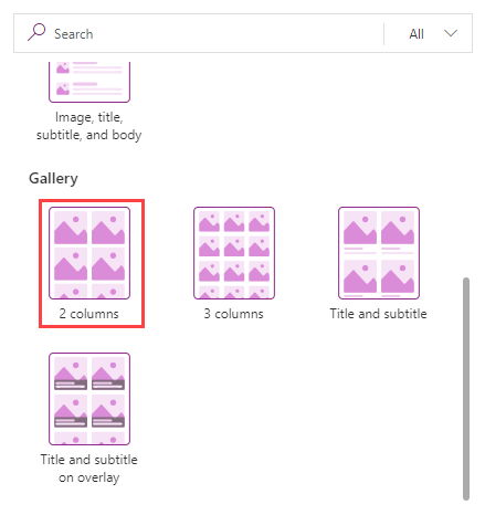
200.Select Machine Type Gallery, and in the Properties tab on the right, select Layout.
Scroll down to the Gallery section and select 2 Columns.
Change the Wrap count to
1. This setting changes the gallery to a single-column gallery.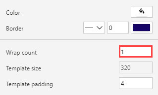
Select the image control within the gallery. Rename the image as
imgMachineType.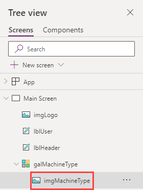
Set the Image value to the following formula, which will set the image value to the photo URL:
ThisItem.PhotoSelect the galMachineType gallery and select the Edit gallery pencil to put the gallery in edit mode.
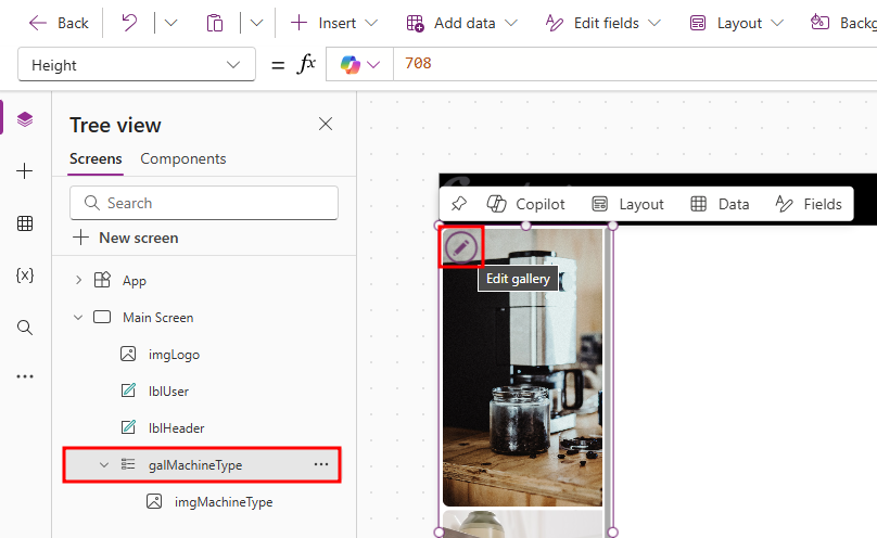
Reduce the height of the template cell so that all four images occupy the gallery without you having to scroll to view them. You want the image to occupy the entire cell.
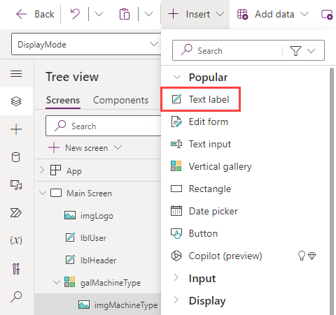
Make sure that the template cell of the gallery is still selected. Select Insert and then select Text label.
Set the Text value of the label to the following formula:
ThisItem.Name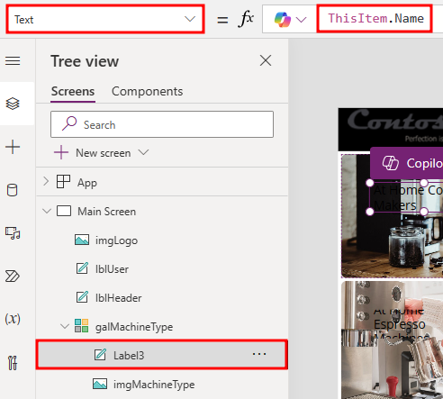
Set the X value of the label to
0.Set the Y value of the label to
132.Set the Width value of the label to
192.Change Fill color to
Color.Black.Change Color to
Color.Gray.Using the tool bar at the top of the page, change the Size to
10.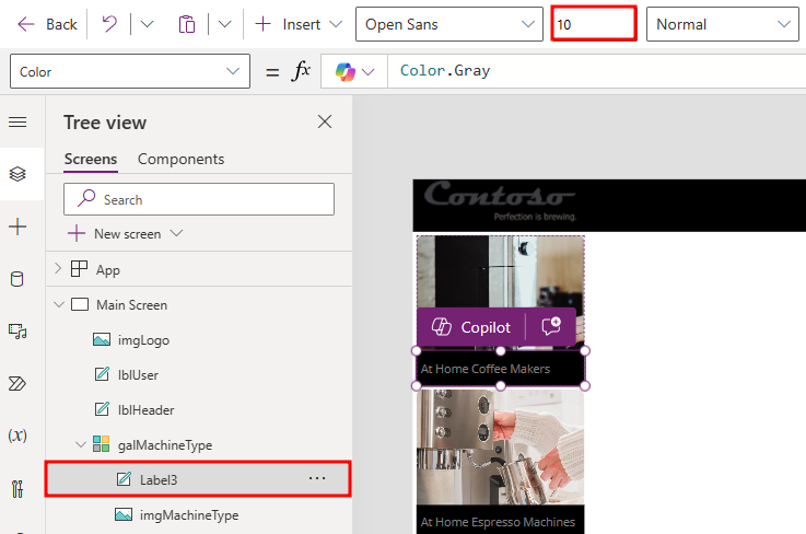
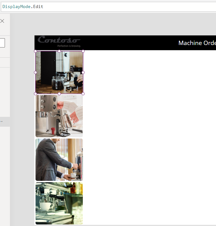
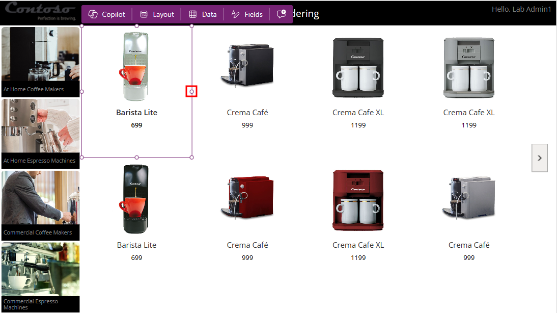
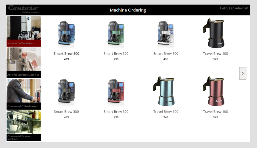
The main screen should now resemble the following image.
Select Save and then wait for the application to be saved.


Task: Add a machine gallery
Follow these steps to add a machine gallery:
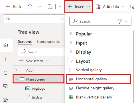
Select Main Screen, then select the + Insert drop-down, expand the Layout group, and then choose Horizontal gallery.
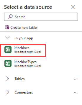
Select Machines as the data source.
Rename the gallery to
galMachine.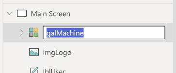


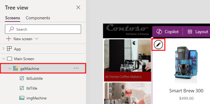
Task: Arrange the Machine Gallery
To arrange the machine gallery, follow these steps:
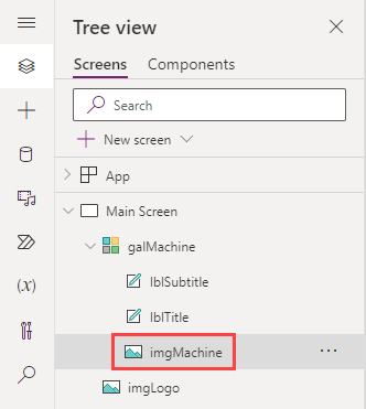
Expand the Machine Gallery which was renamed galMachine and rename the controls according to picture below. Then, select the
imgMachinecontrol.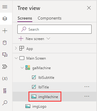
Set the Image value of the image to the following formula:
ThisItem.PhotoFrom the gallery galMachine, select the Title renamed lblTitle.
Set the Text value of the title to the following formula:
ThisItem.'Machine Name'From the gallery galMachine, select the Subtitle renamed lblSubtitle.
Set the Text value of the subtitle to the following formula:
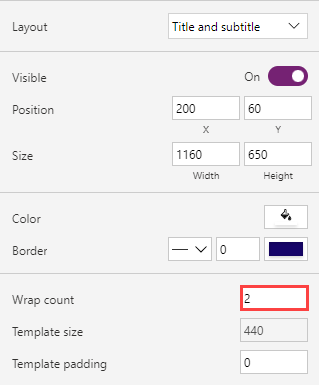
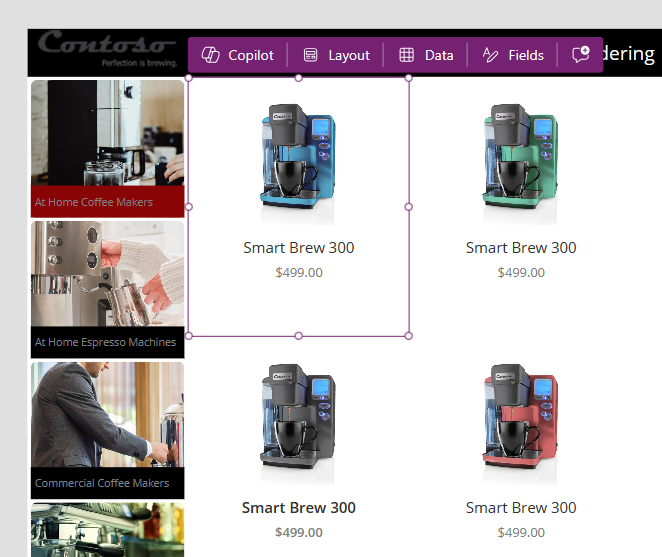
ThisItem.PriceSelect the entire galMachine from the Tree View pane.
Set the X value of the Gallery to
200.Set the Y value of the Gallery to
60.Set the Height value to
650.Set the Width value of the Gallery to
1160.Select the galMachine from the Tree view pane, go to the Properties pane, and set the Wrap count to
2.
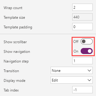
Set the Show scrollbar toggle to Off and the Show navigation toggle to On.
Select the image inside the galMachine within the Tree view pane.
Set the Width value of the image to
200.Set the Height value of the image to
170.Select the lblTitle and lblSubtitle inside the gallery. Press the Ctrl key to select multiple controls.
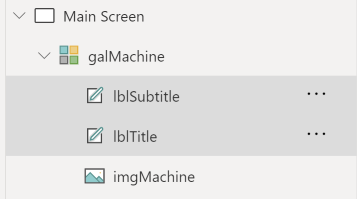
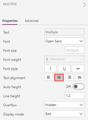
Go to the properties and select Center for Text alignment.
Select galmachine and then select the Pencil to edit the gallery.
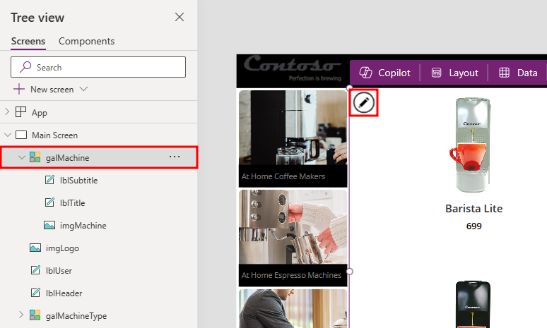
Make the template narrower until a total of 8 machines are visible.


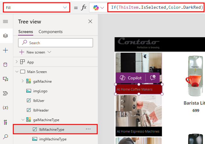
Task: Highlight the selected item in the gallery
In this task, you use the TemplateFill property of the Machine Type Gallery to specify a highlight color for the selected item. You can decide how you want to indicate the selected item. You'll also change the label fill for this gallery.
Expand the galMachine in the Tree View, rename the Label control to
lblMachineType. Then, select the lblMachineType control.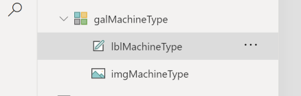
Change the Fill value of the label to the following formula. This Power Fx formula sets the label fill to dark red for the selected item.
If(ThisItem.IsSelected,Color.DarkRed)Alternatively, you could set the Fill property to:
If(ThisItem.IsSelected,ColorFade (lblHeader.Fill,75%))We recommend that you use this approach so that the fill color matches the header label with a 75 percent fade. If you change the fill color of header label, the fill color of the selected item in the gallery will automatically change.
Try using the preview mode to perform a quick test of this highlighting. You can enable preview mode by holding down the Alt key (also known as the Option key) and selecting a few different manufacturers in the gallery. Notice that the selected item in the manufacturer gallery is highlighted. The preview mode ends when you stop holding the key.


Alternatively, you could select the Play button to enter preview mode. To exit preview mode, select the X in the upper-right corner or press the Esc key.
Task: Filter the machine gallery based on the selected machine type
In this task, you use the Filter() function to filter items in the galMachine to only display machines that match the selected item in the galMachine.
Select the galMachine.
Set the Items value to the following formula:
Filter(Machines, 'Machine Type ID' = galMachineType.Selected.'Type ID', 'Machine Type ID')For alternate/European locales, enter the following formula:
Filter(Machines; 'Machine Type ID' = galMachineType.Selected.'Type ID'; 'Machine Type ID')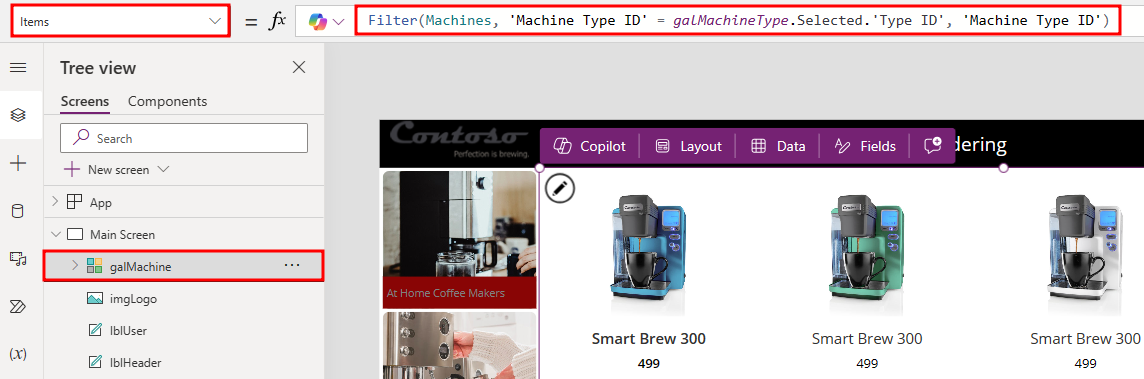
The Machine Gallery should now show machines that match the selected item of the machine types.
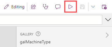
Select the Preview the app button found in the top right corner of the screen.
The app should load.
Select an item from the navigation menu to the left of the galMachine. The machine gallery should show machines that match the selected machine type.
Close the preview.
Note
If you get an error when entering the Filter() command, check the name of the machine type gallery. The name in the filter command must match the name of your gallery.


For more information about the Filter() function, see Filter lookup.
For a complete set of expressions, see Power Fx formula reference.
Task: Set up text labels in the machine gallery
To set up text labels in the machine gallery, follow these steps:
Select the gallery galMachine within the Tree view pane.
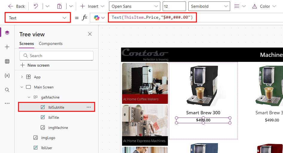
To add the dollar sign ($) to the Subtitle, change the Text value of the expression to the following formula:
Text(ThisItem.Price,"$##,###.00")For alternate/European locales, enter the following formula:
Text(ThisItem.Price;"$##.###,00")Note
After you've entered the preceding value in the formula bar, it will automatically resolve to include your locale, such as [$-en-US]. If an error occurs, your locale might not be supported yet, in which case, as a workaround, you can manually change it to [$-en-US].

Task: Conditional formatting to highlight machines above $10,000
You can make spotting machines that cost more than $10,000 easier by displaying the price in red font.
Under the galMachine, select the lblSubtitle that displays the price and then set the Color value to the following:
If(Value(ThisItem.Price)>10000,Color.OrangeRed,Color.Gray)For alternate/European locales, enter the following formula:
If(Value(ThisItem.Price)>10000;Color.OrangeRed;Color.Gray)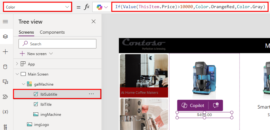
Note
As you're entering this formula, notice that autosuggest shows a choice of matching colors. Power Apps comes with a set of standard colors that you can reference in any property that accepts a color value. You can also set specific RGB color values.
For a full list of color functions and colors, see Function colors.
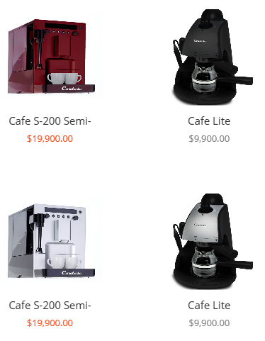
Select Preview the app.
Select Commercial Espresso Machines from the Machine Type Gallery. The price for machines that are over $10,000 should become red.


Note
If a border appears around the Machine Gallery while in Preview mode, you can change the color to not appear. To do so, close out of the preview mode, navigate to the galMachine gallery pane, and set the border color to Transparent.

Close the preview.
Select Save and then wait for the application to be saved.
Task: Add a checkbox to add a machine to the Compare list
Now, you'll want to allow users to select multiple machines to compare before making a final selection on the next screen.
Select the galMachine from the Tree view pane and then select the Edit gallery pencil icon in the upper left of the gallery.
Make sure that only the first item in the gallery is selected (not the entire gallery).
Select the + Insert drop-down, expand the Input group, and then select Check box.
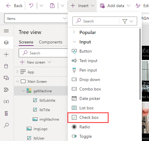
Rename the checkbox to
chkCompare. Move the inserted checkbox below the price.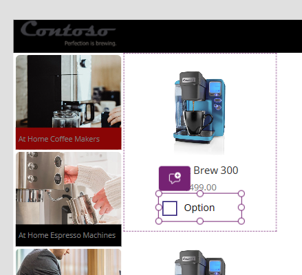
Change the checkbox text to
Compareby changing the Text property value within the formula bar.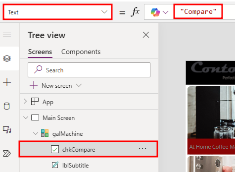


Task: Create a collection for the selected machines
When a user selects a machine to compare, you add it to a collection called CompareList. Consider this collection as an in-memory collection of machines that have been selected for comparison.
Select the Checkbox renamed to chkCompare from within the Tree view pane and change the OnCheck value to the following formula:
Collect(CompareList,ThisItem)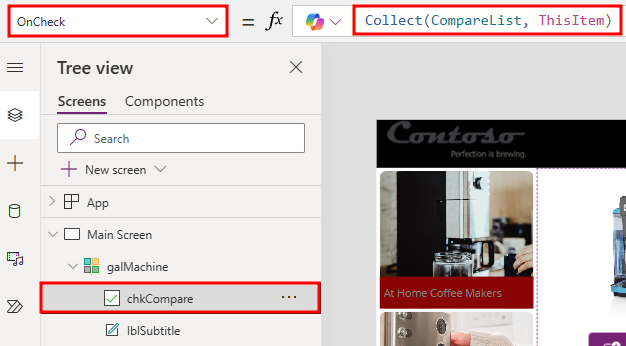
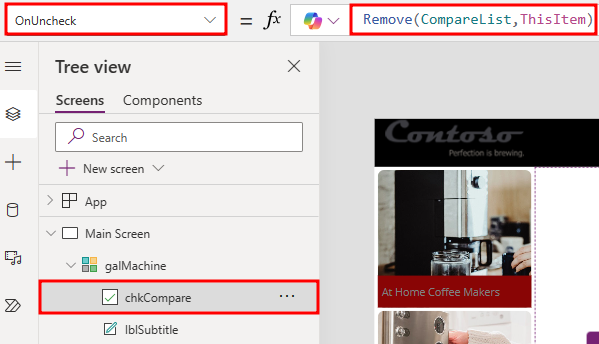
Set the OnUncheck value to the following formula:
Remove(CompareList,ThisItem)This is step is required to make sure that the items that become unchecked are removed from the collection.
Set the Default property of the checkbox to the following formula:
ThisItem in CompareList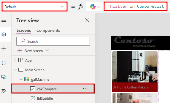
The Default setting of the checkbox is a Boolean true or false value that determines whether the checkbox should be checked by default or not. Setting this formula ensures that the checkbox is selected by default if the item has already been added to the collection because the result will be true, for example, this item *is* in CompareList.
To test the adding of items to a collection, you can run the app in Preview (F5) or you can select the Preview button in the upper right. Select the checkboxes of three machines.
Close the preview.
From the navigation pane to the left of the screen, select the Variables icon. Expand the Collections section.
Hover over the CompareList and select the ellipsis to the right. Choose View Table.
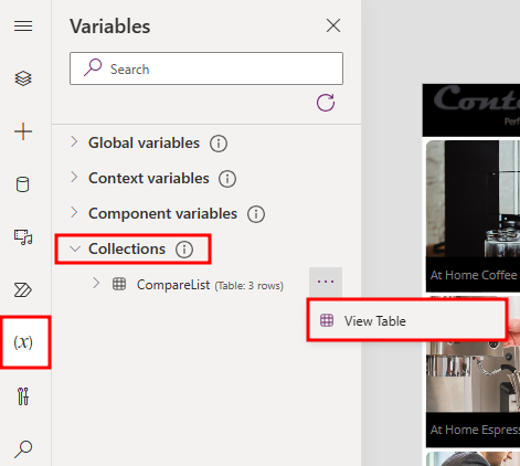
The CompareList collection and the three items that you selected will display.
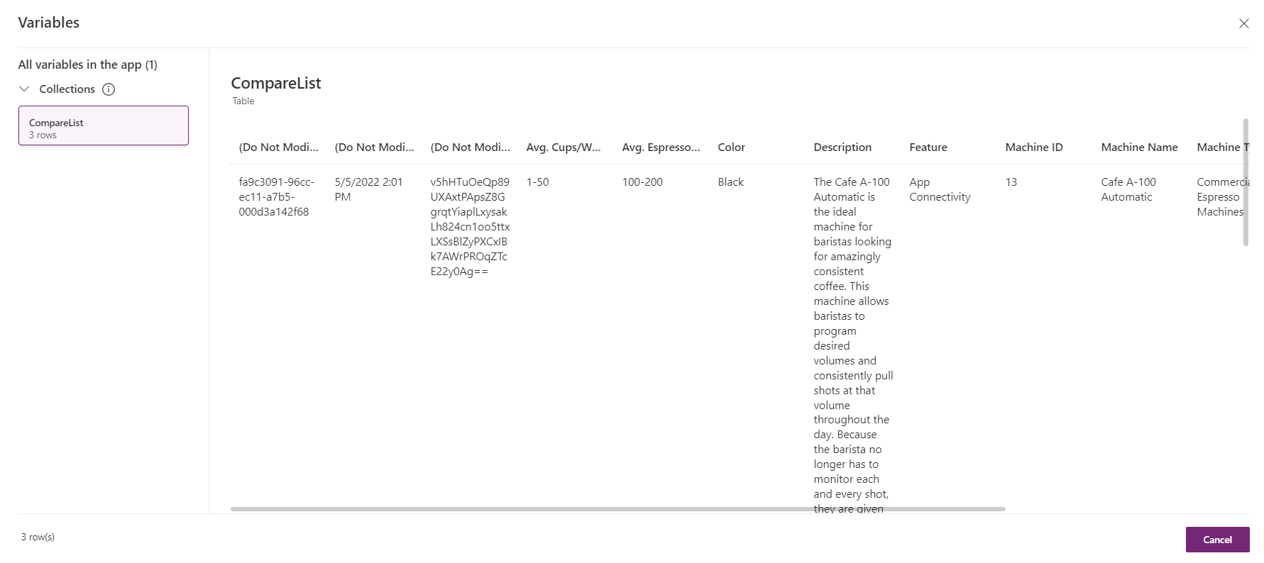
Each item in the collection has the information for each machine that you've received from the Machines data source, not just the fields that you display in the Machine Gallery.
Select the X in the upper right corner to close out and return to the main view.
Select the Preview icon again.
Clear all items with check marks and then close the preview.
Select the ellipsis (...) button next to CompareList under the Collections section and then select View Table again.
Notice that all items are removed from the CompareList collection.
Select the X to close out of the dialog.


Task: Set the default selection to the first machine type and test the app
To avoid getting a blank list of machines when the app starts, set the default selected item in the Machine Type Gallery to be the first item.
Select the entire gallery (by selecting galMachineType in the tree view on the left) and then set the Default property of the gallery in the formula bar to:
First(MachineTypes)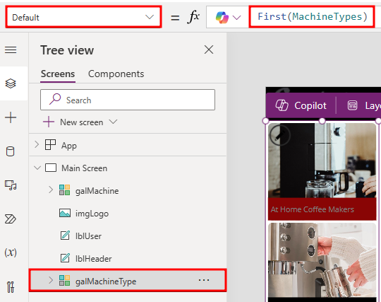
This action sets the selected item to be the first item in the table.
To preview the app, select the Preview button on the upper right of the menu. Alternatively, you can press the F5 key to preview the application. You can also test your app directly on the canvas by holding down the Alt key to activate buttons and other controls.
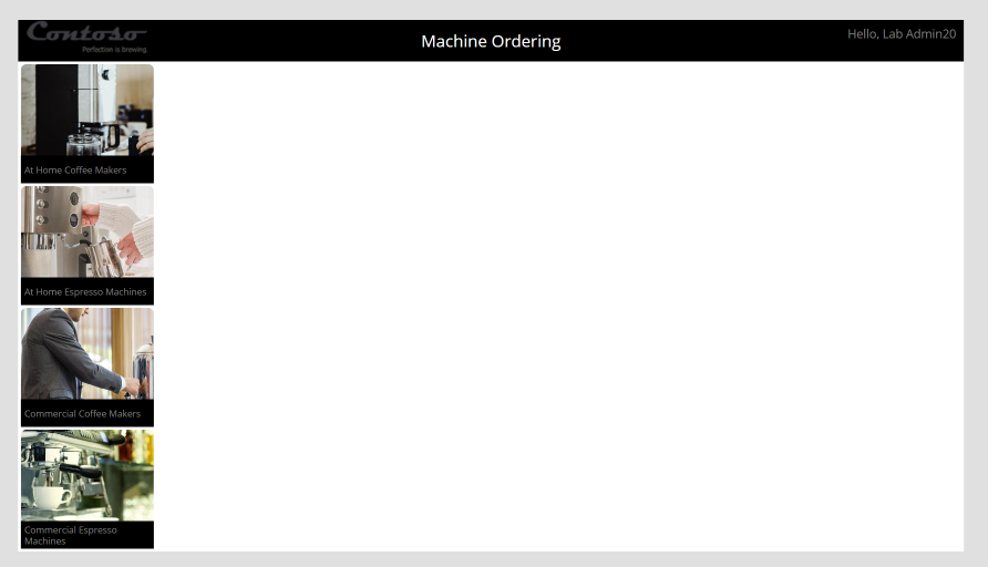
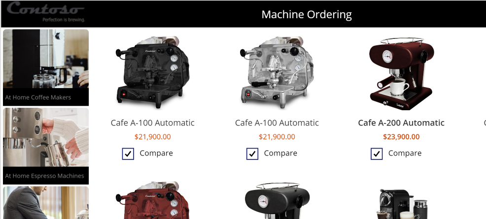
Your app should resemble the following image.
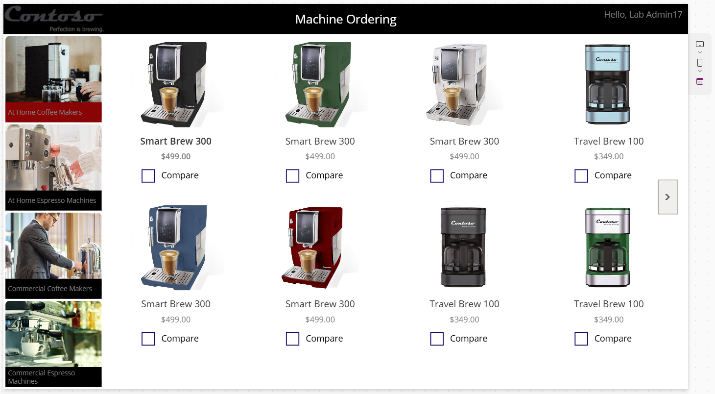
To exit preview mode, select the X in the upper-right corner.
Select Save and then wait for the application to be saved.
Don't navigate away from this page.

