Lab - Creating visualizations
In this lab, create your first dashboard in Power BI using the standard visuals in Power BI, including the bar chart and scatter plot. Then add interactivity using cross filtering, bookmarks, and the Decomposition tree standard visual. At the end of this lab, you create a report like this one.

Creating a dashboard
In this exercise, you create a dashboard and add interactivity.
Task 1: Build a scatter chart
In this task, you create a scatter chart.
Create a new page by selecting the yellow "plus" sign at the bottom of the screen. Title this tab Tailspin Toys.
From the Visualizations panel, select the Scatter chart visual.
From Data section, drag and drop Sales Amount field from Measures Table table to X Axis.
From Data section, drag and drop Quantity field from Sales table to Y Axis.
From Data section, drag and drop Product field from Product table to Details.
This action provides a representation of the Quantity and Sales Amount by Product.
Task 2: Format the scatter chart
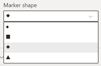
Select the Format you visual icon. Under Visual, select Marker to expand it. Under Shape set the Size to 7 and set the Marker shape to diamond.
Under General, select Title to expand it. Under Title, for Text, enter What are my best selling products? Set the Font size to 18.
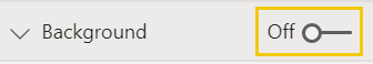
OPTIONAL In the Format section, under Background set to Off.
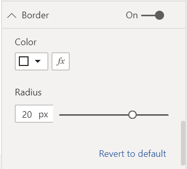
OPTIONAL In the Format section, under Border set the Color to White and the Radius to 20.
OPTIONAL In the Format section, under X-axis, go down to Gridlines and set the Color to White and the Stroke width to 4.
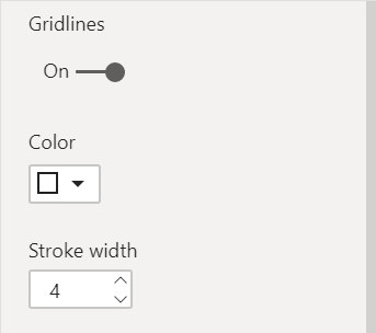
OPTIONAL In the Format section, under Y-axis, go down to Gridlines and set the Color to White and the Stroke width to 4.
Task 3: Create a stacked bar chart
From the Visualizations panel, select the Stacked bar chart visual
 .
.From the Data section, drag and drop Sales Amount field from Measures Table table to Values.
From the Data section, drag and drop State field from Geography table to Axis.
This configuration provides a representation of the Sales Amount by State.
Task 4: Format the stacked bar chart
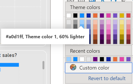
Select the Format you visual icon. Under Visual, select Bars to expand it. Next to Colors > Default select
 .
.Note
From this screen notice that there are a number of different methods you can create conditional formatting including Color Scale, Rules, and Field value. No additional calculations are necessary to create conditional formatting.
In the Default color window, select OK to confirm your selections.
Under Format visual, select General. Select Title to expand it. For Test, enter Where are my highest sales? For Font size, select 18.
OPTIONAL In the Format section, under Background set to Off.
OPTIONAL In the Format section, under Border set the Color to White and the Radius to 20.
Task 5: Create an area chart
From the Visualizations panel, select the Area chart visual
 .
.From the Data section, drag and drop the Sales Amount field from Measure Table to X-axis.
From the Data section, drag and drop the Order Date field from Sales to Y-axis.
From the Visual Header, select the drill-down button twice to show the chart by Year.
Task 6: Format the area chart
Select the Format your visual icon. Select X-axis to expand it. Select the color selector box and select the light blue.
Select Title to expand it. For Title text, enter How have my sales changed over time? Set the font size to 18.
OPTIONAL In the Format section, under Background set to Off.
OPTIONAL In the Format section, under Border set the Color to White and the Radius to 20.
Task 7: Add a decomposition tree
From the Visualizations panel, select the Decomposition tree visual
 .
.From the Data section, drag and drop the Discount % field from Measure Table to Analyze.
From the Data section, drag and drop the ItemGroup field from Product to Explain by.
From the Data section, drag and drop the ProductCategory field from Product to Explain by.
From the Data section, drag and drop the Product field from Product to Explain by.
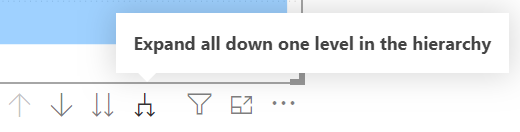
Expand out the fields by selecting the "plus sign" next to each dimensional group.
Task 8: Format decomposition tree
Select the Format your visual icon. Select Tree to expand it. In Tree settings, set Density to Dense.
Select General > Title. Turn the title On and enter the text Where do my discounts go? Set the font size to 18.
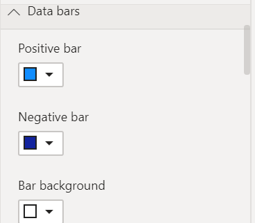
OPTIONAL Under Visual > Data bars > Colors, set Bar background to white.
OPTIONAL Under General > Effects, set Background to Off.
Task 9: Add a multi-row card
From the Visualizations panel, select Multi-row card visual
 .
.From the Data section, drag and drop Sales Amount from Measures Table to the Fields.
From the Data section, drag and drop Quantity field from Sales to the Fields.
From the Data section, drag and drop Discount % field from Measures Table to the Fields.
From the Data section, drag and drop Discount Amount field from Sales to the Fields.
Task 10: Format multi-row card
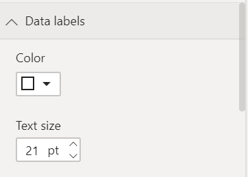
OPTIONAL Select the Format you visual icon. Select Visual > Callout values. Set the Font size to 21 and the Color to white.
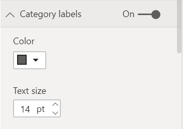
OPTIONAL Select Visual > Category labels. Set the Font size to 14.
OPTIONAL Select Visual > Cards > Style, under Background, select white.
Task 11: Set page background
OPTIONAL Select anywhere on the background of the Page to deselect visuals.
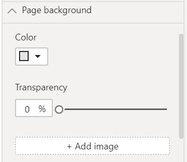
OPTIONAL Select the Format your report page icon. Under Canvas background > Color set the color to the lightest gray available and set Transparency to 0.
Task 12: Add a header (optional)
From the ribbon, under Insert > Elements > Shapes, select the Rectangle icon.
From Format > General > Properties, set the Height and Width and to be 120 and 1280 respectively.
From Format > Shape > Style > Fill, set the value to Off.
From Format > Shape > Style > Border, set the Width to 0.
From Format > General > Effects, for Background select On.
Under Background > Color, select a medium gray.
Task 13: Add a logo
- From the ribbon, under Insert > Elements, select the Image icon. Navigate to the "Toys of Tomorrow Icon" and select Open.
Task 14: Add page filters
Expand the Filters pane, if it's closed.
From the Data section, drag and drop KitType field from Product to Filters on this page.
From the Data section, drag and drop Region field from Geography to Filters on this page.
Task 15: Add cross filtering
Select on one of the visuals you've created.
From the ribbon, under Format > Interactions, select Edit interactions.
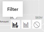
For each of the other visuals you've created, select the Filter icon from the Visual Header.
Repeat the steps in this task with each of the others visuals you created.
Task 16: Create two bookmark actions with icons
In this task, make a copy of the bar chart you've already made, convert it to a map, and give the user the option to pick between the two.
Select the bar chart you've already created. To copy and paste, select Ctrl+C and Ctrl+P.
Select the new copy of your bar chart and, from the Visualizations panel, select Filled Map visual
 .
.Place the bar chart and map that you've created on top of each other.
Open the Selection Pane and Bookmarks Pane by going to the Ribbon under View > Show Panes select Selection Pane and Bookmarks Pane.
From the Selection Pane, hide the map visual by selecting on the Show/Hide icon next to it. You know you've selected the correct visual by selecting on the name in the Selection Pane results in highlighting the visual in the report canvas.
Create your first bookmark by going to the Bookmarks Pane and selecting Add. Rename this bookmark to Bar.
Using the Selection Pane, unhide the map visual. Then hide the bar chart visual.
Create another bookmark by going to the Bookmarks Pane and selecting Add. Rename this bookmark to Map.
From the ribbon, under Insert > Elements, select the Image icon. Navigate to the "Map Icon" and select Open.
Select the "Map Icon" and, under the Format image section, set Action to On.
From Format image section, select Action > Type as "Bookmark" and select Action > Bookmark as "Map".
From the ribbon, under Insert > Elements, select the Image icon. Navigate to the "Bar Chart Icon" and select Open.
Select the "Bar Chart Icon" and, under the Format image section, set Action to On.
From Format image section, select Action > Type as "Bookmark" and select Action > Bookmark as "Bar".
You can now Ctrl-select on either of these two icons to swap between the bar chart and map.
Task 17: Arrange and style
Now that you have the building blocks, use the remaining time to arrange the visuals in a way that tells a story. Here's a couple of tips to get you going:
From the ribbon, under View > Themes, pick a theme to set your colors and font. Then customize the theme to fit your style.

Select anywhere on the empty canvas to reveal options to alter the size, color, or even insert an image into the background.
Ctrl+select multiple items to format them at the same time.

In this lab, you created your first dashboard in Power BI using the standard visuals in Power BI, including the bar chart and scatter plot. You added interactivity using cross filtering, bookmarks, and the Decomposition tree standard visual.