Basics of ACEs: card templates, CardViews, properties, and states
Customers can customize Viva Connections and Viva Home in multiple ways to create tailored experiences for their customers.
Developers can customize and extend Viva Connections with web parts created using the SharePoint Framework (SPFx). Editors can then place the web parts in content areas of pages and configure them to create a customized experience for users.
Developers can also create SPFx application customizers, a type of SPFx extension that can inject HTML and JavaScript into the header and footer of pages.
Another type of extensibility option developers and customizers can use to customize Viva Connections and Viva Home is with Adaptive Card Extensions (ACEs). ACEs are similar to web parts but primarily use Adaptive Cards to implement the user experience.
In this unit, you'll learn what ACEs are, how they work, and basics of creating custom ACEs to extend your user's Viva Connections and Viva Home experience.
Adaptive Card Extensions (ACEs)
The Viva Home and Viva Connections dashboard and mobile experience can be extended and customized using ACEs. Developers use the SPFx to create custom ACEs to enable customized experiences in Viva Connections dashboards and the Viva Connections mobile app.

The ACEs enable users to view information quickly at a glance, or interact with cards to in a focused and mobile friendly experience.
Developers can create a new ACE using the SPFx. Microsoft added support for creating ACEs to SPFx v1.13 released in late 2021. This added a fourth component type capability in addition to the existing support for web parts, extensions, and library components.
An ACE has a similar structure to a web part, so if you have experience creating web parts, the process for creating ACEs will look familiar. Like web parts, ACEs can be developed and tested using the SharePoint hosted workbench in an existing SharePoint Online site.
Card types
Viva Connections and the SPFx support a few different types of card views. These include the basic card view, the image card view, and the primary text card view. Each of these different card types has subtle differences in the properties you can set on the CardView.
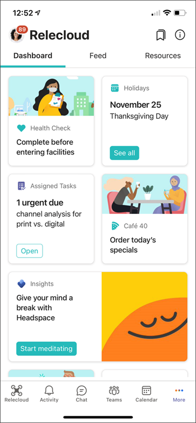
Basic Card Template
The Basic Card template supports two properties:
- The
titleof the ACE, typically set when creating the project with the Yeoman Generator for the SharePoint Framework. - The
primaryTextof the ACE, used to provide some context to the user about the card.
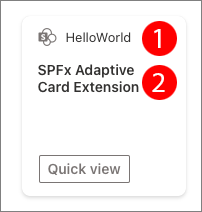
Image Card View
The Image Card template supports three properties:
- The
titleof the ACE, typically set when creating the project with the Yeoman Generator for the SharePoint Framework. - The
primaryTextof the ACE, used to provide some context to the user about the card. - The
imageUrlof the image to display in the card.
When the card size is set to large the image is rendered to the right of the card as shown in the previous image. When set to the medium sized card, the image is rendered above the card's title.
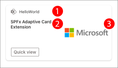
Primary Text Card View
The Primary Text Card template supports three properties:
- The
titleof the ACE, typically set when creating the project with the Yeoman Generator for the SharePoint Framework. - The
primaryTextof the ACE, used to provide some context to the user about the card. - The
descriptionof the ACE is used to display more textual information to the user.
View types
ACEs are based on two types of views:
CardView
The CardView is the default view of an ACE when it's rendered. CardViews are rendered in one of two sizes: medium or large.
The medium view can contain some text and one or no buttons.
The large view option for the CardView can contain text, up to two buttons and optionally an image.
When creating a new ACE, you'll select one of three available card templates that define what properties are available in the CardView.
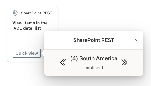
QuickView
The other type of view supported by ACEs is the QuickView. The QuickView is rendered based on an interaction with the CardView. They can be displayed when the user selects the CardView or when one of the buttons is selected.
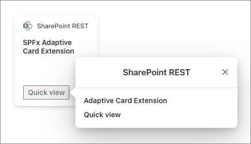
Unlike the CardView, the QuickView rendering is implemented with the Adaptive Card JSON schema. Developers can make the QuickView dynamic by using the Adaptive Card Templating capability where placeholders can reference data bound to the template as a separate object.
For example, a JSON object with a description property can be bound to the QuickView:
{
  "description": "This is some description to display on the QuickView"
}
To reference the property in the Adaptive Card used by the QuickView, use the ${} notion as follows:
{
  "type": "TextBlock",
  "text": "${description}",
  "wrap": true
}
Creating ACEs
Developers can create Adaptive Cards using the same Yeoman Generator for SharePoint used to create SPFx web parts, extensions, and library components.
Explore the core ACE class
An ACE is implemented using the *AdaptiveCardExtension.ts file. This file exports three types of members used to implement the ACE:
- interfaces defining the public properties and state for the component
- constants defining unique IDs for each of the QuickViews used in the ACE
- a class that acts as the hub for the ACE
The ACE class contains a few default methods similar to a SPFx web part.
The onInit() method is used to handle state initialization, view registration, and preloading data tasks. We'll revisit this method and some of these issues later in the module:
public onInit(): Promise<void> {
  this.state = { };

  this.cardNavigator.register(CARD_VIEW_REGISTRY_ID, () => new CardView());
  this.quickViewNavigator.register(QUICK_VIEW_REGISTRY_ID, () => new QuickView());

  return Promise.resolve();
}
The getPropertyPaneConfiguration() and loadPropertyPaneResources() methods are used to initialize, configure, and load the property pane for ACEs that have configurable public properties.
To better support the ACE mobile experience, the loadPropertyPaneResources() method uses the Webpack chunking feature to break out the business logic in script files that implement the property pane and load them when the property pane is activated. This optimization makes it so all users who are consuming the ACE don't always load the property pane script that they won't use:
protected loadPropertyPaneResources(): Promise<void> {
  return import(
    /* webpackChunkName: 'HelloWorld-property-pane'*/
    './HelloWorldPropertyPane'
  )
    .then(
      (component) => {
        this._deferredPropertyPane = new component.HelloWorldPropertyPane();
      }
    );
}

protected getPropertyPaneConfiguration(): IPropertyPaneConfiguration {
  return this._deferredPropertyPane?.getPropertyPaneConfiguration();
}
Finally, the renderCard() method is similar to the web part's render() method. It returns the ID of the CardView that should be used to render the ACE:
protected renderCard(): string | undefined {
  return CARD_VIEW_REGISTRY_ID;
}
Explore the CardView class
The CardView for the ACE is implemented in the ./[..]/cardView/CardView.ts file. The initial CardView.ts file created by the Yeoman generator contains three methods.
The cardButtons() method returns zero, one, or two objects of type ICardButton that define the buttons rendered on the CardView. Different CardView templates restrict how many buttons can be displayed depending on various factors. For example, the Primary Text Card template can only show two buttons when its size is set to large.
public get cardButtons(): [ICardButton] | [ICardButton, ICardButton] | undefined {
  return [
    {
      title: strings.QuickViewButton,
      action: {
        type: 'QuickView',
        parameters: {
          view: QUICK_VIEW_REGISTRY_ID
        }
      }
    }
  ];
}
The data() method returns an object that's bound to the CardView's template using Adaptive Card Templating. The properties on this object should match the properties supported by the current ACE card template selected when creating the project. For example, the following data() method is for the Basic Card Template:
public get data(): IBasicCardParameters {
  return {
    primaryText: strings.PrimaryText,
    title: this.properties.title
  };
}
Finally, the onCardSelection() method is used to control what happens when the CardView is selected. For example, the following implementation will open a link in a new browser tab when the CardView is selected:
public get onCardSelection(): IQuickViewCardAction | IExternalLinkCardAction | undefined {
  return {
    type: 'ExternalLink',
    parameters: {
      target: 'https://www.bing.com'
    }
  };
}
Configurable properties with ACEs
Like SPFx web parts, ACEs support configurable properties to give editors the ability to customize each instance of an ACE. The implementation is similar to web parts in the sense that properties are defined on an interface in the same file as the component.
For example, if the ACE displays data from a SharePoint list, you need to store a reference to the ID of the list so the property interface would look like the following:
export interface ISharePointRestAdaptiveCardExtensionProps {
  title: string;
  listId: string;
}
Like web parts, the default value can be set in the component's *.manifest.json file's preconfiguredEntries.properties object.
One difference from web parts is that ACEs are designed around a mobile-first approach. For the property pane, as previously discussed, this is implemented by separating the code used to define the property pane rendering from the rest of the component. The initial code created for an ACE by the generator puts the property pane definition in a separate file:
export class SharePointRestPropertyPane {
  public getPropertyPaneConfiguration(): IPropertyPaneConfiguration {
    return {
      pages: [
        {
          header: { description: strings.PropertyPaneDescription },
          groups: [
            {
              groupFields: [
                PropertyPaneTextField('title', {
                  label: strings.TitleFieldLabel
                }),
                PropertyPaneTextField('listId', {
                  label: 'List ID (GUID)'
                })
              ]
            }
          ]
        }
      ]
    };
  }
}
ACE component state
If you've built a SPFx web part using React, you're likely familiar with the concept of component state. ACEs implement the same concept in that when the state changes, it triggers the ACE to be re-rendered.
The state for the component is accessible not just in the ACE itself, but in all its views. This includes both the CardView and all QuickViews used by the ACE.
The component's state, like its public properties, is defined in an interface in the same file as the component.
Continuing with the example scenario for an ACE that displays data from a SharePoint list, you probably want to keep a copy of all the items retrieved from the SharePoint list:
export interface ISharePointRestAdaptiveCardExtensionState {
  listTitle: string;
  listItems: IListItem[];
}
When using state in your component, be sure to correctly set it's initial state in the component's onInit() method:
public async onInit(): Promise<void> {
  this.state = {
    listTitle: '',
    listItems: []
  };

  // .. omitted for brevity
}
You can then use the onInit() method to retrieve the items for the list, or have some other event trigger the same process. For instance, you can implement the onPropertyPaneFieldChanged() method that's called when a field on the property pane is updated to do the same thing:
public async onInit(): Promise<void> {
  // .. omitted for brevity

  if (this.properties.listId) {
    Promise.all([
      this.setState({ listTitle: await fetchListTitle(this.context, this.properties.listId) }),
      this.setState({ listItems: await fetchListItems(this.context, this.properties.listId) })
    ]);
  }

  return Promise.resolve();
}

protected onPropertyPaneFieldChanged(propertyPath: string,
                                     oldValue: any,
                                     newValue: any): void {
  if (propertyPath === 'listId' && newValue !== oldValue) {
    if (newValue) {
      (async () => {
        this.setState({ listTitle: await fetchListTitle(this.context, newValue) });
        this.setState({ listItems: await fetchListItems(this.context, newValue) });
      })();
    } else {
      this.setState({ listTitle: '' });
      this.setState({ listItems: [] });
    }
  }
}
Summary
In this unit, you learned what ACEs are, how they work, and basics of creating custom ACEs to extend your user's Viva Connections experience.