Exercise- Review insights and analytics
In this exercise you'll gain reporting insights on the emission activities for Contoso, Texas because of their supply chain activities across purchased capital goods, transportation and distribution, and purchased goods and services.
Analytic reports present calculated emissions in an organized way to detect trends and perform further exploration of data. These reports are updated soon after the calculations are run, within approximately 30 minutes, and they allow you to review the outcome of calculations in an aggregated format. Additionally, you can export data in predefined report formats that include groupings for emissions, activity, and other dimensions. You can use these formats to conduct deeper analysis and prepare different types of reports.
For more information about reports, analytics, and setting scorecards and goals to meet an organization's emission strategy, see: Build reports and review insights and Define carbon reduction goals and scorecards.
Personas and scenarios
The subsequent exercise features the following personas:


Devon Torres - Sustainability specialist for Contoso, Texas
Remy Morris – Sustainability emissions analyst for Contoso, Texas
Persona actions - Works with Remy to review overall reporting and analytics capabilities.
Persona actions - Reviews the Scope 3 dashboards and the overall Scope 3 emissions for Contoso Corp, filters down to Scope 3 Categories 1, 2, and 4, and prepares to send observations back to Devon.
Task: Review reporting and analytics
In this task, Remy and Devon will review the reporting and analytics capabilities of Sustainability Manager. Remy will identify the insights dashboards to investigate further. For more information, see: Build reports and review insights.
Devon Torres
Hi Remy, now that our 2022 Scope 3 carbon emissions have been calculated for Contoso, Texas, let's look at the overall reporting and analytics capabilities.
Sounds great, Devon. I want to see the results of our Scope 3 calculations!
Remy Morris
Select Analytics > Executive dashboard on the left navigation pane.
Select the Show emissions breakdown by scope slider to set it to On.
Scroll down to observe Scope 3 for 2022.
Go to Emissions insights on the left navigation pane.
The page displays the Emissions overview dashboard, which you can filter by selecting a reporting period, accounting method, or organizational hierarchy. The top tile in the dashboard has three tabs: All emissions, By month (comparison), and By source (line chart).
Each tab has a toggle that you can use to show a comparison by year. When the Show comparison by year toggle is off, data for the selected reporting period is shown in a monthly view. When the toggle is on, all available years are shown on a trend chart. The details around each tab in the top tile are as follows:
All emissions - This tab shows the total emissions over time for the reporting period.
By month (comparison) - This tab shows a breakdown of emissions by month.
By source (line chart) - This tab shows each source as a separate line on one chart. Therefore, you can compare emissions by source over time.
The tile in the lower left has two tabs: By source and scope and By org level and emissions source. The By source and scope tile shows a further breakdown of data in each scope. It shows specific sources and their contribution to emissions overall. The By org level and emissions source tab shows specific org levels and their contributions to emissions.
The tile in the lower right has the following three tabs:
By country/region
By organizational unit
By facility
Each tab shows a breakdown of emissions by Scope 1, Scope 2, and Scope 3.
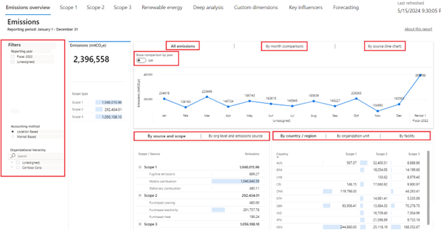
Observe the Scope 3 value.


Acting as Remy, you've reviewed the reporting and analytics capabilities of Sustainability Manager. You can further use this information to identify the dashboard on the Emissions insights page that should be reviewed.
Task: Review Scope 3 Power BI dashboards
In this task, Remy reviews the Scope 3 dashboard.
Devon Torres
Hi Remy, our Scope 3 value was high. Could you please review the Scope 3 dashboard and let me know what you find?
Absolutely, Devon! I'll report back on my findings.
Remy Morris
Go to Emissions insights on the left side of the page.
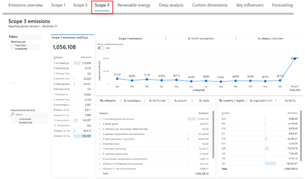
Select Scope 3 on the top tab to view the Scope 3 emissions dashboard.
Scope 3 emissions are the result of activities from assets that aren't owned or controlled by the reporting organization but that the organization indirectly impacts its value chain. Scope 3 emissions include all sources that aren't within an organization's Scope 1 and 2 boundary. You can view Scope 3 emissions by reporting period in the Scope 3 emissions dashboard in Microsoft Sustainability Manager.
You can view the Summary statistics in the left tile. These statistics include the total Scope 3 emissions for the reporting period compared to the previous period. The tile also shows all categories of Scope 3 emissions classified as upstream or downstream. Scope 3 emissions have the following 15 categories.
Upstream
Purchased goods and services
Capital goods
Fuel and energy related activities
Upstream transportation and distribution
Waste generated in operations
Business travel
Employee commuting
Upstream leased assets
Downstream
Downstream transportation and distribution
Processing of sold products
Use of sold products
End-of-life treatment of sold products
Downstream leased assets
Franchises
Investments
The top tile has three tabs: Scope 3 emissions, Scope 3 emissions By month (comparison), and Scope 3 emissions by month (line chart). Each tab has a toggle that you can use to show a comparison by year. When the toggle is off, data for the selected reporting period is shown in a monthly view. When the toggle is on, the data that's shown represents all available reporting periods.
The bottom-left tile has four tabs:
By category - This tab shows Scope 3 emissions by category and spend type.
By subcategory - This tab shows Scope 3 emissions by subcategory.
By facility type - This tab shows Scope 3 emissions by facility type and category.
By account - This tab shows Scope 3 emissions by account.
By waste - This tab shows Scope 3 emissions by waste category and type.
The lower-right tile has three tabs: By country/region, By organizational unit, and By facility. Each tab shows Scope 3 emissions for the corresponding delineation of data.
Select By organizational unit on the lower-right tile to review the breakdown of Scope 3 emissions by organizational unit.
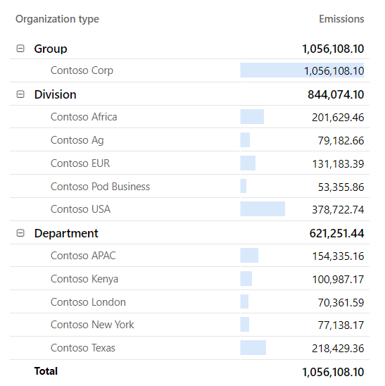
Contoso Texas is a large contributor to the Scope 3 emissions for Contoso Corp. Select Contoso Texas on the lower-right tile.
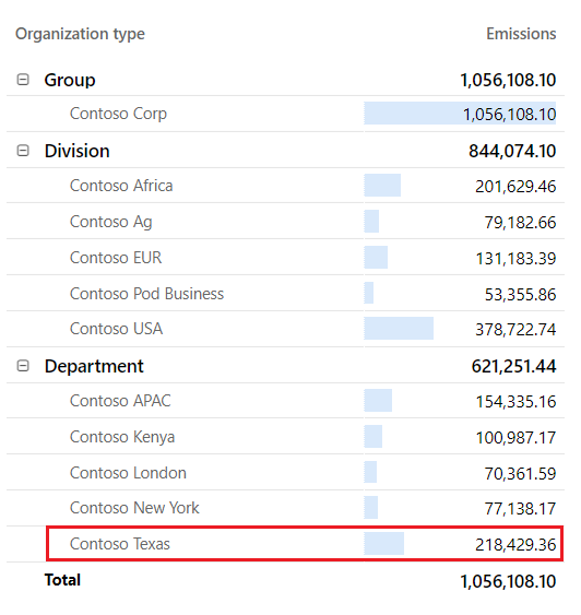
When you select a value in a Microsoft Power BI dashboard, the other tiles and visualizations will automatically filter to show values that are specific to the selected value. In this scenario, when you selected Contoso Texas, all visualizations changed to show only Scope 3 emissions that are related to Contoso Texas, such as the By category tile.
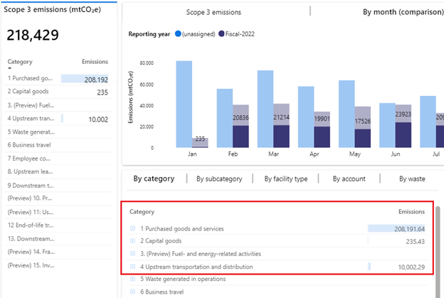
Explore the visualizations. Expand the 1 Purchased goods and services, 2 Capital goods, and 4 Upstream transportation and distribution categories. It shows you the Scope 3 carbon emissions across the three categories that Contoso Texas has calculated in this scenario.


You've now reviewed the reporting and analytics capabilities and have reviewed the Scope 3 Power BI dashboard in Sustainability Manager. The Power BI dashboards that are built into Sustainability Manager give you a starting point to review your organization's carbon emissions. Additionally, you can bring your own Power BI dashboards and embed them into Sustainability Manager if you have dedicated Power BI Pro licenses (not included with the Cloud for Sustainability licensing).
In this exercise, you worked in various personas to complete the following tasks:
Devon, the sustainability specialist and Remy, the sustainability emissions analyst, reviewed the reporting and analytics capabilities.
Remy reviewed the Scope 3 Power BI dashboard and identified the emissions that were calculated during this scenario.