Analyze the process mining report in Power Automate
This unit focuses on the various types of reports that Power Automate provides for process mining and how to effectively analyze them. These reports are crucial for understanding your business processes in-depth and identifying areas for improvement and automation. Though not required, these reports are the same ones that are available after you complete the previous exercise of creating a process mining report in Power Automate. Open your report and follow along.
Summary tab
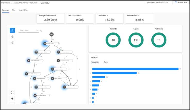
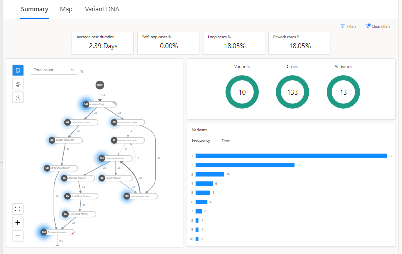
The following screenshot shows the type of data that you can review on the Summary tab, such as KPIs and visualizations.
Key performance indicators
The upper part of the Summary tab shows the process's key performance indicators (KPIs).
Average case duration - Shows the average case duration in days. Outliers in the data can affect this KPI.
Self loop cases % - Percentage of cases that have an activity that repeats itself.
Loop cases % - Percentage of cases that have repeated activities that aren't self loops.
Rework cases % - Percentage of cases that have a self-loop or loop.
These two extra KPIs will show if you have the premium license:
Median case duration - Middle value in a sorted list of case durations. Compared to the average case duration metric, extreme values or outliers in the data have less of an effect on this metric.
Resource count - Count of how many resources exist in the process. A resource could be any entity that performs an activity, such as employees, machinery, or devices.
Visualizations
The visualizations area of the report provides extra information. The top panel displays Variants, Cases, and Activities donut graphs.
Variants - A path is a unique sequence of process steps, from start to finish. The preceding image indicates that 10 paths are in the process, meaning that 10 variations (or variants) exist for completing the process from start to finish. One path might differ from another by one step or by numerous steps.
Cases - A case is a single instance of a process that's completed from start to finish. It represents a grouping of activities or events that take place within that single process. For instance, if an employee in your organization completes a process using five steps, that's one case. Similarly, if another employee completes the same process in four steps, that's a different case. The Cases donut graph in the preceding process report indicates a total of 133 cases, so the process has been completed 133 times.
Activities - An activity represents a specific event or task that takes place within a process, such as Invoice Entry or Refund Customer. The preceding image indicates that your process has identified 13 different activities. Each activity contributes to the overall completion of a case or instance of the process. Understanding the frequency and duration of each activity can provide valuable insights for process improvement.
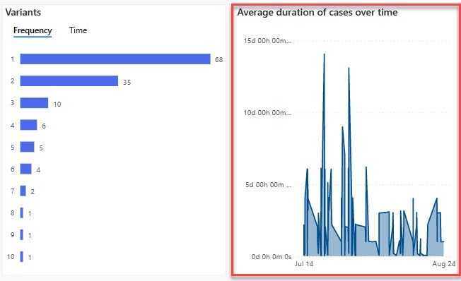
The lower panel displays a horizontal bar chart for the number of Variants which shows how many times each unique path has been followed in your process. For instance, if path 1 is followed 68 times, then 68 different process completions have followed the sequence of steps in path 1. As shown in the following image, the 10 bars in the chart correspond to the 10 paths in the Variants donut. If you switch to the Time category (see just below on the right), you can view the average duration for each path as well.
If you have a premium license, you also have the ability to see a chart called Average duration of cases over time in the same panel. This graph shows the average duration of the process over time. As shown in the following image, the process took longer between mid to late July.
Map tab
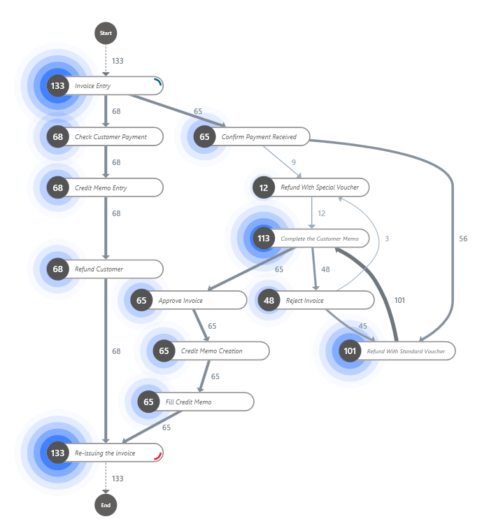
On the Map tab, you can use the process map to visualize the flow of your process from one activity to the next. By looking at a graphical representation of how your business processes are performed, you can glean insights about where opportunities for improvements exist.
On the report page, select the Map tab to open a larger view of the process map. You can drag the map, and use your scrolling button on the process map to zoom in and out (alternatively use the + and - buttons in the lower-left corner of the map). The button depicting corners of a square allows you to recenter the view.
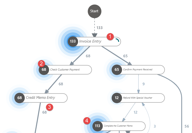
The following list describes different parts of the process map, the numbers correspond to the next screenshot:
Node - Represents a single activity in the process.
Number at the node - Represents how many cases have that activity. In the following example, 68 cases had the Check Customer Payment activity.
Directed arrow lines - These lines connect the nodes and represent the flow from one activity to another. The numbers on the arrows indicate the number of cases that moved from one activity to another on that route. For instance, if the arrow from Credit Memo Entry to Refund Customer has the number 68, then all 68 cases in the Credit Memo Entry activity had the Refund Customer activity as the next step.
Halos - These elements surround the numbers at each node and represent the relative count of cases that have the activity at that node. The size of the halo indicates the number of cases. The larger the case count, the wider the halo. For instance, if an activity has 113 cases out of the 133 cases (approximately 85%), the halo is wider compared to an activity that's present in only 12 cases (approximately 9%).
The next section explores the time performance process map. On the current page, select the Performance button and then select Mean duration from the dropdown menu.
Because you've already gone through the previous descriptions, it's a good time to test your knowledge. Go to the following screenshot and try to describe the attributes of the time performance process map before going through the following descriptions.
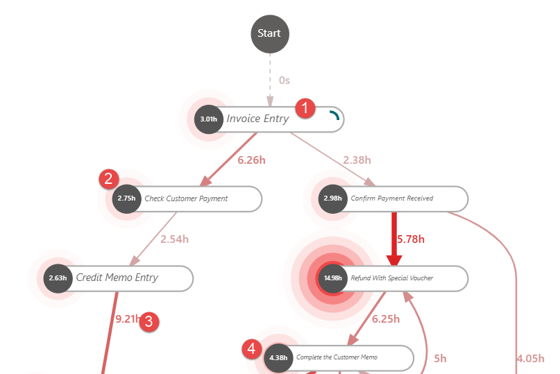
This list describes different parts of the time performance process map, each number corresponds to the next screenshot:
Node - A node represents a single activity in the process.
Number at each node - Represents the mean duration for that particular activity. In the following example, the number at the Check Customer Payment node is 2.75, meaning that it takes an average of 2.75 hours to complete that activity.
Directed arrow lines - These lines, and the numbers on them, represent the flow from one activity to another. In the following example, after the Credit Memo Entry step, it takes an average of 9.21 hours before the Refund Customer step starts.
Red halos - These elements surround the numbers at each node and represent the relative average duration of an activity. The longer the mean duration of an activity is, relative to the duration of other activities, the wider its halo is, highlighting activities that take the most time.
Variant DNA tab
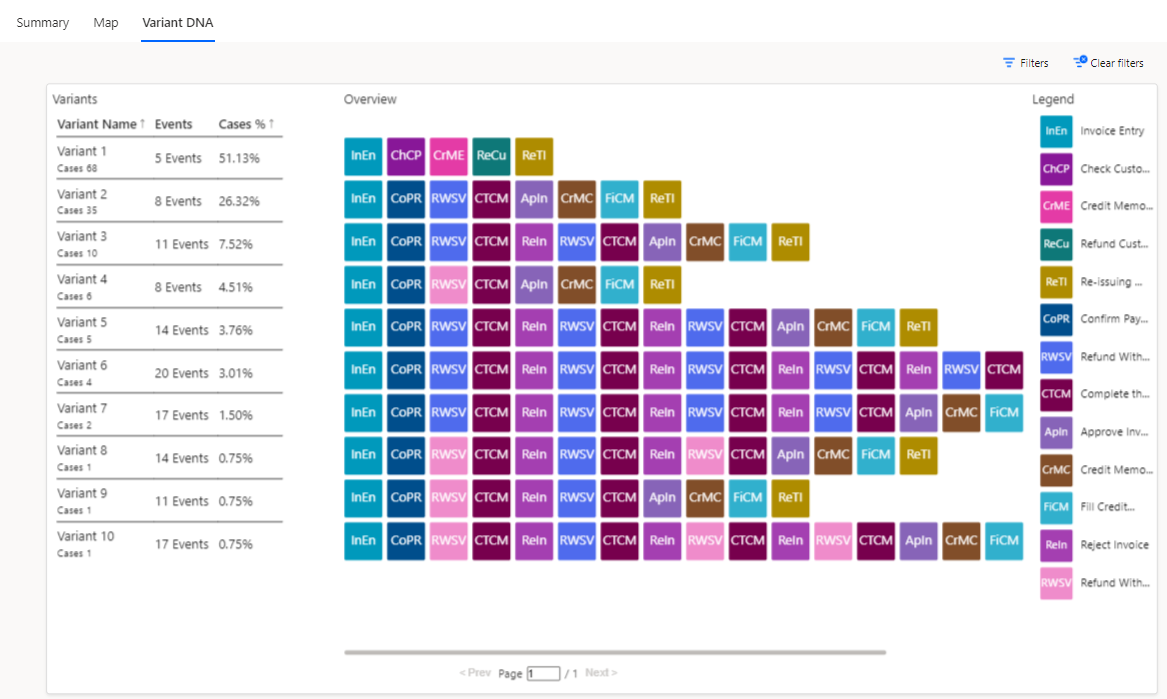
With the Variant DNA chart, you can compare different end-to-end paths of your process and identify exactly where the paths differ. For example, in Variant 2 and Variant 3, the paths differ at step 5. The legend on the side of the chart shows that Variant 2 has the Approve Invoice activity as its fifth activity, while Variant 3 has the Reject Invoice activity as its fifth activity.
Variant DNA can help you identify paths in your process that deviate from your business's ideal or desired path. For instance, if Variant 1 represents the ideal path for your process, then only 51.13 percent of cases follow that path. This result indicates that nearly half of your cases deviate from the desired path, which could suggest that issues or bottlenecks have occurred that you need to address to improve your process efficiency.
This unit focused on helping you learn how to navigate and analyze the various process mining reports that Power Automate generates. These skills are vital for identifying inefficiencies, ensuring compliance, and ultimately guiding your journey toward hyper-automation and process excellence.
