Exercise - Add the base controls
As an app developer, you likely also design the app. Though design is outside the scope of this learning path, you might notice a couple of design elements that might help you in future builds.
A simple way to enhance your app's user interface (UI) is by not overcrowding your screens with too many controls. Consider the end user and how they navigate from screen-to-screen, enter data, view data, and so on. How you design app screens can have as much effect as a poorly functioning app. Users might be less likely to use the app if it's overly complicated and not intuitive.
Therefore, when building your app screens, make sure to use control properties like spacing, alignment, fill, and color. Also, you should use consistent headers and button placement. For example, in this scenario, you're implementing various font colors and font fills, which helps divide the screen pleasantly without it appearing too overwhelming. Notice that the header is one color, the parent information another color, the expense details another, and the main controls yet another color. If you eliminated these colors and left the groups of controls with the same background, it would appear less organized and be more confusing to the user.
Adjust controls and properties
One benefit of building out later screens in your app is that you can copy controls from previous screens.
On the Tree view, select Scr_AllExpenses and then hold down the Ctrl key so that you can select the following controls simultaneously: Lbl_Header_AllExpenses, Icn_Back_AllExpenses, Lbl_TripDestination_AllExpenses.
After you select the controls, press the Ctrl + C keyboard shortcut to copy the controls. Go to Scr_EditExpense and press the Ctrl + V keys to paste the controls.
Rename your newly copied controls with the correct screen name at the end (EditExpense).
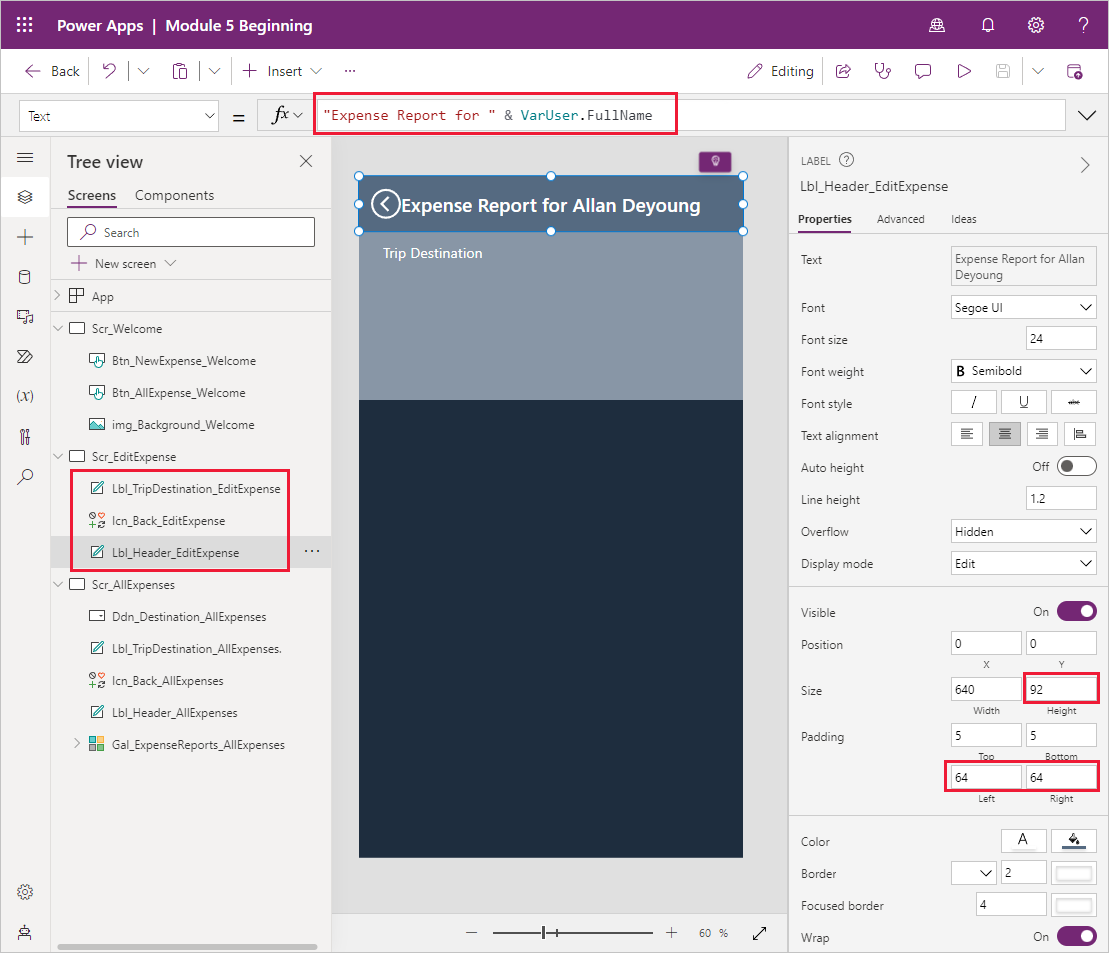
Update the following properties of your header label to these values:
- Text - "Expense Report for " & VarUser.FullName
- PaddingLeft - 64
- PaddingRight - 64
Change the Height property of your trip destination label to 281.
Your screen should resemble the following screenshot.
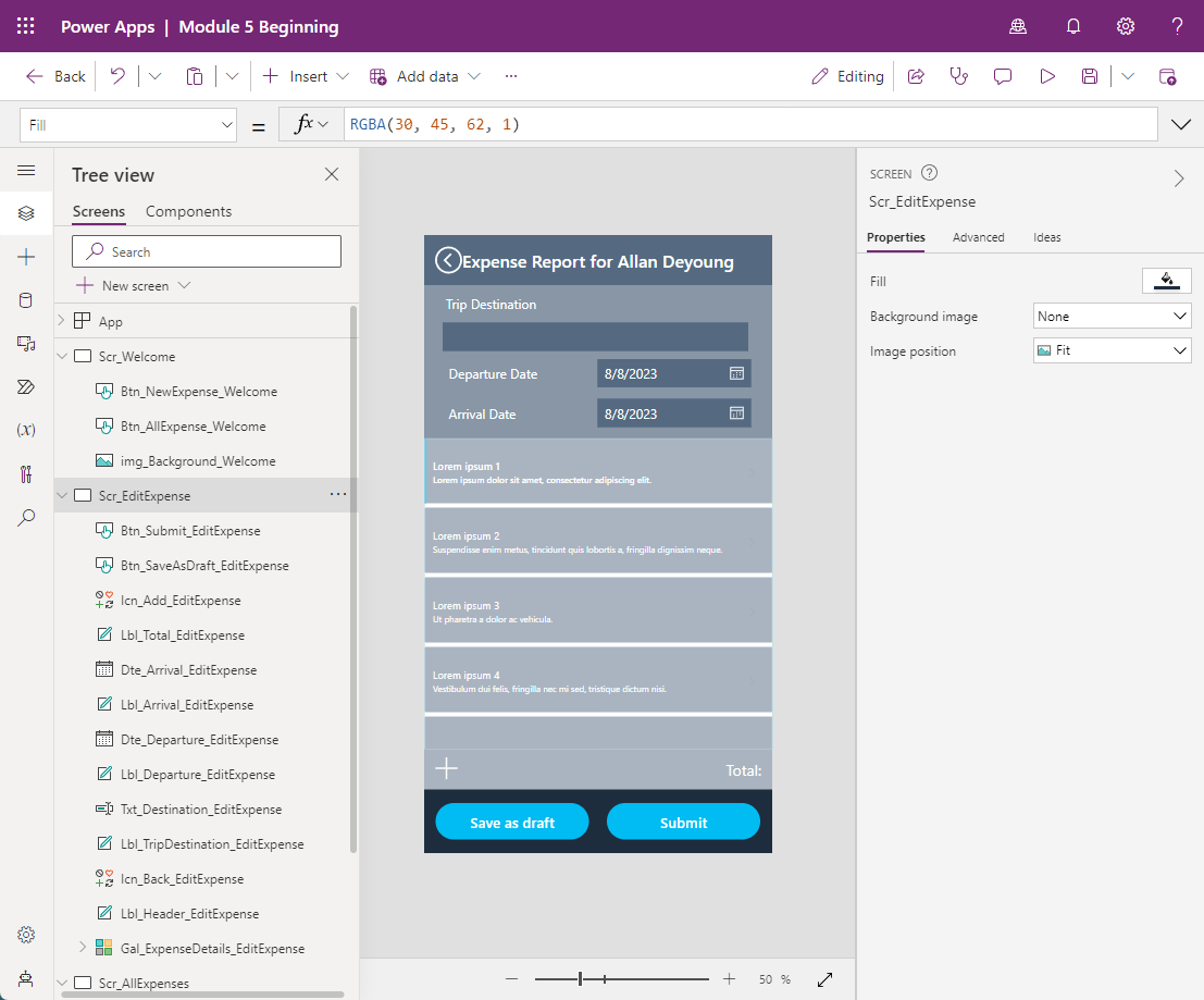
Many controls are needed for this page. The following list shows the controls that you can add and the properties that you need to change. This process might take a while, but it's important to have all fields for which you need to write data. If you can't find a control, it's typically in the Input dropdown menu of the Insert tab.
Add the following controls and properties:
Text input control
- Default: ""
- Size: 18
- X: 35
- Y: 162
- Width: 560
- Height: 50
- Fill: Lbl_Header_EditExpense.Fill
- Name: Txt_Destination_EditExpense
Text label control
- Text: "Departure Date"
- Size: 18
- X: 40
- Y: 229
- Width: 280
- Height: 50
- Name: Lbl_Departure_EditExpense
Date picker control
- Size: 18
- X: 320
- Y: 229
- Width: 280
- Height: 50
- Fill: Lbl_Header_EditExpense.Fill
- IconFill: Color.White
- IconBackground: Lbl_Header_EditExpense.Fill
- Name: Dte_Departure_EditExpense
Text label control
- Text: "Arrival Date"
- Size: 18
- X: 40
- Y: 302
- Width: 280
- Height: 50
- Name: Lbl_Arrival_EditExpense
Date picker control
- Size: 18
- X: 320
- Y: 302
- Width: 280
- Height: 50
- Fill: Lbl_Header_EditExpense.Fill
- IconFill: Color.White
- IconBackground: Lbl_Header_EditExpense.Fill
- Name: Dte_Arrival_EditExpense
Text label control
- Text: "Total:"
- Size: 21
- X: 0
- Y: 945
- Width: 640
- Height: 74
- Align: Align.Right
- Padding Right: 20
- Fill: ColorFade(Lbl_Header_EditExpense.Fill, 50%)
- Name: Lbl_Total_EditExpense
Icon control
- Icon: Add
- X: 9
- Y: 955
- Width: 64
- Height: 50
- Color: Color.White
- Name: Icn_Add_EditExpense
Button control
- Text: "Save as draft"
- X: 22
- Y: 1045
- Width: 280
- Height: 65
- Color: Color.White
- Size: 20
- RadiusTopLeft: 50
- RadiusTopRight: 50
- RadiusBottomLeft: 50
- RadiusBottomRight: 50
- Name: Btn_SaveAsDraft_EditExpense
Button control
- Text: "Submit"
- X: 337
- Y: 1045
- Width: 280
- Height: 65
- Color: Color.White
- Size: 20
- RadiusTopLeft: 50
- RadiusTopRight: 50
- RadiusBottomLeft: 50
- RadiusBottomRight: 50
- Name: Btn_Submit_EditExpense
Vertical gallery control
- Layout: Title and subtitle
- X: 0
- Y: 373
- Width: 640
- Height: 572
- BorderColor: RGBA(204, 242, 252, 1)
- BorderThickness: 1
- TemplateSize: 128
- Fill: ColorFade(Lbl_Header_EditExpense.Fill, 50%)
- Name: Gal_ExpenseDetails_EditExpense
After you add those controls, your app screen should look similar to the following screenshot.
You can certainly return to change some properties, such as calculating a total and writing the OnSelect formula for the buttons and icon. However, building out the controls and design first is common in app building. That approach allows you to concentrate on one task at a time. First, you should focus on the design and ensuring that you have the controls that you need. Then, you can focus on the technical aspects and the logic.
You still need to add more controls, but they are inside the gallery. To add a control inside a gallery, ensure that you're selecting the first item and then insert as normal. If you don't find the control repeated for every line in the gallery, delete the control and try again. Typically, this situation occurs because the entire gallery is selected instead of only the first item. If the whole gallery is selected, and you attempt to add a control in the gallery, it adds the control outside the gallery. That approach doesn't work for what you're doing in this scenario.
The following screenshot shows that only the first item is selected. It exemplifies what the screen should look like when you're adding controls in your gallery.

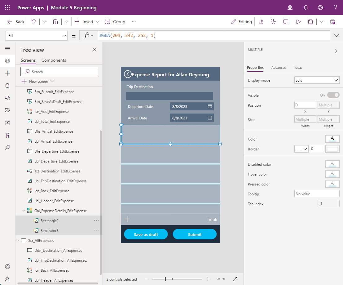
Before adding new controls, you need to delete the text labels and next arrow icon because you don't need them.
Select the two text labels and the next arrow icon in your gallery and then press the Delete key. The only controls in your gallery should be the rectangle and the separator. Select both controls from your Tree view menu while holding the Ctrl button and then change the Fill property to:
RGBA(204, 242, 252, 1). Since the Fill property is the same for both, you update both controls simultaneously.Your app should now resemble the following image.
You still don't have a data source attached to the gallery. You complete that task later. For now, remember to select the first item in the gallery and then add the following controls:
Text input control
- Default: ""
- Size: 16
- X: 40
- Y: 14
- Width: 560
- Height: 50
- Fill: Lbl_Header_EditExpense.Fill
- Name: Txt_Expense_EditExpense
Drop down control
- Size: 16
- X: 40
- Y: 65
- Width: 280
- Height: 50
- Fill: Lbl_Header_EditExpense.Fill
- ChevronBackground: Lbl_Header_EditExpense.Fill
- AllowEmptySelection: true
- Name: Ddn_Category_EditExpense
Date picker control
- Size: 16
- X: 320
- Y: 65
- Width: 171
- Height: 50
- Fill: Lbl_Header_EditExpense.Fill
- IconFill: Color.White
- IconBackground: Lbl_Header_EditExpense.Fill
- Name: Dte_TransactionDate_EditExpense
Text input control
- Default: ""
- Size: 16
- X: 492
- Y: 65
- Width: 108
- Height: 50
- Format: TextFormat.Number
- Fill: Lbl_Header_EditExpense.Fill
- Name: Txt_Amount_EditExpense
Icon control
- Icon: Trash
- X: 0
- Y: 0
- Width: 40
- Height: 128
- Color: Lbl_Header_EditExpense.Fill
- Name: Icn_Trash_EditExpense
After you add these controls in the gallery, your app should resemble the following screenshot.


Note
Your app may only show 1 record in the gallery instead of 4 like the image.
Now that you have all controls that are required to make this screen, you can add the functionality.