Note
Access to this page requires authorization. You can try signing in or changing directories.
Access to this page requires authorization. You can try changing directories.
This section covers monetary symbols for countries/regions supported by the Latin 1 code page. All these characters are primarily used with numerals and should align, space and work well with the numerals.
It may not be always possible for all monetary symbols to vertically align and have advance widths equal to the figures. In fonts with proportionally spaced figures the monetary symbols should be proportional. Meaning symbols that do not comfortably fit on a figure width should be made larger or smaller to compensate for the width of the image. Fonts with tabular figures should have monetary symbols that are tabular so when they are used for monetary amounts in columns or spreadsheets the data will align.
Dollar
Unicode: U+0024Design : Its actual design origins are unknown but most scholars believe it to be derived for the Spanish peso of the 1700s. The myth that the double barred version 'escudo' is derived from the overlapping of 'U' and 'S' has been proven to be a clever repeated mistruth with no historical basis.
Alignment : Visually aligns with figure height, actual distance of the top of the 'S' portion of the dollar is usually lower than the figure top overshoot and/or figure bottom overshoot.
Advance width : Advance width should be the same as the figure space width.
Spacing : This character should space between figure zeros.


Cent
Unicode: U+00A2Alignment : Most designs are made from the lowercase 'c' and align with the lowercase overshoots top and bottom or visually center on the figure height. These two alignments are equally common.


Advance width : Advance width should be the same as the figure space width.
Spacing : Spaces between figure zeros.
Pound sterling
Unicode: U+00A3Alignment : Aligns with the figure heights.

Advance width : Advance width should be the same as the figure space width.
Spacing : This character should space between figure zeros.

Currency symbol
Unicode: U+00A4Design : The weight of the symbol should match the weight of the font. As an example, the regular weight font should have a lighter version of the symbol than the bold weight.

Alignment : Visually centers on the figure height.

Advance width : Advance width should be the same as the figure space width.
Spacing : This character should space between figure zeros.
Yen
Unicode: U+00A5Design : Current design tastes do not accept the style used prior to the 1980's. These earlier designs with two bars crossing at the middle stem, well below the junction of the top diagonal strokes are now considered incorrect.
Today the most common Yen designs are with two or one bar crossing through the 'Y' of the yen. The one bar design is more rare. With two bars the top bar crosses through at the junction of the top diagonal strokes while the lower bar crosses through the main stem. With one bar the placement is slightly lower just under the junction of the diagonals.

Alignment : Aligns with the figure flat height and baseline.
Advance width : Advance width should be the same as the figure space width.
Spacing : This character should space between figure zeros.
Florin currency symbol (Dutch)
Unicode: U+0192Design : This character's design is commonly based on the italic lowercase f design of the typeface.
Alignment : Aligns with the lowercase ascender height and lowercase descender and it is dependent on the design of the typeface.
Advance width : Advance width should be the same as the figure space width.
Spacing : Spaces between figure zeros.
Franc
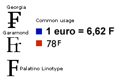
Unicode: U+20A3Design : There are three common types of designs from the Franc. Type companies have been supplying an 'F' with small 'r' design or an 'F' with a horizontal bar. Common usage in France is to use an uppercase or superior F to represent the French Franc.

Alignment : Aligns with the uppercase flat height.
Advance width : Advance width should be the same as the figure space width.
Spacing : Spaces between figure zeros.
Lira
Unicode: U+20A4Design : The Lira is of the same basic design as the Pound Sterling but with two horizontal bars instead of one.

Alignment : Aligns with the figure heights.
Advance width : Advance width should be the same as the figure space width.
Spacing : This character should space between figure zeros.
Peseta
Unicode: U+20A7Design : Similarly to the French Franc the Spanish Peseta has two possible forms. One is an uppercase 'P' with a horizontal bar traveling through the upper bowl of the 'P'. The second and most common design supplied in fonts is the 'Pts' form of a ligature made from the uppercase 'P' lowercase 't' and lowercase 's'.

Alignment : Aligns with the uppercase flat height.
Advance width : Advance width should be the same as the figure space width when the design allows. Otherwise the 'P' and 'Pts' form widths are proportional to the design.
Spacing : This character should space between figure zeros.

Euro
Unicode: U+20ACDesign : All well designed images in a font should match the style, weight and look of the host font. The European Union has shown exact specifications for their standard design of this character. Type designers have unanimously agreed that this is a character and not a logo. And for it to be included in their font, its design should be consistent with the typeface and have the same requirements as other monetary symbols.
Alignment : Aligns with the figure overshoot heights or uppercase height.
Advance width : Advance width should be proportional to the design or equal to the figure space when used with tabular figures.
Spacing : This character should space between figure zeros.