Note
Access to this page requires authorization. You can try signing in or changing directories.
Access to this page requires authorization. You can try changing directories.
Notification systems
There are several ways to inform the user what is happening in Visual Studio regarding their software development tasks.
When implementing any kind of notification:
Keep the number of notifications to the minimum effective number. Notification messages should apply to a majority of Visual Studio users or to users of a specific feature/feature area. Excessive use of notifications may sidetrack the user or diminish perceived ease of use of the system.
Ensure you are presenting clear, actionable messages that the user can use to invoke the appropriate context for making more complex choices and taking further action.
Present synchronous and asynchronous messages appropriately. Synchronous notifications indicate that something needs immediate attention, such as when a web service crashes or a code exception is thrown. The user should be informed of those situations right away in a manner that requires their input, such as in a modal dialog. Asynchronous notifications are ones that the user should know about but not be required to act upon immediately, such as when a build operation completes or a web site deployment finishes. Those messages should be more ambient and not interrupt the user's task flow.
Use modal dialogs only when necessary to prevent the user from taking further action before acknowledging the message or making a decision presented in the dialog.
Remove ambient notifications when they are no longer valid. Do not require the user to dismiss a notification if they have already taken action to address the issue they were notified about.
Be aware that notifications can lead to false correlations. Users might believe that one or more of their actions has triggered a notification when in fact there was no causal relationship. Be clear in the notification message about the context, the trigger, and the source of the notification.
Choosing the right method
Use this table to assist you in choosing the right method to notify the user of your message.
| Method | Use | Do not use |
|---|---|---|
| Modal error message dialogs | Use when a user response is required before proceeding. | Do not use when there is no need to block the user and interrupt their flow. Avoid using modal dialogs if it is possible to show the message in another, less intrusive way. |
| IDE status bar | Use when there is ambient textual information regarding the status of a process. | Do not use alone. Best used in conjunction with another feedback mechanism. |
| Embedded infobar | In a tool window or document window, use to notify of progress, error state, results, and/or actionable information. | Do not use if the information is not relevant to the location where the infobar is placed. Do not use outside a document/tool window. |
| Mouse cursor changes | May be used to notify that a process is going on. Also used to notify that there is a state change in the mouse, such as when drag/drop is in progress or that the mouse cursor is in a certain mode, such as drawing mode. | Do not use for short progress changes or if fluttering of the cursor is likely (for example, when tied to parts of a longer running process instead of to the entire process). |
| Progress indicators | Use when you need to report progress (either determinate or indeterminate). There are a variety of progress indicator types and specific usage for each. See Progress indicators. | |
| Visual Studio Notifications window | The Notifications window is not publicly extensible. However, it is used to communicate a range of messages about Visual Studio, including critical issues with your license and informational notifications of updates to Visual Studio or to packages. | Do not use for other types of notifications. |
| Error list | When the issue relates directly to the user's currently open solution having an issue (error/warning/info), they might need to take action on the code. This would include, for example: - Compiler messages (error/warning/info) - Code Analyzer/Diagnostic messages about the code - Build messages May be appropriate for issues relating to the project or solution files, but consider a Solution Explorer indication first. |
Do not use for items that do not have any relation to the user's open solution code. |
| Editor notifications: Light Bulb | Use when you have a fix available to remedy an issue that exists in the open file. Note that Light Bulb should also be used for hosting Quick Actions that are taken on the user's code on demand, such as refactorings, but in that case will not appear "notification style." |
Do not use for items that do not have any relation to the open file. |
| Editor notifications: Squiggles | Use to alert the user to an issue with a particular span of their open code (for example, a red squiggle for errors). | Do not use for items that do not relate to a particular span of their open code. |
| Embedded status bars | Use to provide status related to content or process within context of a specific tool window, document window, or dialog window. | Do not use for general product notifications, processes, or items that do not have any relation to the content within the specific window. |
| Windows tray notifications | Use to surface notifications for out-of-proc processes or companion applications. | Do not use for notifications that are relevant to the IDE. |
| Notification bubbles | Use to notify of a remote process or change outside of the IDE. | Do not use as a means for notifying the user of processes within the IDE. |
Notification methods
Modal error message dialogs
A modal error message dialog is used to display an error message that requires the user's confirmation or action.
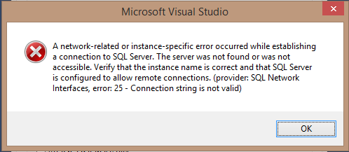
A modal error message dialog alerting the user of an invalid connection string to a database
IDE status bar
The likelihood that users notice status bar text correlates to their all-around computer experience and specific experience with the Windows platform. The Visual Studio customer base tends to be experienced in both areas, though even knowledgeable Windows users might miss changes in the status bar. Therefore, the status bar is best used for informational purposes or as a redundant cue for information presented elsewhere. Any kind of critical information that the user must resolve immediately should be provided in a dialog or in the Notifications tool window.
The Visual Studio status bar is designed to allow for several types of information to be displayed. It is divided into regions for feedback, designer, progress bar, animation, and client.
The feedback region and designer region are always visible. The progress bar and animation regions are always dynamic and based on user context. The designer region has a static width determined by the length of the string that is pulled from an accompanying resource for the text message. This allows localization to resize the width without requiring a code change. For English, the width of this string is roughly 220 pixels. The designer region will behave normally and the feedback region will absorb the remaining space.
The status bar is also colorized to add visual interest and functional value by communicating various IDE state changes such as when the IDE is in debug mode.

IDE status bar colors
Embedded infobar
An infobar can be used at the top of a document window or tool window to inform the user of a state or condition. It can also offer commands so that the user can have a way to easily take action. The Infobar is a standard shell control. Avoid creating your own, which will act and appear inconsistent with others in the IDE. See Infobars for implementation details and usage guidance.
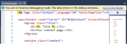
An infobar embedded in a document window, alerting the user that the IDE is in historical debugging mode and the editor will not respond in the same way as it does in standard debugging mode.
Mouse cursor changes
When changing the mouse cursor, use colors that are tied to the VSColor service and are already associated with the cursor. Cursor changes can be used for indicating an ongoing operation, as well as hit zones where the user is hovering over a target that can be dragged, dropped onto, or used to select an object.
Use the busy/wait mouse cursor only when all available CPU time must be reserved for an operation, preventing the user from expressing any further input. In most cases with well-written applications using multithreading, times when users are prevented from doing other operations should be rare.
Keep in mind that cursor changes are useful as a redundant cue for information presented elsewhere. Do not rely on a cursor change as the sole way of communicating with the user especially when trying to convey something that is critical that the user must address.
Progress indicators
Progress indicators are important for giving the user feedback during processes that take more than a few seconds to complete. Progress indicators can be shown in-place (near the launching point of the action in progress), in an embedded status bar, in a modal dialog, or in the Visual Studio status bar. Follow the guidance in Progress indicators regarding their use and implementation.
Visual Studio Notifications window
The Visual Studio Notifications window notifies developers about licensing, environment (Visual Studio), extensions, and updates. Users can dismiss individual notifications or can choose to ignore certain types of notifications. The list of ignored notifications is managed in a Tools > Options page.
The Notifications window is not currently extensible.
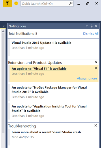
Visual Studio Notifications tool window
Error list
A notification within the error list indicates errors and warnings that occurred during compilation and or build process, and allows the user to navigate in code to that specific code error.

Error list in Visual Studio
Embedded status bars
Because the IDE status bar is dynamic, with its client region context set to the active document window and information updating on the user's context and/or system responses, it is difficult to maintain a continuous display of information or give status on long-term asynchronous processes. For example, the IDE status bar is not appropriate for notifications of test run results for multiple runs and/or immediately actionable item selections. It is important to retain such status information in the context of the document or tool window where the user makes a selection or starts a process.
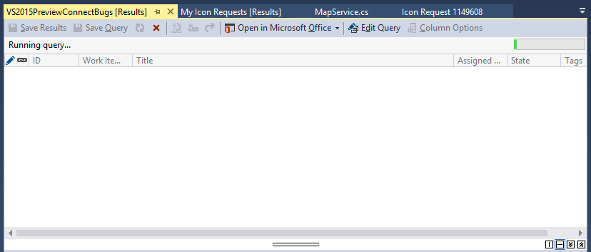
Embedded status bar in Visual Studio
Windows tray notifications
The Windows notification area is next to the system clock on the Windows taskbar. Many utilities and software components provide icons in this area so that the user can obtain a context menu for system-wide tasks, like changing screen resolution or obtaining software updates.
Environment-level notifications should be surfaced in the Visual Studio Notifications hub, not the Windows notification area.
Notification bubbles
Notification bubbles can appear as informational within an editor/designer or as part of the Windows Notification area. The user perceives these bubbles as issues that they can resolve later, which is a benefit for noncritical notifications. Bubbles are inappropriate for critical information that the user must solve right away. If you do use notification bubbles in Visual Studio, follow the Windows Desktop guidance for notification bubbles.

Notification bubble in the Windows Notification area used for Visual Studio
Progress indicators
Progress indicators are an important part of a notification system for giving the user feedback. They tell the user when processes and operations will complete. Familiar indicator types include progress bars, spinning cursors, and animated icons. The type and placement of a progress indicator depends on the context, including what is being reported and how long the process or operation will take to complete.
Factors
In order to determine which indicator type is appropriate, you need to determine the following factors.
Timing: length of time the operation will take
Modality: whether the operation is modal to the environment (locks the UI until the process is complete)
Persistent/Transient: whether the final result of the progress needs to be reported and/or viewable at a later time
Determinate/Indeterminate: whether the operation end time and progress can be calculated
Graphic/Textual location: whether the progress or process is captured inline, in the body of a message, or a specific control, such as the Tree control
Proximity: whether the progress should be in close proximity to the UI that it is related to. (For example, can it be in the status bar, which might be far away, or does it have to be near the button that launched the process?)
Determinate progress
| Progress type | When and how to use | Notes |
|---|---|---|
| Progress bar (determinate) | Expected duration of >5 seconds. May include textual description of process details. |
DON'T embed text into animation. |
| Infobar | Messaging associated with contextual UI. See Infobars. May include textual description of process details. |
DON'T use multiple infobars when you need to indicate multiple processes. Use stacked progress bars instead. |
| Output Window | Transient notification: app-level process that user want to review details of after completion. | DON'T use if the user will need to refer to data later. |
| Log file | Paired with intransient notification in cases when it is important to save details after completion. | |
| Status bar | Transient notification: app-level process that user will not need details of after completion. Includes an embedded progress bar. May include textual description of process details. |
Indeterminate progress
| Progress type | When and how to use | Notes |
|---|---|---|
| Progress bar (indeterminate) | Expected duration of >5 seconds. May include textual description of process details. |
DON'T embed text into animation. |
| Ants (animated horizontal dots) | Round trip to server. Placed near point of context across top of parent container. |
DON'T use if not parented by entire container. |
| Spinner (progress ring) | Process associated with contextual UI, or where space is a consideration. May include textual description of process details. |
|
| Infobar | Messaging associated with contextual UI. See Infobars. | DON'T use multiple infobars when you need to indicate multiple processes. Use stacked progress bars instead. |
| Output Window | Transient notification: app-level process that user will want to review details of after completion. | DON'T use for information that needs to persist across sessions. |
| Log file | Paired with intransient notification in cases when it is important to save details after completion. | |
| Status bar | Transient notification: app-level process that user will not need details of after completion. Includes embedded progress bar. May include textual description of process details. |
Progress indicator types
Progress bars
Indeterminate

Indeterminate progress bar
"Indeterminate" means the overall progress of an operation or process cannot be determined. Use indeterminate progress bars for operations that require an unbounded amount of time or that access an unknown number of objects. Use a textual description to accompany what is happening. Use timeouts to give bounds to time-based operations. Indeterminate progress bars use animations to show that progress is being made, but provide no other information. Don't choose an indeterminate progress bar based only on the possible lack of accuracy alone.
Determinate

Determinate progress bar
"Determinate" means that an operation or process requires a bounded amount of time, even if that amount of time cannot be accurately predicted. Clearly indicate completion. Don't let a progress bar go to 100 percent unless the operation has completed. Determinate progress bar animation moves left-to-right from 0 to 100%.
Never move the progress indicator backward during an operation. The bar should move forward steadily when the operation begins and reach 100% when it ends. The point of the progress bar is to give the user an idea of how long the entire operation takes, regardless of how many steps are involved.
Concurrent reporting (stacked progress bars)
If an operation will take a long time - perhaps several minutes - then two progress bars may be used, one that shows overall progress for an operation and another for the progression of the current step. For example, if a setup program is copying many files, then one progress bar can be used to indicate how long the entire process takes while a second can indicate what percentage of the current file or directory is being copied. Do not report more than five concurrent operations or processes using stacked progress bars. If you have more than five concurrent operations or processes to report, use a modal dialog with a Cancel button and report the progress details to the Output Window.
Textual descriptions
Use a textual description to accompany what is happening and the estimated time to completion. If it is impossible to determine how long an operation will take, then a better choice for giving feedback might be an animated icon rather than a progress bar.
Visual Studio provides a standard progress bar in the status bar that can be used by any product integrated into Visual Studio. For textual descriptions of what is happening while the progress bar is animated, the status bar text can be updated.
Other progress indicators
Ants (animated horizontal dots)

"Ants," animated horizontal dots, provide a visual reference for an indeterminate round-trip server process.
Spinner (progress ring)

The spinner (also known as a "progress ring") is an indeterminate progress indicator primarily used in relation to contextual UI. Display a spinner in close proximity to its related content, such as a textual category header, messaging, or control.
Cursor feedback
For operations that take between 2-7 seconds, provide cursor feedback. Typically, this means using the wait cursor provided by the operating system. For guidance, see the MSDN article Cursors.Wait Property.
Progress indicator locations
Status bar
The status bar gives your application a place to display messages and useful information to the user without interrupting the user's work. Typically displayed at the bottom of a window, status for progress will be a tool tip pane that includes a message about the measure of progress in combination with a progress bar indicator.

Status bar with progress bar

Status bar with textual description
Infobar
Similar to the status bar, the info bar provides contextual notification and messaging, which can also be paired with indeterminate progress indicators such as the progress bar or spinner. The info bar should not provide granular level progress or determinate progress indication. See Infobars.

Infobar with progress bar and textual description

Inline
Inline progress indication can be represented by any of the progress loader types. Typically the progress indicator is paired with messaging, but this is not a requirement.
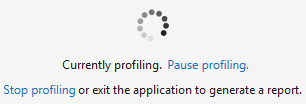
Spinner combined with textual description

Determinate stacked progress bars
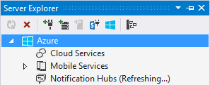
Server Explorer inline text: Refreshing...
Tool windows
Global progress indication is represented by an indeterminate progress bar positioned directly below the tool bar.
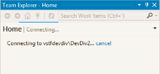
Team Explorer global indeterminate progress bar
Dialogs
Dialogs can contain any of the progress loader types. Progress indicators can be paired with messaging as well as combined with multiple levels of progress indication to represent granular and sub- processes.
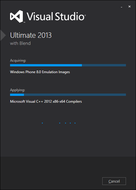
Visual Studio dialog with concurrent processes and multiple progress indicator types
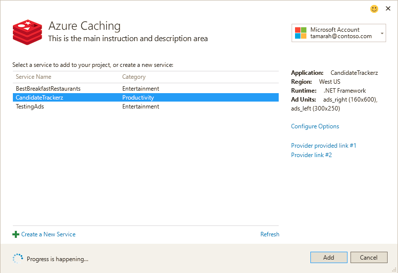
Visual Studio dialog with progress loader and messaging inline commanding
Document well
The document well can display multiple progress loader types in combination with controls.

Indeterminate progress bar below toolbar
Output Window
The Output window is appropriate for handling process progression and ongoing progress status via inline textual messaging. You should use the Status bar along with any Output window progress reporting.

Output Window with ongoing process status and wait messaging
Infobars
Infobars give the user an indicator close to their point of attention and using the shared infobar control ensures consistency in visual appearance and interaction.

Infobars in Visual Studio
Appropriate uses for an infobar
To give the user a non-blocking but important message relevant to the current context
To indicate that the UI is in a certain state or condition that carries some interaction implications, such as historical debugging
To notify the user that the system has detected problems, such as when an extension is causing performance issues
To provide the user a way to easily take action, such as when the editor detects that a file has mixed tabs and spaces
Do:
Keep the infobar message text short and to the point.
Keep the text on links and buttons succinct.
Ensure the "action" options you provide to users are minimal, showing only required actions.
Don't:
Use an infobar to offer standard commands that should be placed in a toolbar.
Use an infobar in place of a modal dialog.
Create a floating message outside a window.
Use multiple infobars in several locations within the same window.
Can multiple infobars show at the same time?
Yes, multiple infobars can show at the same time. They will be displayed in first-come, first-served order with the first infobar showing on top and additional infobars showing below.
The user will see a maximum of three infobars at a time, after which, if more infobars are available, the infobar region will become scrollable.
Creating an infobar
The infobar has four sections, from left to right:
Icon: This is where you'd add any icon you'd like to display for the infobar, such as a warning icon.
Text: You can add text to describe the scenario/situation user is in, along with links within the text, if required. Remember to keep the text succinct.
Actions: This section should contain links and buttons for actions that the user can take in your infobar.
Close button: The last section to the right can have a close button.
Creating a standard infobar in managed code
The InfoBarModel class can be used to create a data source for an infobar. Use one of these four constructors:
public InfoBarModel(IEnumerable<IVsInfoBarTextSpan> textSpans, ImageMoniker image = default(ImageMoniker), bool isCloseButtonVisible = true);
public InfoBarModel(string text, ImageMoniker image = default(ImageMoniker), bool isCloseButtonVisible = true);
public InfoBarModel(IEnumerable<IVsInfoBarTextSpan> textSpans, IEnumerable<IVsInfoBarActionItem> actionItems, ImageMoniker image = default(ImageMoniker), bool isCloseButtonVisible = true);
public InfoBarModel(string text, IEnumerable<IVsInfoBarActionItem> actionItems, ImageMoniker image = default(ImageMoniker), bool isCloseButtonVisible = true);
Here is an example that creates an InfoBarModel with some text with a hyperlink, an action button, and an icon.

var infoBar = new InfoBarModel(
    textSpans: new[]
    {
        new InfoBarTextSpan("This is a "),
        new InfoBarHyperlink("hyperlink"),
        new InfoBarTextSpan(" InfoBar.")
    },
    actionItems: new[]
    {
        new InfoBarButton("Click Me")
    },
    image: KnownMonikers.StatusInformation,
    isCloseButtonVisible: true);
Creating a standard infobar in native code
Implement The IVsInfoBar interface in order to provide an infobar from native code.
public interface IVsInfoBar
{
    IVsInfoBarActionItemCollection ActionItems { get; }
    ImageMoniker Image { get; }
    bool IsCloseButtonVisible { get; }
    IVsInfoBarTextSpanCollection TextSpans { get; }
}
Getting an infobar UIElement from an infobar
The InfoBarModel or IVsInfoBar implementation are data models that must be turned into a UIElement in order to be shown in the UI. A UIElement can be retrieved with the SVsInfoBarUIFactory/IVsInfoBarUIFactory service.
private bool TryCreateInfoBarUI(IVsInfoBar infoBar, out IVsInfoBarUIElement uiElement)
{
    IVsInfoBarUIFactory infoBarUIFactory = serviceProvider.GetService(typeof(SVsInfoBarUIFactory)) as IVsInfoBarUIFactory;
    if (infoBarUIFactory == null)
    {
        uiElement = null;
        return false;
    }

    uiElement = infoBarUIFactory.CreateInfoBar(infoBar);
    return uiElement != null;
}
Placement
Infobars can be shown in one or more of the following locations:
Tool windows
Within a document tab
Important
It's possible to position an infobar to give a message about global context. This would appear between toolbars and the document well. This is not recommended because it causes problems with "jump and jerk" of the IDE and should be avoided unless absolutely necessary and appropriate.
Placing an infobar in a ToolWindowPane
The ToolWindowPane.AddInfoBar(IVsInfoBar) method can be used to add an infobar to a tool window. This API can either add an IVsInfoBar (of which InfoBarModel is a default implementation), or an IVsUIElement.
Placing an infobar in a document or non-ToolWindowPane
To place an infobar into any IVsWindowFrame, use the VSFPROPID_InfoBarHost property to get the IVsInfoBarHost for the frame, and then add the infobar UIElement.
private void AddInfoBar(IVsWindowFrame frame, IVsUIElement uiElement)
{
    IVsInfoBarHost infoBarHost;
    if (TryGetInfoBarHost(frame, out infoBarHost))
    {
        infoBarHost.AddInfoBar(uiElement);
    }
}
private bool TryGetInfoBarHost(IVsWindowFrame frame, out IVsInfoBarHost infoBarHost)
{
    object infoBarHostObj;
    if (ErrorHandler.Failed(frame.GetProperty((int)__VSFPROPID7.VSFPROPID_InfoBarHost, out infoBarHostObj)))
    {
        infoBarHost = null;
        return false;
    }

    infoBarHost = infoBarHostObj as IVsInfoBarHost;
    return infoBarHost != null;
}
Placing an infobar in the main window
To place an infobar in the main window, use the VSSPROPID_MainWindowInfoBarHost of the IVsShell service to get the main window's IVsInfoBarHost, and then add the infobar UIElement to it.
Will I know when the user takes action in my infobar?
Yes, we will return every event action to the infobar author. It is then up to the infobar author to take action in the IDE based on user selection in the infobar. Infobars will be automatically removed from the host whose Close button was clicked, but additional work is required if other infobars need to be removed after close. Telemetry also will need to be logged independently by each infobar.
Receiving infobar events in a ToolWindowPane
ToolWindowPane has two events for infobars. The InfoBarClosed event is raised when an infobar in the ToolWindowPane is closed. The InfoBarActionItemClicked event is raised when a hyperlink or button inside the infobar is clicked.
Receiving infobar events directly from the UIElement
IVsInfoBarUIElement.Advise can be used to subscribe to events directly from an infobar's UIElement. Implementing IVsInfoBarUIEvents will allow the author to receive close and click events.
public interface IVsInfoBarUIEvents
{
    void OnActionItemClicked(IVsInfoBarUIElement infoBarUIElement, IVsInfoBarActionItem actionItem);
    void OnClosed(IVsInfoBarUIElement infoBarUIElement);
}
Error validation
When a user enters information that is not acceptable, such as when a required field is skipped or when data is entered in the incorrect format, it is better to use control validation or feedback near the control instead of using a blocking popup error dialog.
Field validation
Form and field validation consists of three components: a control, an icon, and a tooltip. While several types of controls can use this, a text box will be used as an example.

If the field is required, there should be watermark text stating <Required> and the field background should be light yellow (VSColor: Environment.ControlEditRequiredBackground) and the foreground should be gray (VSColor: Environment.ControlEditRequiredHintText):

The program can determine that the control is in a state of invalid content entered either when focus is moved to another control or when the user clicks on an [OK] commit button or when the user saves the document or form.
When the invalid content state is determined, an icon appears either inside the control or just beside it. A tooltip describing the error should appear on hover of either the icon or the control. Additionally, a 1-pixel border should appear around the control that is creating the invalid state.
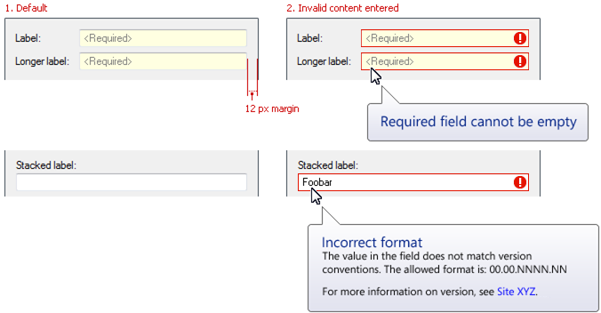
Layout specifications for field validation
Acceptable variations for icon location
There are countless unique cases in which users need to be informed about validation errors. Considering the control type and configuration of the UI, choose the icon placement appropriate to your situation.
![]()
Acceptable variations for field validation icon locations
Validation requiring a round trip to a server or network connection
In some cases, a round trip to the server is required to verify the content, and it would be important to show the user progress, verified, and error states. The below figure shows an example of this case and the recommended UI.
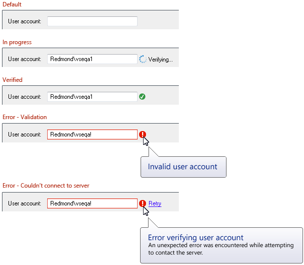
Validation involving a round trip to a server
Note that adequate available space to the right of the control must be provided in order to accommodate the "Verifying..." and "Retry" text.
In-place warning text
When there is room available to put the error message close to the control in a state of error, this is preferable to using the tooltip alone.
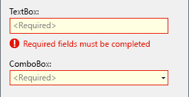
In-place warning text
Watermarks
Sometimes an entire control or window is in an error state. In this situation, use a watermark to indicate the error.
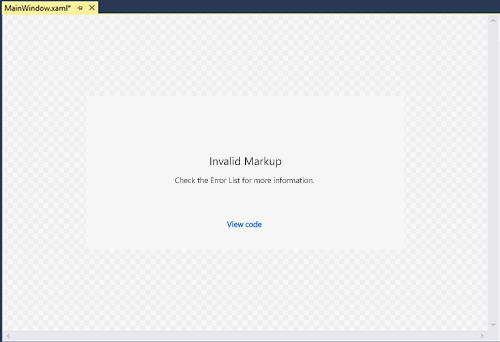
Watermark field validation