Note
Access to this page requires authorization. You can try signing in or changing directories.
Access to this page requires authorization. You can try changing directories.
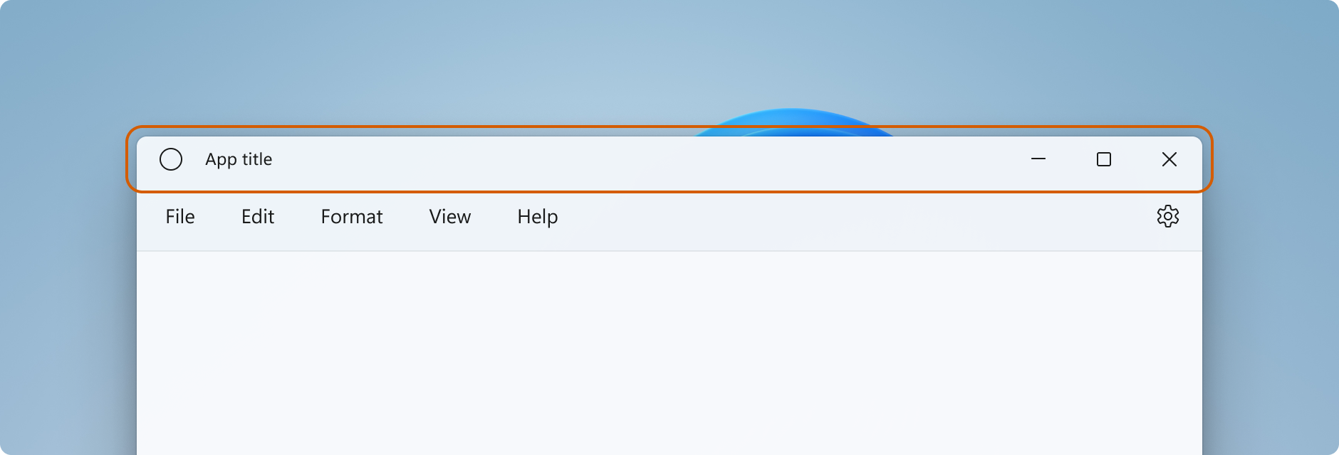
Windows provides a default title bar for every window and lets you customize it to match the personality of your app. The default title bar comes with some standard components and core functionality such as dragging and resizing the window.
See the Title bar design article for guidance on customizing your app's title bar, acceptable title bar area content, and recommended UI patterns.
Important
A new Title bar control has been added in Windows App SDK 1.7. It simplifies the process of title bar customization.
- Applies to: Windows App SDK, WinUI desktop apps
- Important APIs: AppWindow.TitleBar property, AppWindowTitleBar class, AppWindow class, Microsoft.UI.Xaml.Window class, Window.ExtendsContentIntoTitleBar property, Window.SetTitleBar method
Title bar components
This list describes the components of the standard title bar.
- Title bar rectangle
- Title text
- System icon
- System menu - accessed by clicking the app icon or right-clicking the title bar
- Caption controls
- Minimize button
- Maximize/Restore button
- Close button
Windowing
Windowing functionality in the Windows App SDK is through the Microsoft.UI.Windowing.AppWindow class, which is based on the Win32 HWND model. There's a 1:1 mapping between an AppWindow and a top-level HWND in your app. AppWindow and its related classes provide APIs that let you manage many aspects of your app's top-level windows, including customization of the title bar. You can modify the default title bar that Windows provides so that it blends with the rest of your UI, or extend your app canvas into the title bar area and provide your own title bar content.
Windowing functionality in WinUI is through the Microsoft.UI.Xaml.Window class, which is also based on the Win32 HWND model. For XAML apps that use WinUI, XAML Window APIs provide a simpler way to customize the title bar, while still letting you access the AppWindow APIs when needed.
How to work with AppWindow
You can use AppWindow APIs with any UI framework that the Windows App SDK supports - Win32, WPF, WinForms, or WinUI - and you can adopt them incrementally, using only the APIs you need.
If you use WinUI XAML as your app's UI framework, both the Window and the AppWindow APIs are available to you. Starting in Windows App SDK 1.4, the XAML Window and AppWindow use the same AppWindowTitleBar object for title bar customization. Use the Window.AppWindow property to get an AppWindow object from an existing XAML window. With this AppWindow object you have access to the title bar customization APIs.
To access additional features of the title bar, you can use the AppWindow APIs from your XAML Window like this: AppWindow.TitleBar.ForegroundColor = Colors.White;.
If you're not using WinUI 1.3 or later, use interop APIs to get the AppWindow and use the AppWindow APIs to customize the title bar. For more about the interop APIs, see Manage app windows - UI framework and HWND interop and the Windowing gallery sample.
How much to customize the title bar
There are two levels of customization that you can apply to the title bar: apply minor modifications to the default title bar, or extend your app canvas into the title bar area and provide completely custom content.
Simple
For simple customization, such as changing the title bar color, you can set properties on the AppWindowTitleBar object to specify the colors you want to use for title bar elements. In this case, the system retains responsibility for all other aspects of the title bar, such as drawing the app title and defining drag areas.
Full
Your other option is to hide the default system title bar and replace it with your own custom content. For example, you can place text, a search box, or custom menus in the title bar area. You will also need to use this option to extend a material backdrop, like Mica, into the title bar area.
When you opt for full customization, you are responsible for putting content in the title bar area, and you can define your own drag regions. The caption controls (system Close, Minimize, and Maximize buttons) are still available and handled by the system, but elements like the app title are not. You will need to create those elements yourself as needed by your app.
Simple customization
If you want only to customize the title bar title, colors, or icon, you can set properties on the title bar object for your app window.
Title
By default, the title bar shows the app type as the window title (for example, "WinUI Desktop"). You should update the window title to show a meaningful display name for your app.
A XAML app has a display name that's set in the Package.appxmanifest file. You can get this value and use it to set the Title property like this.
Title = AppInfo.Current.DisplayInfo.DisplayName;
To change the window title, set the Window.Title property to a single-line text value, as shown here.
<Window
    ...
    Title="App title">
    ...
</Window>
public MainWindow()
{
    InitializeComponent();
    Title = "App title";
}
To change the window title using AppWindow APIs, set the AppWindow.Title property to a single-line text value, as shown here. This example shows how to use interop APIs to get the AppWindow, which is needed of your app does not use WinUI 1.3 or later.
using Microsoft.UI;           // Needed for WindowId.
using Microsoft.UI.Windowing; // Needed for AppWindow.
using WinRT.Interop;          // Needed for XAML/HWND interop.

private AppWindow m_AppWindow;

public MainWindow()
{
    this.InitializeComponent();

    m_AppWindow = GetAppWindowForCurrentWindow();
    m_AppWindow.Title = "App title";
}

private AppWindow GetAppWindowForCurrentWindow()
{
    IntPtr hWnd = WindowNative.GetWindowHandle(this);
    WindowId wndId = Win32Interop.GetWindowIdFromWindow(hWnd);
    return AppWindow.GetFromWindowId(wndId);
}
Colors
To customize the default title bar colors or to change the default window icon, you will need to use the AppWindow APIs or opt to fully customize your title bar.
This example shows how to get an instance of AppWindowTitleBar and set its color properties.
Important
Color customization is ignored when the app runs on Windows 10.
// Assumes "this" is a XAML Window. In projects that don't use
// WinUI 1.3 or later, use interop APIs to get the AppWindow.
AppWindow m_AppWindow = this.AppWindow;

private bool SetTitleBarColors()
{
    // Check to see if customization is supported.
    // The method returns true on Windows 10 since Windows App SDK 1.2,
    // and on all versions of Windows App SDK on Windows 11.
    if (AppWindowTitleBar.IsCustomizationSupported())
    {
        AppWindowTitleBar m_TitleBar = m_AppWindow.TitleBar;

        // Set active window colors.
        // Note: No effect when app is running on Windows 10
        // because color customization is not supported.
        m_TitleBar.ForegroundColor = Colors.White;
        m_TitleBar.BackgroundColor = Colors.Green;
        m_TitleBar.ButtonForegroundColor = Colors.White;
        m_TitleBar.ButtonBackgroundColor = Colors.SeaGreen;
        m_TitleBar.ButtonHoverForegroundColor = Colors.Gainsboro;
        m_TitleBar.ButtonHoverBackgroundColor = Colors.DarkSeaGreen;
        m_TitleBar.ButtonPressedForegroundColor = Colors.Gray;
        m_TitleBar.ButtonPressedBackgroundColor = Colors.LightGreen;

        // Set inactive window colors.
        // Note: No effect when app is running on Windows 10
        // because color customization is not supported.
        m_TitleBar.InactiveForegroundColor = Colors.Gainsboro;
        m_TitleBar.InactiveBackgroundColor = Colors.SeaGreen;
        m_TitleBar.ButtonInactiveForegroundColor = Colors.Gainsboro;
        m_TitleBar.ButtonInactiveBackgroundColor = Colors.SeaGreen;
        return true;
    }
    return false;
}
There are a few things to be aware of when setting title bar colors:
- The button background color is not applied to the close button hover and pressed states. The close button always uses the system-defined color for those states.
- Setting a color property to
nullresets it to the default system color. - You can't set transparent colors. The color's alpha channel is ignored.
Windows gives a user the option to apply their selected accent color to the title bar. If you set any title bar color, we recommend that you explicitly set all the colors. This ensures that there are no unintended color combinations that occur because of user defined color settings.
Icon and system menu
You can hide the system icon, or replace it with a custom icon. The system icon shows the system menu when right clicked or tapped once. It closes the window when double clicked/tapped.
To show or hide the system icon and associated behaviors, set the title bar IconShowOptions property.
m_TitleBar.IconShowOptions = IconShowOptions.HideIconAndSystemMenu;
To use a custom window icon, call one of the AppWindow.SetIcon methods to set the new icon.
SetIcon(String)The SetIcon(String) method currently works only with .ico files. The string you pass to this method is the fully qualified path to the .ico file.
m_AppWindow.SetIcon("iconPath/iconName.ico");SetIcon(IconId)If you already have a handle to an icon (
HICON) from one of the Icon functions like CreateIcon, you can use the GetIconIdFromIcon interop API to get an IconId. You can then pass theIconIdto the SetIcon(IconId) method to set your window icon.m_AppWindow.SetIcon(iconId));
Full customization
When you opt-in to full title bar customization, your app's client area is extended to cover the entire window, including the title bar area. You are responsible for drawing and input-handling for the entire window except the caption buttons, which are still provided by the window.
To hide the system title bar and extend your content into the title bar area, set the property that extends app content into the title bar area to true. In a XAML app, this property can be set in your app's OnLaunched method (App.xaml.cs), or in your app's first page.
Tip
See the Full customization example section to see all the code at once.
This example shows how to set the Window.ExtendsContentIntoTitleBar property to true.
public MainWindow()
{
    this.InitializeComponent();

    // Hide system title bar.
    ExtendsContentIntoTitleBar = true;
}
Caution
ExtendsContentIntoTitleBar shows in the XAML IntelliSense for Window, but setting it in XAML causes an error. Set this property in code instead.
This example shows how to get the AppWindowTitleBar and set the AppWindowTitleBar.ExtendsContentIntoTitleBar property to true. This example shows how to use interop APIs to get the AppWindow, which is needed if your app does not use WinUI 1.3 or later.
using Microsoft.UI;           // Needed for WindowId.
using Microsoft.UI.Windowing; // Needed for AppWindow.
using WinRT.Interop;          // Needed for XAML/HWND interop.

private AppWindow m_AppWindow;

public MainWindow()
{
    this.InitializeComponent();

    m_AppWindow = GetAppWindowForCurrentWindow();
    var titleBar = m_AppWindow.TitleBar;
    // Hide system title bar.
    titleBar.ExtendsContentIntoTitleBar = true;
}

private AppWindow GetAppWindowForCurrentWindow()
{
    IntPtr hWnd = WindowNative.GetWindowHandle(this);
    WindowId wndId = Win32Interop.GetWindowIdFromWindow(hWnd);
    return AppWindow.GetFromWindowId(wndId);
}
Title bar content and the default drag region
When your app is extended into the title bar area, you're responsible for defining and managing the UI for the title bar. This typically includes, at a minimum, specifying title text and the drag region. The drag region of the title bar defines where the user can click and drag to move the window around. It's also where the user can right-click to show the system menu.
To learn more about acceptable title bar content and recommended UI patterns, see Title bar design.
This example shows the XAML for a custom title bar UI without interactive content.
<Grid x:Name="AppTitleBar"
      Height="32">
    <Grid.ColumnDefinitions>
        <ColumnDefinition x:Name="LeftPaddingColumn" Width="0"/>
        <ColumnDefinition/>
        <ColumnDefinition x:Name="RightPaddingColumn" Width="0"/>
    </Grid.ColumnDefinitions>
    <Image x:Name="TitleBarIcon" Source="ms-appx:///Assets/StoreLogo.png"
           Grid.Column="1"
           HorizontalAlignment="Left"
           Width="16" Height="16"
           Margin="8,0,0,0"/>
    <TextBlock x:Name="TitleBarTextBlock"
               Text="App title"
               Style="{StaticResource CaptionTextBlockStyle}"
               Grid.Column="1"
               VerticalAlignment="Center"
               Margin="28,0,0,0"/>
</Grid>
Important
The LeftPaddingColumn and RightPaddingColumn are used to reserve space for the caption buttons. The Width values for these columns are set in code, which is shown later. See the System caption buttons section for the code and explanation.
A XAML app has a display name that's set in the Package.appxmanifest file. You can get this value and use it in your custom title bar like this.
TitleBarTextBlock.Text = AppInfo.Current.DisplayInfo.DisplayName;
When you extend your content into the title bar area, the system title bar is hidden and a default AppWindowTitleBar is created that provides caption buttons and a drag region across the width of the screen, identical to the system title bar. If you don't place interactive content in your title bar, you can leave this default drag region as-is. If you place interactive content in your title bar, you need to specify the regions that are interactive, which we cover in the next section.
Caution
When you define custom drag regions, they don't have to be at the top of the window in the default title bar area; you can define any part of your UI as a drag region. However, placing drag regions in different places might make it difficult for your users to discover them.
Interactive content
You can place interactive controls, like buttons, menus, or a search box, in the top part of the app so they appear to be in the title bar. However, you need to specify which regions are interactive to ensure that your interactive elements receive user input while still allowing users to move your window around.
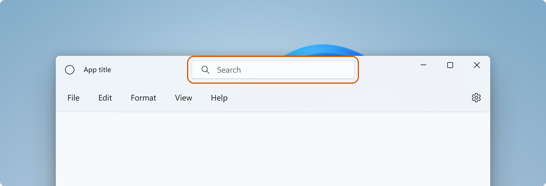
When you add interactive content in the title bar area, you need to use the InputNonClientPointerSource class to specify areas where input is passed through to the interactive control, rather than handled by the title bar. To set the interactive regions, call the InputNonClientPointerSource.SetRegionRects method. This method takes a value that specifies the kind of region being set (in this case, Passthrough), and an array of rectangles, each of which defines a Passthrough region. When the size of the title bar changes, you need to recalculate the interactive regions to match the new size, and call SetRegionRects with the new values.
This example shows a custom title bar UI with a search box and a PersonPicture account control. It demonstrates how to calculate and set the interactive rectangles for these controls so that input is passed through to them.
Here are a few important points to notice about this code:
- Set the
AppTitleBarGrid height to 48 to follow the Title bar design guidance for interactive content. - Set PreferredHeightOption to
Tallso the caption buttons are the same height as the title bar. - To make resizing controls and calculating regions easier, use a
Gridwith multiple named columns for the layout. - Use star (*) sizing with
MinWidthfor the column that contains theAutoSuggestBoxso that it will automatically resize with the window. - Set
MinWidthon theRightDragColumnto reserve a small area that is always draggable even when the window is resized. - Set
ExtendsContentIntoTitleBartotruein the MainWindow constructor. If you set it in code that gets called later, the default system title bar might be shown first, and then hidden. - Make the initial call to calculate interactive regions after the
AppTitleBarelement has loaded. Otherwise, there's no guarantee that the elements used for the calculation will have their correct values. - Update the interactive rectangle calculations only after the
AppTitleBarelement has changed size (AppTitleBar_SizeChanged). If you depend on the windowChangedevent, there will be situations (like window maximize/minimize) where the event occurs beforeAppTitleBaris resized and the calculations will use incorrect values. - Set your custom drag/interactive areas only after you check
ExtendsContentIntoTitleBarto confirm that a custom title bar is being used.
<Grid x:Name="AppTitleBar"
      Height="48">
    <Grid.ColumnDefinitions>
        <ColumnDefinition x:Name="LeftPaddingColumn" Width="0"/>
        <ColumnDefinition x:Name="IconColumn" Width="Auto"/>
        <ColumnDefinition x:Name="TitleColumn" Width="Auto"/>
        <ColumnDefinition x:Name="LeftDragColumn" Width="*"/>
        <ColumnDefinition x:Name="SearchColumn" Width="4*" MinWidth="220"/>
        <ColumnDefinition x:Name="RightDragColumn" Width="*" MinWidth="48"/>
        <ColumnDefinition x:Name="AccountColumn" Width="Auto"/>
        <ColumnDefinition x:Name="RightPaddingColumn" Width="0"/>
    </Grid.ColumnDefinitions>
    <Image x:Name="TitleBarIcon"
           Source="ms-appx:///Assets/StoreLogo.png"
           Grid.Column="1"
           Width="16" Height="16"
           Margin="8,0,4,0"/>
    <TextBlock x:Name="TitleBarTextBlock"
               Text="App title"
               Style="{StaticResource CaptionTextBlockStyle}"
               Grid.Column="2"
               VerticalAlignment="Center">
    </TextBlock>
    <AutoSuggestBox x:Name="TitleBarSearchBox"
                    Grid.Column="4"
                    QueryIcon="Find"
                    PlaceholderText="Search"
                    VerticalAlignment="Center"
                    MaxWidth="600"/>
    <PersonPicture x:Name="PersonPic"
                   Grid.Column="6"
                   Height="32" Margin="0,0,16,0"/>
</Grid>
This code shows how to calculate and set the interactive regions that correspond to the AutoSuggestBox and PersonPicture controls.
public sealed partial class MainWindow : Window
{
    public MainWindow()
    {
        this.InitializeComponent();

        // Assumes "this" is a XAML Window. In projects that don't use
        // WinUI 1.3 or later, use interop APIs to get the AppWindow.
        m_AppWindow = this.AppWindow;
        AppTitleBar.Loaded += AppTitleBar_Loaded;
        AppTitleBar.SizeChanged += AppTitleBar_SizeChanged;
        ExtendsContentIntoTitleBar = true;
        TitleBarTextBlock.Text = AppInfo.Current.DisplayInfo.DisplayName;
    }

    private void AppTitleBar_Loaded(object sender, RoutedEventArgs e)
    {
        if (ExtendsContentIntoTitleBar == true)
        {
            // Set the initial interactive regions.
            SetRegionsForCustomTitleBar();
        }
    }

    private void AppTitleBar_SizeChanged(object sender, SizeChangedEventArgs e)
    {
        if (ExtendsContentIntoTitleBar == true)
        {
            // Update interactive regions if the size of the window changes.
            SetRegionsForCustomTitleBar();
        }
    }

    private void SetRegionsForCustomTitleBar()
    {
        // Specify the interactive regions of the title bar.

        double scaleAdjustment = AppTitleBar.XamlRoot.RasterizationScale;

        RightPaddingColumn.Width = new GridLength(m_AppWindow.TitleBar.RightInset / scaleAdjustment);
        LeftPaddingColumn.Width = new GridLength(m_AppWindow.TitleBar.LeftInset / scaleAdjustment);

        GeneralTransform transform = TitleBarSearchBox.TransformToVisual(null);
        Rect bounds = transform.TransformBounds(new Rect(0, 0,
                                                         TitleBarSearchBox.ActualWidth,
                                                         TitleBarSearchBox.ActualHeight));
        Windows.Graphics.RectInt32 SearchBoxRect = GetRect(bounds, scaleAdjustment);

        transform = PersonPic.TransformToVisual(null);
        bounds = transform.TransformBounds(new Rect(0, 0,
                                                    PersonPic.ActualWidth,
                                                    PersonPic.ActualHeight));
        Windows.Graphics.RectInt32 PersonPicRect = GetRect(bounds, scaleAdjustment);

        var rectArray = new Windows.Graphics.RectInt32[] { SearchBoxRect, PersonPicRect };

        InputNonClientPointerSource nonClientInputSrc =
            InputNonClientPointerSource.GetForWindowId(this.AppWindow.Id);
        nonClientInputSrc.SetRegionRects(NonClientRegionKind.Passthrough, rectArray);
    }

    private Windows.Graphics.RectInt32 GetRect(Rect bounds, double scale)
    {
        return new Windows.Graphics.RectInt32(
            _X: (int)Math.Round(bounds.X * scale),
            _Y: (int)Math.Round(bounds.Y * scale),
            _Width: (int)Math.Round(bounds.Width * scale),
            _Height: (int)Math.Round(bounds.Height * scale)
        );
    }
}
Warning
AppWindow uses physical pixels for compatibility with UI frameworks that don't use logical coordinates. If you use WPF or WinUI, RightInset, LeftInset, and the values used to calculate regions need to be adjusted if the display scale is not 100%. In this example, we get a scaleAdjustment value to account for the display scale setting.
- For WinUI, use the XamlRoot.RasterizationScale property to get the scale adjustment.
- For WPF, you can handle the Window.DpiChanged event to get the NewDpi value and calculate the scale adjustment.
System caption buttons
The system reserves the upper-left or upper-right corner of the app window for the system caption buttons (minimize, maximize/restore, close). The system retains control of the caption button area to guarantee that minimum functionality is provided for dragging, minimizing, maximizing, and closing the window. The system draws the Close button in the upper-right for left-to-right languages and the upper-left for right-to-left languages.
You can draw content underneath the caption control area, such as your app background, but you should not put any UI that you expect the user to be able to interact with. It does not receive any input because input for the caption controls is handled by the system.
These lines from the previous example show the padding columns in the XAML that defines the title bar. Using padding columns instead of margins ensures that the background paints the area under the caption control buttons (for transparent buttons). Using both right and left padding columns ensures that your title bar behaves correctly in both right-to-left and left-to-right layouts.
<Grid.ColumnDefinitions>
    <ColumnDefinition x:Name="LeftPaddingColumn" Width="0"/>
    <ColumnDefinition/>
    <ColumnDefinition x:Name="RightPaddingColumn" Width="0"/>
</Grid.ColumnDefinitions>
The dimensions and position of the caption control area is communicated by the AppWindowTitleBar class so that you can account for it in the layout of your title bar UI. The width of the reserved region on each side is given by the LeftInset or RightInset properties, and its height is given by the Height property.
Here's how the width of the padding columns is specified when the drag regions are calculated and set.
RightPaddingColumn.Width =
    new GridLength(m_AppWindow.TitleBar.RightInset / scaleAdjustment);
LeftPaddingColumn.Width =
    new GridLength(m_AppWindow.TitleBar.LeftInset / scaleAdjustment);
Important
See important information in the Interactive content section about how display scaling affects these values.
Tall title bar support for custom title bars
When you add interactive content like a search box or person picture in the title bar, we recommend that you increase the height of your title bar to provide more room for these elements. A taller title bar also makes touch manipulation easier. The AppWindowTitleBar.PreferredHeightOption property gives you the option of increasing your title bar height from the standard height, which is the default, to a taller height. When you select Tall title bar mode, the caption buttons that the system draws as an overlay in the client area are rendered taller with their min/max/close glyphs centered. If you haven't specified a drag region, the system will draw one that extends the width of your window and the height determined by the PreferredHeightOption value that you set.
This example shows how you can set the PreferredHeightOption property.
// A taller title bar is only supported when drawing a fully custom title bar.
if (ExtendsContentIntoTitleBar == true)
{
    m_AppWindow.TitleBar.PreferredHeightOption = TitleBarHeightOption.Tall;
}
Caution
The AppWindowTitleBar.ExtendsContentIntoTitleBar property must be true before you set the PreferredHeightOption property. If you attempt to set PreferredHeightOption while ExtendsContentIntoTitleBar is false, an exception is thrown.
Color and transparency in caption buttons
When you extend your app content into the title bar area, you can make the background of the caption buttons transparent to let your app background show through. You typically set the background to Colors.Transparent for full transparency. For partial transparency, set the alpha channel for the Color you set the property to.
These title bar properties can be transparent:
- ButtonBackgroundColor
- ButtonHoverBackgroundColor
- ButtonPressedBackgroundColor
- ButtonInactiveBackgroundColor
All other color properties will continue to ignore the alpha channel. If ExtendsContentIntoTitleBar is set to false, the alpha channel is always ignored for all AppWindowTitleBar color properties.
The button background color is not applied to the Close button hover and pressed states. The close button always uses the system-defined color for those states.
Tip
Mica is a delightful material that helps distinguish the window that's in focus. We recommend it as the background for long-lived windows in Windows 11. If you have applied Mica in the client area of your window, you can extend it into the title bar area and make your caption buttons transparent for the Mica to show through. See Mica material for more info.
Dim the title bar when the window is inactive
You should make it obvious when your window is active or inactive. At a minimum, you should change the color of the text, icons, and buttons in your title bar.
For XAML apps, handle the Window.Activated event to determine the activation state of the window, and update your title bar UI as needed.
public MainWindow()
{
    ...
    Activated += MainWindow_Activated;
}

private void MainWindow_Activated(object sender, WindowActivatedEventArgs args)
{
    if (args.WindowActivationState == WindowActivationState.Deactivated)
    {
        TitleBarTextBlock.Foreground =
            (SolidColorBrush)App.Current.Resources["WindowCaptionForegroundDisabled"];
    }
    else
    {
        TitleBarTextBlock.Foreground =
            (SolidColorBrush)App.Current.Resources["WindowCaptionForeground"];
    }
}
For other UI frameworks, handle an event to determine the activation state of the window, and update your title bar UI as needed. How you determine the state of the window depends on the UI framework you use for your app.
- Win32: Listen and respond to the WM_ACTIVATE message.
- WPF: Handle Window.Activated, Window.Deactivated.
- WinForms: Handle Form.Activated, Form.Deactivate.
Reset the title bar
To reset or switch to the system title bar while your app is running, you can call AppWindowTitleBar.ResetToDefault.
m_AppWindow.TitleBar.ResetToDefault();
For XAML apps, you can also reset the title bar is these ways:
- Call SetTitleBar to switch to a new title bar element while your app is running.
- Call
SetTitleBarwithnullas the parameter to reset to the defaultAppWindowTitleBardrag regions. - Call
SetTitleBarwithnullas the parameter and set ExtendsContentIntoTitleBar tofalseto revert to the default system title bar.
Show and hide the title bar
If you add support for full screen or compact overlay modes to your app, you might need to make changes to your title bar when your app switches between these modes. The XAML Window does not provide any APIs to support full screen mode; you can use AppWindow APIs for this.
When your app runs in full screen mode, the system hides the title bar and caption control buttons. You can handle the AppWindow.Changed event and check the event args DidPresenterChange property to determine if you should show, hide, or change the title bar in response to a new window presentation.
This example shows how to handle the Changed event to show and hide the AppTitleBar element from previous examples. If the window is put in compact overlay mode, the title bar is reset to the default system title bar (or you could provide a custom title bar optimized for compact overlay).
public MainWindow()
{
    this.InitializeComponent();

    m_AppWindow = this.AppWindow;
    m_AppWindow.Changed += AppWindow_Changed;
}

private void AppWindow_Changed(AppWindow sender, AppWindowChangedEventArgs args)
{
    if (args.DidPresenterChange)
    {
        switch (sender.Presenter.Kind)
        {
            case AppWindowPresenterKind.CompactOverlay:
                // Compact overlay - hide custom title bar
                // and use the default system title bar instead.
                AppTitleBar.Visibility = Visibility.Collapsed;
                sender.TitleBar.ResetToDefault();
                break;

            case AppWindowPresenterKind.FullScreen:
                // Full screen - hide the custom title bar
                // and the default system title bar.
                AppTitleBar.Visibility = Visibility.Collapsed;
                sender.TitleBar.ExtendsContentIntoTitleBar = true;
                break;

            case AppWindowPresenterKind.Overlapped:
                // Normal - hide the system title bar
                // and use the custom title bar instead.
                AppTitleBar.Visibility = Visibility.Visible;
                sender.TitleBar.ExtendsContentIntoTitleBar = true;
                break;

            default:
                // Use the default system title bar.
                sender.TitleBar.ResetToDefault();
                break;
        }
    }
}
Note
Full screen and compact overlay modes can be entered only if supported by your app. See Manage app windows, FullScreenPresenter, and CompactOverlayPresenter for more info.
Do's and don'ts
- Do make it obvious when your window is active or inactive. At a minimum, change the color of the text, icons, and buttons in your title bar.
- Do define a drag region along the top edge of the app canvas. Matching the placement of system title bars makes it easier for users to find.
- Do define a drag region that matches the visual title bar (if any) on the app's canvas.
Full customization example
This examples shows all the code described in the Full customization section.
<Window
    x:Class="WinUI3_CustomTitleBar.MainWindow"
    xmlns="http://schemas.microsoft.com/winfx/2006/xaml/presentation"
    xmlns:x="http://schemas.microsoft.com/winfx/2006/xaml"
    xmlns:d="http://schemas.microsoft.com/expression/blend/2008"
    xmlns:mc="http://schemas.openxmlformats.org/markup-compatibility/2006"
    mc:Ignorable="d">

    <Grid>
        <Grid.RowDefinitions>
            <RowDefinition Height="Auto"/>
            <RowDefinition/>
        </Grid.RowDefinitions>

        <Grid x:Name="AppTitleBar"
      Height="48">
            <Grid.ColumnDefinitions>
                <ColumnDefinition x:Name="LeftPaddingColumn" Width="0"/>
                <ColumnDefinition x:Name="IconColumn" Width="Auto"/>
                <ColumnDefinition x:Name="TitleColumn" Width="Auto"/>
                <ColumnDefinition x:Name="LeftDragColumn" Width="*"/>
                <ColumnDefinition x:Name="SearchColumn" Width="4*" MinWidth="220"/>
                <ColumnDefinition x:Name="RightDragColumn" Width="*" MinWidth="48"/>
                <ColumnDefinition x:Name="AccountColumn" Width="Auto"/>
                <ColumnDefinition x:Name="RightPaddingColumn" Width="0"/>
            </Grid.ColumnDefinitions>
            <Image x:Name="TitleBarIcon"
           Source="ms-appx:///Assets/StoreLogo.png"
           Grid.Column="1"
           Width="16" Height="16"
           Margin="8,0,4,0"/>
            <TextBlock x:Name="TitleBarTextBlock"
                       Text="App title"
                       Style="{StaticResource CaptionTextBlockStyle}"
                       Grid.Column="2"
                       VerticalAlignment="Center">
            </TextBlock>
            <AutoSuggestBox x:Name="TitleBarSearchBox"
                            Grid.Column="4"
                            QueryIcon="Find"
                            PlaceholderText="Search"
                            VerticalAlignment="Center"
                            MaxWidth="600"/>
            <PersonPicture x:Name="PersonPic"
                           Grid.Column="6"
                           Height="32" Margin="0,0,16,0"/>
        </Grid>

        <NavigationView Grid.Row="1"
                        IsBackButtonVisible="Collapsed"
                        IsSettingsVisible="False">
            <StackPanel>
                <TextBlock Text="Content"
                           Style="{ThemeResource TitleTextBlockStyle}"
                           Margin="32,0,0,0"/>
                <StackPanel Grid.Row="1" VerticalAlignment="Center">
                    <Button Margin="4" x:Name="CompactoverlaytBtn"
                            Content="Enter CompactOverlay"
                            Click="SwitchPresenter"/>
                    <Button Margin="4" x:Name="FullscreenBtn"
                            Content="Enter FullScreen"
                            Click="SwitchPresenter"/>
                    <Button Margin="4" x:Name="OverlappedBtn"
                            Content="Revert to default (Overlapped)"
                            Click="SwitchPresenter"/>
                </StackPanel>
            </StackPanel>
        </NavigationView>
    </Grid>
</Window>
using Microsoft.UI.Input;
using Microsoft.UI.Windowing;
using Microsoft.UI.Xaml;
using Microsoft.UI.Xaml.Controls;
using Microsoft.UI.Xaml.Media;
using System;
using Windows.ApplicationModel;
using Rect = Windows.Foundation.Rect;

public sealed partial class MainWindow : Window
{
    private AppWindow m_AppWindow;

    public MainWindow()
    {
        this.InitializeComponent();

        // Assumes "this" is a XAML Window. In projects that don't use
        // WinUI 1.3 or later, use interop APIs to get the AppWindow.
        m_AppWindow = this.AppWindow;
        m_AppWindow.Changed += AppWindow_Changed;
        Activated += MainWindow_Activated;
        AppTitleBar.SizeChanged += AppTitleBar_SizeChanged;
        AppTitleBar.Loaded += AppTitleBar_Loaded;

        ExtendsContentIntoTitleBar = true;
        if (ExtendsContentIntoTitleBar == true)
        {
            m_AppWindow.TitleBar.PreferredHeightOption = TitleBarHeightOption.Tall;
        }
        TitleBarTextBlock.Text = AppInfo.Current.DisplayInfo.DisplayName;
    }

    private void AppTitleBar_Loaded(object sender, RoutedEventArgs e)
        {
            if (ExtendsContentIntoTitleBar == true)
            {
                // Set the initial interactive regions.
                SetRegionsForCustomTitleBar();
            }
        }

    private void AppTitleBar_SizeChanged(object sender, SizeChangedEventArgs e)
        {
            if (ExtendsContentIntoTitleBar == true)
            {
                // Update interactive regions if the size of the window changes.
                SetRegionsForCustomTitleBar();
            }
        }

    private void SetRegionsForCustomTitleBar()
    {
        // Specify the interactive regions of the title bar.

        double scaleAdjustment = AppTitleBar.XamlRoot.RasterizationScale;

        RightPaddingColumn.Width = new GridLength(m_AppWindow.TitleBar.RightInset / scaleAdjustment);
        LeftPaddingColumn.Width = new GridLength(m_AppWindow.TitleBar.LeftInset / scaleAdjustment);

        // Get the rectangle around the AutoSuggestBox control.
        GeneralTransform transform = TitleBarSearchBox.TransformToVisual(null);
        Rect bounds = transform.TransformBounds(new Rect(0, 0,
                                                         TitleBarSearchBox.ActualWidth,
                                                         TitleBarSearchBox.ActualHeight));
        Windows.Graphics.RectInt32 SearchBoxRect = GetRect(bounds, scaleAdjustment);

        // Get the rectangle around the PersonPicture control.
        transform = PersonPic.TransformToVisual(null);
        bounds = transform.TransformBounds(new Rect(0, 0,
                                                    PersonPic.ActualWidth,
                                                    PersonPic.ActualHeight));
        Windows.Graphics.RectInt32 PersonPicRect = GetRect(bounds, scaleAdjustment);

        var rectArray = new Windows.Graphics.RectInt32[] { SearchBoxRect, PersonPicRect };

        InputNonClientPointerSource nonClientInputSrc =
            InputNonClientPointerSource.GetForWindowId(this.AppWindow.Id);
        nonClientInputSrc.SetRegionRects(NonClientRegionKind.Passthrough, rectArray);
    }

    private Windows.Graphics.RectInt32 GetRect(Rect bounds, double scale)
    {
        return new Windows.Graphics.RectInt32(
            _X: (int)Math.Round(bounds.X * scale),
            _Y: (int)Math.Round(bounds.Y * scale),
            _Width: (int)Math.Round(bounds.Width * scale),
            _Height: (int)Math.Round(bounds.Height * scale)
        );
    }

    private void MainWindow_Activated(object sender, WindowActivatedEventArgs args)
    {
        if (args.WindowActivationState == WindowActivationState.Deactivated)
        {
            TitleBarTextBlock.Foreground =
                (SolidColorBrush)App.Current.Resources["WindowCaptionForegroundDisabled"];
        }
        else
        {
            TitleBarTextBlock.Foreground =
                (SolidColorBrush)App.Current.Resources["WindowCaptionForeground"];
        }
    }

    private void AppWindow_Changed(AppWindow sender, AppWindowChangedEventArgs args)
    {
        if (args.DidPresenterChange)
        {
            switch (sender.Presenter.Kind)
            {
                case AppWindowPresenterKind.CompactOverlay:
                    // Compact overlay - hide custom title bar
                    // and use the default system title bar instead.
                    AppTitleBar.Visibility = Visibility.Collapsed;
                    sender.TitleBar.ResetToDefault();
                    break;

                case AppWindowPresenterKind.FullScreen:
                    // Full screen - hide the custom title bar
                    // and the default system title bar.
                    AppTitleBar.Visibility = Visibility.Collapsed;
                    sender.TitleBar.ExtendsContentIntoTitleBar = true;
                    break;

                case AppWindowPresenterKind.Overlapped:
                    // Normal - hide the system title bar
                    // and use the custom title bar instead.
                    AppTitleBar.Visibility = Visibility.Visible;
                    sender.TitleBar.ExtendsContentIntoTitleBar = true;
                    break;

                default:
                    // Use the default system title bar.
                    sender.TitleBar.ResetToDefault();
                    break;
            }
        }
    }

    private void SwitchPresenter(object sender, RoutedEventArgs e)
    {
        if (AppWindow != null)
        {
            AppWindowPresenterKind newPresenterKind;
            switch ((sender as Button).Name)
            {
                case "CompactoverlaytBtn":
                    newPresenterKind = AppWindowPresenterKind.CompactOverlay;
                    break;

                case "FullscreenBtn":
                    newPresenterKind = AppWindowPresenterKind.FullScreen;
                    break;

                case "OverlappedBtn":
                    newPresenterKind = AppWindowPresenterKind.Overlapped;
                    break;

                default:
                    newPresenterKind = AppWindowPresenterKind.Default;
                    break;
            }

            // If the same presenter button was pressed as the
            // mode we're in, toggle the window back to Default.
            if (newPresenterKind == AppWindow.Presenter.Kind)
            {
                AppWindow.SetPresenter(AppWindowPresenterKind.Default);
            }
            else
            {
                // Else request a presenter of the selected kind
                // to be created and applied to the window.
                AppWindow.SetPresenter(newPresenterKind);
            }
        }
    }
}
Related articles
Collaborate with us on GitHub
The source for this content can be found on GitHub, where you can also create and review issues and pull requests. For more information, see our contributor guide.

Windows developer