Note
Access to this page requires authorization. You can try signing in or changing directories.
Access to this page requires authorization. You can try changing directories.
Windows provides a default title bar for every window and lets you customize it to match the personality of your app. The default title bar comes with some standard components and core functionality such as dragging and resizing the window.
See the Title bar design article for guidance on customizing your app's title bar, acceptable title bar area content, and recommended UI patterns.
Note
This article shows how to customize the title bar for apps that use UWP and WinUI 2. For apps that use the Windows App SDK and WinUI 3, see Title bar customization for the Windows App SDK.
If you are considering migrating your UWP app to Windows App SDK, please view our windowing functionality migration guide. See Windowing functionality migration for more information.
- Applies to: UWP/WinUI 2
- Important APIs: ApplicationView.TitleBar property, ApplicationViewTitleBar class, CoreApplicationViewTitleBar class
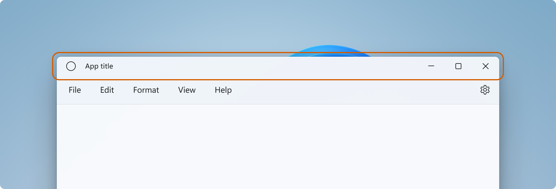
Title bar components
This list describes the components of the standard title bar.
- Title bar rectangle
- Title text
- System menu - accessed by clicking the app icon or right-clicking the title bar
- Caption controls
- Minimize button
- Maximize/Restore button
- Close button
In UWP applications, you can customize the title bar by using members of the ApplicationView and CoreApplicationView classes. There are multiple APIs to progressively modify the appearance of your title bar based on the level of customization needed.
Note
The Windows.UI.WindowManagement.AppWindow class, used for secondary windows in UWP apps, does not support title bar customization. To customize the title bar of a UWP app that uses secondary windows, use ApplicationView as described in Show multiple views with ApplicationView.
How much to customize the title bar
There are two levels of customization that you can apply to the title bar: apply minor modifications to the default title bar, or extend your app canvas into the title bar area and provide completely custom content.
Simple
For simple customization, such as changing the title bar color, you can set properties on your app window's title bar object to specify the colors you want to use for title bar elements. In this case, the system retains responsibility for all other aspects of the title bar, such as drawing the app title and defining drag areas.
Full
Your other option is to hide the default title bar and replace it with your own custom content. For example, you can place text, a search box, or custom menus in the title bar area. You will also need to use this option to extend a material backdrop, like Mica, into the title bar area.
When you opt for full customization, you are responsible for putting content in the title bar area, and you can define your own drag region. The caption controls (system Close, Minimize, and Maximize buttons) are still available and handled by the system, but elements like the app title are not. You will need to create those elements yourself as needed by your app.
Simple customization
If you want only to customize the title bar colors or icon, you can set properties on the title bar object for your app window.
Title
By default, the title bar shows the app's display name as the window title. The display name is set in the Package.appxmanifest file.
To add custom text to the title, set the ApplicationView.Title property to a text value, as shown here.
public MainPage()
{
    this.InitializeComponent();

    ApplicationView.GetForCurrentView().Title = "Custom text";
}
Your text is prepended to the window title, which will be displayed as "custom text - app display name". To show a custom title without the app display name, you have to replace the default title bar as shown in the Full customization section.
Colors
This example shows how to get an instance of ApplicationViewTitleBar and set its color properties.
This code can be placed in your app's OnLaunched method (App.xaml.cs), after the call to Window.Activate, or in your app's first page.
// using Windows.UI;
// using Windows.UI.ViewManagement;

var titleBar = ApplicationView.GetForCurrentView().TitleBar;

// Set active window colors
titleBar.ForegroundColor = Colors.White;
titleBar.BackgroundColor = Colors.Green;
titleBar.ButtonForegroundColor = Colors.White;
titleBar.ButtonBackgroundColor = Colors.SeaGreen;
titleBar.ButtonHoverForegroundColor = Colors.White;
titleBar.ButtonHoverBackgroundColor = Colors.DarkSeaGreen;
titleBar.ButtonPressedForegroundColor = Colors.Gray;
titleBar.ButtonPressedBackgroundColor = Colors.LightGreen;

// Set inactive window colors
titleBar.InactiveForegroundColor = Colors.Gainsboro;
titleBar.InactiveBackgroundColor = Colors.SeaGreen;
titleBar.ButtonInactiveForegroundColor = Colors.Gainsboro;
titleBar.ButtonInactiveBackgroundColor = Colors.SeaGreen;
There are a few things to be aware of when setting title bar colors:
- The button background color is not applied to the close button hover and pressed states. The close button always uses the system-defined color for those states.
- Setting a color property to
nullresets it to the default system color. - You can't set transparent colors. The color's alpha channel is ignored.
Windows gives a user the option to apply their selected accent color to the title bar. If you set any title bar color, we recommend that you explicitly set all the colors. This ensures that there are no unintended color combinations that occur because of user defined color settings.
Full customization
When you opt-in to full title bar customization, your app's client area is extended to cover the entire window, including the title bar area. You are responsible for drawing and input-handling for the entire window except the caption buttons, which are still provided by the window.
To hide the default title bar and extend your content into the title bar area, set the ExtendViewIntoTitleBar property to true. You can set this property in your app's OnLaunched method (App.xaml.cs), or in your app's first page.
Tip
See the Full customization example section to see all the code at once.
This example shows how to get the CoreApplicationViewTitleBar and set the ExtendViewIntoTitleBar property to true.
using Windows.ApplicationModel.Core;

public MainPage()
{
    this.InitializeComponent();

    // Hide default title bar.
    var coreTitleBar = CoreApplication.GetCurrentView().TitleBar;
    coreTitleBar.ExtendViewIntoTitleBar = true;
}
Tip
This setting persists when your app is closed and restarted. In Visual Studio, if you set ExtendViewIntoTitleBar to true, and then want to revert to the default, you should explicitly set it to false and run your app to overwrite the persisted setting.
Title bar content and drag regions
When your app is extended into the title bar area, you're responsible for defining and managing the UI for the title bar. This typically includes, at a minimum, specifying title text and the drag region. The drag region of the title bar defines where the user can click and drag to move the window around. It's also where the user can right-click to show the system menu.
To learn more about acceptable title bar content and recommended UI patterns, see Title bar design.
You specify the drag region by calling the Window.SetTitleBar method and passing in a UIElement that defines the drag region. (The UIElement is typically a panel that contains other elements.) The ExtendViewIntoTitleBar property must be set to true in order for the call to SetTitleBar to have any effect.
Here's how to set a Grid of content as the draggable title bar region. This code goes in the XAML and code-behind for your app's first page.
<Grid x:Name="AppTitleBar" Background="Transparent">
    <!-- Width of the padding columns is set in LayoutMetricsChanged handler. -->
    <!-- Using padding columns instead of Margin ensures that the background
         paints the area under the caption control buttons (for transparent buttons). -->
    <Grid.ColumnDefinitions>
        <ColumnDefinition x:Name="LeftPaddingColumn" Width="0"/>
        <ColumnDefinition/>
        <ColumnDefinition x:Name="RightPaddingColumn" Width="0"/>
    </Grid.ColumnDefinitions>
    <Image Source="Assets/WindowIcon.png"
           Grid.Column="1"
           HorizontalAlignment="Left"
           Width="16" Height="16"
           Margin="8,0,0,0"/>
    <TextBlock x:Name="AppTitleTextBlock"
               Text="App title"
               Style="{StaticResource CaptionTextBlockStyle}"
               Grid.Column="1"
               VerticalAlignment="Center"
               Margin="28,0,0,0"/>
</Grid>
public MainPage()
{
    this.InitializeComponent();

    var coreTitleBar = CoreApplication.GetCurrentView().TitleBar;
    coreTitleBar.ExtendViewIntoTitleBar = true;

    // Set XAML element as a drag region.
    Window.Current.SetTitleBar(AppTitleBar);
}
By default, the system title bar shows the app's display name as the window title. The display name is set in the Package.appxmanifest file. You can get this value and use it in your custom title bar like this.
AppTitleTextBlock.Text = AppInfo.Current.DisplayInfo.DisplayName;
Important
The drag region you specify needs to be hit testable. By default, some UI elements, such as Grid, do not participate in hit testing when they don't have a background set. This means, for some elements, you might need to set a transparent background brush. See the remarks on VisualTreeHelper.FindElementsInHostCoordinates for more info.
For example, if you define a Grid as your drag region, set Background="Transparent" to make it draggable.
This Grid is not draggable (but visible elements within it are): <Grid x:Name="AppTitleBar">.
This Grid looks the same, but the whole Grid is draggable: <Grid x:Name="AppTitleBar" Background="Transparent">.
Interactive content
You can place interactive controls, like buttons, menus, or a search box, in the top part of the app so they appear to be in the title bar. However, there are a few rules you must follow to ensure that your interactive elements receive user input while still allowing users to move your window around.
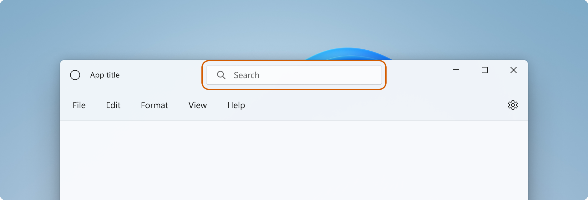
- You must call SetTitleBar to define an area as the draggable title bar region. If you don't, the system sets the default drag region at the top of the page. The system will then handle all user input to this area, and prevent input from reaching your controls.
- Place your interactive controls over the top of the drag region defined by the call to SetTitleBar (with a higher z-order). Don't make your interactive controls children of the UIElement passed to
SetTitleBar. After you pass an element toSetTitleBar, the system treats it like the system title bar and handles all pointer input to that element.
Here, the AutoSuggestBox element has a higher z-order than AppTitleBar, so it receives user input.
<Grid>
    <Grid.RowDefinitions>
        <RowDefinition Height="48"/>
        <RowDefinition/>
    </Grid.RowDefinitions>
    <Grid x:Name="AppTitleBar" Background="Transparent">
        <!-- Width of the padding columns is set in LayoutMetricsChanged handler. -->
        <!-- Using padding columns instead of Margin ensures that the background
             paints the area under the caption control buttons (for transparent buttons). -->
        <Grid.ColumnDefinitions>
            <ColumnDefinition x:Name="LeftPaddingColumn" Width="0"/>
            <ColumnDefinition/>
            <ColumnDefinition x:Name="RightPaddingColumn" Width="0"/>
        </Grid.ColumnDefinitions>
        <Image Source="Assets/WindowIcon.png"
               Grid.Column="1"
               HorizontalAlignment="Left"
               Width="16" Height="16"
               Margin="8,0,0,0"/>
        <TextBlock x:Name="AppTitleTextBlock"
                   Text="App title"
                   Style="{StaticResource CaptionTextBlockStyle}"
                   Grid.Column="1"
                   VerticalAlignment="Center"
                   Margin="28,0,0,0"/>
    </Grid>

    <!-- This control has a higher z-order than AppTitleBar,
         so it receives user input. -->
    <AutoSuggestBox QueryIcon="Find"
                    PlaceholderText="Search"
                    HorizontalAlignment="Center"
                    Width="260" Height="32"/>
</Grid>
System caption buttons
The system reserves the upper-left or upper-right corner of the app window for the system caption buttons (minimize, maximize/restore, close). The system retains control of the caption button area to guarantee that minimum functionality is provided for dragging, minimizing, maximizing, and closing the window. The system draws the Close button in the upper-right for left-to-right languages and the upper-left for right-to-left languages.
You can draw content underneath the caption control area, such as your app background, but you should not put any UI that you expect the user to be able to interact with. It does not receive any input because input for the caption controls is handled by the system.
These lines from the previous example show the padding columns in the XAML that defines the title bar. Using padding columns instead of margins ensures that the background paints the area under the caption control buttons (for transparent buttons). Using both right and left padding columns ensures that your title bar behaves correctly in both right-to-left and left-to-right layouts.
<Grid.ColumnDefinitions>
    <ColumnDefinition x:Name="LeftPaddingColumn" Width="0"/>
    <ColumnDefinition/>
    <ColumnDefinition x:Name="RightPaddingColumn" Width="0"/>
</Grid.ColumnDefinitions>
The dimensions and position of the caption control area is communicated by the CoreApplicationViewTitleBar class so that you can account for it in the layout of your title bar UI. The width of the reserved region on each side is given by the SystemOverlayLeftInset or SystemOverlayRightInset properties, and its height is given by the Height property.
You can handle the LayoutMetricsChanged event to respond to changes in the size of the caption buttons. For example, this can happen if the app layout changes from left-to-right to right-to-left. Handle this event to verify and update the positioning of UI elements that depend on the title bar's size.
This example shows how to adjust the layout of your title bar to account for changes in the title bar metrics. AppTitleBar, LeftPaddingColumn, and RightPaddingColumn are declared in the XAML shown previously.
private void CoreTitleBar_LayoutMetricsChanged(CoreApplicationViewTitleBar sender, object args)
{
    // Get the size of the caption controls and set padding.
    LeftPaddingColumn.Width = new GridLength(coreTitleBar.SystemOverlayLeftInset);
    RightPaddingColumn.Width = new GridLength(coreTitleBar.SystemOverlayRightInset);
}
Color and transparency in caption buttons
When you extend your app content into the title bar area, you can make the background of the caption buttons transparent to let your app background show through. You typically set the background to Colors.Transparent for full transparency. For partial transparency, set the alpha channel for the Color you set the property to.
These title bar properties can be transparent:
- ButtonBackgroundColor
- ButtonHoverBackgroundColor
- ButtonPressedBackgroundColor
- ButtonInactiveBackgroundColor
All other color properties will continue to ignore the alpha channel. If ExtendViewIntoTitleBar is set to false, the alpha channel is always ignored for all ApplicationViewTitleBar color properties.
The button background color is not applied to the Close button hover and pressed states. The close button always uses the system-defined color for those states.
Tip
Mica is a delightful material that helps distinguish the window that's in focus. We recommend it as the background for long-lived windows in Windows 11. If you have applied Mica in the client area of your window, you can extend it into the title bar area and make your caption buttons transparent for the Mica to show through. See Mica material for more info.
Dim the title bar when the window is inactive
You should make it obvious when your window is active or inactive. At a minimum, you should change the color of the text, icons, and buttons in your title bar.
Handle the CoreWindow.Activated event to determine the activation state of the window, and update your title bar UI as needed.
public MainPage()
{
    ...
    Window.Current.CoreWindow.Activated += CoreWindow_Activated;
}

private void CoreWindow_Activated(CoreWindow sender, WindowActivatedEventArgs args)
{
    UISettings settings = new UISettings();
    if (args.WindowActivationState == CoreWindowActivationState.Deactivated)
    {
        AppTitleTextBlock.Foreground =
            new SolidColorBrush(settings.UIElementColor(UIElementType.GrayText));
    }
    else
    {
        AppTitleTextBlock.Foreground =
            new SolidColorBrush(settings.UIElementColor(UIElementType.WindowText));
    }
}
Reset the title bar
You can call SetTitleBar to switch to a new title bar element while your app is running. You can also pass null as the parameter to SetTitleBar and set ExtendViewIntoTitleBar to false to revert to the default system title bar.
Show and hide the title bar
If you add support for full screen or compact overlay modes to your app, you might need to make changes to your title bar when your app switches between these modes.
When your app runs in full screen or tablet mode (Windows 10 only), the system hides the title bar and caption control buttons. However, the user can invoke the title bar to have it shown as an overlay on top of the app's UI.
You can handle the CoreApplicationViewTitleBar.IsVisibleChanged event to be notified when the title bar is hidden or invoked, and show or hide your custom title bar content as needed.
This example shows how to handle the IsVisibleChanged event to show and hide the AppTitleBar element from previous examples.
public MainPage()
{
    this.InitializeComponent();

    var coreTitleBar = CoreApplication.GetCurrentView().TitleBar;

    // Register a handler for when the title bar visibility changes.
    // For example, when the title bar is invoked in full screen mode.
    coreTitleBar.IsVisibleChanged += CoreTitleBar_IsVisibleChanged;
}

private void CoreTitleBar_IsVisibleChanged(CoreApplicationViewTitleBar sender, object args)
{
    if (sender.IsVisible)
    {
        AppTitleBar.Visibility = Visibility.Visible;
    }
    else
    {
        AppTitleBar.Visibility = Visibility.Collapsed;
    }
}
Note
Full screen mode can be entered only if supported by your app. See ApplicationView.IsFullScreenMode for more info. Tablet mode (Windows 10 only) is a user option in Windows 10 on supported hardware, so a user can choose to run any app in tablet mode.
Do's and don'ts
- Do make it obvious when your window is active or inactive. At a minimum, change the color of the text, icons, and buttons in your title bar.
- Do define a drag region along the top edge of the app canvas. Matching the placement of system title bars makes it easier for users to find.
- Do define a drag region that matches the visual title bar (if any) on the app's canvas.
Full customization example
This examples shows all the code described in the Full customization section.
<Page
    x:Class="WinUI2_ExtendedTitleBar.MainPage"
    xmlns="http://schemas.microsoft.com/winfx/2006/xaml/presentation"
    xmlns:x="http://schemas.microsoft.com/winfx/2006/xaml"
    xmlns:local="using:WinUI2_ExtendedTitleBar"
    xmlns:d="http://schemas.microsoft.com/expression/blend/2008"
    xmlns:mc="http://schemas.openxmlformats.org/markup-compatibility/2006"
    mc:Ignorable="d"
    xmlns:muxc="using:Microsoft.UI.Xaml.Controls"
    muxc:BackdropMaterial.ApplyToRootOrPageBackground="True">
    <Grid>
        <Grid.RowDefinitions>
            <RowDefinition Height="48"/>
            <RowDefinition/>
        </Grid.RowDefinitions>
        <Grid x:Name="AppTitleBar" Background="Transparent">
            <!-- Width of the padding columns is set in LayoutMetricsChanged handler. -->
            <!-- Using padding columns instead of Margin ensures that the background
                 paints the area under the caption control buttons (for transparent buttons). -->
            <Grid.ColumnDefinitions>
                <ColumnDefinition x:Name="LeftPaddingColumn" Width="0"/>
                <ColumnDefinition/>
                <ColumnDefinition x:Name="RightPaddingColumn" Width="0"/>
            </Grid.ColumnDefinitions>
            <Image Source="Assets/WindowIcon.png"
                   Grid.Column="1"
                   HorizontalAlignment="Left"
                   Width="16" Height="16"
                   Margin="8,0,0,0"/>
            <TextBlock x:Name="AppTitleTextBlock"
                       Text="App title"
                       Style="{StaticResource CaptionTextBlockStyle}"
                       Grid.Column="1"
                       VerticalAlignment="Center"
                       Margin="28,0,0,0"/>
        </Grid>

        <!-- This control has a higher z-order than AppTitleBar,
             so it receives user input. -->
        <AutoSuggestBox QueryIcon="Find"
                        PlaceholderText="Search"
                        HorizontalAlignment="Center"
                        Width="260" Height="32"/>

        <muxc:NavigationView Grid.Row="1"
                             IsBackButtonVisible="Collapsed"
                             IsSettingsVisible="False">
            <StackPanel>
                <TextBlock Text="Content"
                           Style="{ThemeResource TitleTextBlockStyle}"
                           Margin="12,0,0,0"/>
            </StackPanel>
        </muxc:NavigationView>
    </Grid>
</Page>
public MainPage()
{
    this.InitializeComponent();

    // Hide default title bar.
    CoreApplicationViewTitleBar coreTitleBar =
        CoreApplication.GetCurrentView().TitleBar;
    coreTitleBar.ExtendViewIntoTitleBar = true;

    // Set caption buttons background to transparent.
    ApplicationViewTitleBar titleBar =
        ApplicationView.GetForCurrentView().TitleBar;
    titleBar.ButtonBackgroundColor = Colors.Transparent;

    // Set XAML element as a drag region.
    Window.Current.SetTitleBar(AppTitleBar);

    // Register a handler for when the size of the overlaid caption control changes.
    coreTitleBar.LayoutMetricsChanged += CoreTitleBar_LayoutMetricsChanged;

    // Register a handler for when the title bar visibility changes.
    // For example, when the title bar is invoked in full screen mode.
    coreTitleBar.IsVisibleChanged += CoreTitleBar_IsVisibleChanged;

    // Register a handler for when the window activation changes.
    Window.Current.CoreWindow.Activated += CoreWindow_Activated;
}

private void CoreTitleBar_LayoutMetricsChanged(CoreApplicationViewTitleBar sender, object args)
{
    // Get the size of the caption controls and set padding.
    LeftPaddingColumn.Width = new GridLength(coreTitleBar.SystemOverlayLeftInset);
    RightPaddingColumn.Width = new GridLength(coreTitleBar.SystemOverlayRightInset);
}

private void CoreTitleBar_IsVisibleChanged(CoreApplicationViewTitleBar sender, object args)
{
    if (sender.IsVisible)
    {
        AppTitleBar.Visibility = Visibility.Visible;
    }
    else
    {
        AppTitleBar.Visibility = Visibility.Collapsed;
    }
}

 private void CoreWindow_Activated(CoreWindow sender, WindowActivatedEventArgs args)
 {
     UISettings settings = new UISettings();
     if (args.WindowActivationState == CoreWindowActivationState.Deactivated)
     {
         AppTitleTextBlock.Foreground =
            new SolidColorBrush(settings.UIElementColor(UIElementType.GrayText));
     }
     else
     {
         AppTitleTextBlock.Foreground =
            new SolidColorBrush(settings.UIElementColor(UIElementType.WindowText));
     }
 }