ColorPicker XAML Control
The ColorPicker control lets a user pick a color using a color spectrum, palette, sliders, or text input.
There is also a DropDownButton version of the control named ColorPickerButton which provides a preview of the selected color and allows a user to expand the drop-down to select a new color.
Platform APIs:
ColorPicker,ColorPickerButton
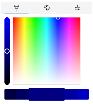
Example
<controls:ColorPicker Color="Navy"/>
Example Output
Sample Project
ColorPicker sample page Source. You can see this in action in Windows Community Toolkit Sample App.
Source Code
Related Topics
Feedback
Coming soon: Throughout 2024 we will be phasing out GitHub Issues as the feedback mechanism for content and replacing it with a new feedback system. For more information see: https://aka.ms/ContentUserFeedback.
Submit and view feedback for