Note
Access to this page requires authorization. You can try signing in or changing directories.
Access to this page requires authorization. You can try changing directories.
Parsing XAML markup to construct objects in memory is time-consuming for a complex UI. Here are some things you can do to improve the parse and load time of your XAML markup and the memory efficiency of your WinUI app.
At app startup, limit the XAML markup that is loaded to only what you need for your initial UI. Examine the markup in your initial page, including page resources, and confirm that you aren't loading extra elements that aren't needed right away. These elements can come from a variety of sources, such as resource dictionaries, elements that are initially collapsed, and elements drawn over other elements.
Optimizing your XAML for efficiency requires making tradeoffs; there's not always a single solution for every situation. Here, we look at some common issues and provide guidelines you can use to make the right tradeoffs for your WinUI app.
Minimize element count
Although the XAML platform is capable of displaying large numbers of elements, you can make your app lay out and render faster by using the fewest number of elements needed to achieve the visuals you want.
The choices you make in how you lay out your UI controls affect the number of UI elements that are created when your app starts. For more detailed information about optimizing layout, see Optimize your XAML layout.
Element count is extremely important in data templates because each element is created again for each data item. For info about reducing element count in a list or grid, see Element reduction per item in the Optimize ListView and GridView performance for WinUI article.
Here, we look at some other ways you can reduce the number of elements your app has to load at startup.
Defer item creation
If your XAML markup contains elements that you don't show right away, you can defer loading those elements until they are shown. For example, you can delay the creation of non-visible content such as a secondary tab in a tab-like UI. Or, you might show items in a grid view by default, but provide an option for the user to view the data in a list instead. You can delay loading the list until it's needed.
Use the x:Load attribute instead of the Visibility property to control when an element is shown. When an element's visibility is set to Collapsed, then it is skipped during the render pass, but you still pay the object instance costs in memory. When you use x:Load instead, the framework does not create the object instance until it is needed, so the memory costs are even lower. The drawback is that you pay a small memory overhead (approximately 600 bytes) when the UI is not loaded.
Note
In Windows App SDK, x:Load is the recommended deferred-loading pattern for XAML content that is not needed immediately.
The following examples show the difference in element count and memory use when different techniques are used to hide UI elements. A ListView and a GridView containing identical items are placed in a page's root Grid. The ListView is not visible, but the GridView is shown. The XAML in each of these examples produces the same UI on the screen. Use tools for profiling and performance to check element count and memory use in your app.
Option 1 - Inefficient
Here, the ListView is loaded, but is not visible because its Width is 0. The ListView and each of its child elements are created in the visual tree and loaded into memory.
<!-- NOTE: EXAMPLE OF INEFFICIENT CODE; DO NOT COPY-PASTE. -->
<Grid Background="{ThemeResource ApplicationPageBackgroundThemeBrush}">

    <ListView x:Name="List1" Width="0">
        <ListViewItem>Item 1</ListViewItem>
        <ListViewItem>Item 2</ListViewItem>
        <ListViewItem>Item 3</ListViewItem>
        <ListViewItem>Item 4</ListViewItem>
        <ListViewItem>Item 5</ListViewItem>
        <ListViewItem>Item 6</ListViewItem>
        <ListViewItem>Item 7</ListViewItem>
        <ListViewItem>Item 8</ListViewItem>
        <ListViewItem>Item 9</ListViewItem>
        <ListViewItem>Item 10</ListViewItem>
    </ListView>

    <GridView x:Name="Grid1">
        <GridViewItem>Item 1</GridViewItem>
        <GridViewItem>Item 2</GridViewItem>
        <GridViewItem>Item 3</GridViewItem>
        <GridViewItem>Item 4</GridViewItem>
        <GridViewItem>Item 5</GridViewItem>
        <GridViewItem>Item 6</GridViewItem>
        <GridViewItem>Item 7</GridViewItem>
        <GridViewItem>Item 8</GridViewItem>
        <GridViewItem>Item 9</GridViewItem>
        <GridViewItem>Item 10</GridViewItem>
    </GridView>
</Grid>
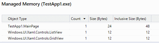
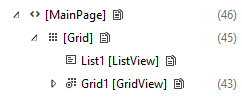
Live visual tree with the ListView loaded. Total element count for the page is 89.
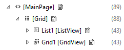
ListView and its children are loaded into memory.
Option 2 - Better
Here, the ListView's Visibility is set to Collapsed (the other XAML is identical to the original). The ListView is created in the visual tree, but its child elements are not. However, they are still loaded into memory, so memory use is identical to the previous example.
<ListView x:Name="List1" Visibility="Collapsed">
Live visual tree with the ListView collapsed. Total element count for the page is 46.
ListView and its children are loaded into memory.
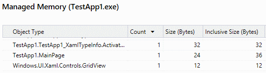
Option 3 - Most efficient
Here, the ListView has the x:Load attribute set to False (the other XAML is identical to the original). The ListView is not created in the visual tree or loaded into memory at startup.
<ListView x:Name="List1" Visibility="Collapsed" x:Load="False">
Live visual tree with the ListView not loaded. Total element count for the page is 45.
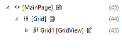
ListView and its children are not loaded into memory.
Note
The element counts and memory use in these examples are very small and are shown only to demonstrate the concept. In these examples, the overhead of using x:Load is greater than the memory savings, so the app would not benefit. You should use profiling tools on your app to determine whether deferred loading will help.
Use layout panel properties
Layout panels have a Background property, so there's no need to put a Rectangle in front of a panel just to color it.
Inefficient
<!-- NOTE: EXAMPLE OF INEFFICIENT CODE; DO NOT COPY-PASTE. -->
<Grid>
    <Rectangle Fill="Black"/>
</Grid>
Efficient
<Grid Background="Black"/>
Layout panels also have built-in border properties, so you don't need to put a Border element around a layout panel. See Optimize your XAML layout for more info and examples.
Use images in place of vector-based elements
If you reuse the same vector-based element enough times, it becomes more efficient to use an Image element instead. Vector-based elements can be more expensive because the CPU must create each individual element separately. The image file needs to be decoded only once.
Optimize resources and resource dictionaries
You typically use resource dictionaries to store, at a somewhat global level, resources that you want to reference in multiple places in your app. For example, styles, brushes, templates, and so on.
In general, ResourceDictionary is optimized to avoid instantiating resources until they're asked for. But there are situations you should avoid so that resources aren't instantiated unnecessarily.
Resources with x:Name
Use the x:Key attribute to reference your resources. Any resource with the x:Name attribute won't benefit from the platform optimization; instead, it is instantiated as soon as the ResourceDictionary is created. This happens because x:Name tells the platform that your app needs field access to this resource, so the platform needs to create something to hold a reference to it.
ResourceDictionary in a UserControl
A ResourceDictionary defined inside of a UserControl carries a penalty. The platform creates a copy of such a ResourceDictionary for every instance of the UserControl. If you have a UserControl that is used a lot, then move the ResourceDictionary out of the UserControl and put it at the page level.
Resource and ResourceDictionary scope
If a page references a user control or a resource defined in a different file, then the framework parses that file too.
Here, because InitialPage.xaml uses one resource from ExampleResourceDictionary.xaml, the whole of ExampleResourceDictionary.xaml must be parsed at startup.
InitialPage.xaml
<Page x:Class="ExampleNamespace.InitialPage" ...>
    <Page.Resources>
        <ResourceDictionary>
            <ResourceDictionary.MergedDictionaries>
                <ResourceDictionary Source="ExampleResourceDictionary.xaml"/>
            </ResourceDictionary.MergedDictionaries>
        </ResourceDictionary>
    </Page.Resources>

    <Grid>
        <TextBox Foreground="{StaticResource TextBrush}"/>
    </Grid>
</Page>
ExampleResourceDictionary.xaml
<ResourceDictionary>
    <SolidColorBrush x:Key="TextBrush" Color="#FF3F42CC"/>

    <!--This ResourceDictionary contains many other resources that
        are used in the app, but are not needed during startup.-->
</ResourceDictionary>
If you use a resource on many pages throughout your app, then storing it in App.xaml is a good practice and avoids duplication. But App.xaml is parsed at app startup, so any resource that is used in only one page, unless that page is the initial page, should be put into the page's local resources. This example shows App.xaml containing resources that are used by only one page that is not the initial page. This needlessly increases startup time.
App.xaml
<!-- NOTE: EXAMPLE OF INEFFICIENT CODE; DO NOT COPY-PASTE. -->
<Application ...>
     <Application.Resources>
        <SolidColorBrush x:Key="DefaultAppTextBrush" Color="#FF3F42CC"/>
        <SolidColorBrush x:Key="InitialPageTextBrush" Color="#FF3F42CC"/>
        <SolidColorBrush x:Key="SecondPageTextBrush" Color="#FF3F42CC"/>
        <SolidColorBrush x:Key="ThirdPageTextBrush" Color="#FF3F42CC"/>
    </Application.Resources>
</Application>
InitialPage.xaml
<!-- NOTE: EXAMPLE OF INEFFICIENT CODE; DO NOT COPY-PASTE. -->
<Page x:Class="ExampleNamespace.InitialPage" ...>
    <StackPanel>
        <TextBox Foreground="{StaticResource InitialPageTextBrush}"/>
    </StackPanel>
</Page>
SecondPage.xaml
<!-- NOTE: EXAMPLE OF INEFFICIENT CODE; DO NOT COPY-PASTE. -->
<Page x:Class="ExampleNamespace.SecondPage" ...>
    <StackPanel>
        <Button Content="Submit" Foreground="{StaticResource SecondPageTextBrush}"/>
    </StackPanel>
</Page>
To make this example more efficient, move SecondPageTextBrush into SecondPage.xaml and move ThirdPageTextBrush into ThirdPage.xaml. InitialPageTextBrush can remain in App.xaml because application resources must be parsed at app startup in any case.
Consolidate multiple brushes that look the same into one resource
The XAML platform tries to cache commonly used objects so that they can be reused as often as possible. But XAML can't easily tell whether a brush declared in one piece of markup is the same as a brush declared in another. The example here uses SolidColorBrush to demonstrate, but the case is more likely and more important with GradientBrush. Also check for brushes that use predefined colors; for example, "Orange" and "#FFFFA500" are the same color.
Inefficient
<!-- NOTE: EXAMPLE OF INEFFICIENT CODE; DO NOT COPY-PASTE. -->
<Page ... >
    <StackPanel>
        <TextBlock>
            <TextBlock.Foreground>
                <SolidColorBrush Color="#FFFFA500"/>
            </TextBlock.Foreground>
        </TextBlock>
        <Button Content="Submit">
            <Button.Foreground>
                <SolidColorBrush Color="#FFFFA500"/>
            </Button.Foreground>
        </Button>
    </StackPanel>
</Page>
To fix the duplication, define the brush as a resource. If controls in other pages use the same brush, move it to App.xaml.
Efficient
<Page ... >
    <Page.Resources>
        <SolidColorBrush x:Key="BrandBrush" Color="#FFFFA500"/>
    </Page.Resources>

    <StackPanel>
        <TextBlock Foreground="{StaticResource BrandBrush}" />
        <Button Content="Submit" Foreground="{StaticResource BrandBrush}" />
    </StackPanel>
</Page>
Minimize overdrawing
Overdrawing occurs where more than one object is drawn in the same screen pixels. Note that there is sometimes a tradeoff between this guidance and the desire to minimize element count.
Use DebugSettings.IsOverdrawHeatMapEnabled as a visual diagnostic. You might find objects being drawn that you didn't know were in the scene.
Transparent or hidden elements
If an element isn't visible because it's transparent or hidden behind other elements, and it's not contributing to layout, then delete it. If the element isn't visible in the initial visual state but is visible in other visual states, then use x:Load to control its state or set Visibility to Collapsed on the element itself and change the value to Visible in the appropriate states. There will be exceptions to this heuristic: in general, the value a property has in the majority of visual states is best set locally on the element.
Composite elements
Use a composite element instead of layering multiple elements to create an effect. In this example, the result is a two-toned shape where the top half is black from the background of the Grid and the bottom half is gray from the semi-transparent white Rectangle alpha-blended over the black background of the Grid. Here, 150% of the pixels necessary to achieve the result are being filled.
Inefficient
<!-- NOTE: EXAMPLE OF INEFFICIENT CODE; DO NOT COPY-PASTE. -->
<Grid Background="Black">
    <Grid.RowDefinitions>
        <RowDefinition Height="*"/>
        <RowDefinition Height="*"/>
    </Grid.RowDefinitions>
    <Rectangle Grid.Row="1" Fill="White" Opacity=".5"/>
</Grid>
Efficient
<Grid>
    <Grid.RowDefinitions>
        <RowDefinition Height="*"/>
        <RowDefinition Height="*"/>
    </Grid.RowDefinitions>
    <Rectangle Fill="Black"/>
    <Rectangle Grid.Row="1" Fill="#FF7F7F7F"/>
</Grid>
Layout panels
A layout panel can have two purposes: to color an area and to lay out child elements. If an element further back in z-order is already coloring an area, then a layout panel in front doesn't need to paint that area; instead it can focus on laying out its children. Here's an example.
Inefficient
<!-- NOTE: EXAMPLE OF INEFFICIENT CODE; DO NOT COPY-PASTE. -->
<GridView Background="Blue">
    <GridView.ItemTemplate>
        <DataTemplate>
            <Grid Background="Blue"/>
        </DataTemplate>
    </GridView.ItemTemplate>
</GridView>
Efficient
<GridView Background="Blue">
    <GridView.ItemTemplate>
        <DataTemplate>
            <Grid/>
        </DataTemplate>
    </GridView.ItemTemplate>
</GridView>
If the Grid has to be hit-testable, then set a background value of Transparent on it.
Borders
Use a Border element to draw a border around an object. In this example, a Grid is used as a makeshift border around a TextBox. But all the pixels in the center cell are overdrawn.
Inefficient
<!-- NOTE: EXAMPLE OF INEFFICIENT CODE; DO NOT COPY-PASTE. -->
<Grid Background="Blue" Width="300" Height="45">
    <Grid.RowDefinitions>
        <RowDefinition Height="5"/>
        <RowDefinition/>
        <RowDefinition Height="5"/>
    </Grid.RowDefinitions>
    <Grid.ColumnDefinitions>
        <ColumnDefinition Width="5"/>
        <ColumnDefinition/>
        <ColumnDefinition Width="5"/>
    </Grid.ColumnDefinitions>
    <TextBox Grid.Row="1" Grid.Column="1"></TextBox>
</Grid>
Efficient
<Border BorderBrush="Blue" BorderThickness="5" Width="300" Height="45">
    <TextBox/>
</Border>
Margins
Be aware of margins. Two neighboring elements will overlap, possibly accidentally, if negative margins extend into another element's render bounds and cause overdrawing.
Cache static content
Another source of overdrawing is a shape made from many overlapping elements. If you set CacheMode to BitmapCache on the UIElement that contains the composite shape, then the platform renders the element to a bitmap once and uses that bitmap each frame instead of overdrawing.
Inefficient
<Canvas Background="White">
    <Ellipse Height="40" Width="40" Fill="Blue"/>
    <Ellipse Canvas.Left="21" Height="40" Width="40" Fill="Blue"/>
    <Ellipse Canvas.Top="13" Canvas.Left="10" Height="40" Width="40" Fill="Blue"/>
</Canvas>

The image above is the result, but here's a map of the overdrawn regions. Darker red indicates higher amounts of overdraw.

Efficient
<Canvas Background="White" CacheMode="BitmapCache">
    <Ellipse Height="40" Width="40" Fill="Blue"/>
    <Ellipse Canvas.Left="21" Height="40" Width="40" Fill="Blue"/>
    <Ellipse Canvas.Top="13" Canvas.Left="10" Height="40" Width="40" Fill="Blue"/>
</Canvas>
Note the use of CacheMode. Don't use this technique if any of the sub-shapes animate because the bitmap cache will likely need to be regenerated every frame, defeating the purpose.
Use compiled XAML output
Windows App SDK compiles XAML into a binary representation as part of the build, which avoids text-parsing costs at runtime. The compiled format also optimizes load and tree creation for common XAML types such as visual states, resource dictionaries, and styles.
Built-in WinUI controls and dictionaries already benefit from this pipeline. For your own WinUI app, keep the normal XAML compilation steps enabled so the generated markup compile output is available at runtime.
Related articles
Collaborate with us on GitHub
The source for this content can be found on GitHub, where you can also create and review issues and pull requests. For more information, see our contributor guide.

Windows developer