Note
Access to this page requires authorization. You can try signing in or changing directories.
Access to this page requires authorization. You can try changing directories.
The Windows Ribbon framework provides developers with a robust and consistent model for managing dynamic content across a variety of collection-based controls. By adapting and reconfiguring the Ribbon UI, these dynamic controls allow the framework to respond to user interaction in both the host application and Ribbon itself, and provide the flexibility to handle various run time environments.
Introduction
This ability of the Ribbon framework to dynamically adapt to run-time conditions, application requirements, and end-user input highlights the rich UI capabilities of the framework, and provides developers with the flexibility to cater to a broad range of customer needs.
The focus of this guide is to describe the dynamic gallery controls supported by the framework, explain their differences, discuss when and where they may best be used, and demonstrate how they can be incorporated into a Ribbon application.
Galleries
Galleries are functionally and graphically rich list box controls. The item collection of a gallery can be organized by categories, displayed in flexible column and row-based layouts, represented with images and text, and depending on the type of gallery, support live previewing.
Galleries are functionally distinct from other dynamic Ribbon controls for the following reasons:
- Galleries implement the IUICollection interface that defines the various methods for manipulating gallery item collections.
- Galleries can be updated at run time, based on activity that occurs directly in the Ribbon, such as when a user adds a Command to the Quick Access Toolbar (QAT).
- Galleries can be updated at run time, based on activity that occurs indirectly from the run-time environment, such as when a printer driver supports portrait page layouts only.
- Galleries can be updated at run time, based on activity that occurs indirectly in the host application, such as when a user selects an item in a document.
The Ribbon framework exposes two types of galleries: item galleries and Command galleries.
Item Galleries
Item galleries contain an index-based collection of related items where each item is represented by an image, a string, or both. The control is bound to a single Command handler that relies on the index value that is identified by the UI_PKEY_SelectedItem property.
Item galleries support live previewing, which means displaying a Command result, based on mouseover or focus, without committing to or actually invoking the Command.
Important
The framework does not support hosting item galleries in the Application Menu.
Command Galleries
Command galleries contain a collection of distinct, non-indexed items. Each item is represented by a single control bound to a Command handler through a Command ID. Like standalone controls, each item in a Command gallery routes input events to an associated Command handler—the Command gallery itself does not listen for events.
Command galleries do not support live previewing.
Gallery Controls
There are four gallery controls in the Ribbon framework: the DropDownGallery, the SplitButtonGallery, the InRibbonGallery, and the ComboBox. All except the ComboBox can be implemented as either an item gallery or a Command gallery.
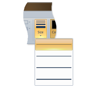
DropDownGallery
A DropDownGallery is a button that displays a drop-down list that contains a collection of mutually exclusive items or Commands.
The following screen shot illustrates the Ribbon Drop-Down Gallery control in Microsoft Paint for Windows 7.
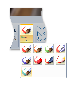
SplitButtonGallery
A SplitButtonGallery is a composite control that exposes a single default item or Command from its collection on a primary button, and displays other items or commands in a mutually exclusive drop-down list that is displayed when a secondary button is clicked.
The following screen shot illustrates the Ribbon Split Button Gallery control in Microsoft Paint for Windows 7.
InRibbonGallery
An InRibbonGallery is a gallery that displays a collection of related items or Commands in the Ribbon. If there are too many items in the gallery, an expand arrow is provided to display the rest of the collection in an expanded pane.
The following screen shot illustrates the Ribbon In-Ribbon Gallery control in Microsoft Paint for Windows 7.
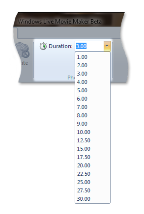
ComboBox
A ComboBox is a single-column list box that contains a collection of items with either a static control or edit control and dropdown arrow. The list box portion of the control is displayed when the user clicks the drop-down arrow.
The following screen shot illustrates a Ribbon Combo Box control from Windows Live Movie Maker.
Because the ComboBox is exclusively an item gallery, it does not support Command items. It is also the only gallery control that does not support a Command Space. (A Command Space is a collection of Commands that are declared in markup and listed at the bottom of an item gallery or Command gallery.)
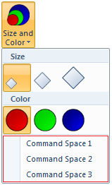
The following code example shows the markup required to declare a three-button Command Space in a DropDownGallery.
<DropDownGallery
  CommandName="cmdSizeAndColor"
  TextPosition="Hide"
  Type="Commands"
  ItemHeight="32"
  ItemWidth="32">
  <DropDownGallery.MenuLayout>
    <FlowMenuLayout Rows="2" Columns="3" Gripper="None"/>
  </DropDownGallery.MenuLayout>
  <Button CommandName="cmdCommandSpace1"/>
  <Button CommandName="cmdCommandSpace2"/>
  <Button CommandName="cmdCommandSpace3"/>
</DropDownGallery>
The following screen shot illustrates the three-button Command Space of the preceding code example.
How to Implement a Gallery
This section discusses the implementation details of Ribbon galleries and walks through how to incorporate them in a Ribbon application.
The Basic Components
This section describes the set of properties and methods that form the backbone of dynamic content in the Ribbon framework and support adding, deleting, updating, and otherwise manipulating the content and visual layout of Ribbon galleries at run time.
IUICollection
Galleries require a basic set of methods to access and manipulate the individual items in their collections.
The IEnumUnknown interface defines these methods, and the framework supplements their functionality with additional methods that are defined in the IUICollection interface. IUICollection is implemented by the framework for each gallery declaration in the Ribbon markup.
If additional functionality is required that is not provided by the IUICollection interface, then a custom collection object that is implemented by the host application and derived from IEnumUnknown can be substituted for the framework collection.
IUICollectionChangedEvent
For an application to respond to changes in a gallery collection, it must implement the IUICollectionChangedEvent interface. Applications can subscribe to notifications from an IUICollection object through the IUICollectionChangedEvent::OnChanged event listener.
When the application replaces the gallery collection provided by the framework with a custom collection, the application should implement the IConnectionPointContainer interface. If IConnectionPointContainer is not implemented, then the application is unable to notify the framework of changes in the custom collection that require dynamic updates to the gallery control.
In those cases where IConnectionPointContainer is not implemented, the gallery control can be updated only by invalidation through IUIFramework::InvalidateUICommand and IUICommandHandler::UpdateProperty, or by calling IUIFramework::SetUICommandProperty.
IUISimplePropertySet
Applications must implement IUISimplePropertySet for each item or Command in a gallery collection. However, the properties that can be requested with IUISimplePropertySet::GetValue vary.
Items are defined and bound to a gallery through the UI_PKEY_ItemsSource property key and expose properties with an IUICollection object.
The valid properties for items in item galleries (UI_COMMANDTYPE_COLLECTION) are described in the following table.
Note
Some item properties, such as UI_PKEY_Label, can be defined in markup. For more detail, see the Property Keys reference documentation.
Control
Properties
UI_PKEY_Label, UI_PKEY_CategoryId
UI_PKEY_Label, UI_PKEY_ItemImage , UI_PKEY_CategoryId
UI_PKEY_Label, UI_PKEY_ItemImage , UI_PKEY_CategoryId
UI_PKEY_Label, UI_PKEY_ItemImage, UI_PKEY_CategoryId
UI_PKEY_SelectedItem is a property of the item gallery.
The valid item properties for Command galleries (UI_COMMANDTYPE_COMMANDCOLLECTION) are described in the following table.
Categories are used to organize items and Commands in galleries. Categories are defined and bound to a gallery through the UI_PKEY_Categories property key and expose properties with a category-specific IUICollection object.
Categories do not have a CommandType and do not support user interaction. For example, categories cannot become the SelectedItem in an item gallery, and they are not bound to a Command in a Command gallery. Like other gallery item properties, category properties such as UI_PKEY_Label and UI_PKEY_CategoryId can be retrieved by calling IUISimplePropertySet::GetValue.
Important
IUISimplePropertySet::GetValue should return UI_COLLECTION_INVALIDINDEX when UI_PKEY_CategoryId is requested for an item that does not have an associated category.
Declare the Controls in Markup
Galleries, like all Ribbon controls, must be declared in markup. A gallery is identified in markup as an item gallery or Command gallery, and various presentation details are declared. Unlike other controls, galleries require the base control only, or collection container, to be declared in markup. The actual collections are populated at run time. When a gallery is declared in markup, the Type attribute is used to specify whether the gallery is an item gallery of a Command gallery.
There are a number of optional layout attributes available for each of the controls discussed here. These attributes provide developer preferences for the framework to follow that directly affect how a control is populated and displayed in a ribbon. The preferences applicable in markup are related to the display and layout templates and behaviors discussed in Customizing a Ribbon Through Size Definitions and Scaling Policies.
If a particular control does not allow layout preferences directly in markup, or the layout preferences are not specified, then the framework defines control-specific display conventions based on the amount of screen space available.
The following examples demonstrate how to incorporate a set of galleries into a Ribbon.
Command Declarations
Commands should be declared with a CommandName attribute that is used to associate a control, or set of controls, with the Command.
A CommandId attribute used to bind a Command to a Command handler when the markup is compiled can also be specified here. If no ID is provided, then one is generated by the framework.
<!-- ComboBox -->
<Command Name="cmdComboBoxGroup"
         Symbol="cmdComboBoxGroup"
         Comment="ComboBox Group"
         LabelTitle="ComboBox"/>
<Command Name="cmdComboBox"
         Symbol="cmdComboBox"
         Comment="ComboBox"
         LabelTitle="ComboBox"/>
<!-- DropDownGallery -->
<Command Name="cmdDropDownGalleryGroup"
         Symbol="cmdDropDownGalleryGroup"
         Comment="DropDownGallery Group"
         LabelTitle="DropDownGallery"/>
<Command Name="cmdDropDownGallery"
         Symbol="cmdDropDownGallery"
         Comment="DropDownGallery"
         LabelTitle="DropDownGallery"/>
<!-- InRibbonGallery -->
<Command Name="cmdInRibbonGalleryGroup"
         Symbol="cmdInRibbonGalleryGroup"
         Comment="InRibbonGallery Group"
         LabelTitle="InRibbonGallery"/>
<Command Name="cmdInRibbonGallery"
         Symbol="cmdInRibbonGallery"
         Comment="InRibbonGallery"
         LabelTitle="InRibbonGallery"
<!-- SplitButtonGallery -->
<Command Name="cmdSplitButtonGalleryGroup"
         Symbol="cmdSplitButtonGalleryGroup"
         Comment="SplitButtonGallery Group"
         LabelTitle="SplitButtonGallery"/>
<Command Name="cmdSplitButtonGallery"
         Symbol="cmdSplitButtonGallery"
         Comment="SplitButtonGallery"
         LabelTitle="SplitButtonGallery"
Control Declarations
This section contains examples that demonstrate the basic control markup required for the various gallery types. They show how to declare the gallery controls and associate them with a Command through the CommandName attribute.
The following example shows a control declaration for the DropDownGallery where the Type attribute is used to specify that this is a Command gallery.
<!-- DropDownGallery -->
<Group CommandName="cmdDropDownGalleryGroup">
  <DropDownGallery CommandName="cmdDropDownGallery"
                   TextPosition="Hide"
                   Type="Commands"
                   ItemHeight="32"
                   ItemWidth="32">
    <DropDownGallery.MenuLayout>
      <FlowMenuLayout Rows="2"
                      Columns="3"
                      Gripper="None"/>
    </DropDownGallery.MenuLayout>
    <DropDownGallery.MenuGroups>
      <MenuGroup>
        <Button CommandName="cmdButton1"></Button>
        <Button CommandName="cmdButton2"></Button>
       </MenuGroup>
       <MenuGroup>
        <Button CommandName="cmdButton3"></Button>
      </MenuGroup>
    </DropDownGallery.MenuGroups>
  </DropDownGallery>
</Group>
The following example shows a control declaration for the SplitButtonGallery.
<!-- SplitButtonGallery -->
<Group CommandName="cmdSplitButtonGalleryGroup">
  <SplitButtonGallery CommandName="cmdSplitButtonGallery">
    <SplitButtonGallery.MenuLayout>
      <FlowMenuLayout Rows="2"
                      Columns="3"
                      Gripper="None"/>
    </SplitButtonGallery.MenuLayout>
    <SplitButtonGallery.MenuGroups>
      <MenuGroup>
        <Button CommandName="cmdButton1"></Button>
        <Button CommandName="cmdButton2"></Button>
      </MenuGroup>
      <MenuGroup>
        <Button CommandName="cmdButton3"></Button>
      </MenuGroup>
    </SplitButtonGallery.MenuGroups>
  </SplitButtonGallery>
</Group>
The following example shows a control declaration for the InRibbonGallery.
Note
Because the InRibbonGallery is designed to display a subset of its item collection in the Ribbon without activating a drop-down menu, it provides a number of optional attributes that govern its size and item layout on Ribbon initialization. These attributes are unique to the InRibbonGallery and are not available from the other dynamic controls.
<!-- InRibbonGallery -->
<Group CommandName="cmdInRibbonGalleryGroup" SizeDefinition="OneInRibbonGallery">
  <InRibbonGallery CommandName="cmdInRibbonGallery"
                   MaxColumns="10"
                   MaxColumnsMedium="5"
                   MinColumnsLarge="5"
                   MinColumnsMedium="3"
                   Type="Items">
    <InRibbonGallery.MenuLayout>
      <VerticalMenuLayout Rows="2"
                          Gripper="Vertical"/>
    </InRibbonGallery.MenuLayout>
    <InRibbonGallery.MenuGroups>
      <MenuGroup>
        <Button CommandName="cmdButton1"></Button>
        <Button CommandName="cmdButton2"></Button>
      </MenuGroup>
      <MenuGroup>
        <Button CommandName="cmdButton3"></Button>
      </MenuGroup>
    </InRibbonGallery.MenuGroups>
  </InRibbonGallery>
</Group>
The following example shows a control declaration for the ComboBox.
<!-- ComboBox -->
<Group CommandName="cmdComboBoxGroup">
  <ComboBox CommandName="cmdComboBox">
  </ComboBox>
</Group>
Create a Command Handler
For each Command, the Ribbon framework requires a corresponding Command handler in the host application. Command handlers are implemented by the Ribbon host application and are derived from the IUICommandHandler interface.
Note
Multiple Commands can be bound to a single Command handler.
A Command handler serves two purposes:
- IUICommandHandler::UpdateProperty responds to property update requests. The values of Command properties, such as UI_PKEY_Enabled or UI_PKEY_Label, are set through calls to IUIFramework::SetUICommandProperty or IUIFramework::InvalidateUICommand.
- IUICommandHandler::Execute responds to execute events. This method supports the following three execution states that are specified by the UI_EXECUTIONVERB parameter.
- The Execute state executes, or commits to, any commands to which the handler is bound.
- The Preview state previews any commands to which the handler is bound. This essentially executes the commands without committing to the result.
- The CancelPreview state cancels any previewed Commands. This is required to support traversal through a menu or list and sequentially preview and undo the results as required.
The following example demonstrates a gallery command handler.
/*
 * GALLERY COMMAND HANDLER IMPLEMENTATION
 */
class CGalleryCommandHandler
      : public CComObjectRootEx<CComMultiThreadModel>
      , public IUICommandHandler
{
public:
  BEGIN_COM_MAP(CGalleryCommandHandler)
    COM_INTERFACE_ENTRY(IUICommandHandler)
  END_COM_MAP()

  // Gallery command handler's Execute method
  STDMETHODIMP Execute(UINT nCmdID,
                       UI_EXECUTIONVERB verb,
                       const PROPERTYKEY* key,
                       const PROPVARIANT* ppropvarValue,
                       IUISimplePropertySet* pCommandExecutionProperties)
  {
    HRESULT hr = S_OK;

    // Switch on manner of execution (Execute/Preview/CancelPreview)
    switch (verb)
    {
      case UI_EXECUTIONVERB_EXECUTE:
        if(nCmdID == cmdTextSizeGallery ||
           nCmdID == cmdTextSizeGallery2 ||
           nCmdID == cmdTextSizeGallery3)
        {
          if (pCommandExecutionProperties != NULL)
          {
            CItemProperties *pItem =
              static_cast<CItemProperties *>(pCommandExecutionProperties);
            g_prevSelection = g_index = pItem->GetIndex();
            UpdateGallerySelectedItems();
            ::InvalidateRect(g_hWindowFrame, NULL, TRUE);
          }
          else
          {
            g_prevSelection = g_index = 0;
            UpdateGallerySelectedItems();
            ::InvalidateRect(g_hWindowFrame, NULL, TRUE);
          }
        }
        break;
      case UI_EXECUTIONVERB_PREVIEW:
        CItemProperties *pItem =
          static_cast<CItemProperties *>(pCommandExecutionProperties);
        g_index = pItem->GetIndex();
        ::InvalidateRect(g_hWindowFrame, NULL, TRUE);
        break;
      case UI_EXECUTIONVERB_CANCELPREVIEW:
        g_index = g_prevSelection;
        ::InvalidateRect(g_hWindowFrame, NULL, TRUE);
        break;
    }
    return hr;
  }

  // Gallery command handler's UpdateProperty method
  STDMETHODIMP UpdateProperty(UINT nCmdID,
                              REFPROPERTYKEY key,
                              const PROPVARIANT* ppropvarCurrentValue,
                              PROPVARIANT* ppropvarNewValue)
  {
    UNREFERENCED_PARAMETER(ppropvarCurrentValue);

    HRESULT hr = E_NOTIMPL;

    if (key == UI_PKEY_ItemsSource) // Gallery items requested
    {
      if (nCmdID == cmdTextSizeGallery ||
          nCmdID == cmdTextSizeGallery2 ||
          nCmdID == cmdTextSizeGallery3)
      {
        CComQIPtr<IUICollection> spCollection(ppropvarCurrentValue->punkVal);

        int count = _countof(g_labels);

        for (int i = 0; i < count; i++)
        {
          CComObject<CItemProperties> * pItem;
          CComObject<CItemProperties>::CreateInstance(&pItem);

          pItem->AddRef();
          pItem->Initialize(i);

          spCollection->Add(pItem);
        }
        return S_OK;
      }
      if (nCmdID == cmdCommandGallery1)
      {
        CComQIPtr<IUICollection> spCollection(ppropvarCurrentValue->punkVal);

        int count = 12;
        int commands[] = {cmdButton1,
                          cmdButton2,
                          cmdBoolean1,
                          cmdBoolean2,
                          cmdButton1,
                          cmdButton2,
                          cmdBoolean1,
                          cmdBoolean2,
                          cmdButton1,
                          cmdButton2,
                          cmdBoolean1,
                          cmdBoolean2};

        for (int i = 0; i < count; i++)
        {
          CComObject<CItemProperties> * pItem;
          CComObject<CItemProperties>::CreateInstance(&pItem);

          pItem->AddRef();
          pItem->InitializeAsCommand(commands[i]);

          spCollection->Add(pItem);
        }
        return S_OK;
      }
    }
    else if (key == UI_PKEY_SelectedItem) // Selected item requested
    {
      hr = UIInitPropertyFromUInt32(UI_PKEY_SelectedItem, g_index, ppropvarNewValue);
    }
    return hr;
  }
};
Bind the Command Handler
After you define a Command handler, the Command must be bound to the handler.
The following example demonstrates how to bind a gallery Command to a specific Command handler. In this case, both the ComboBox and gallery controls are bound to their respective Command handlers.
// Called for each Command in markup.
// Application will return a Command handler for each Command.
STDMETHOD(OnCreateUICommand)(UINT32 nCmdID,
                             UI_COMMANDTYPE typeID,
                             IUICommandHandler** ppCommandHandler)
{
  // CommandType for ComboBox and galleries
  if (typeID == UI_COMMANDTYPE_COLLECTION || typeID == UI_COMMANDTYPE_COMMANDCOLLECTION)
  {
    switch (nCmdID)
    {
      case cmdComboBox:
        CComObject<CComboBoxCommandHandler> * pComboBoxCommandHandler;
        CComObject<CComboBoxCommandHandler>::CreateInstance(&pComboBoxCommandHandler);
        return pComboBoxCommandHandler->QueryInterface(IID_PPV_ARGS(ppCommandHandler));
      default:
        CComObject<CGalleryCommandHandler> * pGalleryCommandHandler;
        CComObject<CGalleryCommandHandler>::CreateInstance(&pGalleryCommandHandler);
        return pGalleryCommandHandler->QueryInterface(IID_PPV_ARGS(ppCommandHandler));
    }
    return E_NOTIMPL; // Command is not implemented, so do not pass a handler back.
  }
}
Initialize a Collection
The following example demonstrates a custom implementation of IUISimplePropertySet for both item and Command galleries.
The CItemProperties class in this example is derived from IUISimplePropertySet. In addition to the required method IUISimplePropertySet::GetValue, the CItemProperties class implements a set of helper functions for initialization and index tracking.
//
//  PURPOSE:    Implementation of IUISimplePropertySet.
//
//  COMMENTS:
//              Three gallery-specific helper functions included.
//

class CItemProperties
  : public CComObjectRootEx<CComMultiThreadModel>
  , public IUISimplePropertySet
{
  public:

  // COM map for QueryInterface of IUISimplePropertySet.
  BEGIN_COM_MAP(CItemProperties)
    COM_INTERFACE_ENTRY(IUISimplePropertySet)
  END_COM_MAP()

  // Required method that enables property key values to be
  // retrieved on gallery collection items.
  STDMETHOD(GetValue)(REFPROPERTYKEY key, PROPVARIANT *ppropvar)
  {
    HRESULT hr;

    // No category is associated with this item.
    if (key == UI_PKEY_CategoryId)
    {
      return UIInitiPropertyFromUInt32(UI_PKEY_CategoryId,
                                       UI_COLLECTION_INVALIDINDEX,
                                       pprovar);
    }

    // A Command gallery.
    // _isCommandGallery is set on initialization.
    if (_isCommandGallery)
    {
      if(key == UI_PKEY_CommandId && _isCommandGallery)
      {
        // Return a pointer to the CommandId of the item.
        return InitPropVariantFromUInt32(_cmdID, ppropvar);
      }
    }
    // An item gallery.
    else
    {
      if (key == UI_PKEY_Label)
      {
        // Return a pointer to the item label string.
        return UIInitPropertyFromString(UI_PKEY_Label, ppropvar);
      }
      else if(key == UI_PKEY_ItemImage)
      {
        // Return a pointer to the item image.
        return UIInitPropertyFromImage(UI_PKEY_ItemImage, ppropvar);
      }
    }
    return E_NOTIMPL;
  }

  // Initialize an item in an item gallery collection at the specified index.
  void Initialize(int index)
  {
    _index = index;
    _cmdID = 0;
    _isCommandGallery = false;
  }

  // Initialize a Command in a Command gallery.
  void InitializeAsCommand(__in UINT cmdID)
  {
    _index = 0;
    _cmdID = cmdID;
    _isCommandGallery = true;
  }

  // Gets the index of the selected item in an item gallery.
  int GetIndex()
  {
    return _index;
  }

private:
  int _index;
  int _cmdID;
  bool _isCommandGallery;
};
Handle Collection Events
The following example demonstrates an IUICollectionChangedEvent implementation.
class CQATChangedEvent
  : public CComObjectRootEx<CComSingleThreadModel>
  , public IUICollectionChangedEvent
{
  public:

  HRESULT FinalConstruct()
  {
    _pSite = NULL;
    return S_OK;
  }

  void Initialize(__in CQATSite* pSite)
  {
    if (pSite != NULL)
    {
      _pSite = pSite;
    }
  }

  void Uninitialize()
  {
    _pSite = NULL;
  }

  BEGIN_COM_MAP(CQATChangedEvent)
    COM_INTERFACE_ENTRY(IUICollectionChangedEvent)
  END_COM_MAP()

  // IUICollectionChangedEvent interface
  STDMETHOD(OnChanged)(UI_COLLECTIONCHANGE action,
                       UINT32 oldIndex,
                       IUnknown *pOldItem,
                       UINT32 newIndex,
                       IUnknown *pNewItem)
  {
    if (_pSite)
    {
      _pSite->OnCollectionChanged(action, oldIndex, pOldItem, newIndex, pNewItem);
    }
    return S_OK;
  }

  protected:
  virtual ~CQATChangedEvent(){}

  private:
  CQATSite* _pSite; // Weak ref to avoid circular refcounts
};

HRESULT CQATHandler::EnsureCollectionEventListener(__in IUICollection* pUICollection)
{
  // Check if listener already exists.
  if (_spQATChangedEvent)
  {
    return S_OK;
  }

  HRESULT hr = E_FAIL;

  // Create an IUICollectionChangedEvent listener.
  hr = CreateInstanceWithRefCountOne(&_spQATChangedEvent);

  if (SUCCEEDED(hr))
  {
    CComPtr<IUnknown> spUnknown;
    _spQATChangedEvent->QueryInterface(IID_PPV_ARGS(&spUnknown));

    // Create a connection between the collection connection point and the sink.
    AtlAdvise(pUICollection, spUnknown, __uuidof(IUICollectionChangedEvent), &_dwCookie);
    _spQATChangedEvent->Initialize(this);
  }
  return hr;
}

HRESULT CQATHandler::OnCollectionChanged(
             UI_COLLECTIONCHANGE action,
          UINT32 oldIndex,
             IUnknown *pOldItem,
          UINT32 newIndex,
          IUnknown *pNewItem)
{
    UNREFERENCED_PARAMETER(oldIndex);
    UNREFERENCED_PARAMETER(newIndex);

    switch (action)
    {
      case UI_COLLECTIONCHANGE_INSERT:
      {
        CComQIPtr<IUISimplePropertySet> spProperties(pNewItem);

        PROPVARIANT var;
        if (SUCCEEDED(spProperties->GetValue(UI_PKEY_CommandId, &var)))
        {
          UINT tcid;
          if (SUCCEEDED(UIPropertyToUInt32(UI_PKEY_CommandId, var, &tcid)))
          {
            FireETWEvent(tcid, L"Added to QAT");
            PropVariantClear(&var);
          }
        }
      }
      break;
      case UI_COLLECTIONCHANGE_REMOVE:
      {
        CComQIPtr<IUISimplePropertySet> spProperties(pOldItem);

        PROPVARIANT var;
        if (SUCCEEDED(spProperties->GetValue(UI_PKEY_CommandId, &var)))
        {
          UINT tcid;
          if (SUCCEEDED(UIPropertyToUInt32(UI_PKEY_CommandId, var, &tcid)))
          {
            FireETWEvent(tcid, L"Removed from QAT");
            PropVariantClear(&var);
          }
        }
      }
      break;
    default:
  }
  return S_OK;
}
Related topics