RadioButtons Class
Definition
Important
Some information relates to prerelease product that may be substantially modified before it’s released. Microsoft makes no warranties, express or implied, with respect to the information provided here.
Represents a control that shows a group of related options from which one can be selected.
This documentation applies to WinUI 2 for UWP (for WinUI in the Windows App SDK, see the Windows App SDK namespaces).
/// [Microsoft.UI.Xaml.CustomAttributes.MUXContractProperty(version=0)]
/// [Microsoft.UI.Xaml.CustomAttributes.MUXPropertyChangedCallback(enable=true)]
/// [Microsoft.UI.Xaml.CustomAttributes.MUXPropertyChangedCallbackMethodName(value="OnPropertyChanged")]
/// [Windows.Foundation.Metadata.MarshalingBehavior(Windows.Foundation.Metadata.MarshalingType.Agile)]
/// [Windows.Foundation.Metadata.Threading(Windows.Foundation.Metadata.ThreadingModel.Both)]
/// [Windows.Foundation.Metadata.Version(1)]
/// [Windows.UI.Xaml.Markup.ContentProperty(Name="Items")]
class RadioButtons : Control
/// [Microsoft.UI.Xaml.CustomAttributes.MUXPropertyChangedCallback(enable=true)]
/// [Microsoft.UI.Xaml.CustomAttributes.MUXPropertyChangedCallbackMethodName(value="OnPropertyChanged")]
/// [Windows.Foundation.Metadata.MarshalingBehavior(Windows.Foundation.Metadata.MarshalingType.Agile)]
/// [Windows.Foundation.Metadata.Threading(Windows.Foundation.Metadata.ThreadingModel.Both)]
/// [Windows.UI.Xaml.Markup.ContentProperty(Name="Items")]
/// [Windows.Foundation.Metadata.ContractVersion(Microsoft.UI.Xaml.XamlContract, 65536)]
class RadioButtons : Control[Microsoft.UI.Xaml.CustomAttributes.MUXContractProperty(version=0)]
[Microsoft.UI.Xaml.CustomAttributes.MUXPropertyChangedCallback(enable=true)]
[Microsoft.UI.Xaml.CustomAttributes.MUXPropertyChangedCallbackMethodName(value="OnPropertyChanged")]
[Windows.Foundation.Metadata.MarshalingBehavior(Windows.Foundation.Metadata.MarshalingType.Agile)]
[Windows.Foundation.Metadata.Threading(Windows.Foundation.Metadata.ThreadingModel.Both)]
[Windows.Foundation.Metadata.Version(1)]
[Windows.UI.Xaml.Markup.ContentProperty(Name="Items")]
public class RadioButtons : Control[Microsoft.UI.Xaml.CustomAttributes.MUXPropertyChangedCallback(enable=true)]
[Microsoft.UI.Xaml.CustomAttributes.MUXPropertyChangedCallbackMethodName(value="OnPropertyChanged")]
[Windows.Foundation.Metadata.MarshalingBehavior(Windows.Foundation.Metadata.MarshalingType.Agile)]
[Windows.Foundation.Metadata.Threading(Windows.Foundation.Metadata.ThreadingModel.Both)]
[Windows.UI.Xaml.Markup.ContentProperty(Name="Items")]
[Windows.Foundation.Metadata.ContractVersion(typeof(Microsoft.UI.Xaml.XamlContract), 65536)]
public class RadioButtons : ControlPublic Class RadioButtons
Inherits Control- Inheritance
-
RadioButtons
- Attributes
-
Microsoft.UI.Xaml.CustomAttributes.MUXContractPropertyAttribute Microsoft.UI.Xaml.CustomAttributes.MUXPropertyChangedCallbackAttribute Microsoft.UI.Xaml.CustomAttributes.MUXPropertyChangedCallbackMethodNameAttribute MarshalingBehaviorAttribute ThreadingAttribute VersionAttribute ContentPropertyAttribute ContractVersionAttribute
Examples
Tip
For more info, design guidance, and code examples, see Radio button.
The WinUI 2 Gallery app includes interactive examples of most WinUI 2 controls, features, and functionality. Get the app from the Microsoft Store or get the source code on GitHub.
Remarks
For more info, design guidance, and code examples, see Radio buttons.
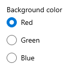
Use radio buttons, also called option buttons, to let users select one option from a collection of two or more mutually exclusive, but related, options. Radio buttons are always used in groups, and each option is represented by one radio button in the group.
The RadioButtons control simplifies layout, handles keyboard navigation and accessibility, and supports binding to a data source. When you use RadioButtons, you can treat your group of options as a single entity, rather than keeping track of individual RadioButton controls.
The RadioButtons control uses a content model similar to an ItemsControl. This means that you can:
- Populate it by adding items directly to the Items collection or by binding data to its ItemsSource property.
- Use the SelectedIndex or SelectedItem properties to get and set which option is selected.
- Handle the SelectionChanged event to take action when an option is chosen.
Control style and template
You can modify the default Style and ControlTemplate to give the control a unique appearance. For information about modifying a control's style and template, see XAML styles. The default style, template, and resources that define the look of the control are included in the generic.xaml file. For design purposes, generic.xaml is installed with the WinUI (Microsoft.UI.Xaml) NuGet package. By default, this location is \Users\<username>\.nuget\packages\microsoft.ui.xaml\<version>\lib\uap10.0\Microsoft.UI.Xaml\Themes\generic.xaml. Styles and resources from different versions of WinUI might have different values.
XAML also includes resources that you can use to modify the colors of a control in different visual states without modifying the control template. Modifying these resources is preferred to setting properties such as Background and Foreground. For more info, see the Light-weight styling section of the XAML styles article.
Constructors
| RadioButtons() |
Initializes a new instance of the RadioButtons class. This documentation applies to WinUI 2 for UWP (for WinUI in the Windows App SDK, see the Windows App SDK namespaces). |
Properties
| Header |
Gets or sets the content for the group header. This documentation applies to WinUI 2 for UWP (for WinUI in the Windows App SDK, see the Windows App SDK namespaces). |
| HeaderProperty |
Identifies the Header dependency property. This documentation applies to WinUI 2 for UWP (for WinUI in the Windows App SDK, see the Windows App SDK namespaces). |
| HeaderTemplate |
Gets or sets the data template used to display the content of the control's header. This documentation applies to WinUI 2 for UWP (for WinUI in the Windows App SDK, see the Windows App SDK namespaces). |
| HeaderTemplateProperty |
Identifies the HeaderTemplate dependency property. This documentation applies to WinUI 2 for UWP (for WinUI in the Windows App SDK, see the Windows App SDK namespaces). |
| Items |
Gets the collection used to generate the content of the control. This documentation applies to WinUI 2 for UWP (for WinUI in the Windows App SDK, see the Windows App SDK namespaces). |
| ItemsProperty |
Identifies the Items dependency property. This documentation applies to WinUI 2 for UWP (for WinUI in the Windows App SDK, see the Windows App SDK namespaces). |
| ItemsSource |
Gets or sets an object source used to generate the content of the control. This documentation applies to WinUI 2 for UWP (for WinUI in the Windows App SDK, see the Windows App SDK namespaces). |
| ItemsSourceProperty |
Identifies the ItemsSource dependency property. This documentation applies to WinUI 2 for UWP (for WinUI in the Windows App SDK, see the Windows App SDK namespaces). |
| ItemTemplate |
Gets or sets the DataTemplate used to display each item. This documentation applies to WinUI 2 for UWP (for WinUI in the Windows App SDK, see the Windows App SDK namespaces). |
| ItemTemplateProperty |
Identifies the ItemTemplate dependency property. This documentation applies to WinUI 2 for UWP (for WinUI in the Windows App SDK, see the Windows App SDK namespaces). |
| MaxColumns |
Gets or sets the maximum number of columns the radio buttons are arranged in. This documentation applies to WinUI 2 for UWP (for WinUI in the Windows App SDK, see the Windows App SDK namespaces). |
| MaxColumnsProperty |
Identifies the MaxColumns dependency property. This documentation applies to WinUI 2 for UWP (for WinUI in the Windows App SDK, see the Windows App SDK namespaces). |
| SelectedIndex |
Gets or sets the index of the selected radio button. This documentation applies to WinUI 2 for UWP (for WinUI in the Windows App SDK, see the Windows App SDK namespaces). |
| SelectedIndexProperty |
Identifies the SelectedIndex dependency property. This documentation applies to WinUI 2 for UWP (for WinUI in the Windows App SDK, see the Windows App SDK namespaces). |
| SelectedItem |
Gets or sets the selected radio button. This documentation applies to WinUI 2 for UWP (for WinUI in the Windows App SDK, see the Windows App SDK namespaces). |
| SelectedItemProperty |
Identifies the SelectedItem dependency property. This documentation applies to WinUI 2 for UWP (for WinUI in the Windows App SDK, see the Windows App SDK namespaces). |
Methods
| ContainerFromIndex(Int32) |
Returns the container for the item at the specified index within the item collection. This documentation applies to WinUI 2 for UWP (for WinUI in the Windows App SDK, see the Windows App SDK namespaces). |
Events
| SelectionChanged |
Occurs when the currently selected item changes. This documentation applies to WinUI 2 for UWP (for WinUI in the Windows App SDK, see the Windows App SDK namespaces). |