iPhone SDK vs. Windows Phone 7 Series SDK Challenge, Part 2: MoveMe
In this series, I will be taking sample applications from the iPhone SDK and implementing them on Windows Phone 7 Series. My goal is to do as much of an “apples-to-apples” comparison as I can. This series will be written to not only compare and contrast how easy or difficult it is to complete tasks on either platform, how many lines of code, etc., but I’d also like it to be a way for iPhone developers to either get started on Windows Phone 7 Series development, or for developers in general to learn the platform.
Here’s my methodology:
- Run the iPhone SDK app in the iPhone Simulator to get a feel for what it does and how it works, without looking at the implementation
- Implement the equivalent functionality on Windows Phone 7 Series using Silverlight.
- Compare the two implementations based on complexity, functionality, lines of code, number of files, etc.
- Add some functionality to the Windows Phone 7 Series app that shows off a way to make the scenario more interesting or leverages an aspect of the platform, or uses a better design pattern to implement the functionality.
You can download Microsoft Visual Studio 2010 Express for Windows Phone CTP here, and the Expression Blend 4 Beta here.
If you’re seeing this series for the first time, check out Part 1: Hello World.
A note on methodology…in the prior post there was some feedback about lines of code not being a very good metric for this exercise. I don’t really disagree, there’s a lot more to this than lines of code but I believe that is a relevant metric, even if it’s not the ultimate one. And there’s no perfect answer here. So I am going to continue to report the number of lines of code that I, as a developer would need to write in these apps as a data point, and I’ll leave it up to the reader to determine how that fits in with overall complexity, etc. The first example was so basic that I think it was difficult to talk about in real terms. I think that as these apps get more complex, the subjective differences in concept count and will be more important.
MoveMe
The MoveMe app is the main end-to-end app writing example in the iPhone SDK, called Creating an iPhone Application. This application demonstrates a few concepts, including handling touch input, how to do animations, and how to do some basic transforms.
The behavior of the application is pretty simple.
User touches the button: The button does a “throb” type animation where it scales up and then back down briefly.
User drags the button: After a touch begins, moving the touch point will drag the button around with the touch.
User lets go of the button: The button animates back to its original position, but does a few small bounces as it reaches it’s original point, which makes the app fun and gives it an extra bit of interactivity.
Now, how would I write an app that meets this spec for Windows Phone 7 Series, and how hard would it be? Let’s find out!
Implementing the UI
Okay, let’s build the UI for this application. In the HelloWorld example, we did all the UI design in Visual Studio and/or by hand in XAML.
In this example, we’re going to use the Expression Blend 4 Beta.
You might be wondering when to use Visual Studio, when to use Blend, and when to do XAML by hand. Different people will have different takes on this, but here’s mine:
- XAML by hand – simple UI that doesn’t contain animations, gradients, etc., and or UI that I want to really optimize and craft when I know exactly what I want to do.
- Visual Studio – Basic UI layout, property setting, data binding, etc.
- Blend – Any serious design work needs to be done in Blend, including animations, handling states and transitions, styling and templating, editing resources.
As in Part 1, go ahead and fire up Visual Studio 2010 Express for Windows Phone (yes, soon it will take longer to say the name of our products than to start them up!), and create a new Windows Phone Application. As in Part 1, clear out the XAML from the designer. An easy way to do this is to just:
- Click on the design surface
- Hit Control+A
- Hit Delete
There’s a little bit left over (the “Grid.RowDefinitions” element), just go ahead and delete that element so we’re starting with a clean state of only one outer Grid element.
To use Blend, we need to save this project. See, when you create a project with Visual Studio Express, it doesn’t commit it to the disk (well, in a place where you can find it, at least) until you actually save the project. This is handy if you’re doing some fooling around, because it doesn’t clutter your disk with WindowsPhoneApplication23-like directories. But it’s also kind of dangerous, since when you close VS, if you don’t save the project…it’s all gone. Yes, this has bitten me since I was saving files and didn’t remember that, so be careful to save the project/solution via “Save All”, at least once.
So, save and note the location on disk.
Start Expression Blend 4 Beta, and chose File –> Open Project/Solution, and load your project. You should see just about the same thing you saw over in VS: a blank, black designer surface.
Now, thinking about this application, we don’t really need a button, even though it looks like one. We never click it. So we’re just going to create a visual and use that. This is also true in the iPhone example above, where the visual is actually not a button either but a jpg image with a nice gradient and round edges. We’ll do something simple here that looks pretty good.
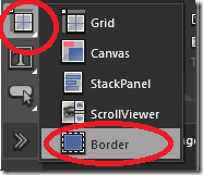
In Blend, look in the tool pane on the left for the icon that looks like the below (the highlighted one on the left), and hold it down to get the popout menu, and choose “Border”:
Okay, now draw out a box in the middle of the design surface of about 300x100. The Properties Pane to the left should show the properties for this item.
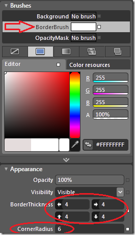
First, let’s make it more visible by giving it a border brush. Set the BorderBrush to white by clicking BorderBrush and dragging the color selector all the way to the upper right in the palette. Then, down a bit farther, make the BorderThickness 4 all the way around, and the CornerRadius set to 6.
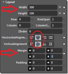
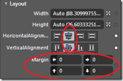
In the Layout section, do the following to Width, Height, Horizontal and Vertical Alignment, and Margin (all 4 margin values):
You’ll see the outline now is in the middle of the design surface.
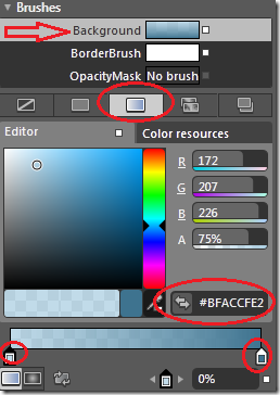
Now let’s give it a background color. Above “BorderBrush” select “Background”, and click the third tab over: Gradient Brush. You’ll see a gradient slider at the bottom, and if you click the markers, you can edit the gradient stops individually (or add more). In this case, you can select something you like, but where’s what I chose:
Left stop: #BFACCFE2 (I just picked a spot on the palette and set opacity to 75%, no magic here, feel free to fiddle these or just enter these numbers into the hex area and be done with it)
Right stop: #FF3E738F
Okay, looks pretty good. Finally set the name of the element in the “Name” field at the top of the Properties pane to “welcome”.
Now let’s add some text. Just hit “T” and it’ll select the TextBlock tool automatically:
Now draw out some are inside our “welcome” visual and type “Welcome!”, then click on the design surface (to exit text entry mode) and hit “V” to go back into selection mode (or the top item in the tool pane that looks like a mouse pointer).
Click on the text again to select it in the tool pane.
Just like the border, we want to center this. So set HorizontalAlignment and VerticalAlignment to “Center”, and clear the Margins:
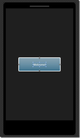
That’s it for the UI. Here’s how it looks, on the design surface:
Not bad! Okay, now the fun part…
Adding Animations
Using Blend to build animations is a lot of fun, and it’s easy. In XAML, I can not only declare elements and visuals, but also I can declare animations that will affect those visuals. These are called Storyboards.
To recap, we’ll be doing two animations:
- The “throb” animation when the element is touched
- The “center” animation when the element is released after being dragged.
The throb animation is just a scale transform, so we’ll do that first.
In the Objects and Timeline Pane (left side, bottom half), click the little + icon to add a new Storyboard called “touchStoryboard”:
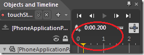
The timeline view will appear. In there, click a bit to the right of “0” to create a keyframe at .2 seconds:
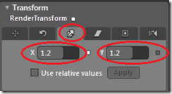
Now, click on our “welcome” element (the Border, not the TextBlock in it), and scroll to the bottom of the Properties Pane. Open up Transform, click the third tab ("Scale”), and set X and Y to 1.2:
This all of this says that, at .2 seconds, I want the X and Y size of this element to scale to 1.2.
In fact you can see this happen. Push the “Play” arrow in the timeline view, and you’ll see the animation run!
Let’s make two tweaks. First, we want the animation to automatically reverse so it scales up then back down nicely.
Click in the dropdown that says “touchStoryboard” in Objects and Timeline, then in the Properties pane check “Auto Reverse”:
Now run it again, and you’ll see it go both ways. Let’s even make it nicer by adding an easing function.
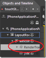
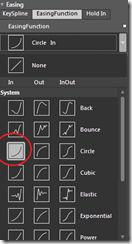
First, click on the “Render Transform” item in the Objects tree, then, in the Property Pane, you’ll see a bunch of easing functions to choose from. Feel free to play with this, then seeing how each runs. I chose “Circle In”, but some other ones are fun. Try them out! Elastic In is kind of fun, but we’ll stick with Circle In.
That’s it for that animation.
Now, we also want an animation to move the Border back to it’s original position when the user ends the touch gesture. This is exactly the same process as above, but just targeting a different transform property.
Create a new animation called “releaseStoryboard”
- Select a timeline point at 1.2 seconds.
- Click on the “welcome” Border element again
- Scroll to the “Transforms” panel at the bottom of the Properties Pane
- Choose the first tab (“Translate”), which may already be selected
- Set both X and Y values to 0.0 (we do this just to make the values stick, because the value is already 0 and we need Blend to know we want to save that value)
- Click on “RenderTransform” in the Objects tree
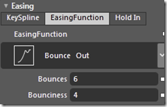
- In the properties pane, choose “Bounce Out”
- Set “Bounces” to 6, and “Bounciness” to 4 (feel free to play with these as well)
Okay, we’re done.
Note, if you want to test this Storyboard, you have to do something a little tricky because the final value is the same as the initial value, so playing it does nothing. If you want to play with it, do the following:
- Next to the selection dropdown, hit the little "x” (Close Storyboard)
- Go to the Translate Transform value for “welcome”
- Set X,Y to –50, –200, respectively (or whatever)
- Select “releaseStoryboard” again from the dropdown
- Hit play, see it run
- Go into the object tree and select “RenderTransform” to change the easing function.
- When you’re done, hit the Close Storyboard “x” again and set the values in Transform/Translate back to 0
Wiring Up the Animations
Okay, now go back to Visual Studio. You’ll get a prompt due to the modification of MainPage.xaml. Hit “Yes”.
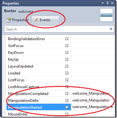
In the designer, click on the “welcome” Border element. In the Property Browser, hit the “Events” button, then double click each of “ManipulationStarted”, “ManipulationDelta”, “ManipulationCompleted”. You’ll need to flip back to the designer from code, after each double click.
It’s code time. Here we go.
Here, three event handlers have been created for us:
welcome_ManipulationStarted: This will execute when a manipulation begins. Think of it as MouseDown.
welcome_ManipulationDelta: This executes each time a manipulation changes. Think MouseMove.
welcome_ManipulationCompleted: This will execute when the manipulation ends. Think MouseUp.
Now, in ManipuliationStarted, we want to kick off the “throb” animation that we called “touchAnimation”. That’s easy:
1: private void welcome_ManipulationStarted(object sender, ManipulationStartedEventArgs e)
2: {
3: touchStoryboard.Begin();
4: }
Likewise, when the manipulation completes, we want to re-center the welcome visual with our bounce animation:
1: private void welcome_ManipulationCompleted(object sender, ManipulationCompletedEventArgs e)
2: {
3: releaseStoryboard.Begin();
4: }
Note there is actually a way to kick off these animations from Blend directly via something called “Triggers”, but I think it’s clearer to show what’s going on like this. A Trigger basically allows you to say “When this event fires, trigger this Storyboard”, so it’s the exact same logical process as above, but without the code.
But how do we get the object to move? Well, for that we really don’t want an animation because we want it to respond immediately to user input.
We do this by directly modifying the transform to match the offset for the manipulation, and then we’ll let the animation bring it back to zero when the manipulation completes. The manipulation events do a great job of keeping track of all the stuff that you usually had to do yourself when doing drags: where you started from, how far you’ve moved, etc.
So we can easily modify the position as below:
1: private void welcome_ManipulationDelta(object sender, ManipulationDeltaEventArgs e)
2: {
3: CompositeTransform transform = (CompositeTransform)welcome.RenderTransform;
4:
5: transform.TranslateX = e.CumulativeManipulation.Translation.X;
6: transform.TranslateY = e.CumulativeManipulation.Translation.Y;
7: }
That’s it!
Go ahead and run the app in the emulator. I suggest running without the debugger, it’s a little faster (CTRL+F5). If you’ve got a machine that supports DirectX 10, you’ll see nice smooth GPU accelerated graphics, which also what it looks like on the phone, running at about 60 frames per second. If your machine does not support DX10 (like the laptop I’m writing this on!), it won’t be quite a smooth so you’ll have to take my word for it!
Comparing Against the iPhone
This is an example where the flexibility and power of XAML meets the tooling of Visual Studio and Blend, and the whole experience really shines.
So, for several things that are declarative and 100% toolable with the Windows Phone 7 Series, this example does them with code on the iPhone. In parens is the lines of code that I count to do these operations.
- PlacardView.m: 19 total LOC
- Creating the view that hosts the button-like image and the text
- Drawing the image that is the background of the button
- Drawing the “Welcome” text over the image (I think you could technically do this step and/or the prior one using Interface Builder)
- MoveMeView.m: 63 total LOC
- Constructing and running the scale (“throb”) animation (25)
- Constructing the path describing the animation back to center plus bounce effect (38)
Beyond the code count, yy experience with doing this kind of thing in code is that it’s VERY time intensive. When I was a developer back on Windows Forms, doing GDI+ drawing, we did this stuff a lot, and it took forever! You write some code and even once you get it basically working, you see it’s not quite right, you go back, tweak the interval, or the math a bit, run it again, etc. You can take a look at the iPhone code here to judge for yourself. Scroll down to “animatePlacardViewToCenter” toward the bottom. I don’t think this code is terribly complicated, but it’s not what I’d call simple and it’s not at all simple to get right.
And then there’s a few other lines of code running around for setting up the ViewController and the Views, about 15 lines between MoveMeAppDelegate, PlacardView, and MoveMeView, plus the assorted decls in the h files.
Adding those up, I conservatively get something like 100 lines of code (19+63+15+decls) on iPhone that I have to write, by hand, to make this project work.
The lines of code that I wrote in the examples above is 5 lines of code on Windows Phone 7 Series.
In terms of incremental concept counts beyond the HelloWorld app, here’s a shot at that:
iPhone:
- Drawing Images
- Drawing Text
- Handling touch events
- Creating animations
- Scaling animations
- Building a path and animating along that
Windows Phone 7 Series:
- Laying out UI in Blend
- Creating & testing basic animations in Blend
- Handling touch events
- Invoking animations from code
This was actually the first example I tried converting, even before I did the HelloWorld, and I was pretty surprised. Some of this is luck that this app happens to match up with the Windows Phone 7 Series platform just perfectly. In terms of time, I wrote the above application, from scratch, in about 10 minutes. I don’t know how long it would take a very skilled iPhone developer to write MoveMe on that iPhone from scratch, but if I was to write it on Silverlight in the same way (e.g. all via code), I think it would likely take me at least an hour or two to get it all working right, maybe more if I ended up picking the wrong strategy or couldn’t get the math right, etc.
Making Some Tweaks
Silverlight contains a feature called “Projections” to do a variety of 3D-like effects with a 2D surface.
So let’s play with that a bit.
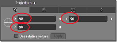
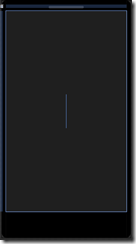
Go back to Blend and select the “welcome” Border in the object tree. In it’s properties, scroll down to the bottom, open Transform, and see Projection at the bottom. Set X,Y,Z to 90. You’ll see the element kind of disappear, replaced by a thin blue line.
Now…
- Create a new animation called “startupStoryboard”.
- Set it’s key time to .5 seconds in the timeline view
- Set the projection values above to 0 for X, Y, and Z.
- Save
- Go back to Visual Studio, and in the constructor, add the following bold code (lines 7-9 to the constructor:
1: public MainPage()
2: {
3: InitializeComponent();
4:
5: SupportedOrientations = SupportedPageOrientation.Portrait;
6:
7: this.Loaded += (s, e) =>
8: {
9: startupStoryboard.Begin();
10: };
11: }
If the code above looks funny, it’s using something called a lambda in C#, which is an inline anonymous method. It’s just a handy shorthand for creating a handler like the manipulation ones above.
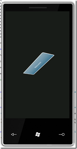
So with this you’ll get a nice 3D looking fly in effect when the app starts up. Here it is, in flight:
Pretty cool!
Comments
Anonymous
March 26, 2010
The comment has been removedAnonymous
March 27, 2010
I just ran through this tutorial as well as your Hello World tutorial, and really enjoyed both of them. As an iPhone developer just getting started poking around with Windows Phone development, these tutorials are a great introduction. Looking forward to more in the series!Anonymous
March 27, 2010
Nice! However, if I fastly click multiple times on the "button" the AutoReverse animation of the touchStoryboard seems to fail. The "button" maintains the enlarged/scaled size. I changed the app a little, so the AutoReverse was set to false and I changed the releaseStoryboard so it sets the Scale values explicitly to 0. This looked slightly better IMHO and fixed the AutoReverse issue. But it probably doesn't match the iPhone sample anymore.Anonymous
March 27, 2010
@Leon - ah rats, good catch. Try this, before you start the touchStoryboard, call touchStoryboard.SkipToFill(). That should force it to it's end so that the animations don't overlap.Anonymous
March 28, 2010
The comment has been removedAnonymous
March 29, 2010
The comment has been removedAnonymous
March 29, 2010
@shawn - YES you have to find a "compareable baseline" and MonoTouch is different - so your decission to use "plain OC" is a good choice. You forgot to answer (thats what counts for me) if you'll also cover "phone specific" topics like Sending Email, Browsing Contacts, Location Services, Internet Access (Webservices, Webpages, Images...), and so on. ManfredAnonymous
March 30, 2010
@ManniAt - oh, yes I'll be covering some of those. I'm actually trying to figure out what to do next because a lot of the really interesting things (accelerometer, location, contacts, media/images, etc) aren't currently available via the emulator, and my preference is for things that people can actually build and play with. But I think you're right and I'l have to do some demonstration posts of stuff that only works on the phone. Maybe I can post a video of them running on the phone or something. Web service access and web browser are good ideas though, I'll sift through the iPhone apps to see if I can't find some good examples. I was kind of thinking of doing a more data-focused application next, though. Something with a real view model and some more complex user interaction. Suggeestions welcome.Anonymous
March 30, 2010
Really enjoying this series, keep up the good work.Anonymous
March 31, 2010
The comment has been removedAnonymous
March 31, 2010
The number of lines of code or mark up code does not really matter, what truly matters is the development experience to the developer in terms of efficiency, ease and the IDEs and tools, and in terms of this I think Windows Phone 7 truly out-wins the iPhone.Anonymous
April 23, 2010
The comment has been removedAnonymous
May 13, 2010
Shawn, I'm trying my hand in some of this and I wanted to try to do something simple.
- Display a button
- On touch, display a shape
- Touch the shape, or shake the device, to make it disappear. Now, this is a learning experience so I'm trying to do it the hard way. I was successful at throwing in the button in VS and even made the shape appear. I did so using CS. Now, comes where I'm stuck. How do I apply "manipulationStarted" to an oobject using only CS? I was hoping that it would just be: rect.ManipulationStarted = "removeRectangle"; But... no such luck and I haven't had any luck searching for how to do this.
Anonymous
May 13, 2010
Hi Jason - typically you'd do this: public MainPage() { //... // hook up the event rect.ManipulationStarted += rect_ManipulationStarted; } private void rect_ManipulationStarted(object s, ManipulationStartedEventArgs e) { // hide the rect rect.Visibility = Visibility.Collapsed; } Though I'd recommend using ManipulationCompleted rather than started so the shape disappears when the touch completes.Anonymous
September 19, 2010
Aw, this was a really quality post. In theory I’d like to write like this too – taking time and real effort to make a good article… but what can I say… Admiring the time and effort you put into your blog and detailed information you offer.
![MoveMe[1] MoveMe[1]](https://msdntnarchive.z22.web.core.windows.net/media/TNBlogsFS/BlogFileStorage/blogs_msdn/sburke/WindowsLiveWriter/iPh.WindowsPhone7SeriesSDKChallengePart2_8C17/MoveMe%5B1%5D_thumb_1.jpg)
